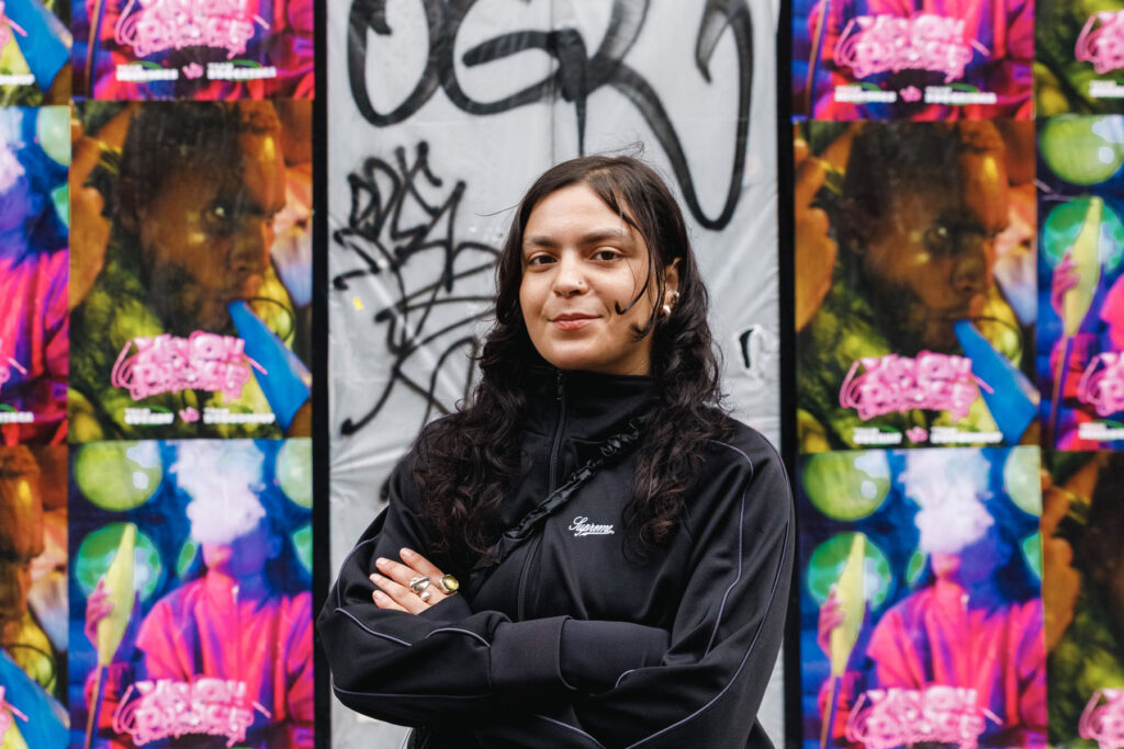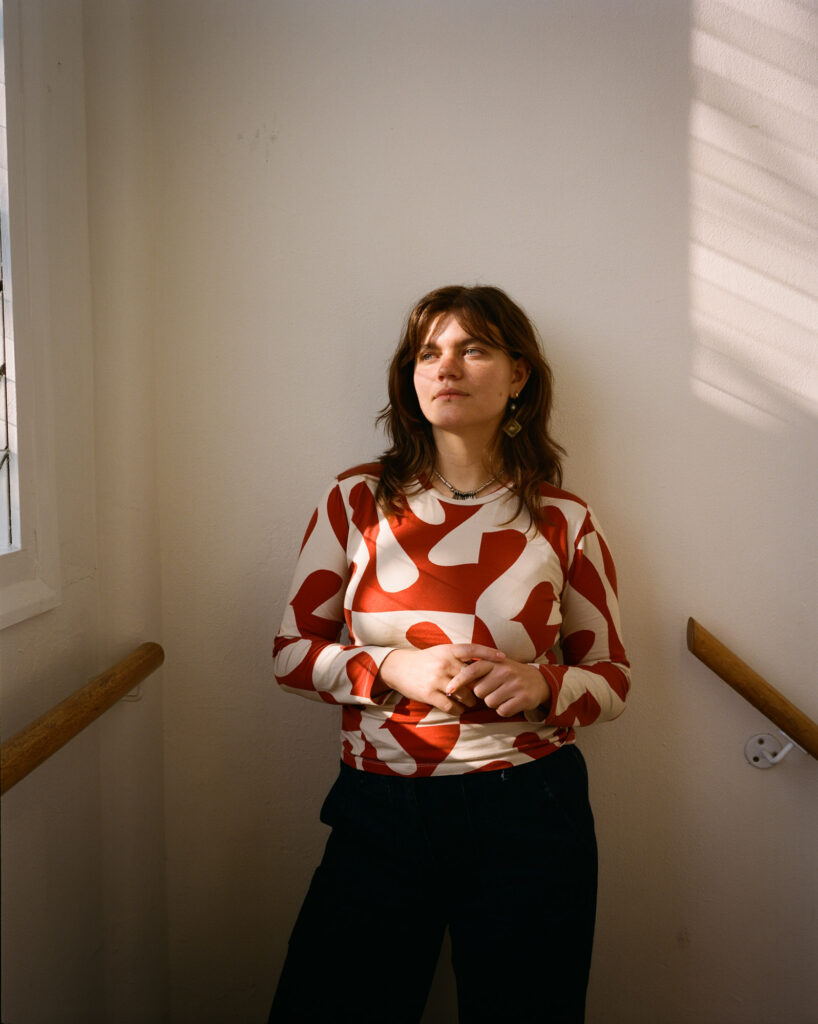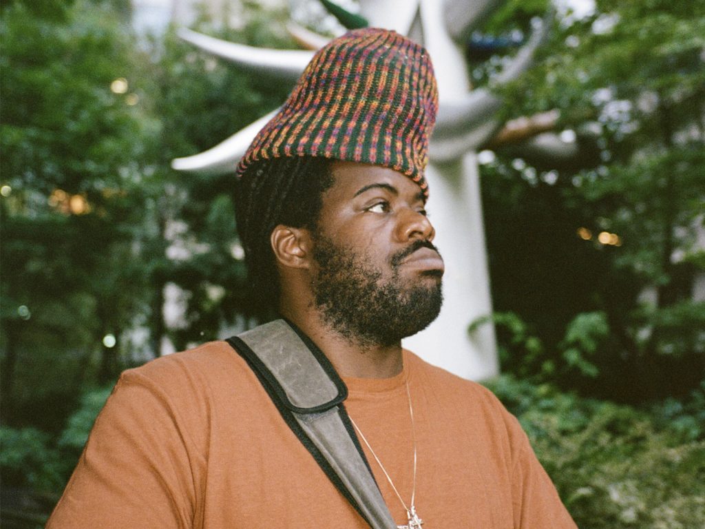


“I’m trying to put the attention on normal things.”
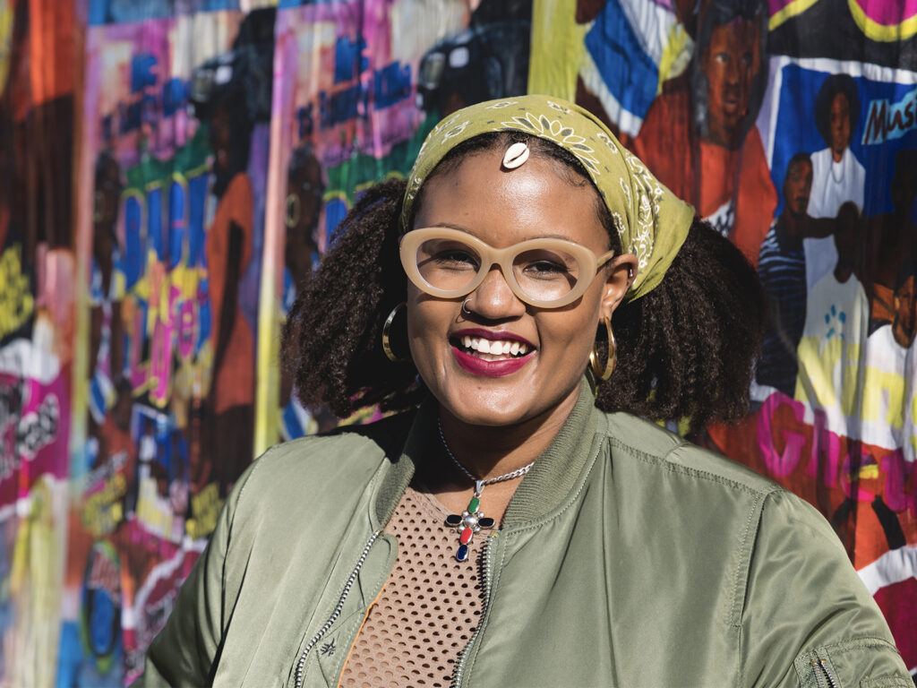
Chiara Fossati says it how it is, and so does her photography.
Born in Legnano in 1984 and now long since based in Milan, Fossati is a member of CESURA, the Italian photo collective and independent group built on shared skills, independent publishing, and the kind of support system photography often needs to survive as a long-term practice. “Photography is a very lonely work. So we create a sort of net,” she says.
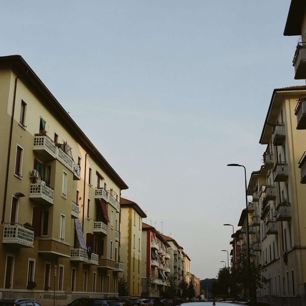
That sense of community matters to how Fossati works, and so does place. She lives and works in Milan’s outskirts, neighbourhoods that can often be reduced to stereotypes from the outside — or, more so, from within the city centre. “People from the centre are scared of the outskirts, and a lot of it is about communication.”
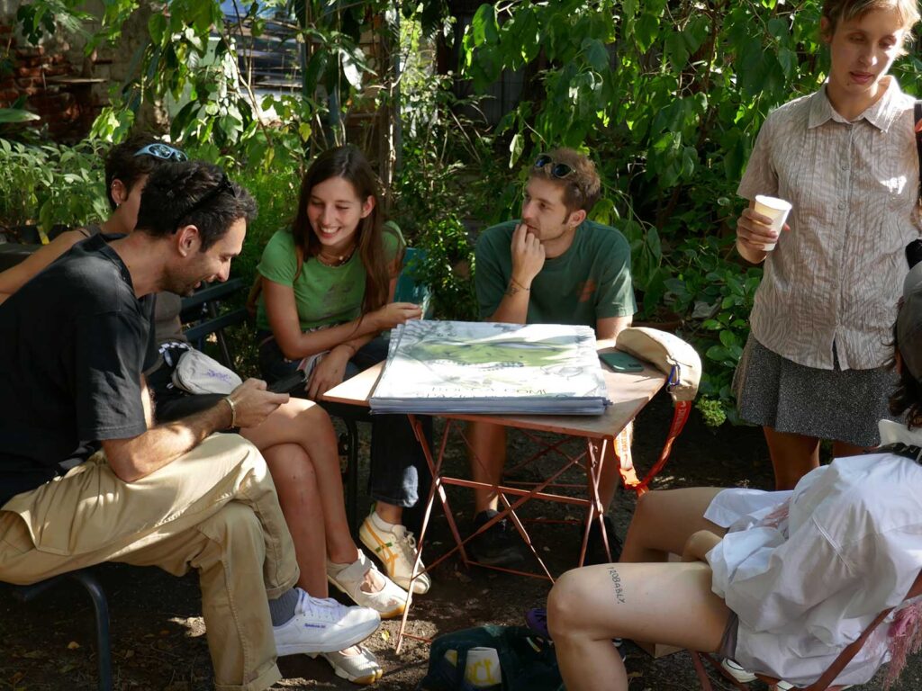
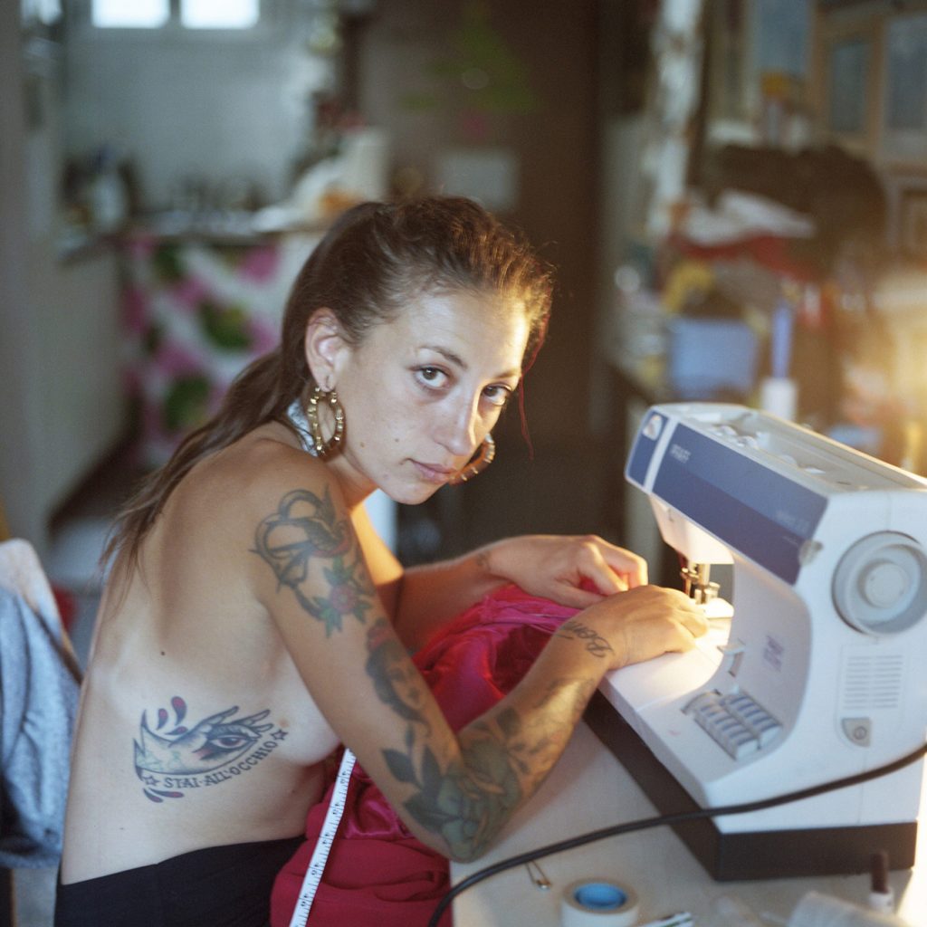
Fossati’s work pushes back against that distance. Not by dressing things up, and not by chasing shock. Her images are built through time, trust, and conversation. The kind of approach where people feel involved, not taken from. The result is photographs that hold softness without ever feeling too sentimental: attentive to gesture, to presence, and to the everyday realities that rarely get given space.
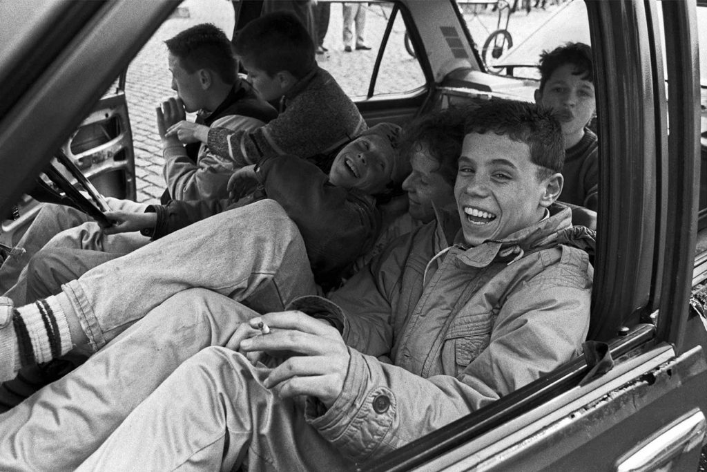
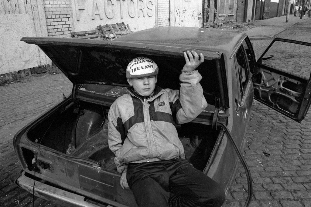
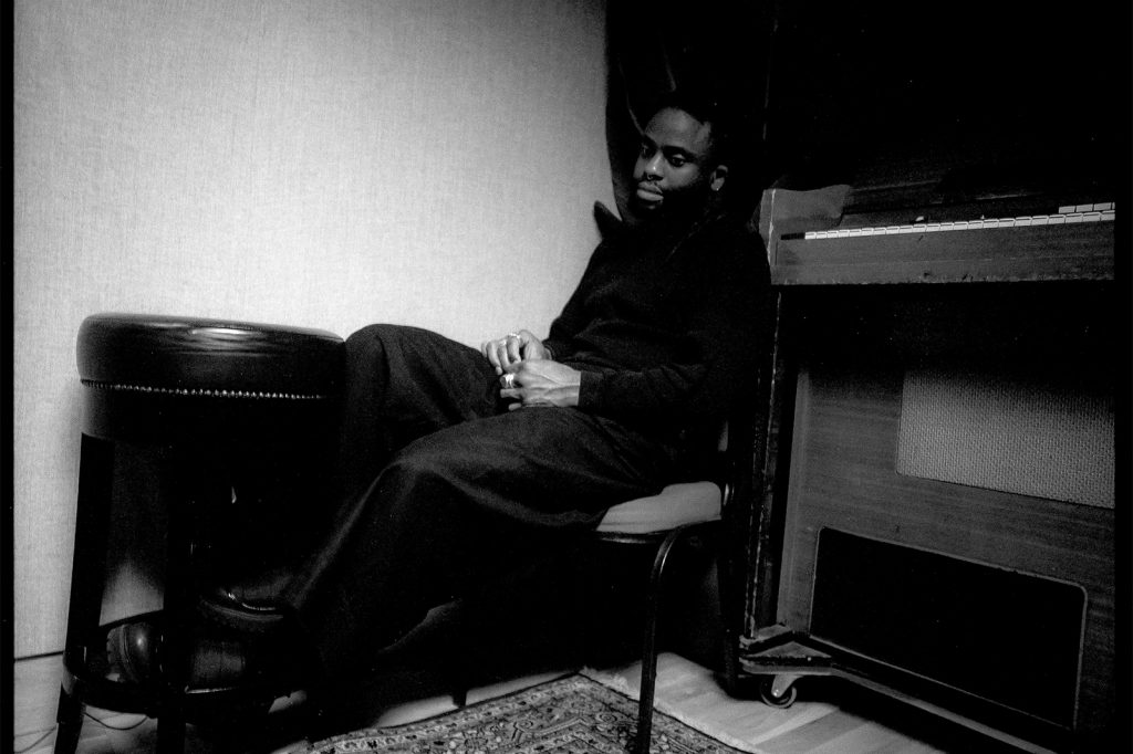
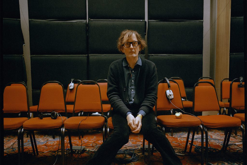
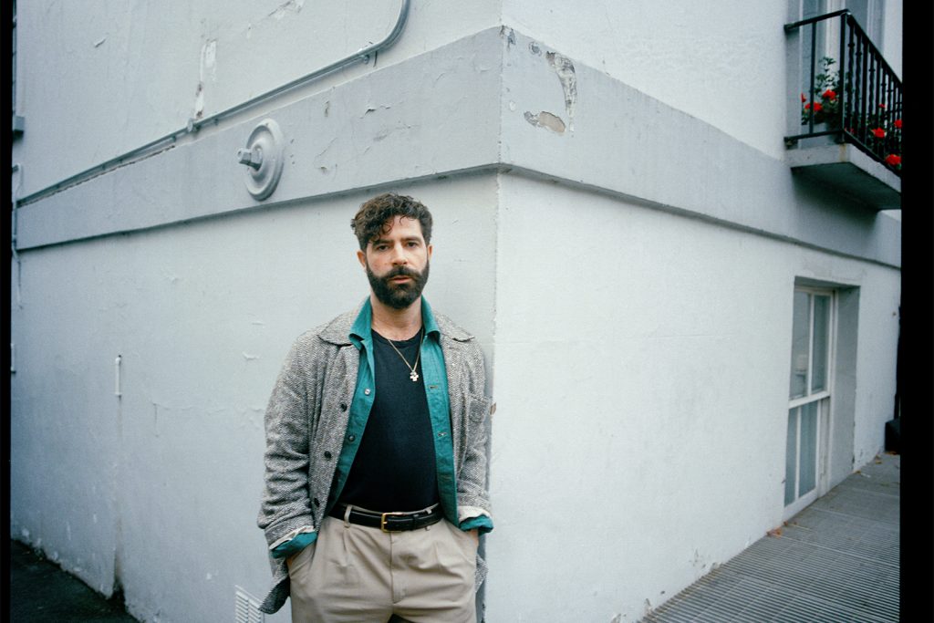
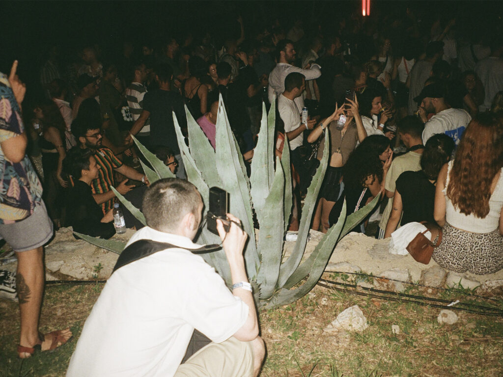
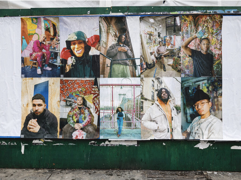
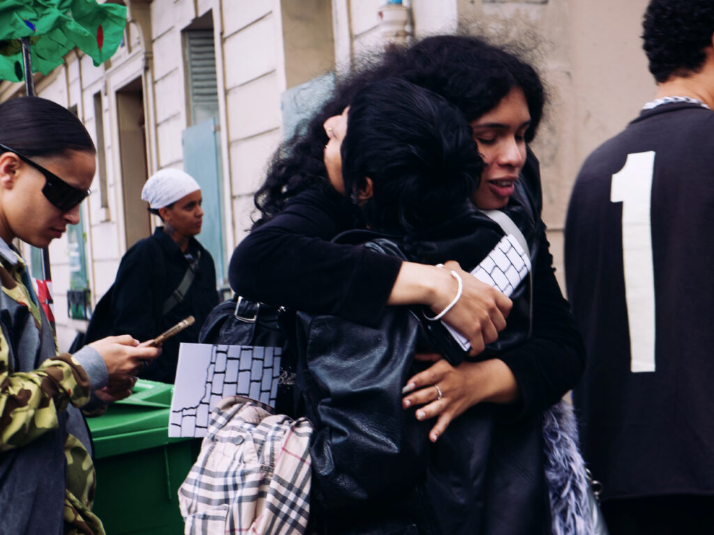
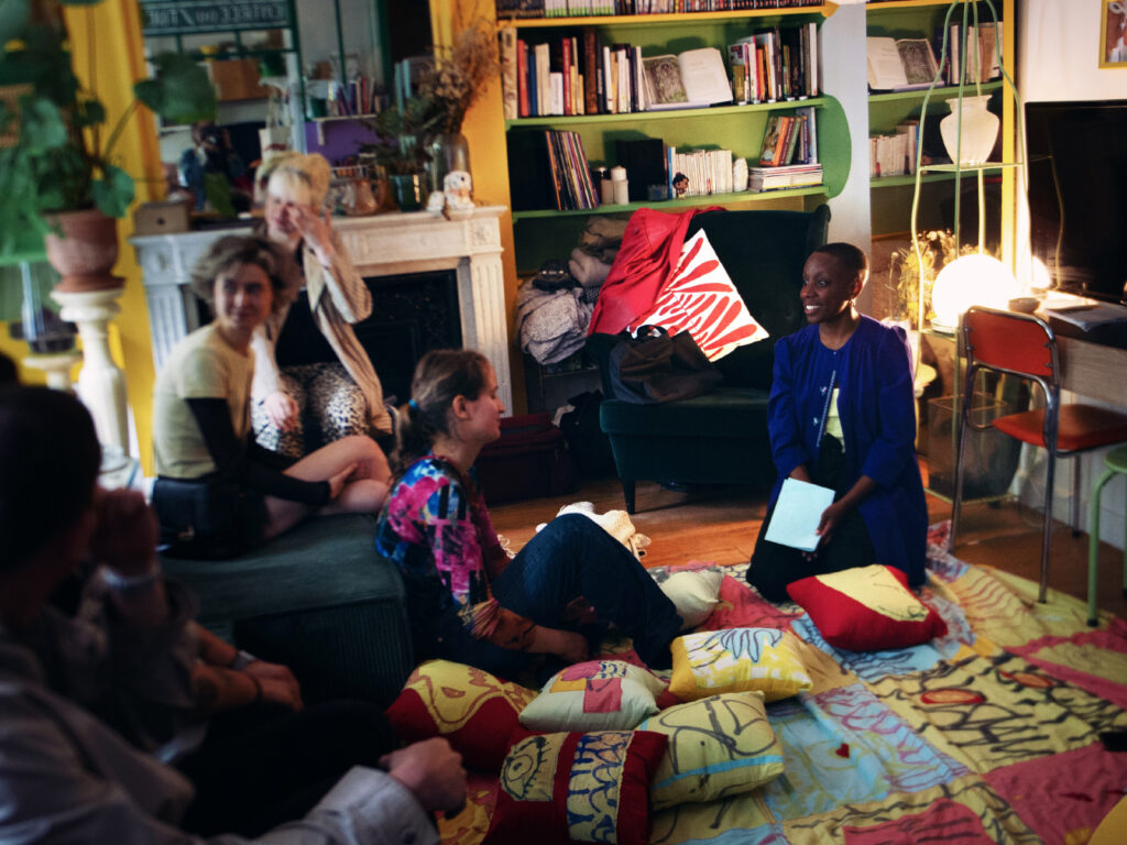
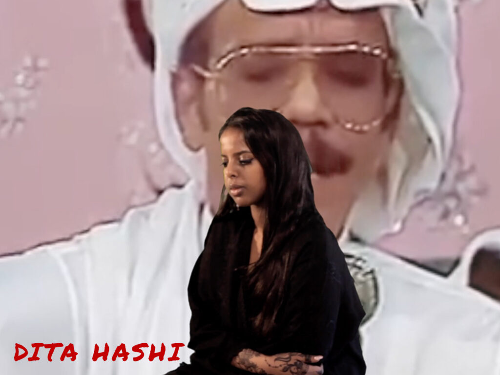
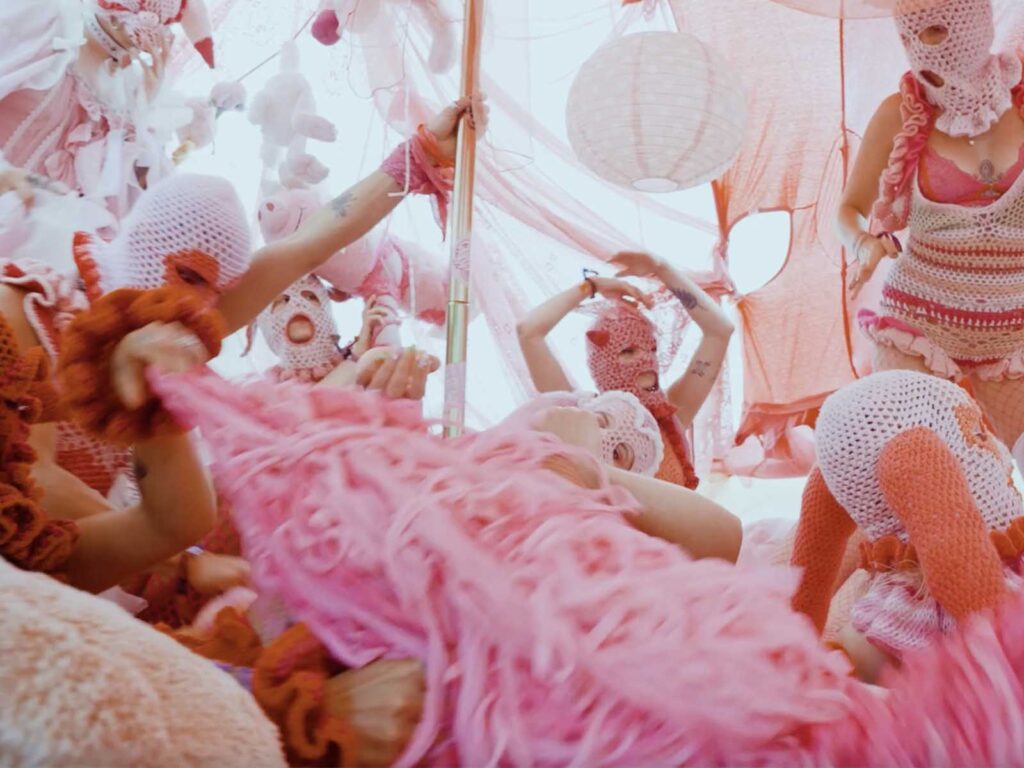
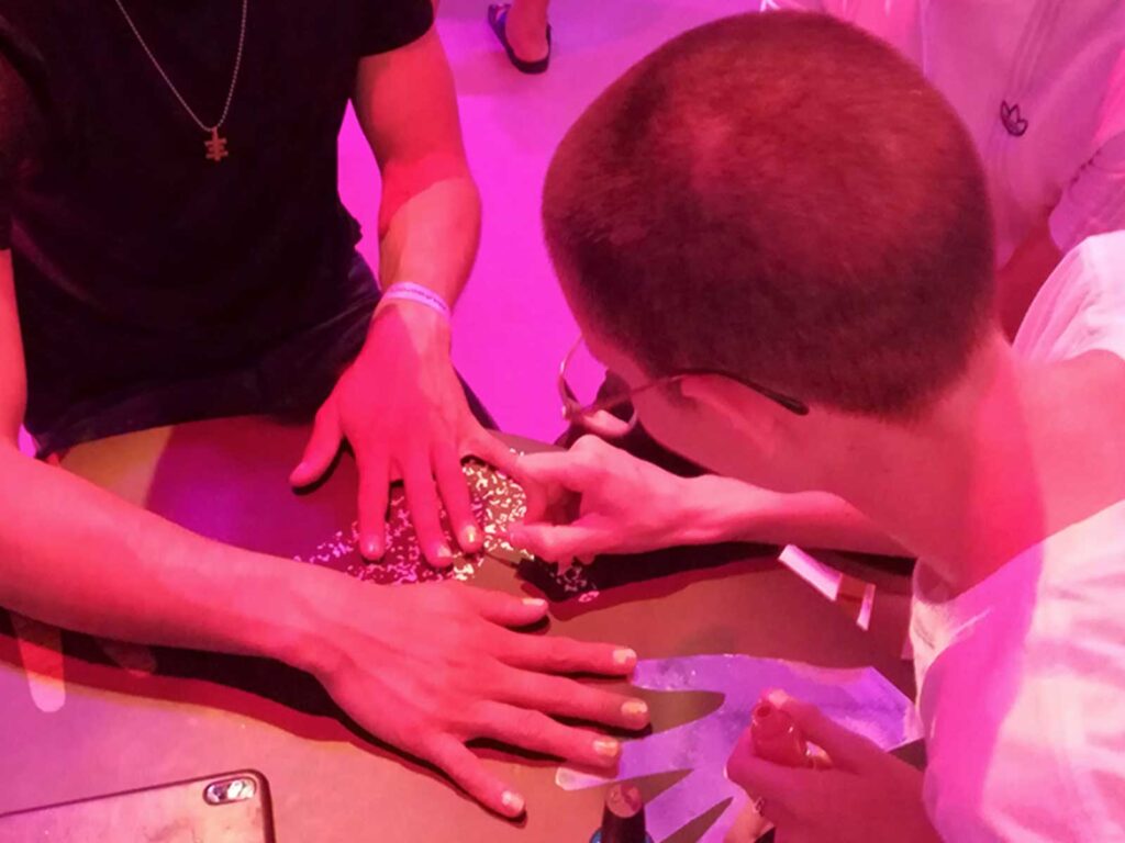
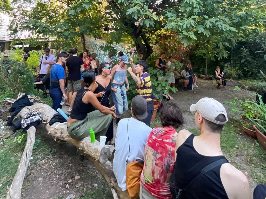
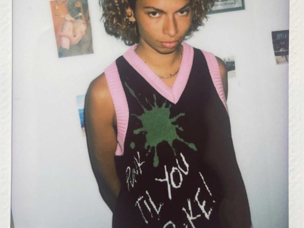
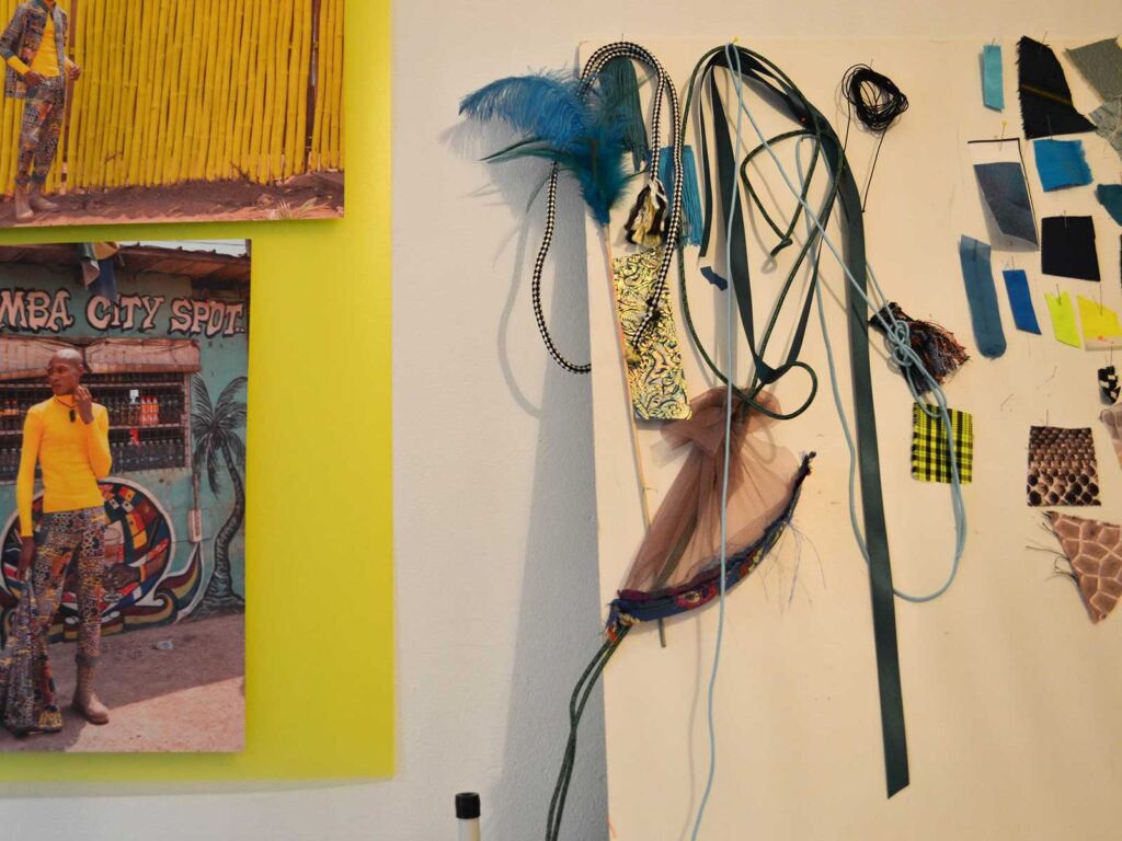
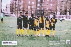
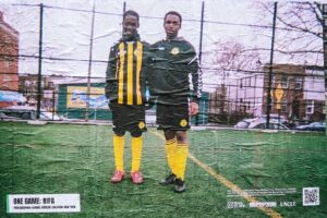
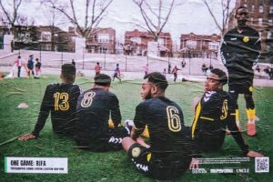
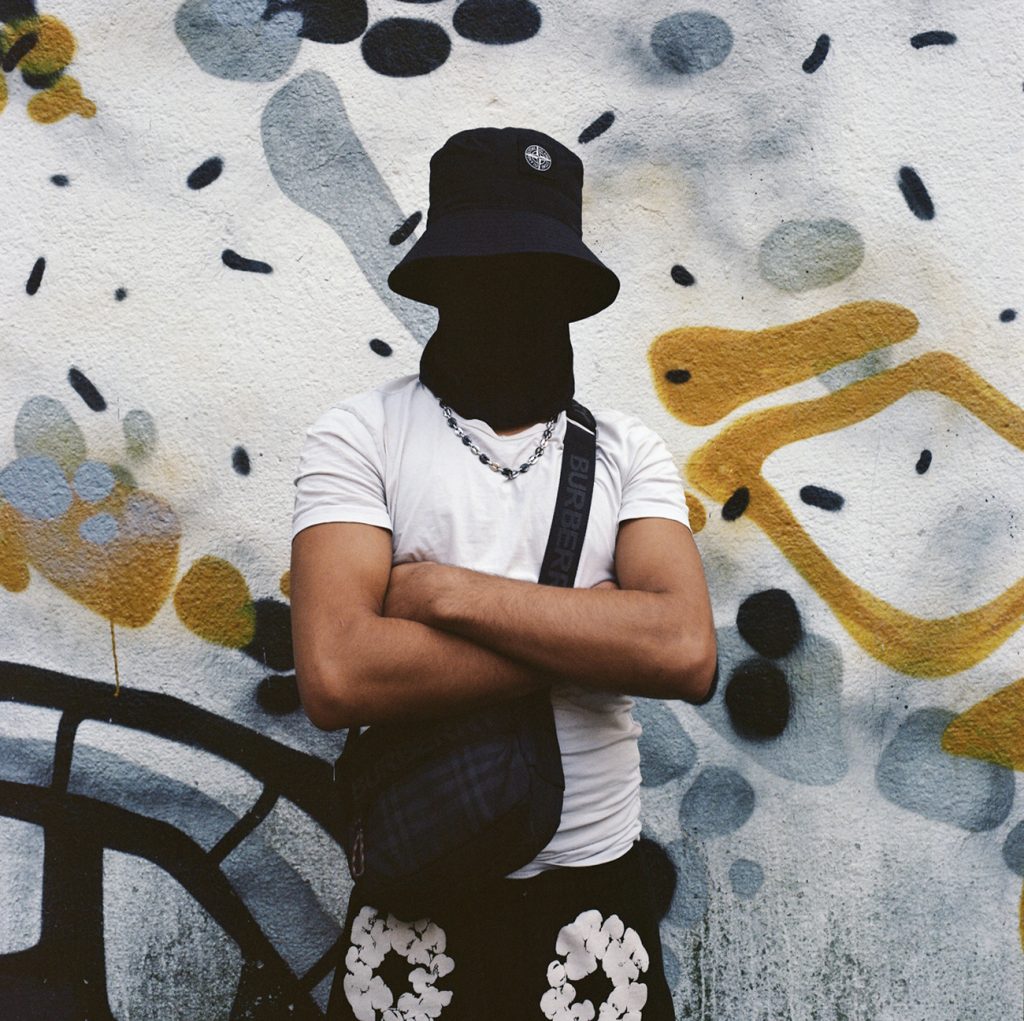
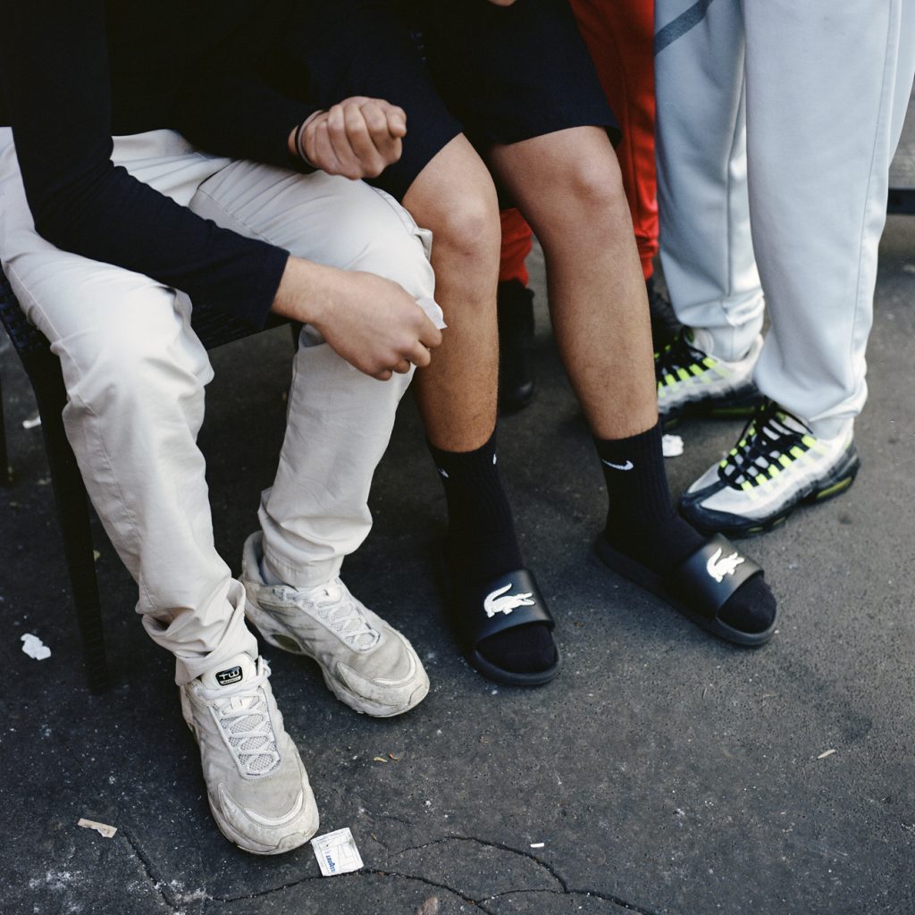
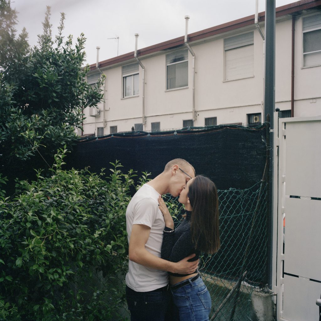
Projects like Whatever, Villaggio dei Fiori and Comete! feature portraits of ravers, teenagers, and communities in Milan’s outer neighbourhoods, photographed without shock value or struggle-as-aesthetic. These are not Chiara’s subjects; they are her neighbours.
In a city sold internationally as fast, fashionable, and polished, Fossati’s photographs are a reminder that Milan is also made in stairwells, courtyards, bus stops, basketball courts — the everyday spaces where life happens without an audience. Her work has been recognised in Italy’s contemporary photography world (including prizes for Villaggio dei Fiori
and Comete!), and she has also published her first book, Whatever, through CESURA’s own publishing arm.
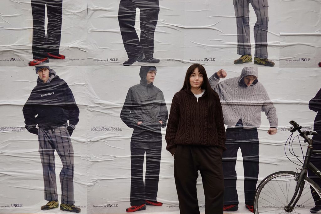
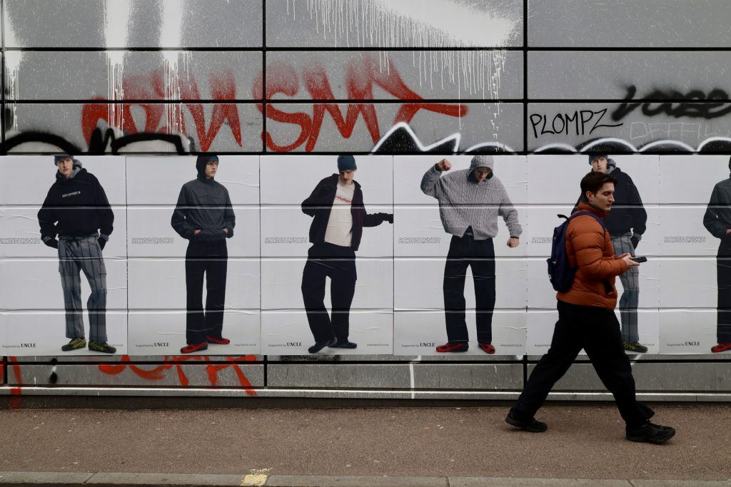
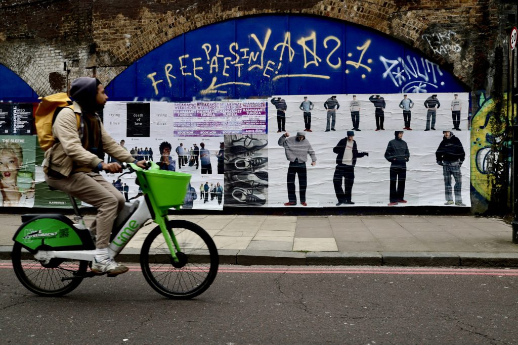
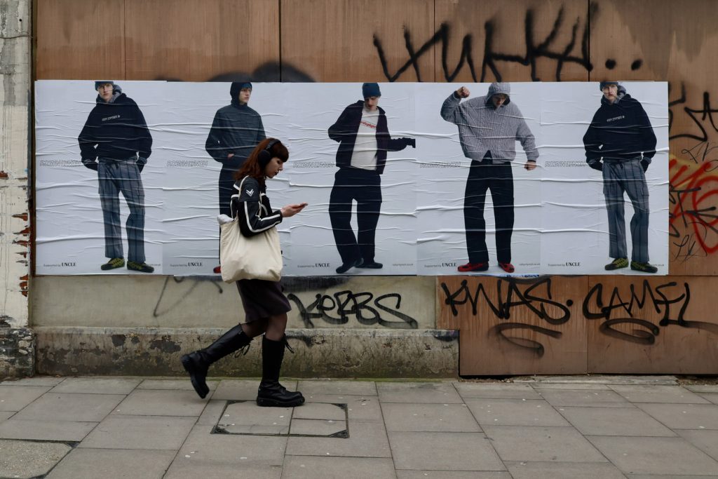
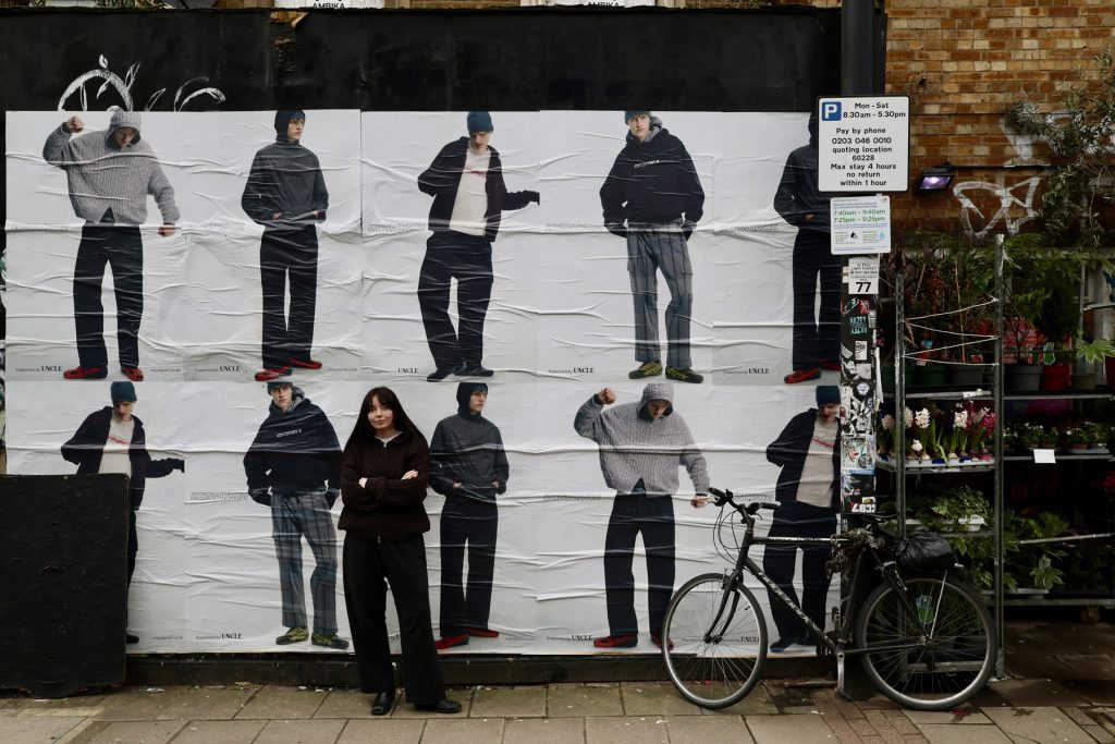
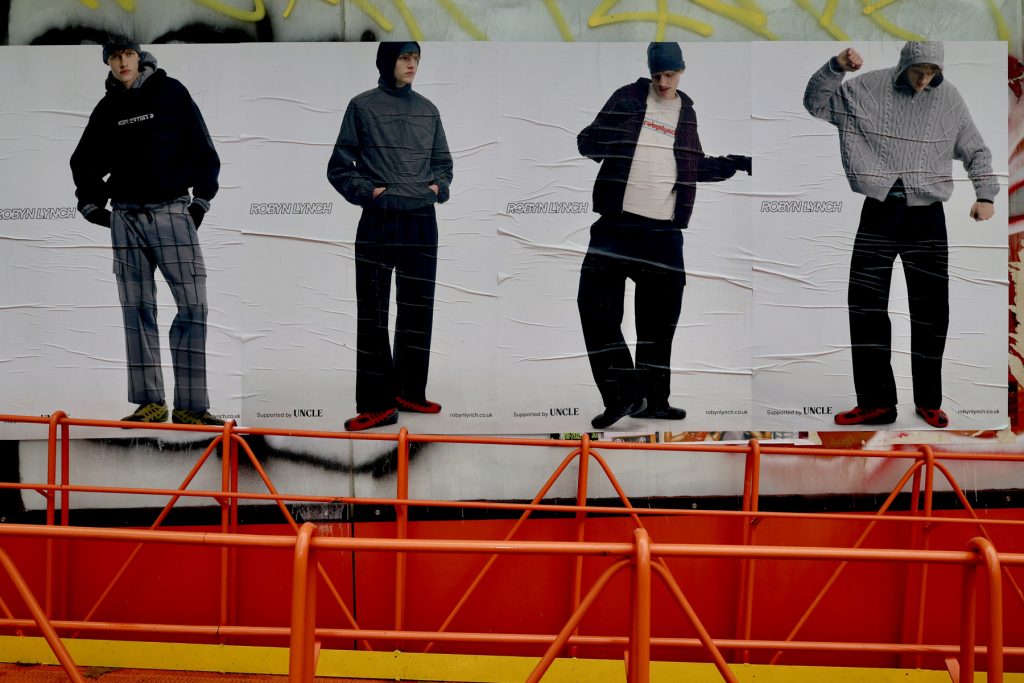
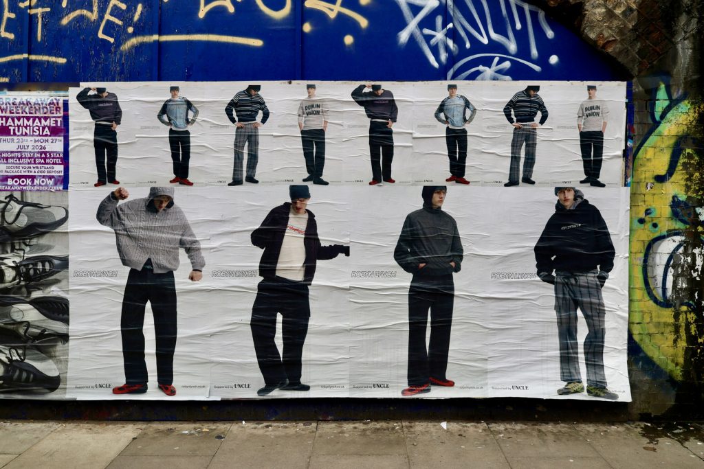
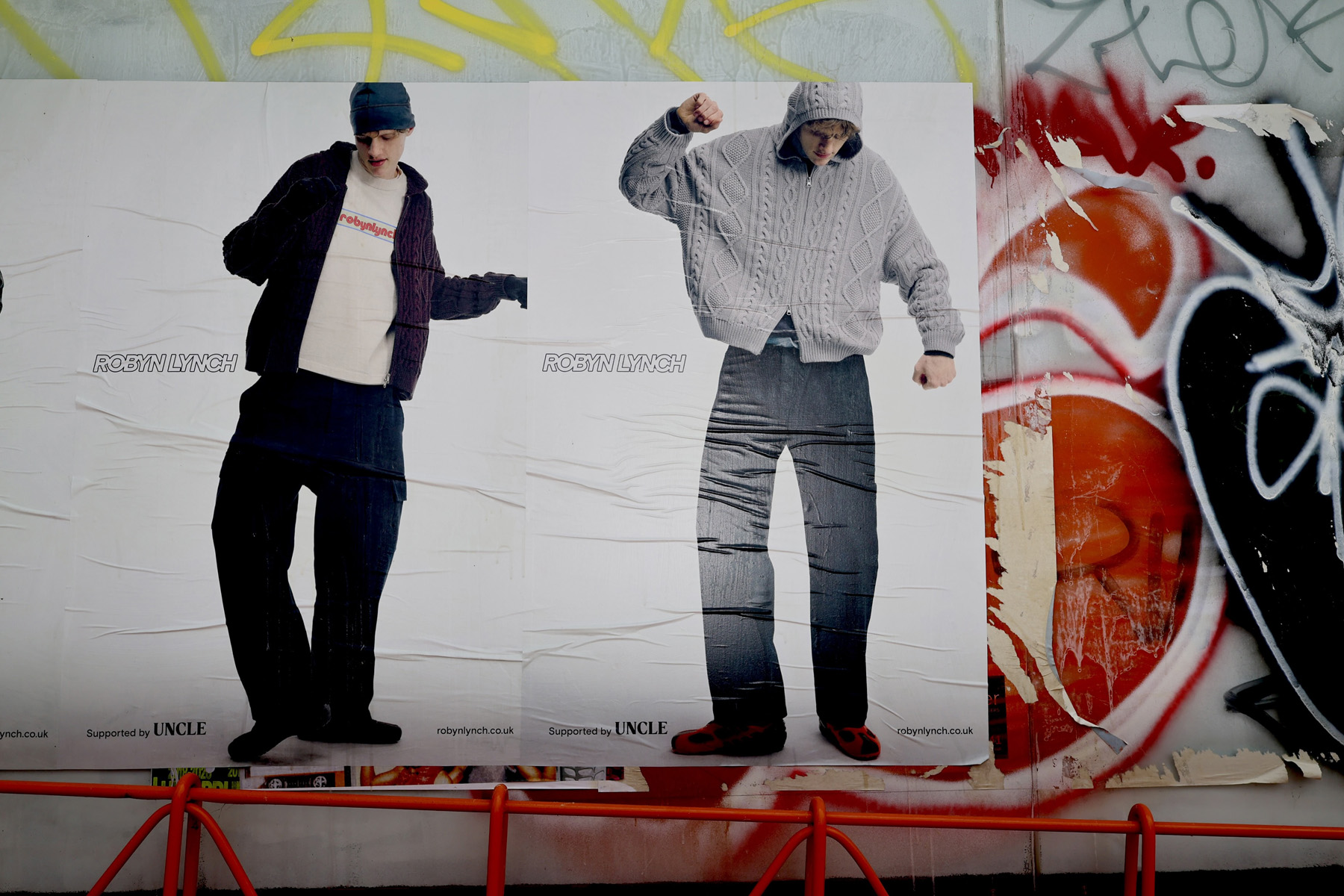
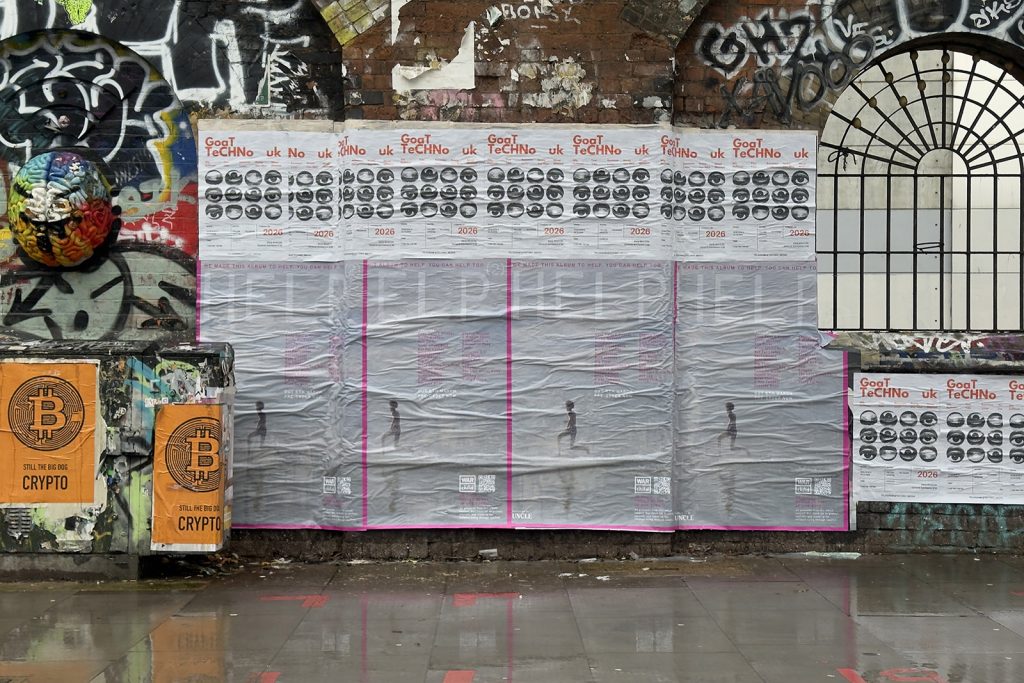
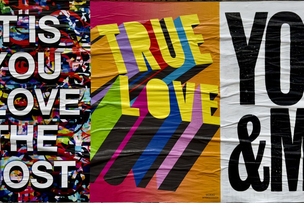
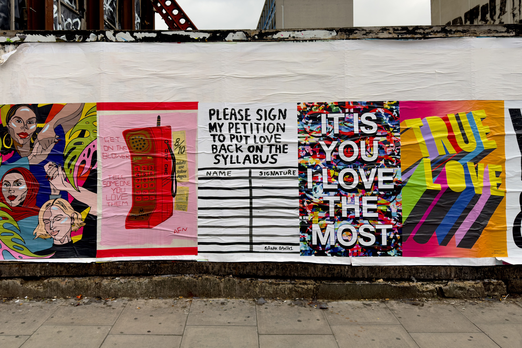
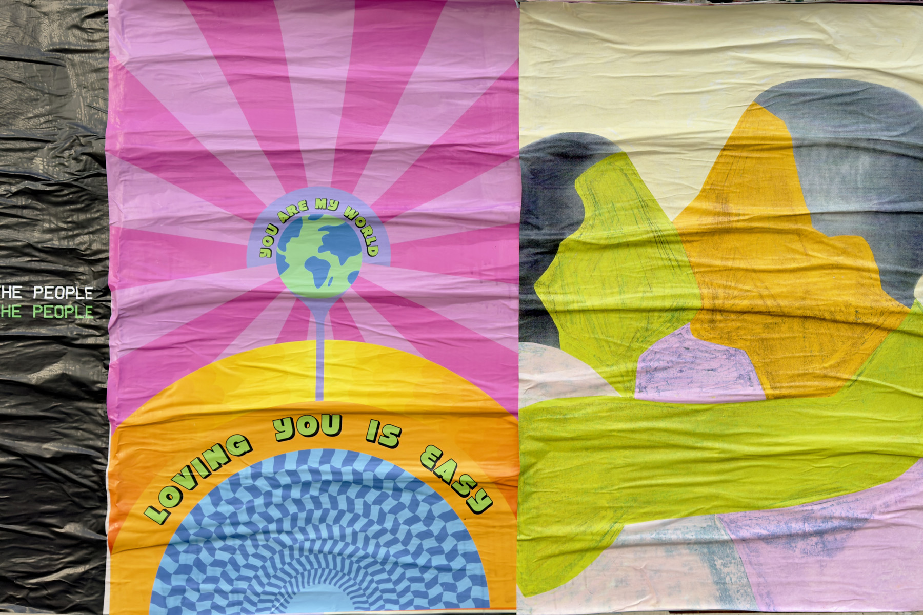
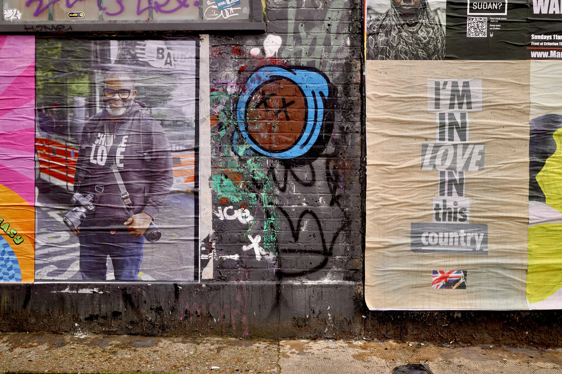
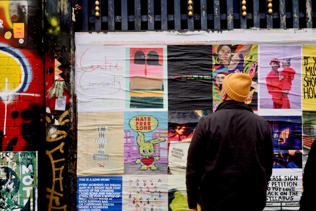
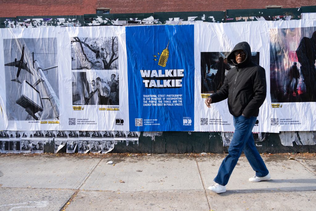
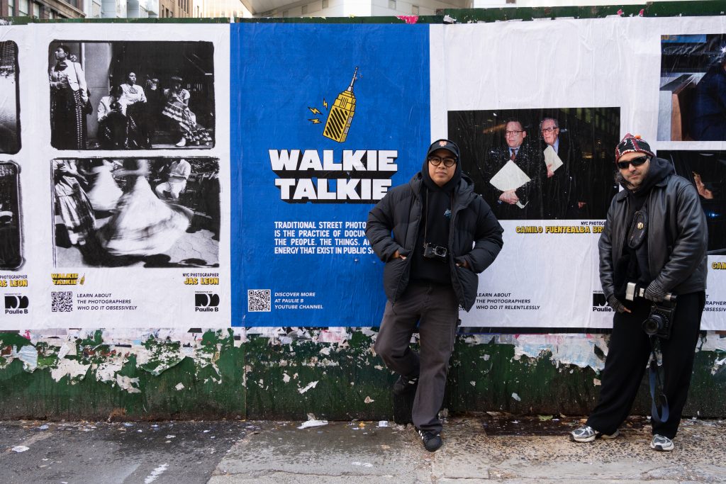
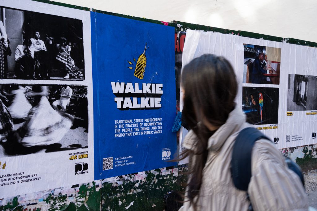
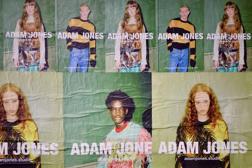
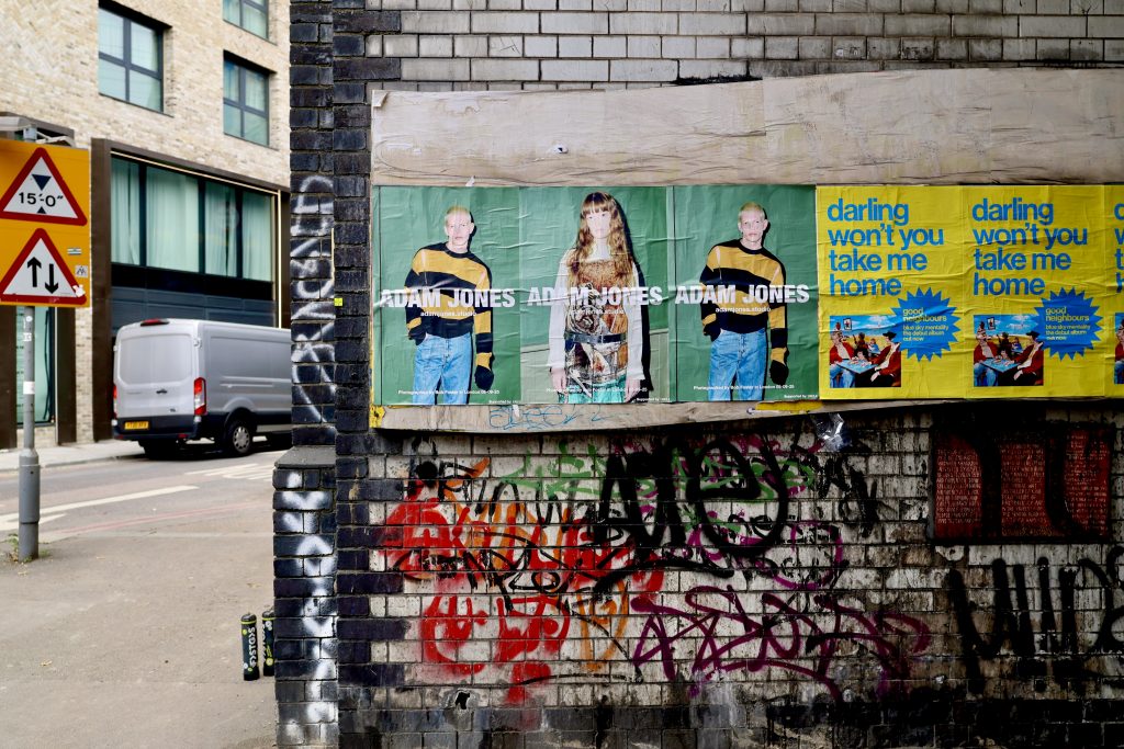
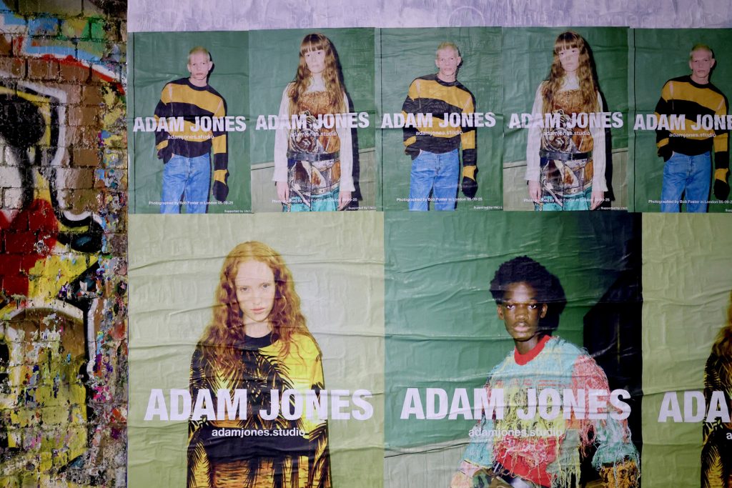
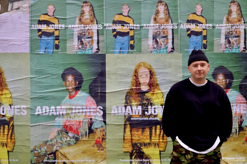
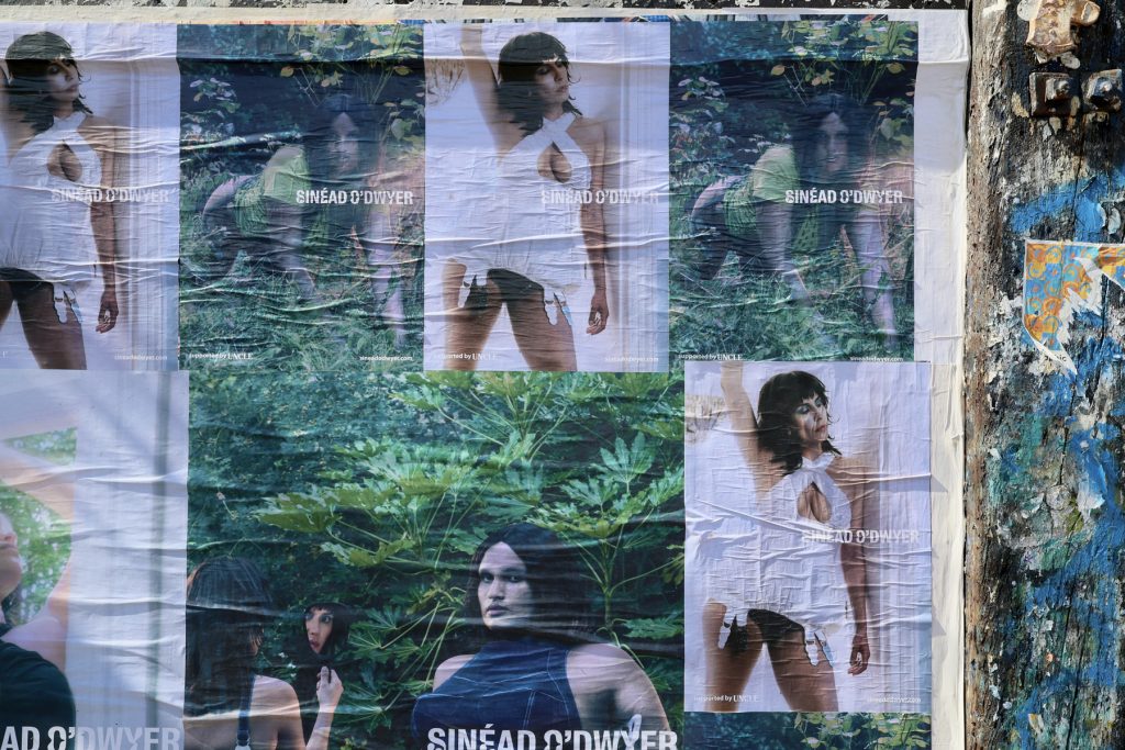
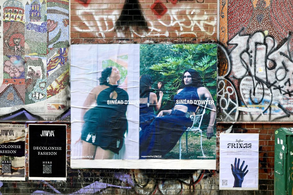
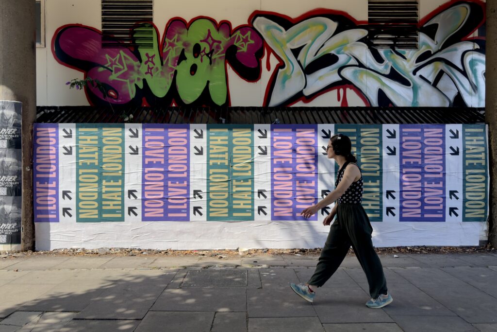
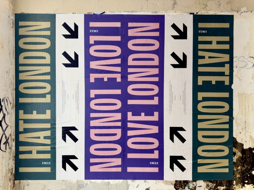
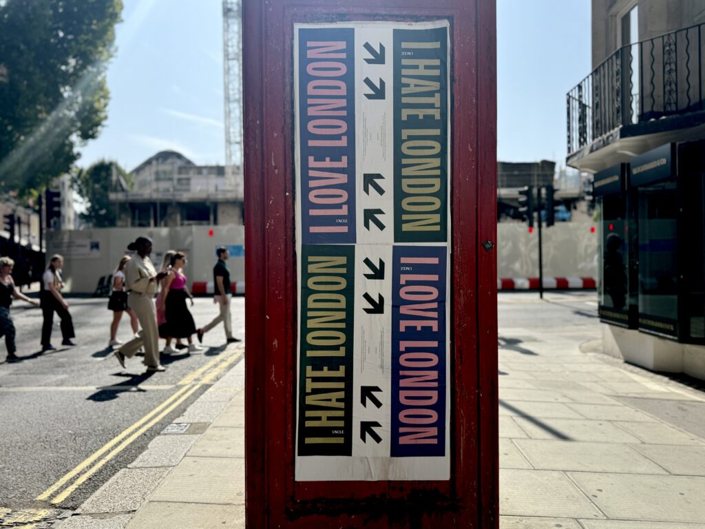
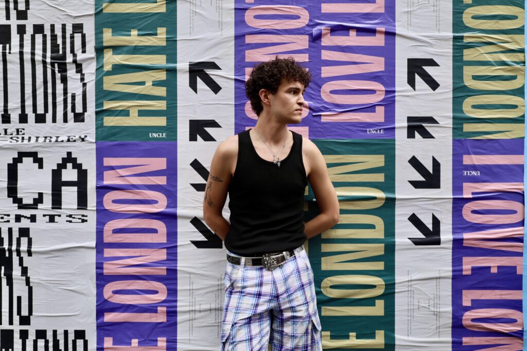
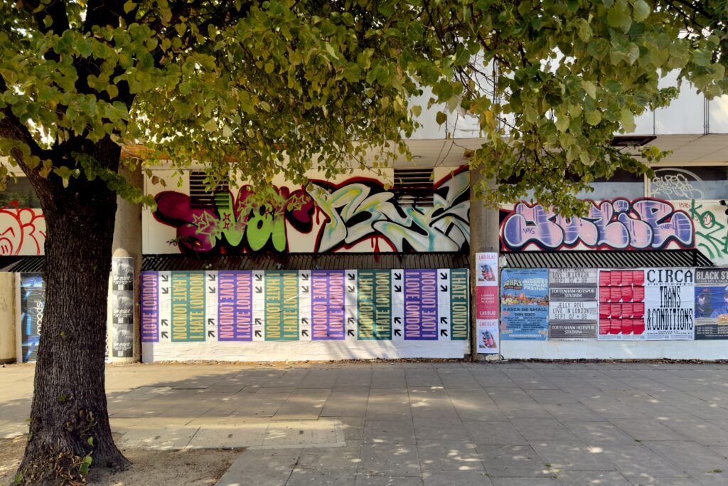
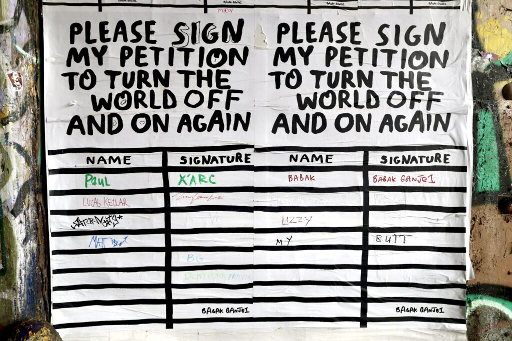
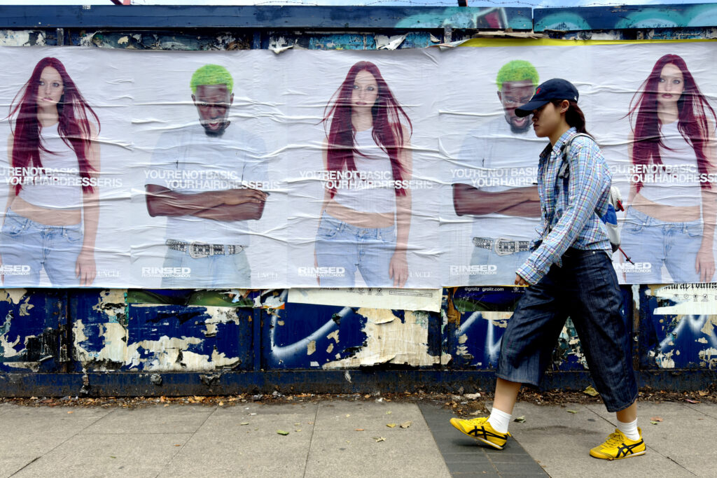
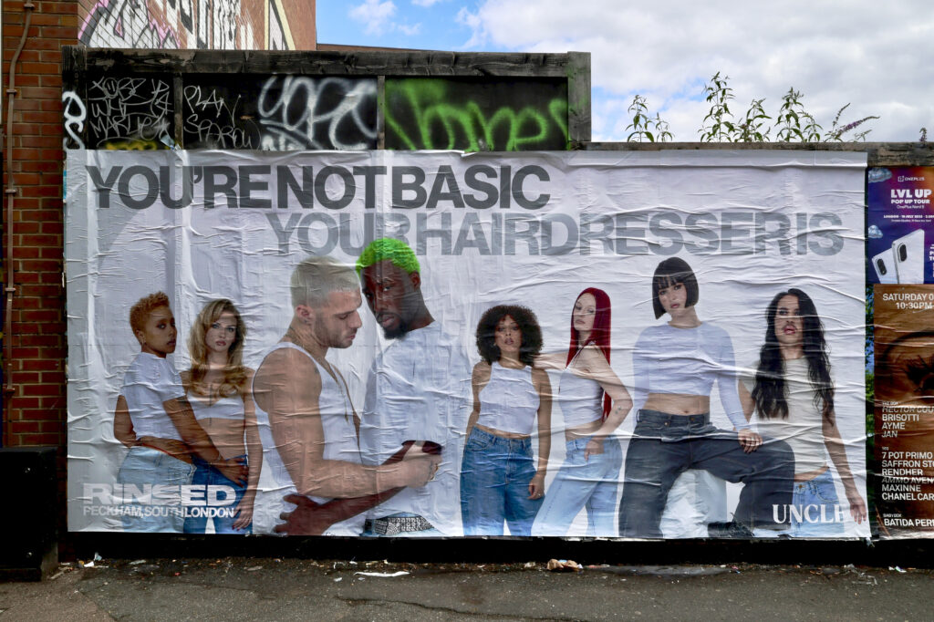
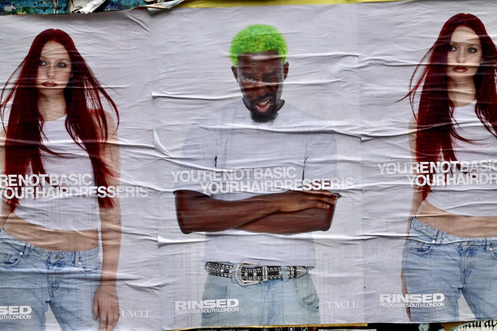
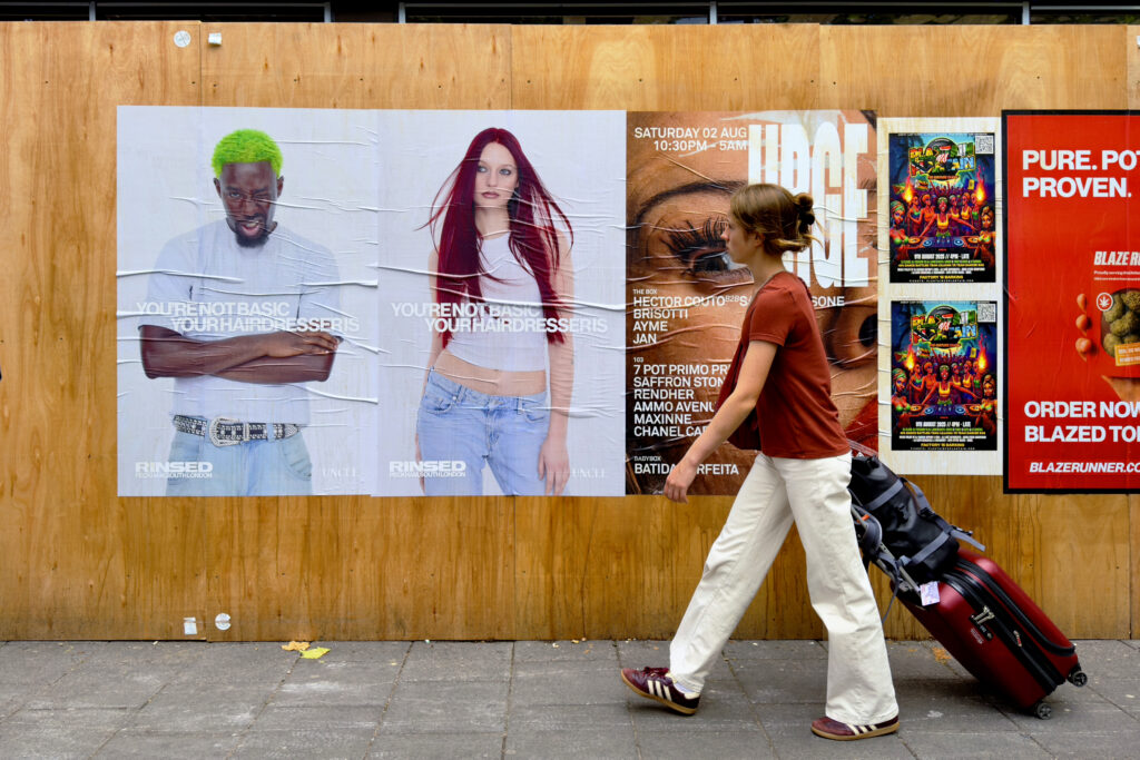
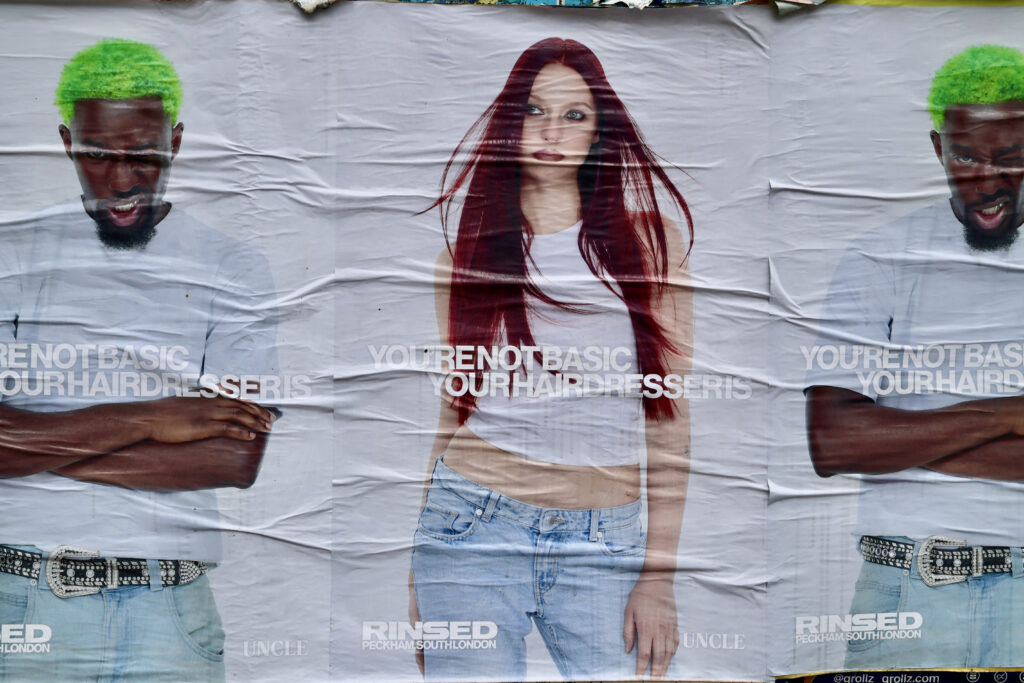
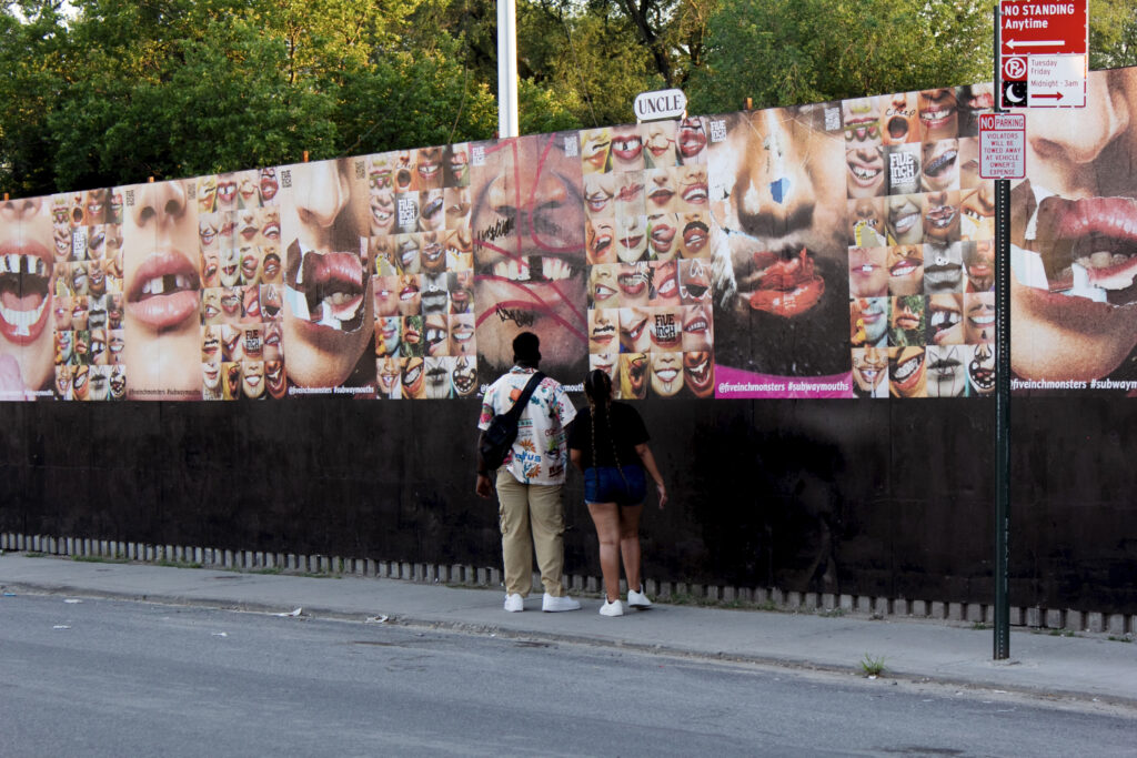
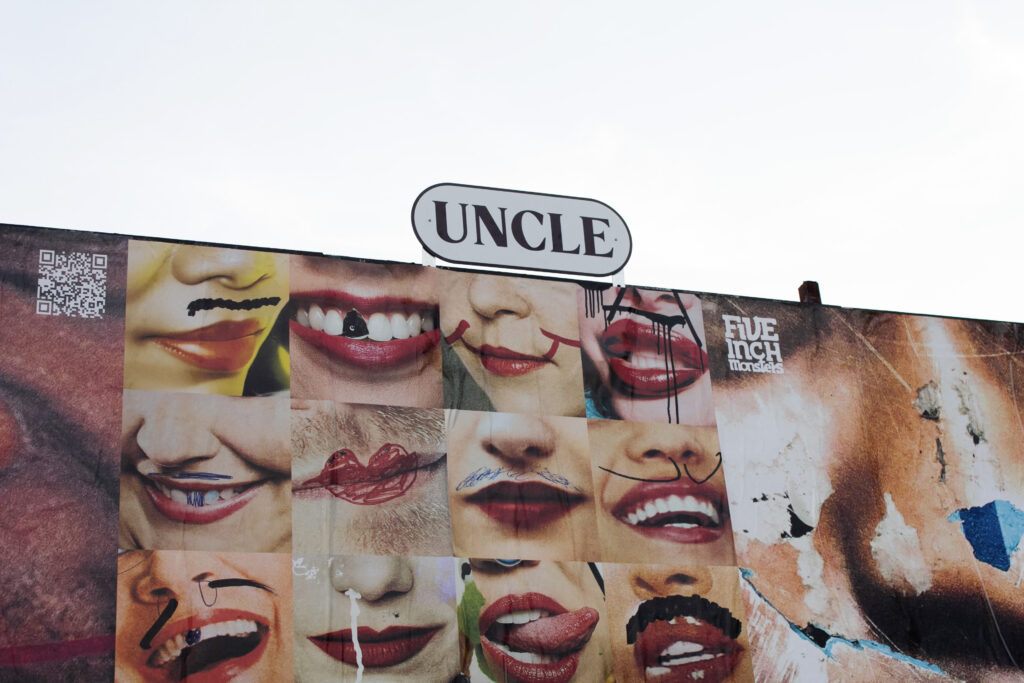
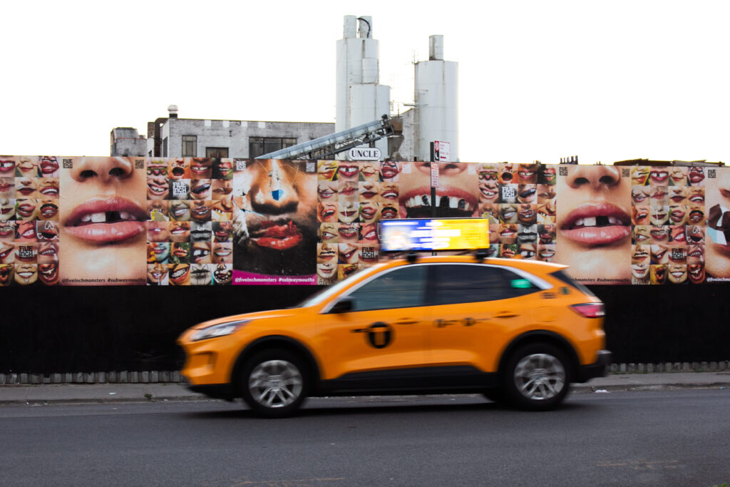
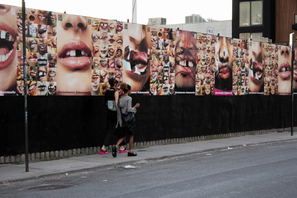
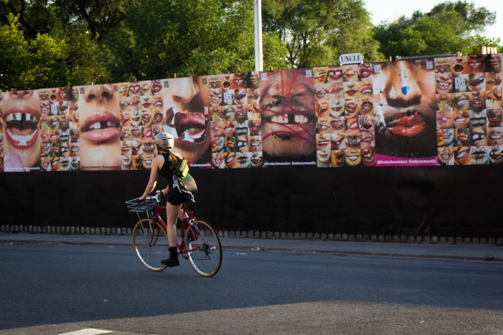
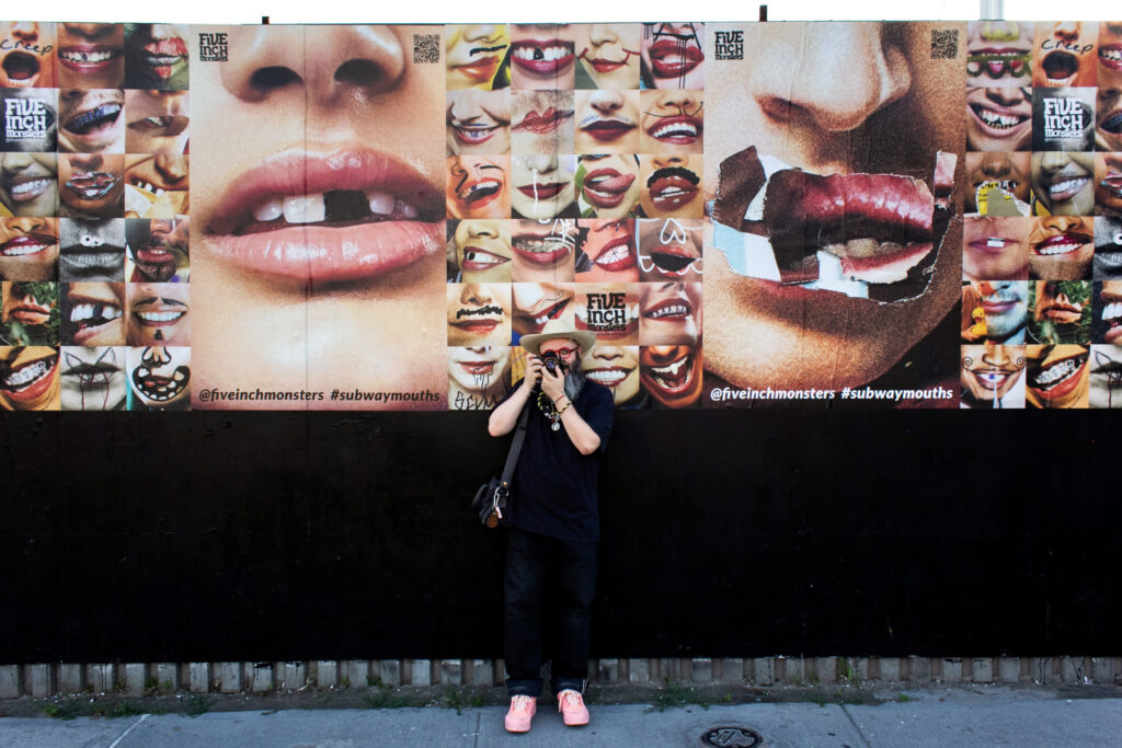
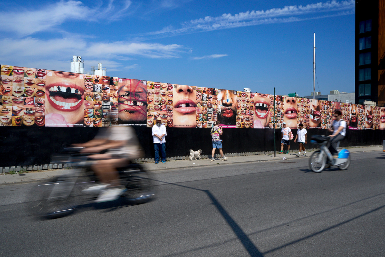
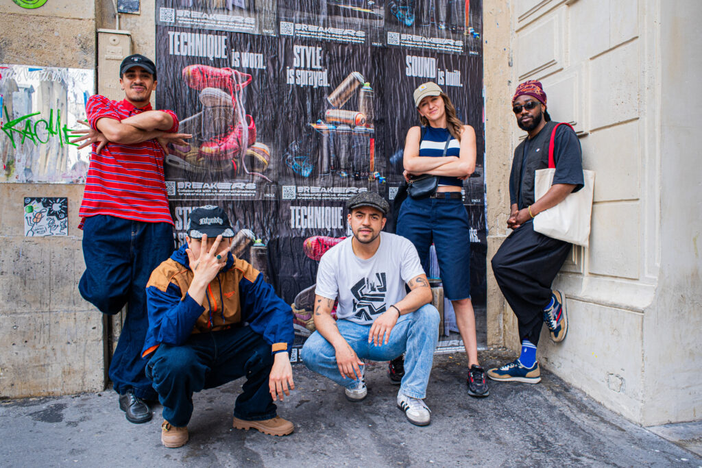
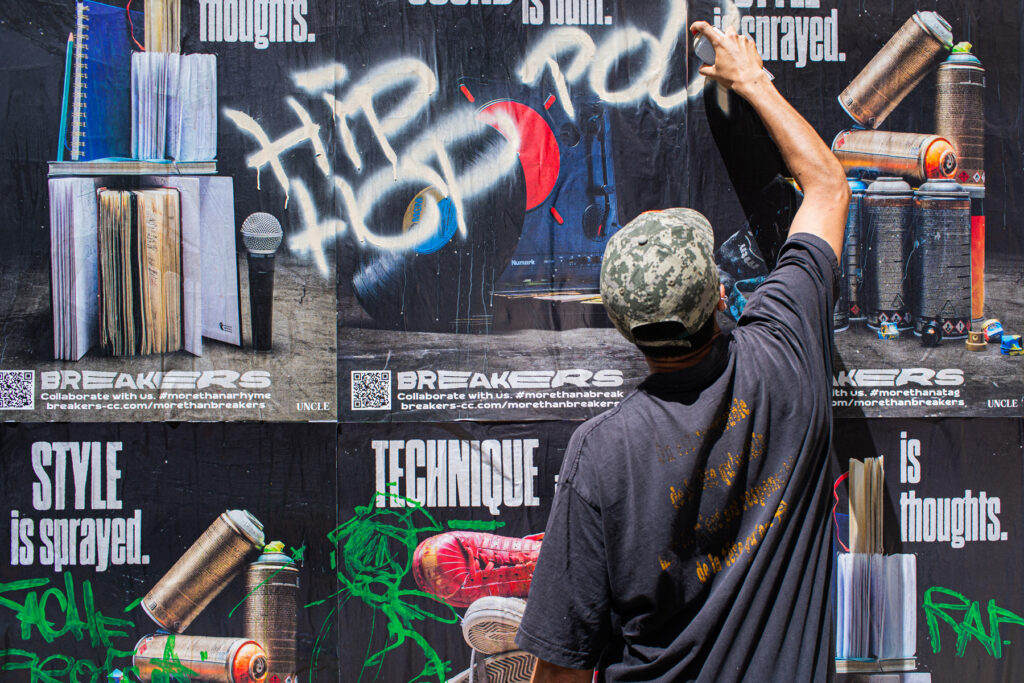
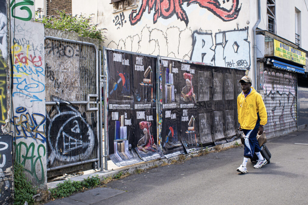
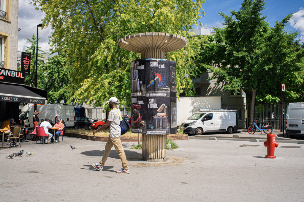
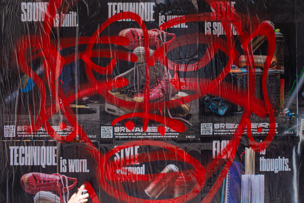
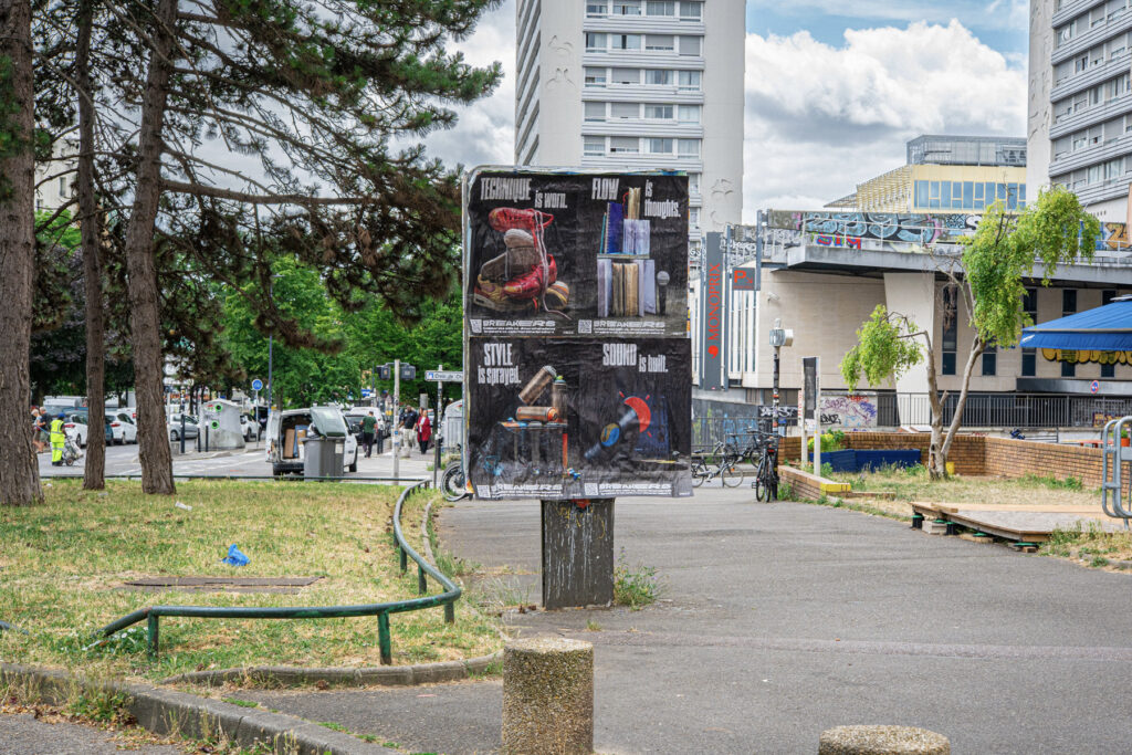
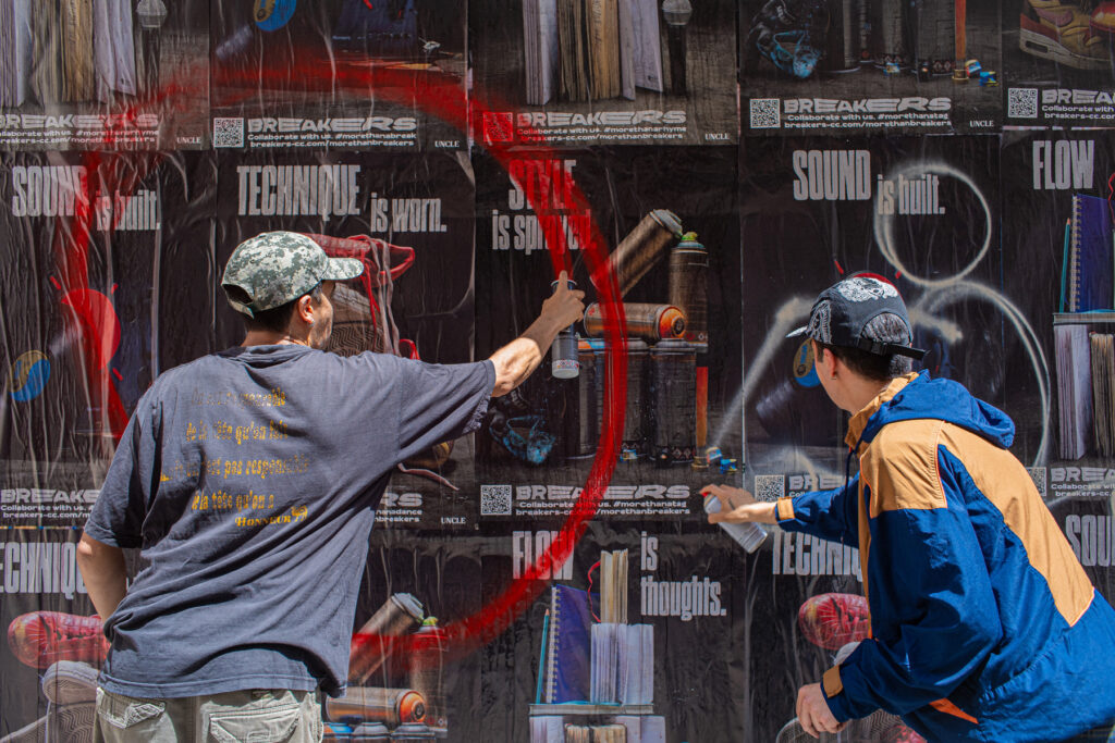
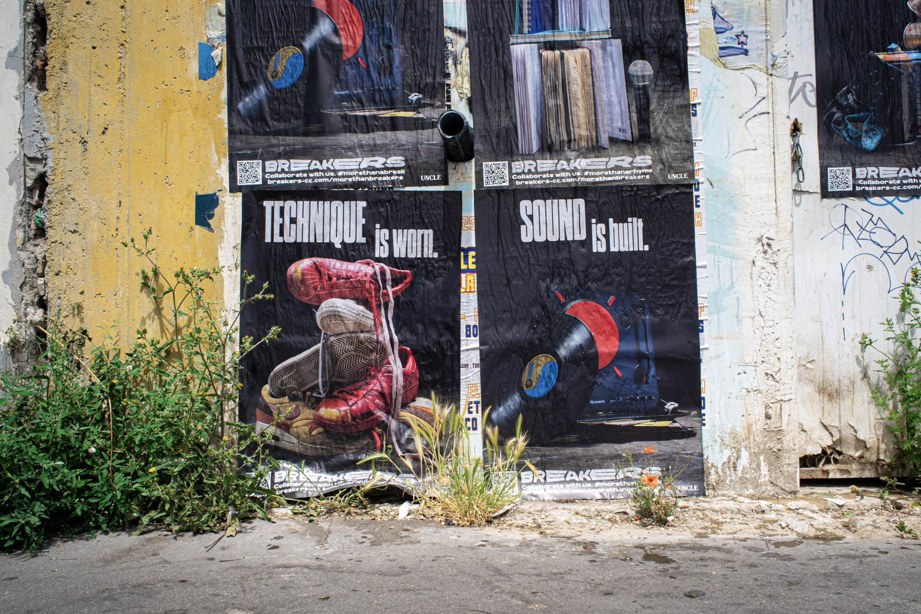
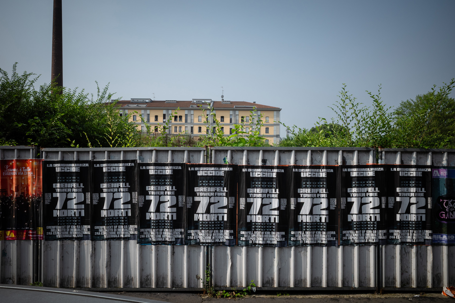
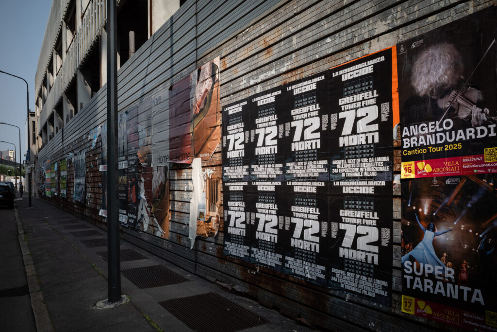
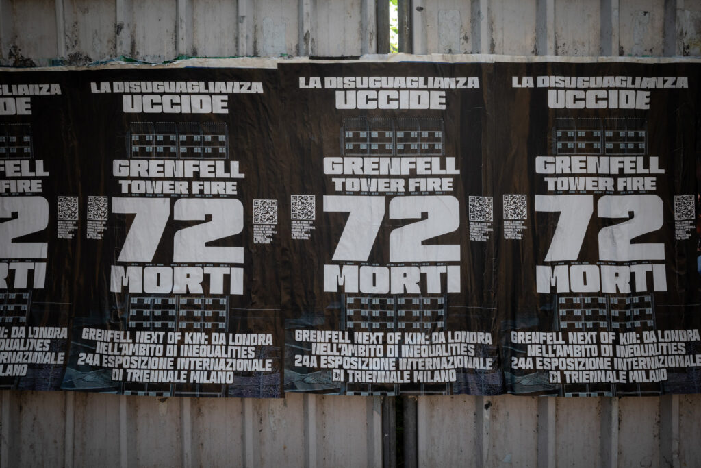
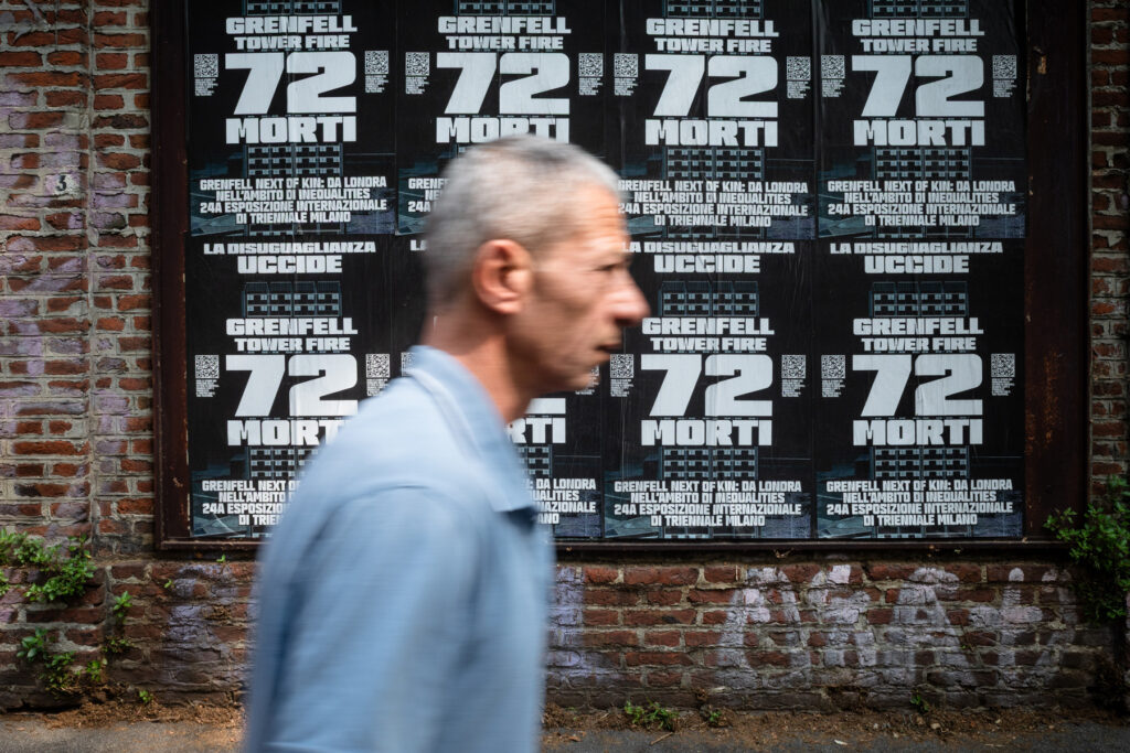
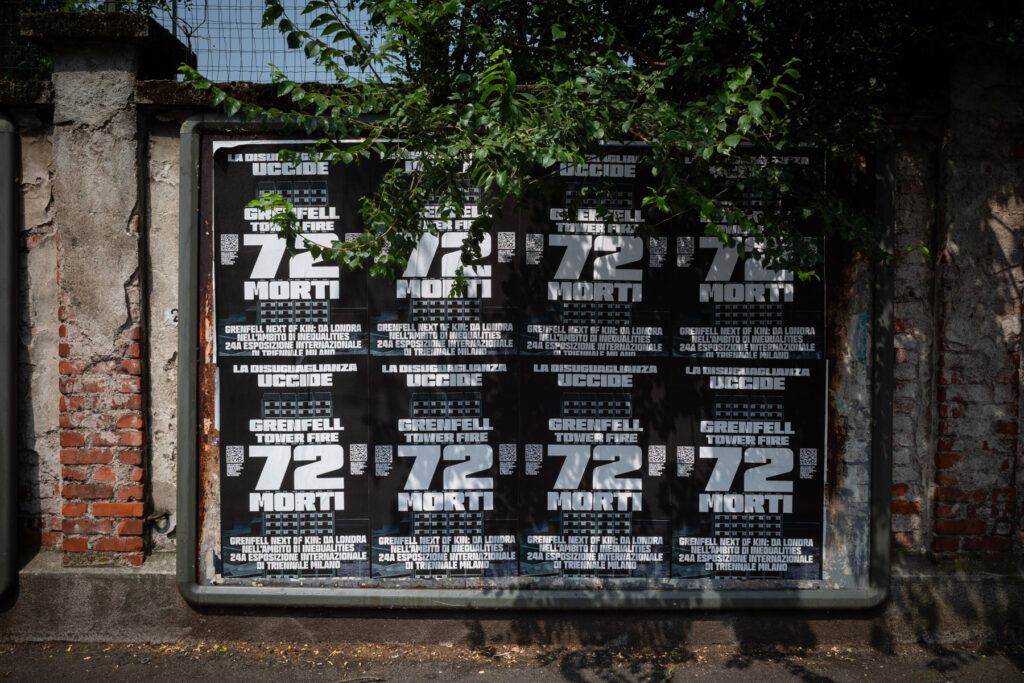
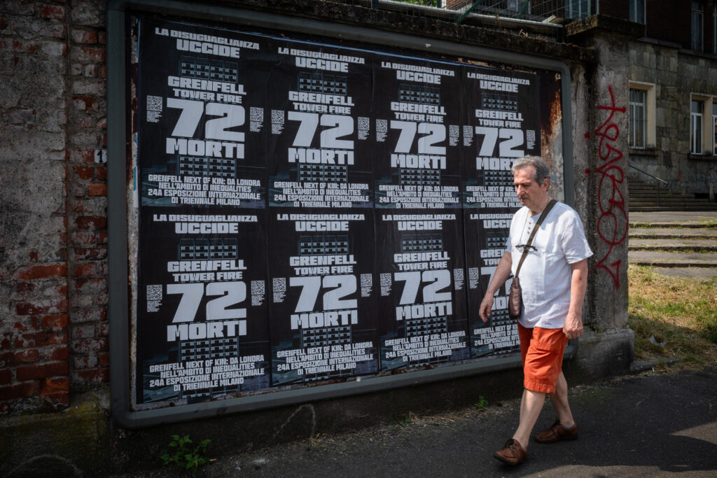
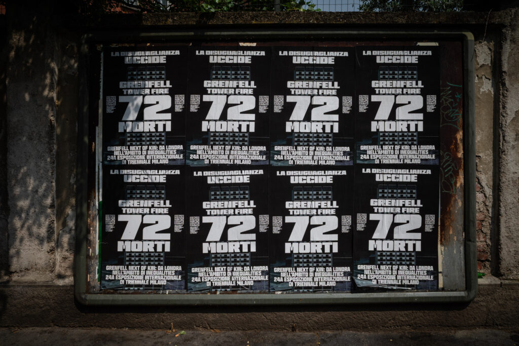
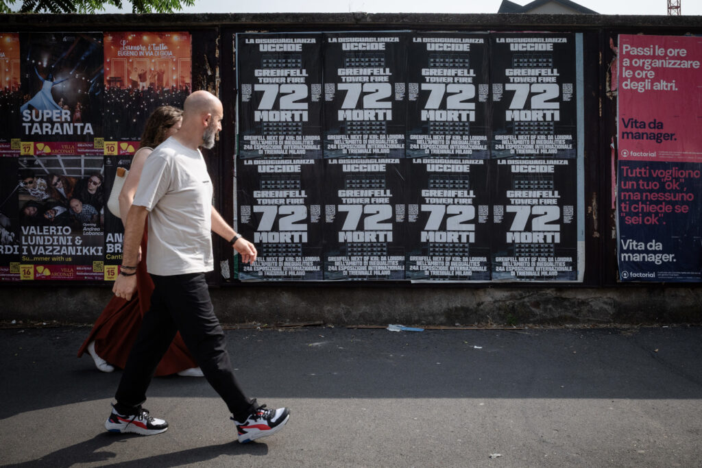
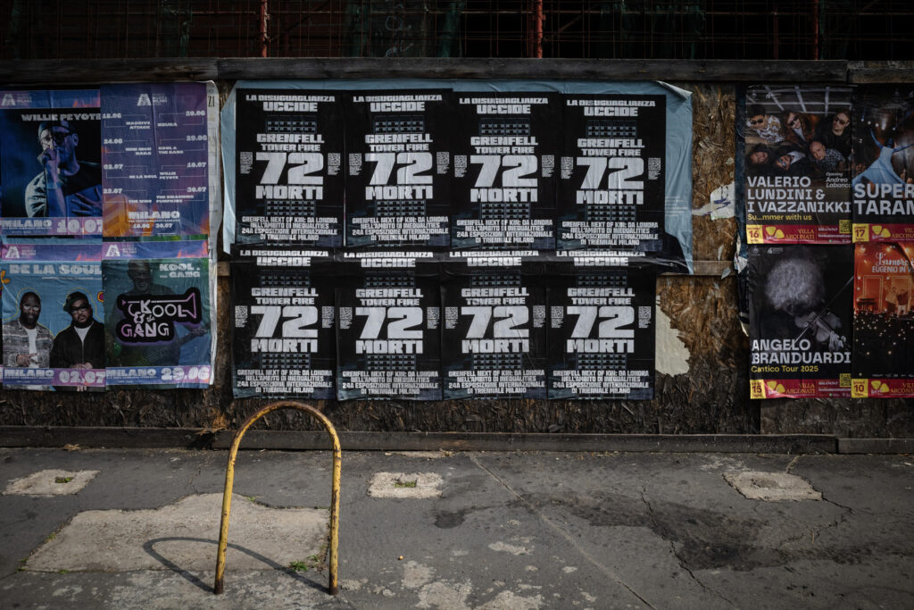
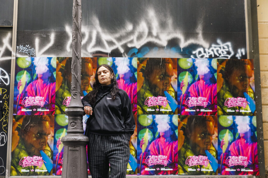
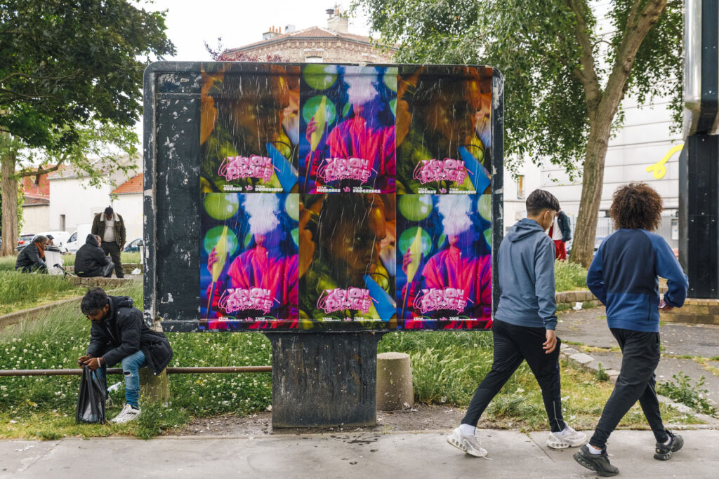
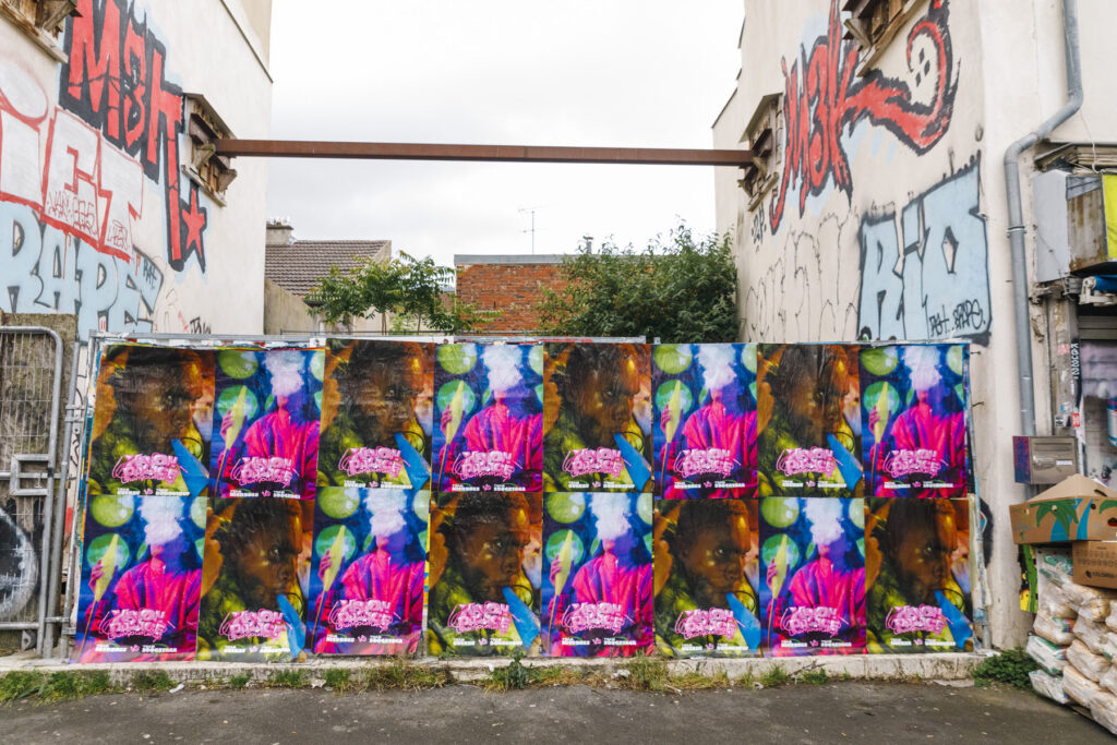
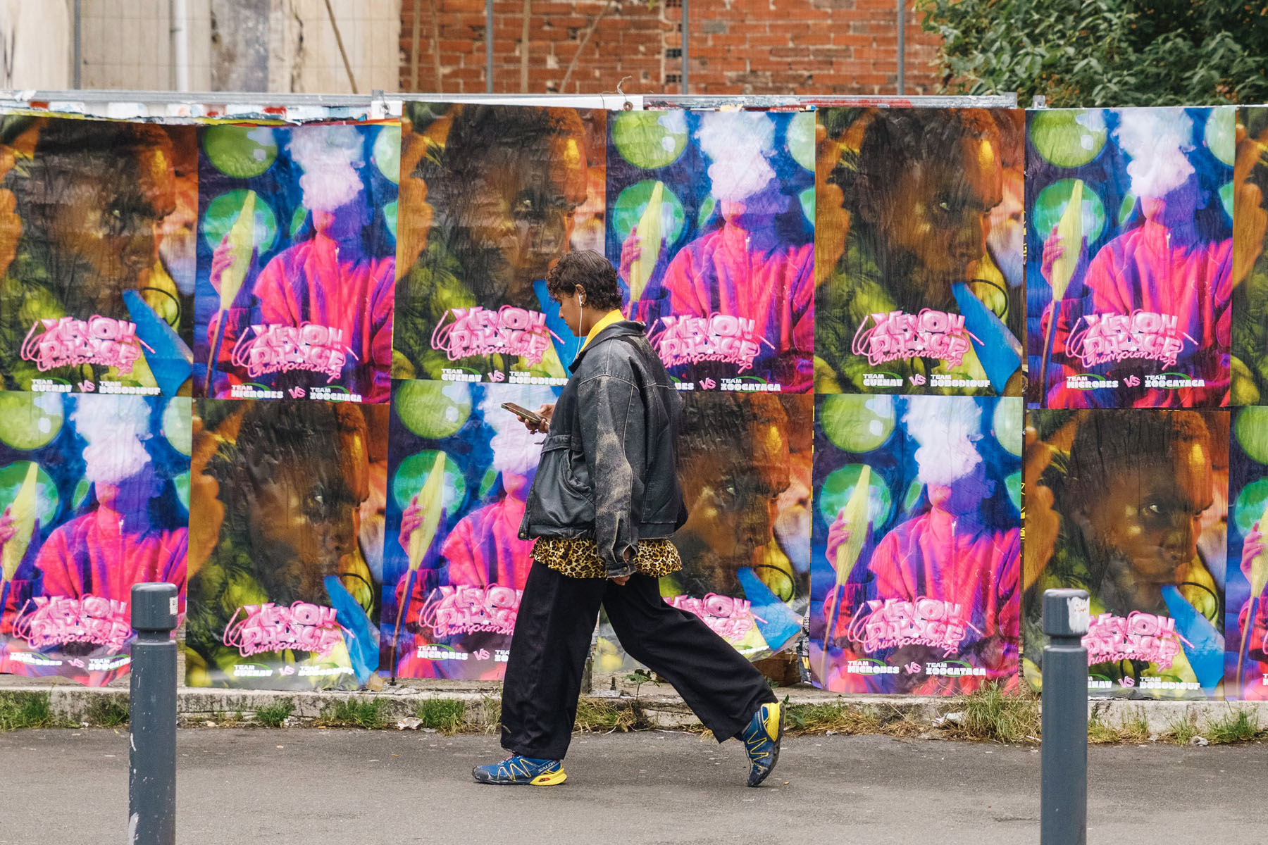
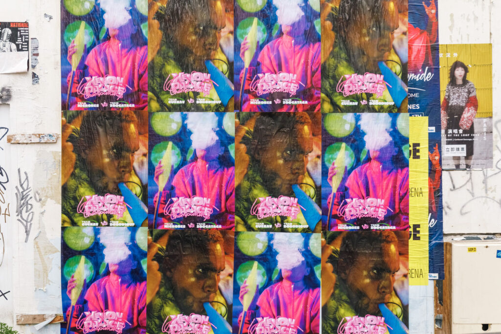
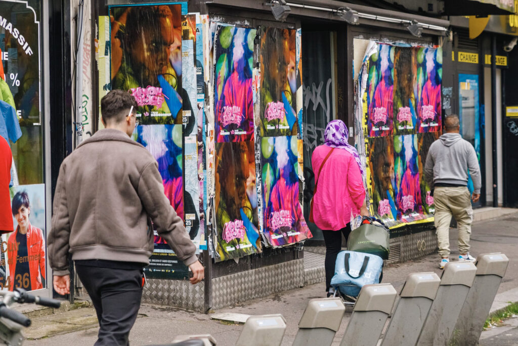
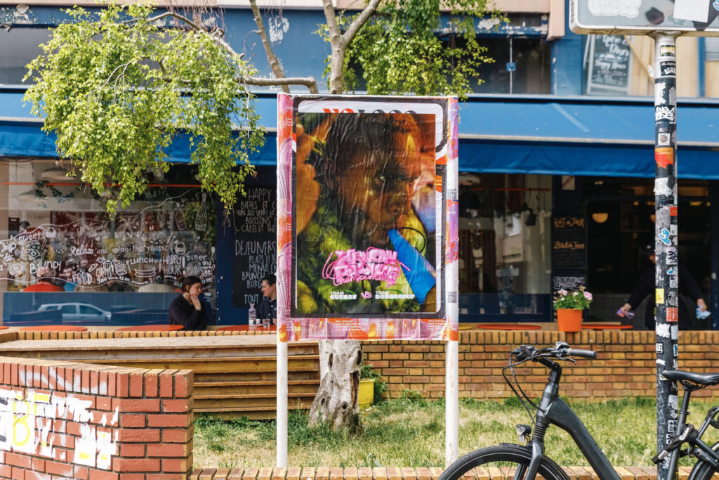
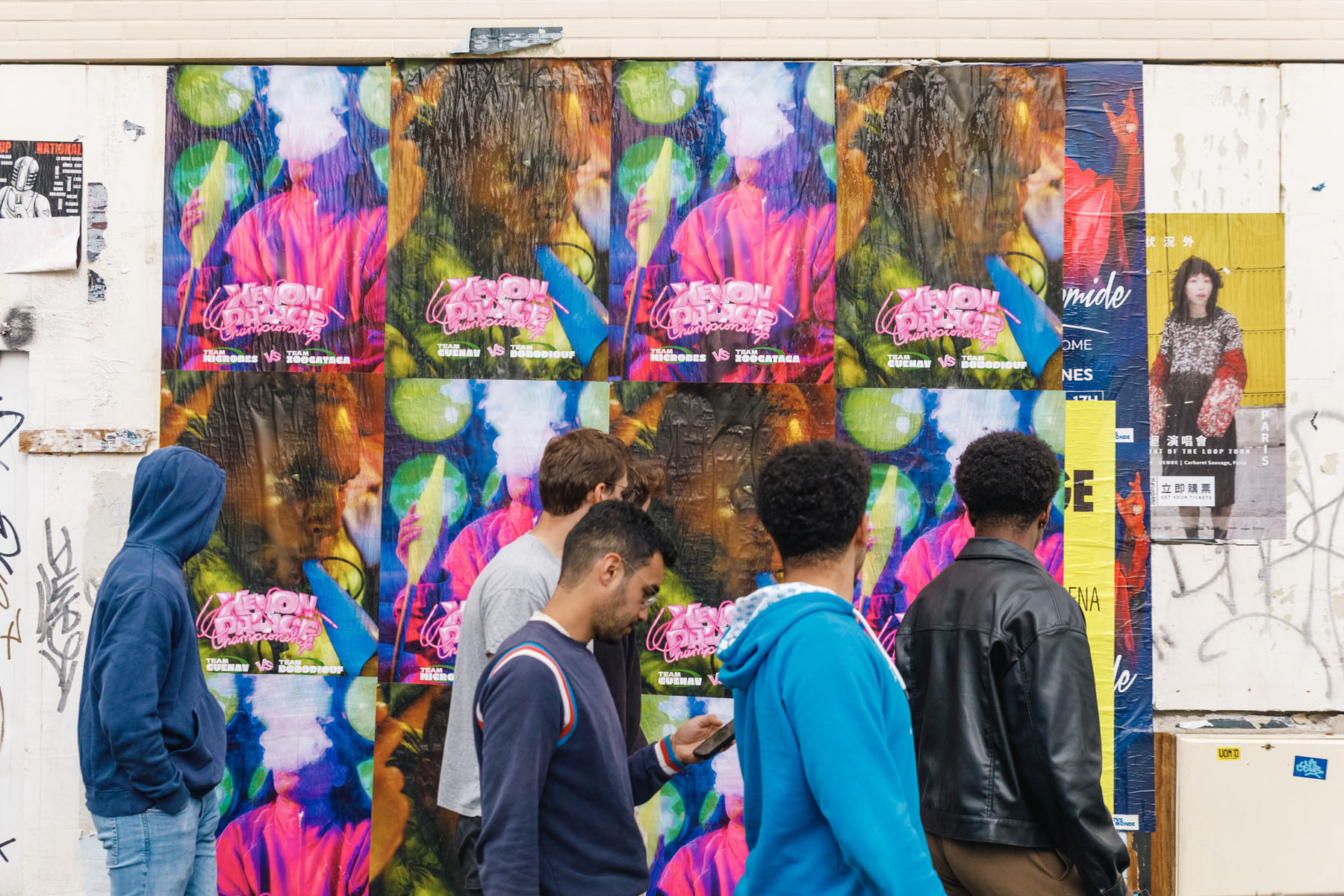
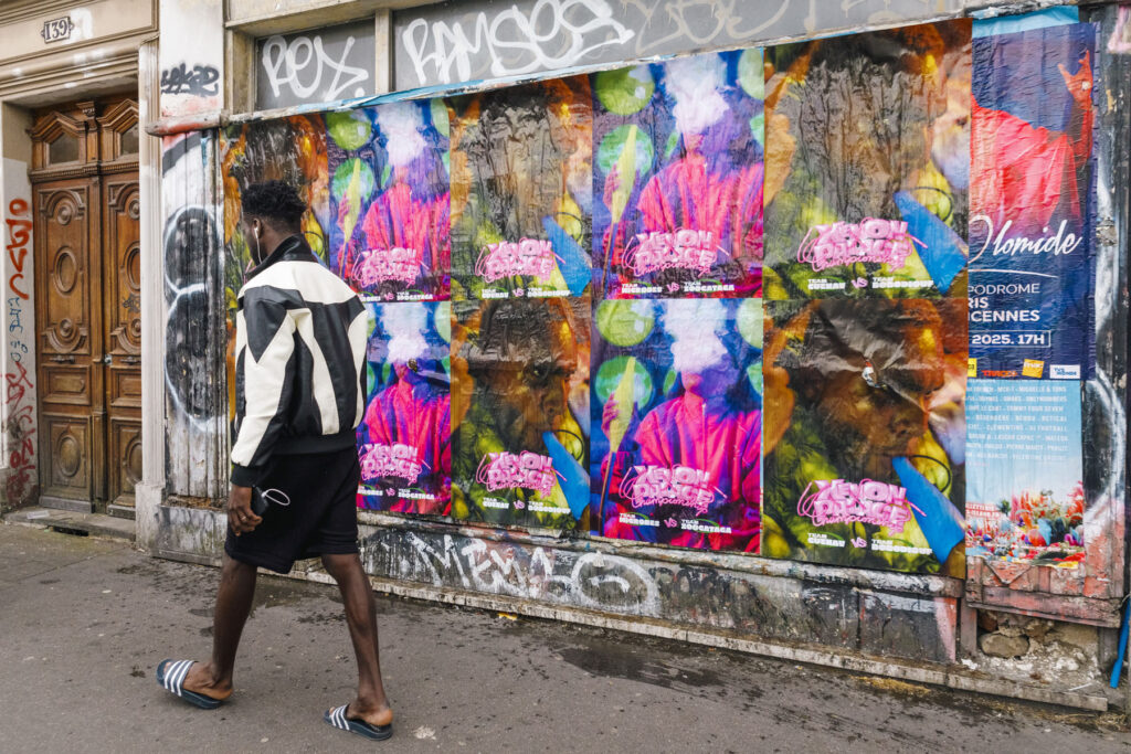
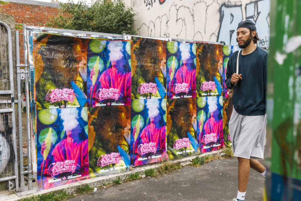
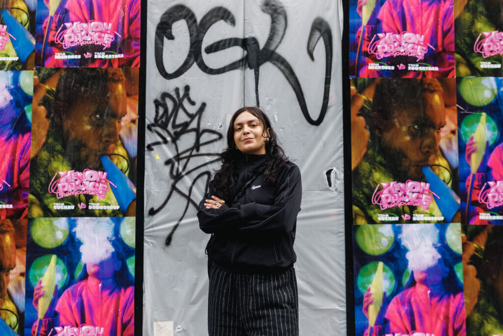
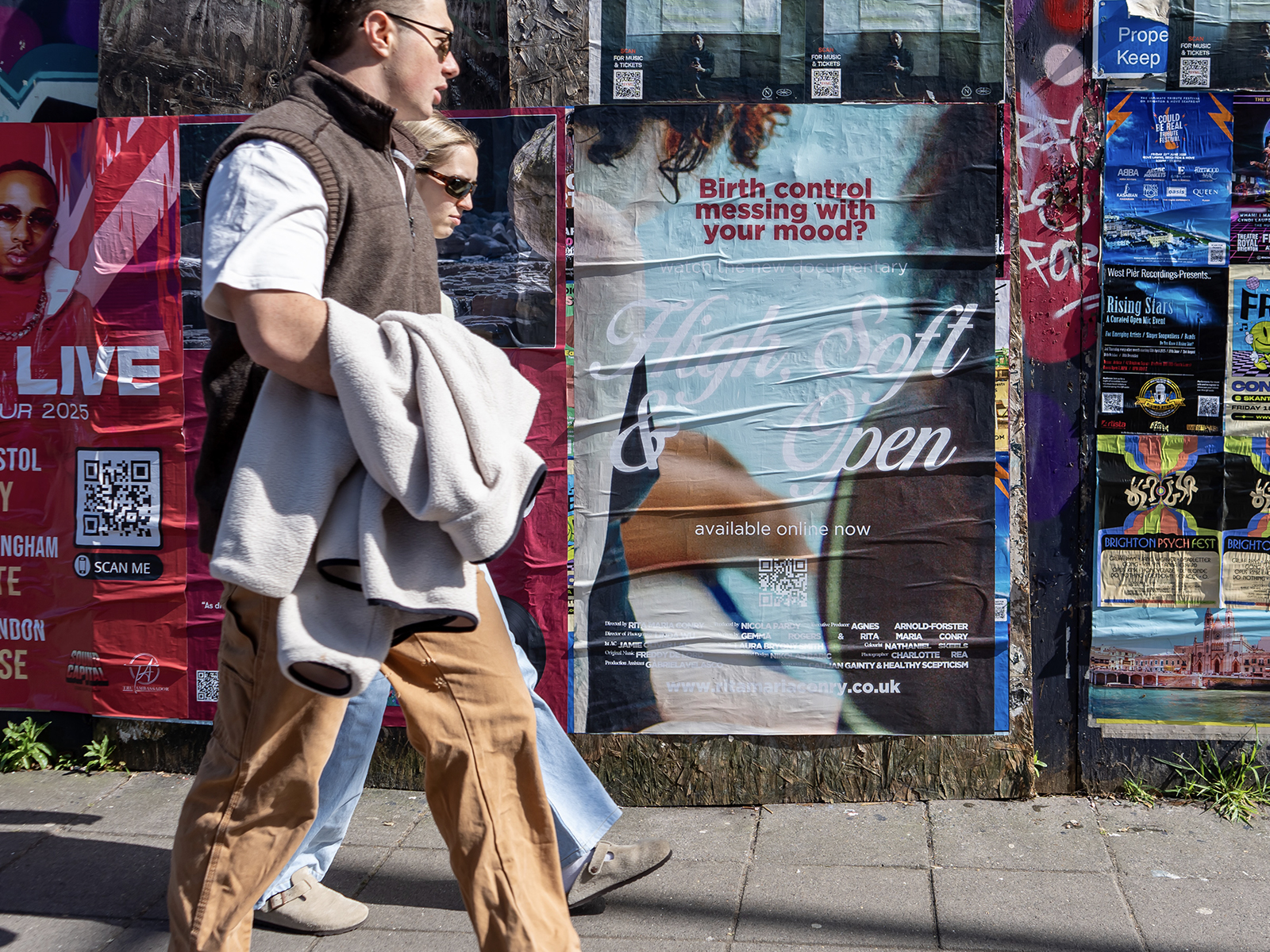
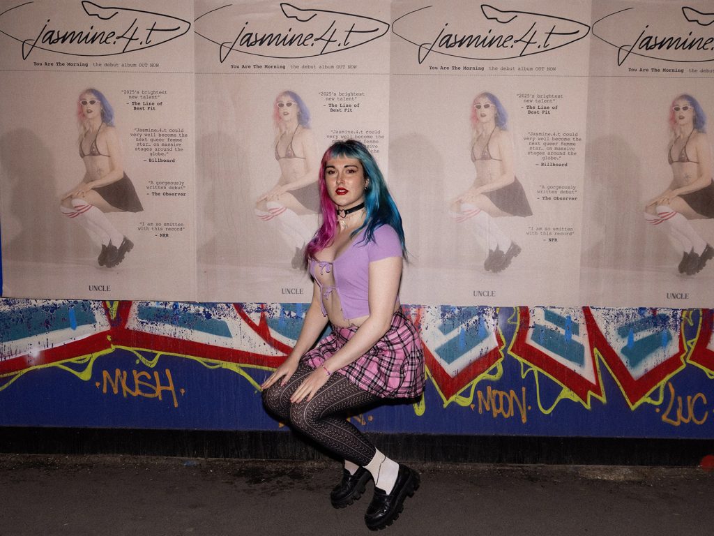
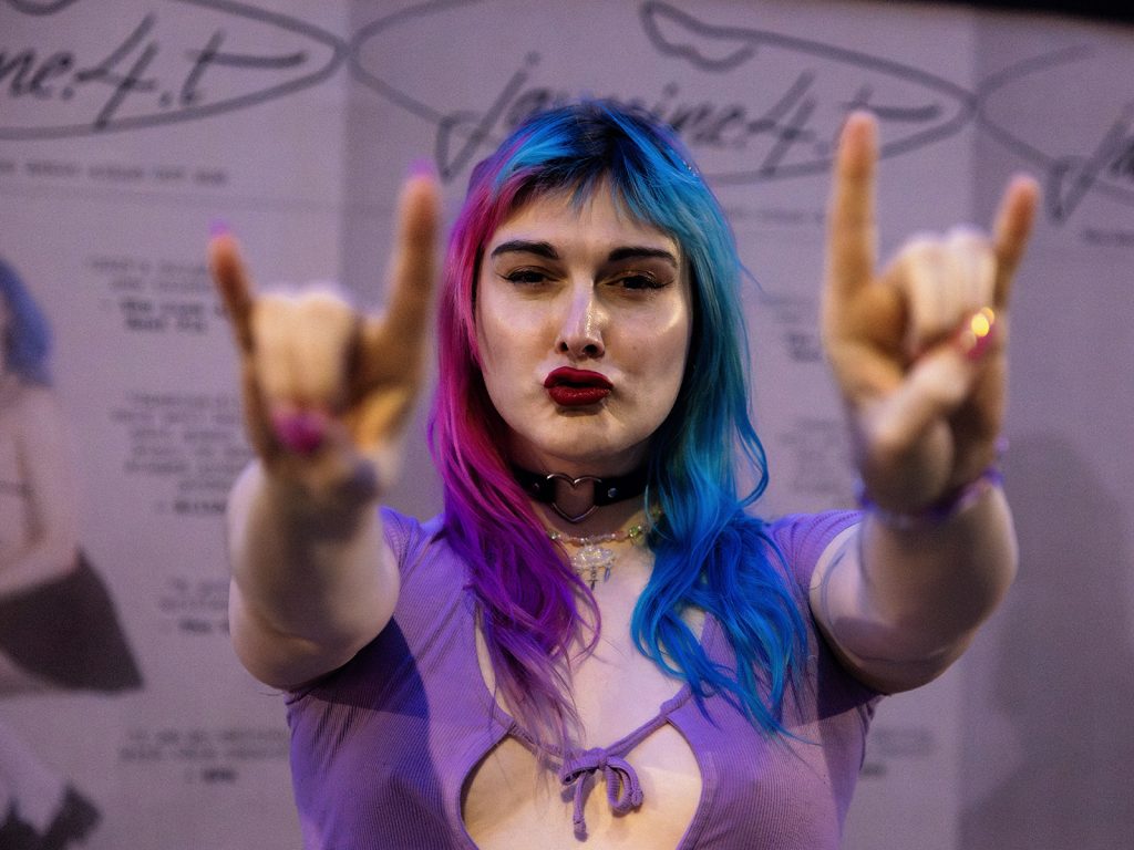
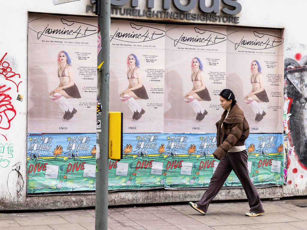
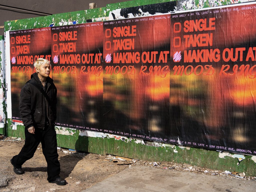
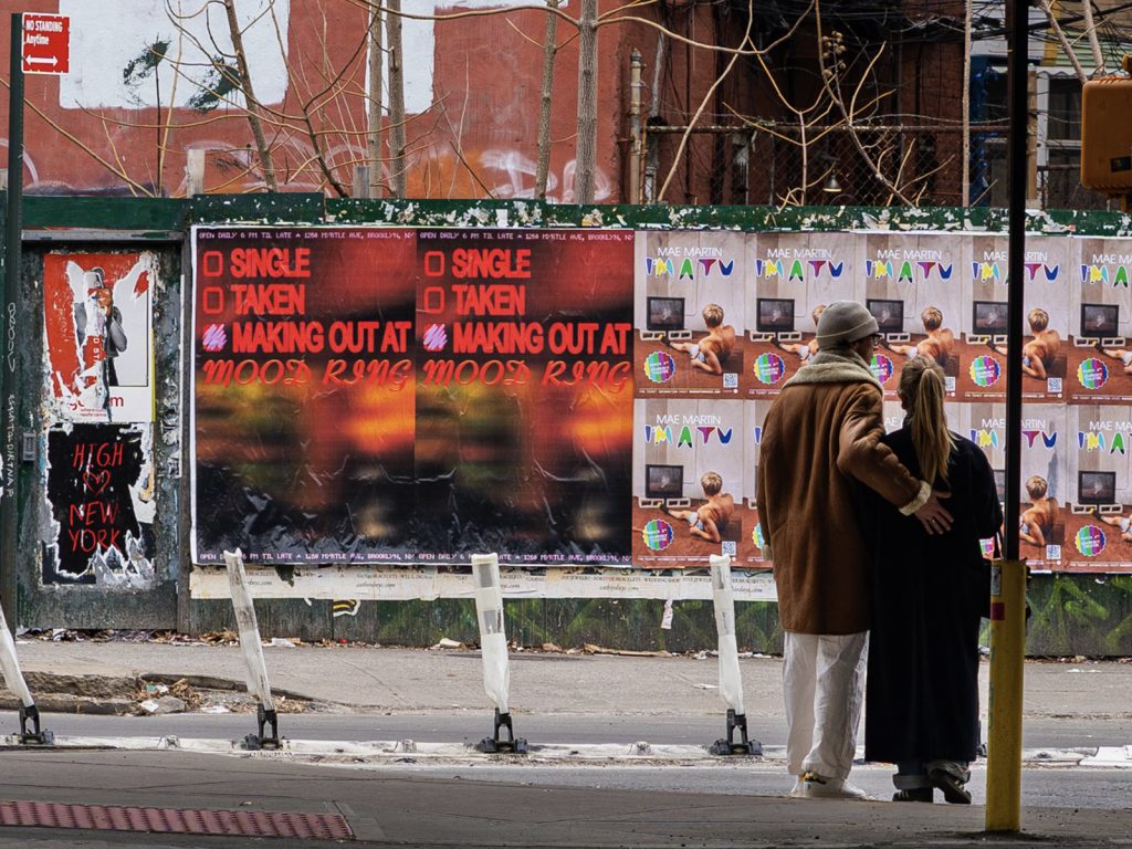
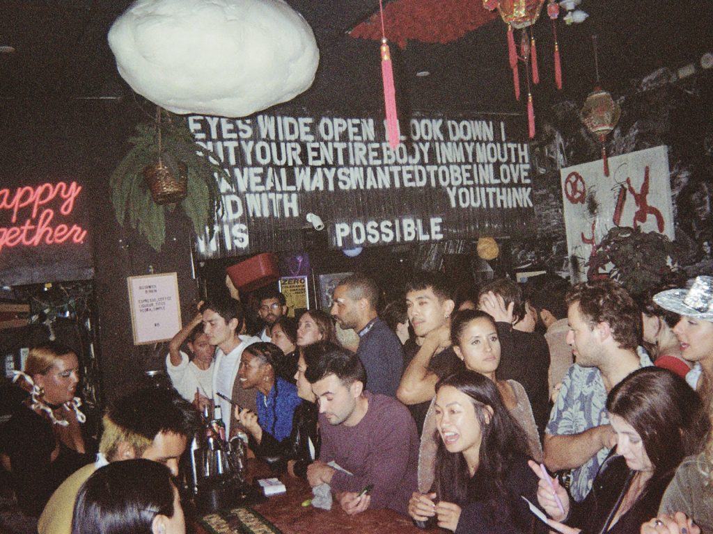
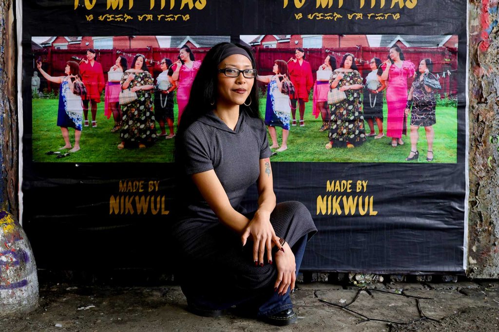
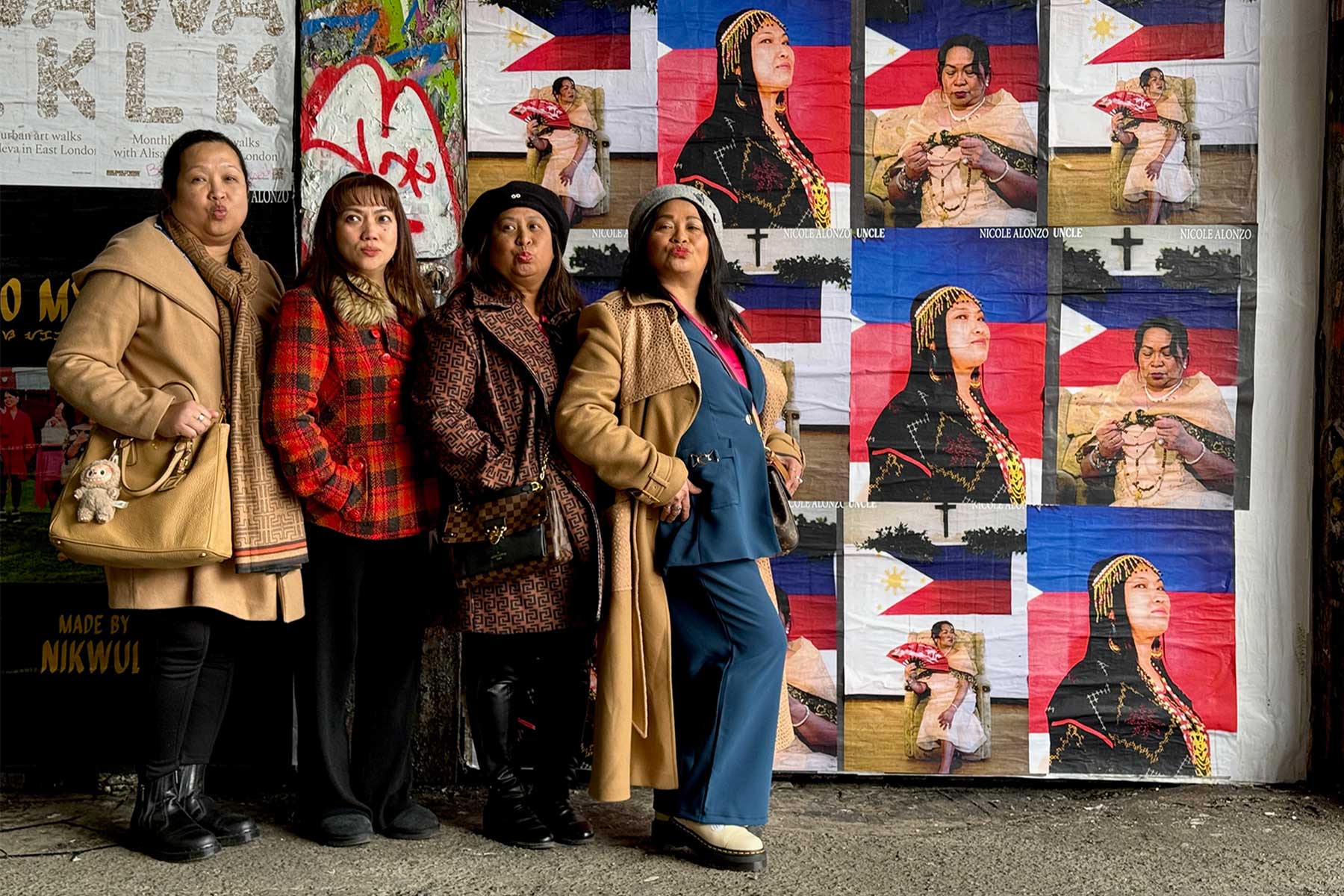
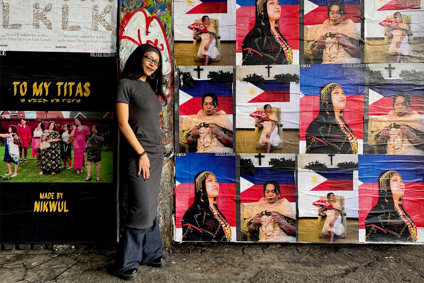
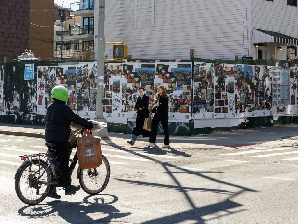
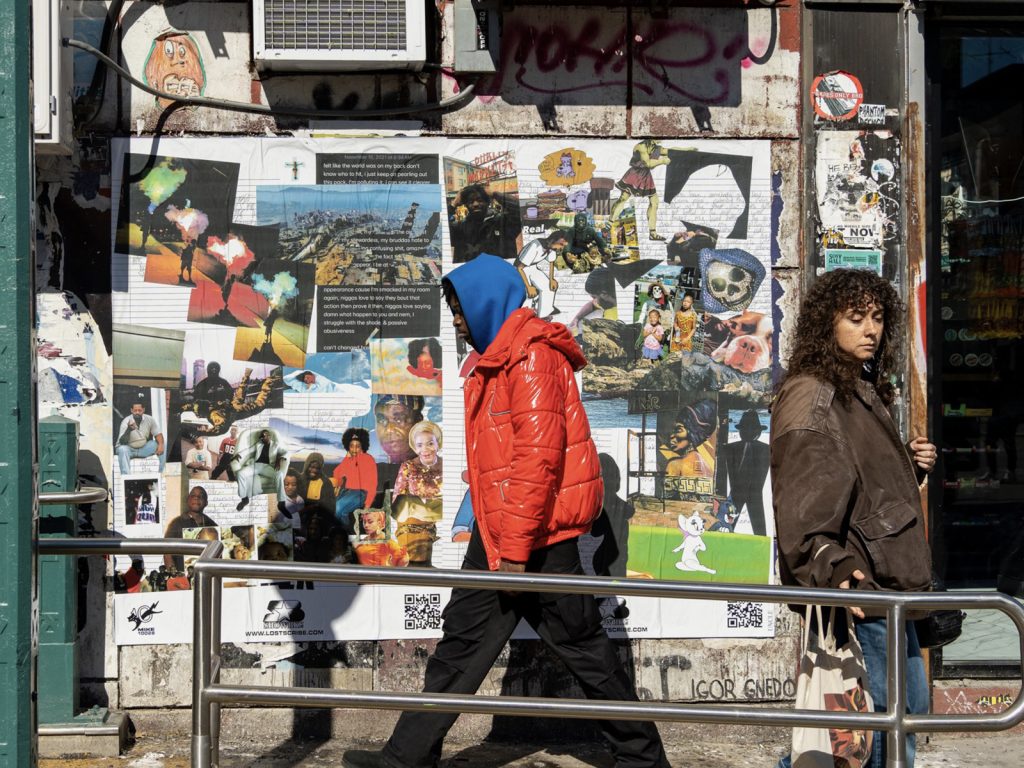
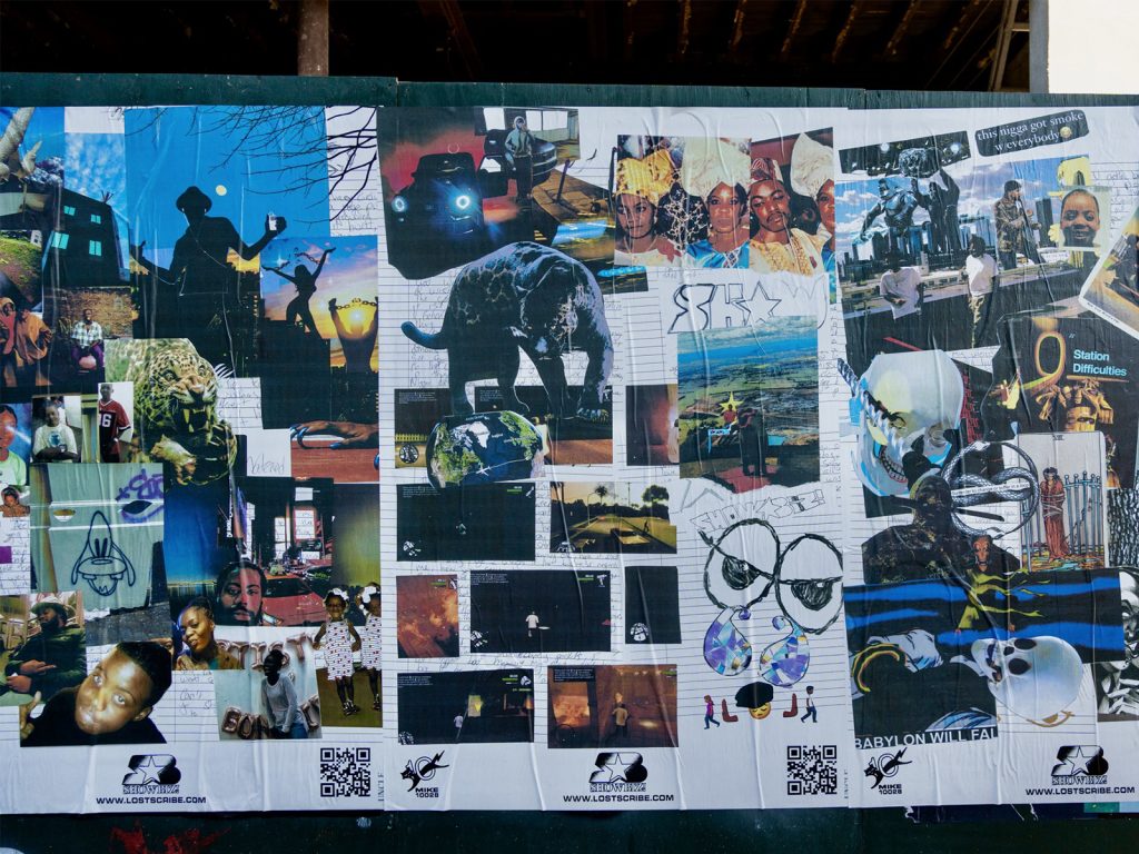
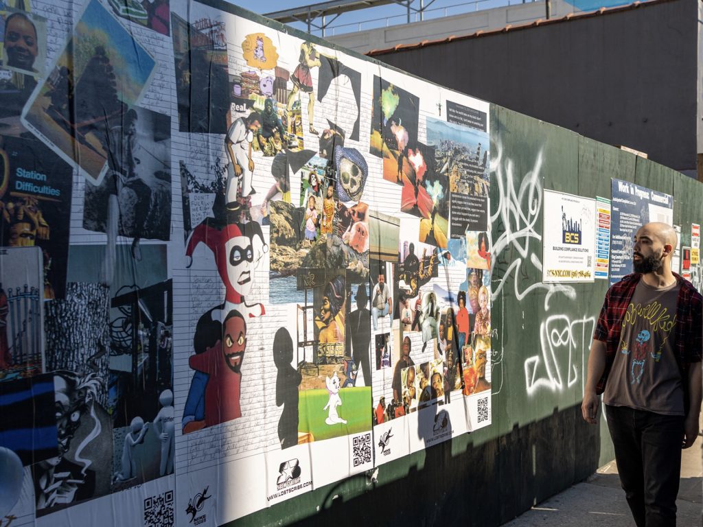
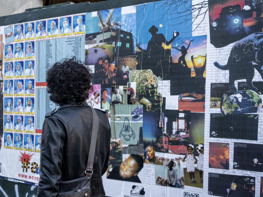
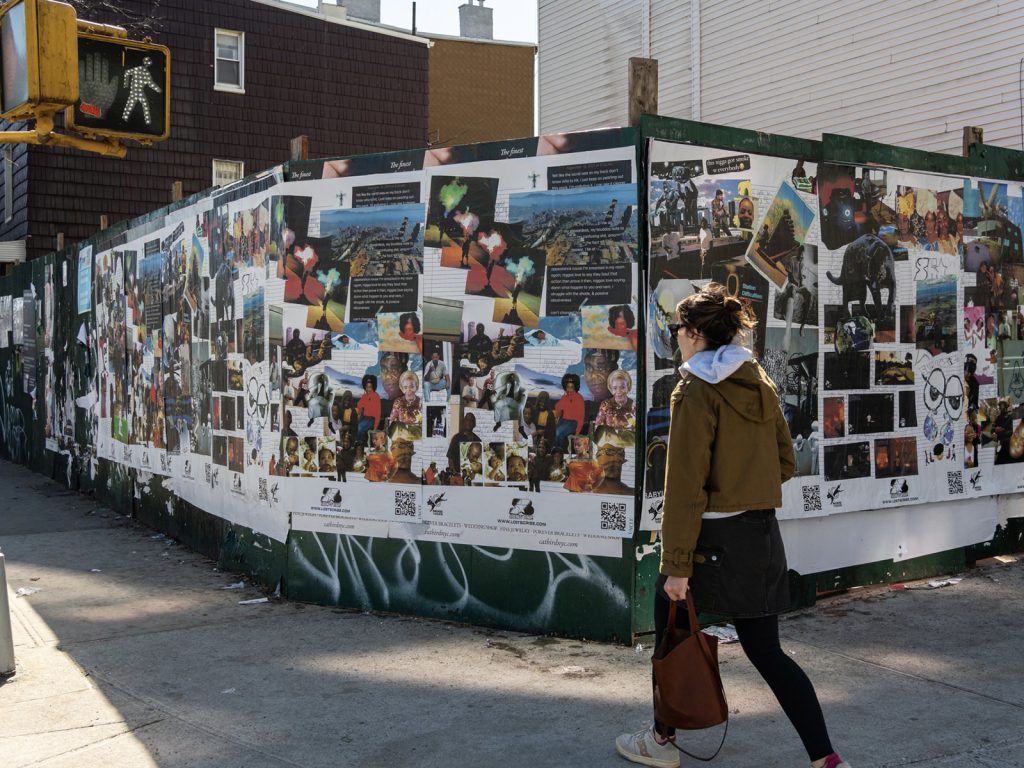
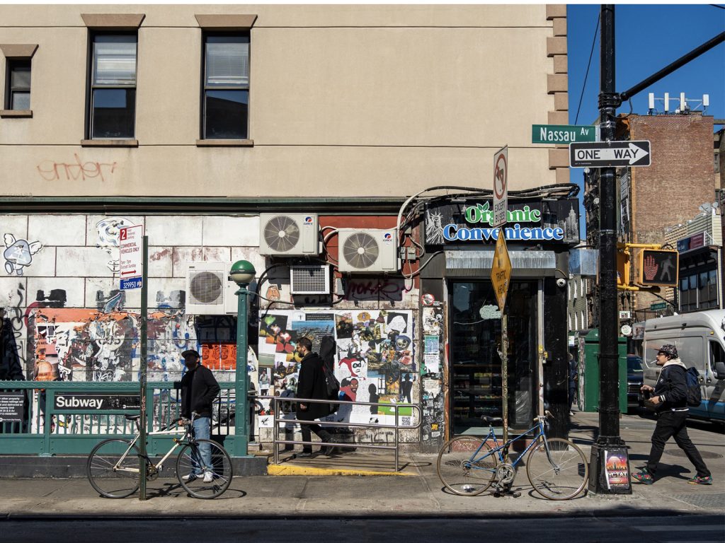
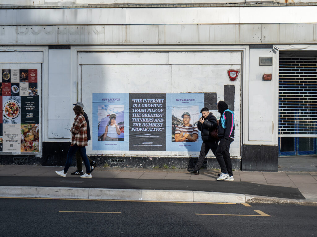
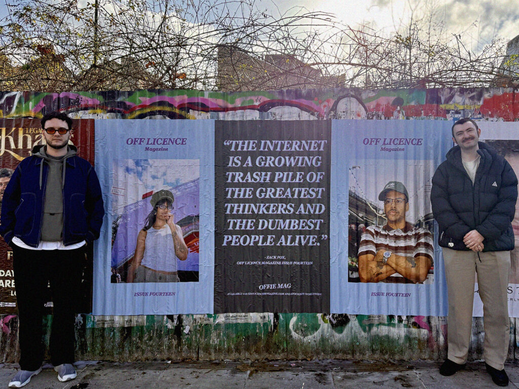
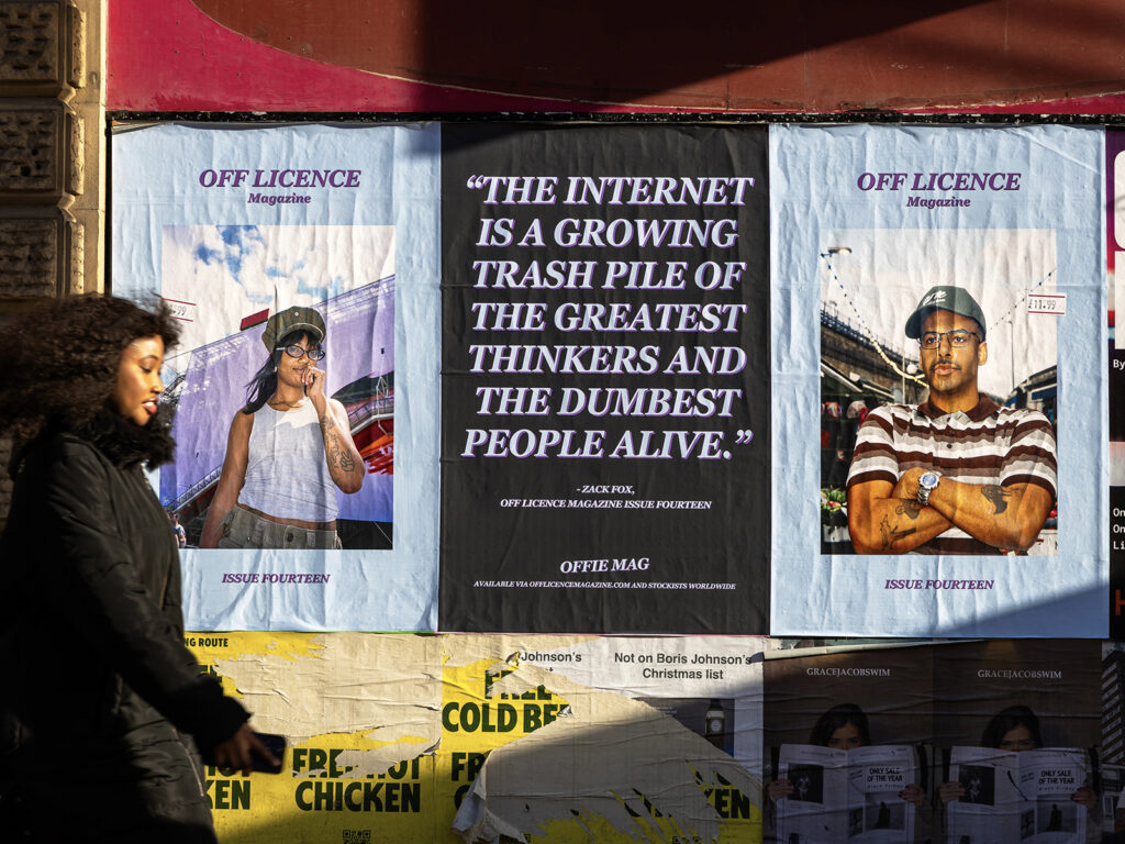
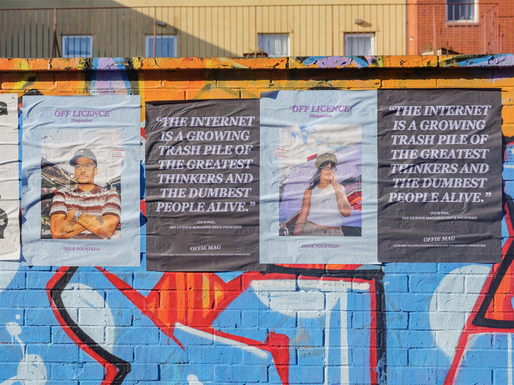
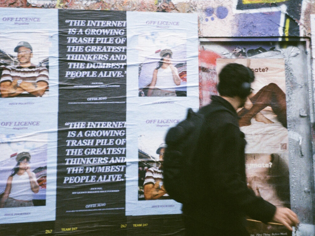
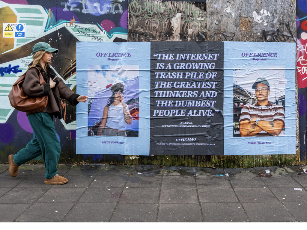
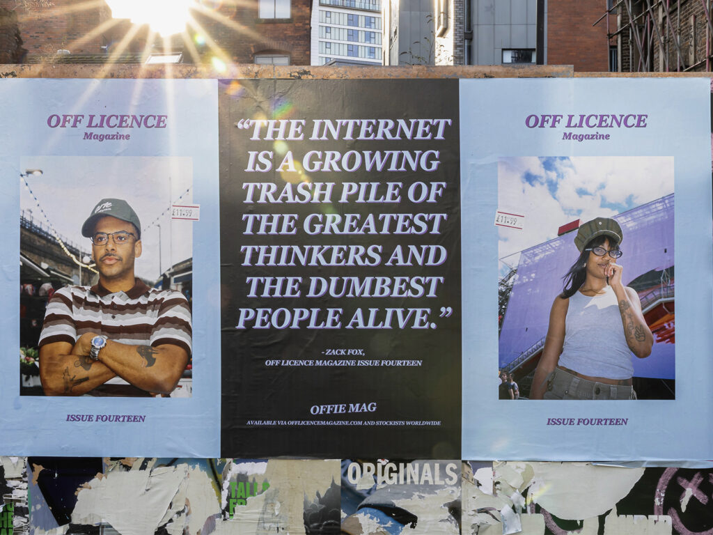
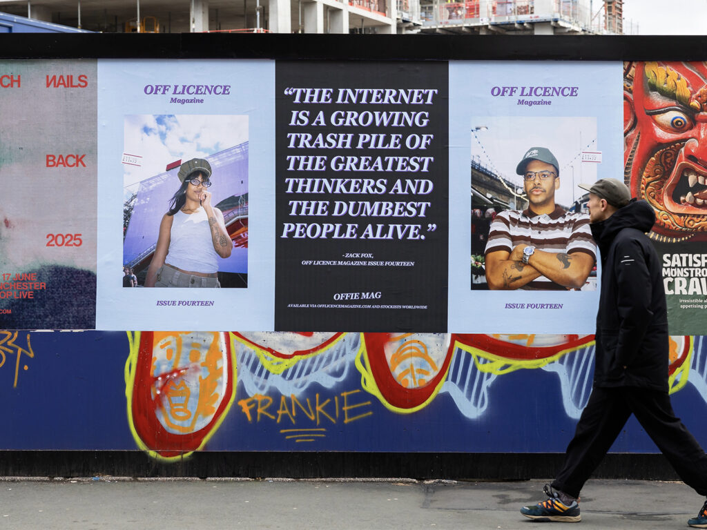
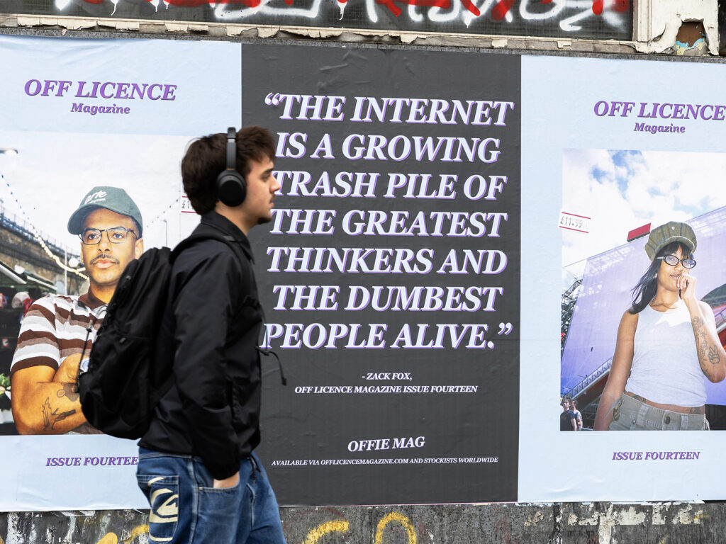
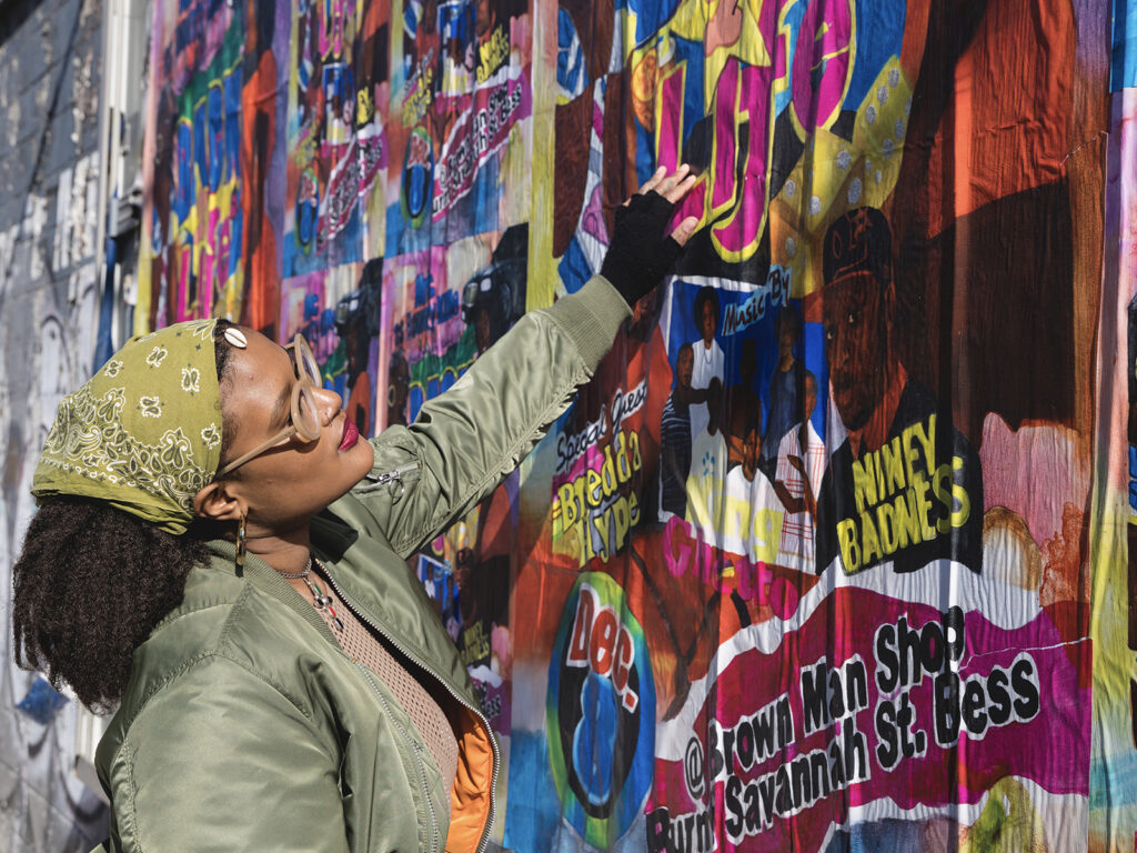
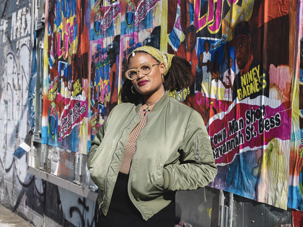
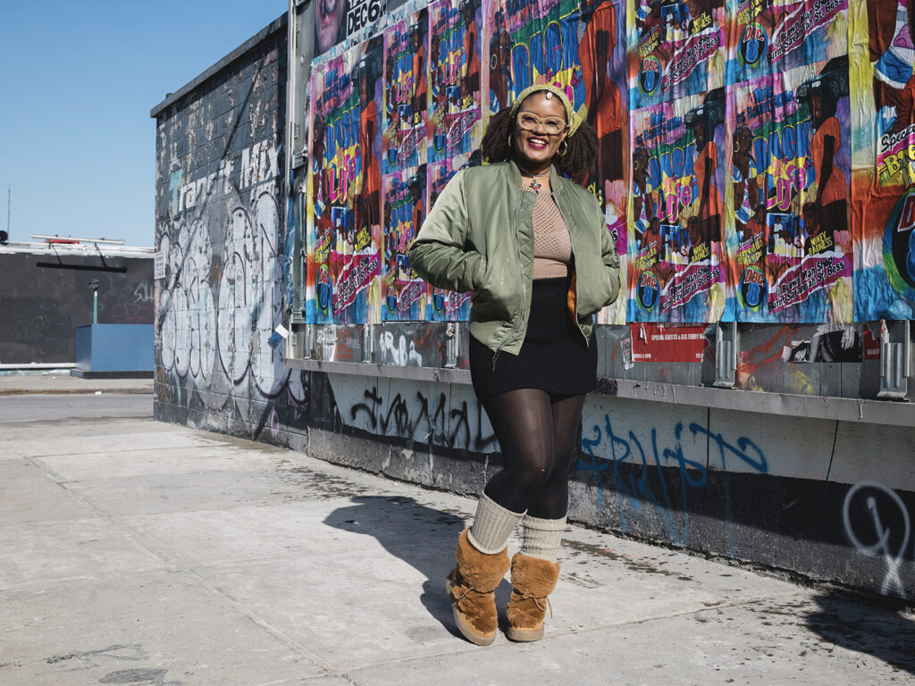
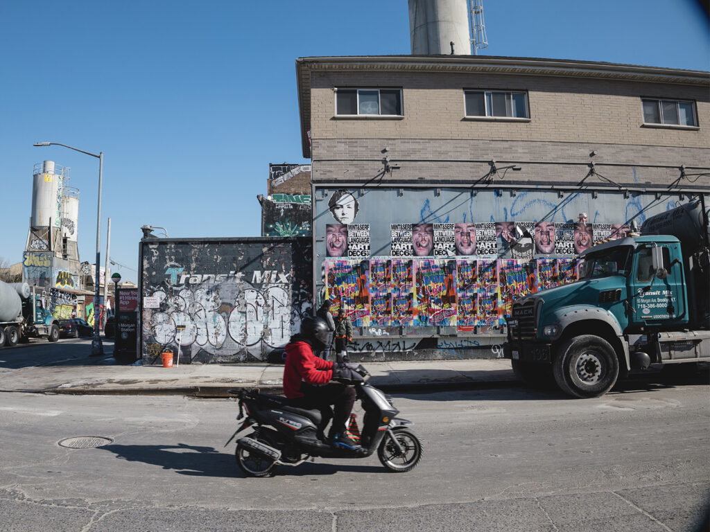
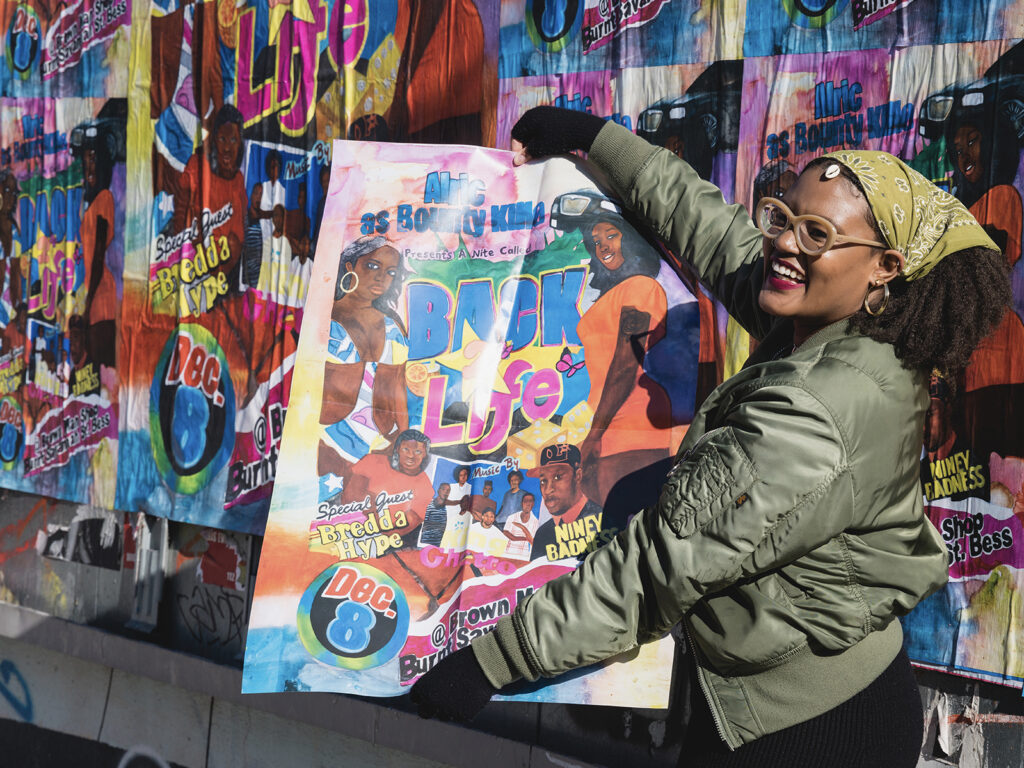
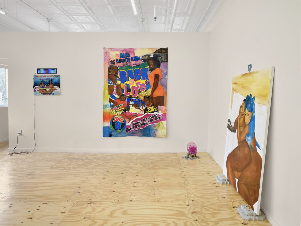
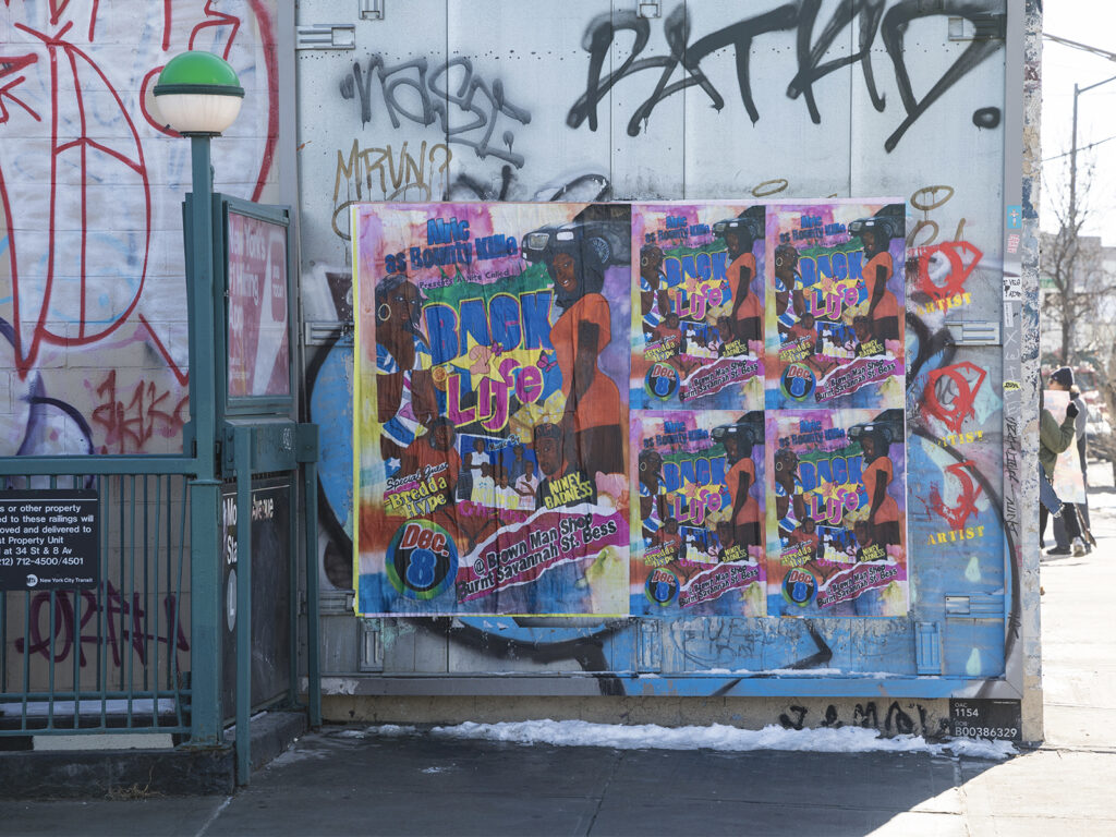
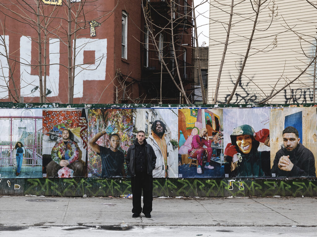
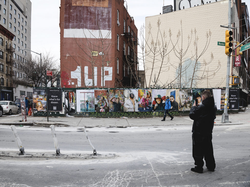
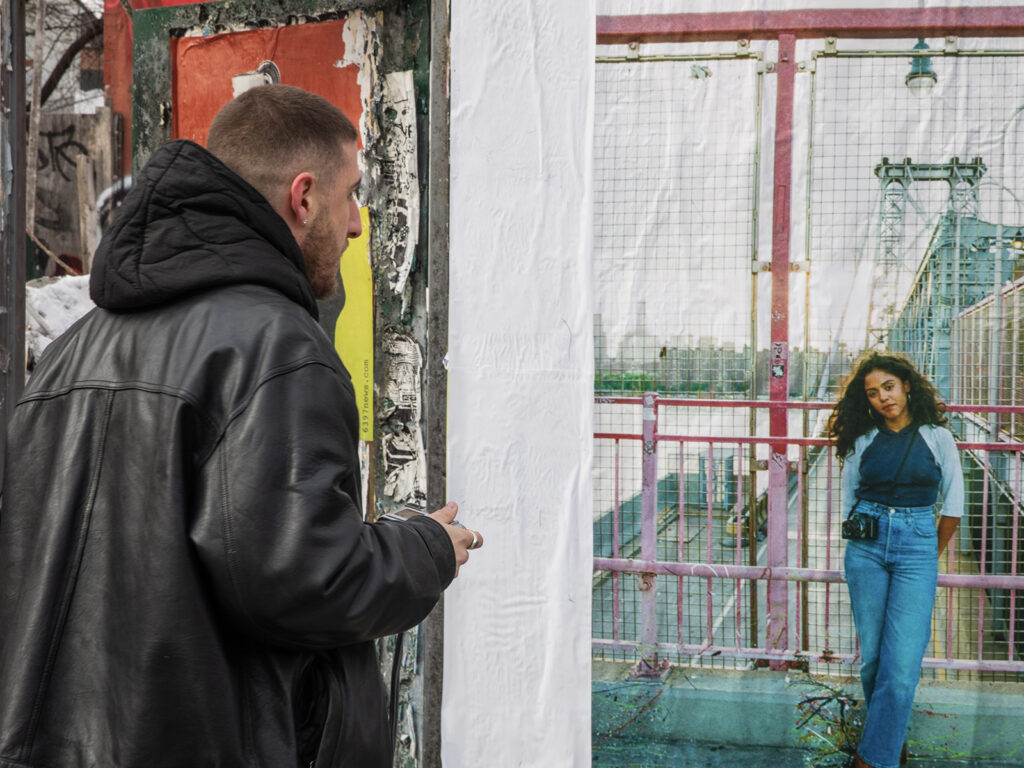
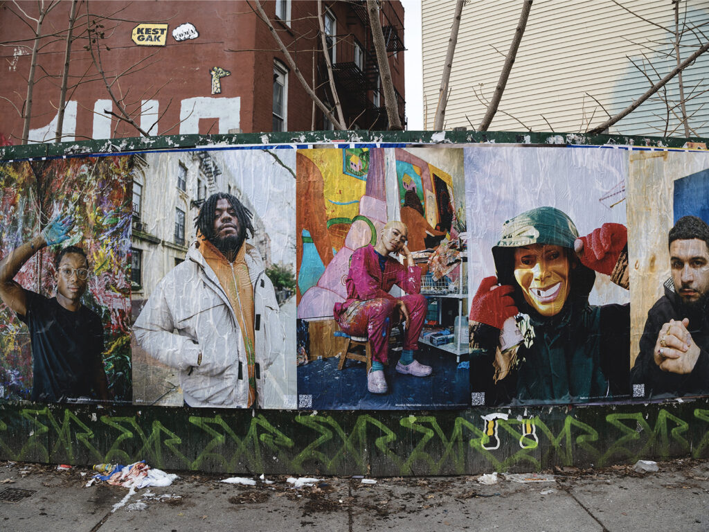
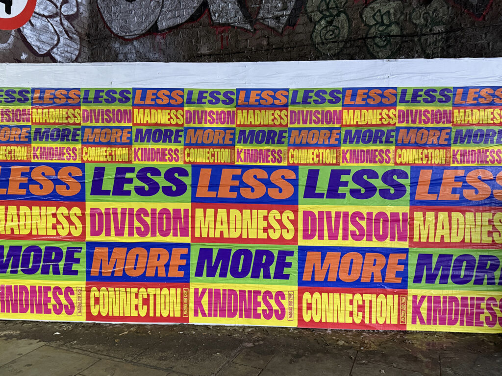
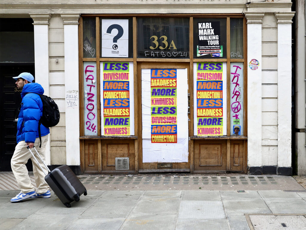
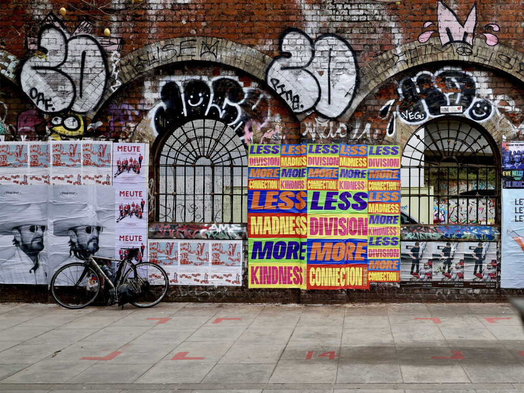
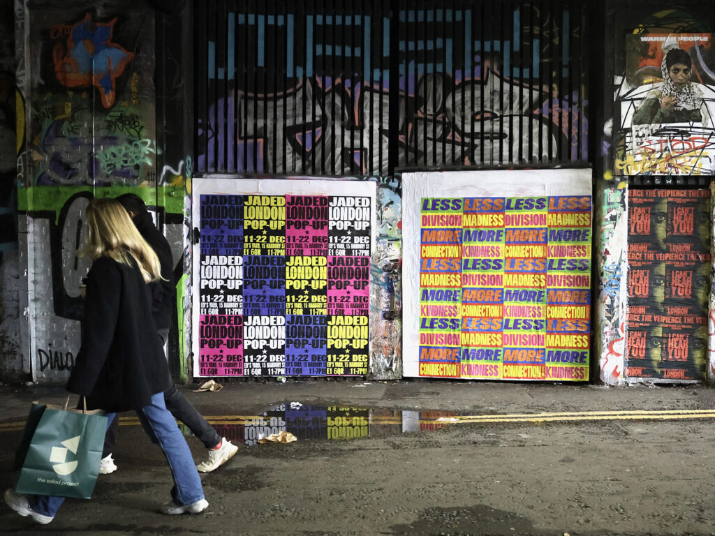
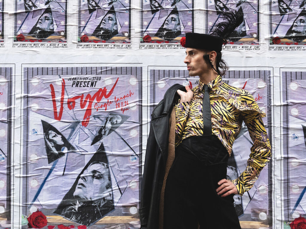
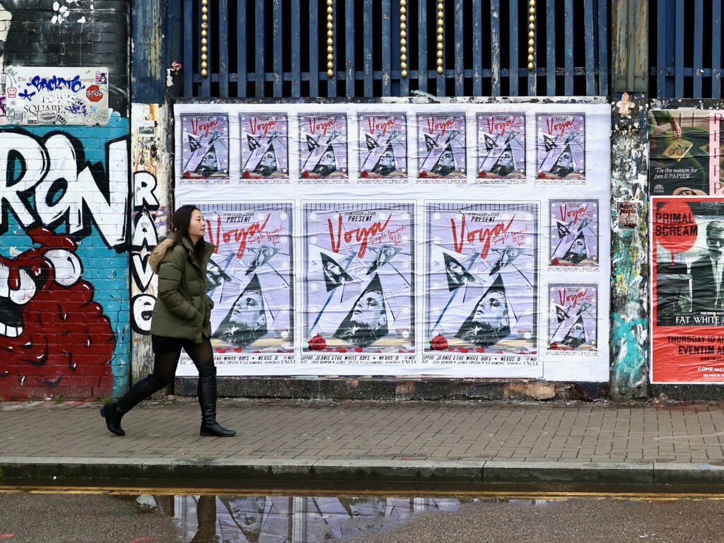
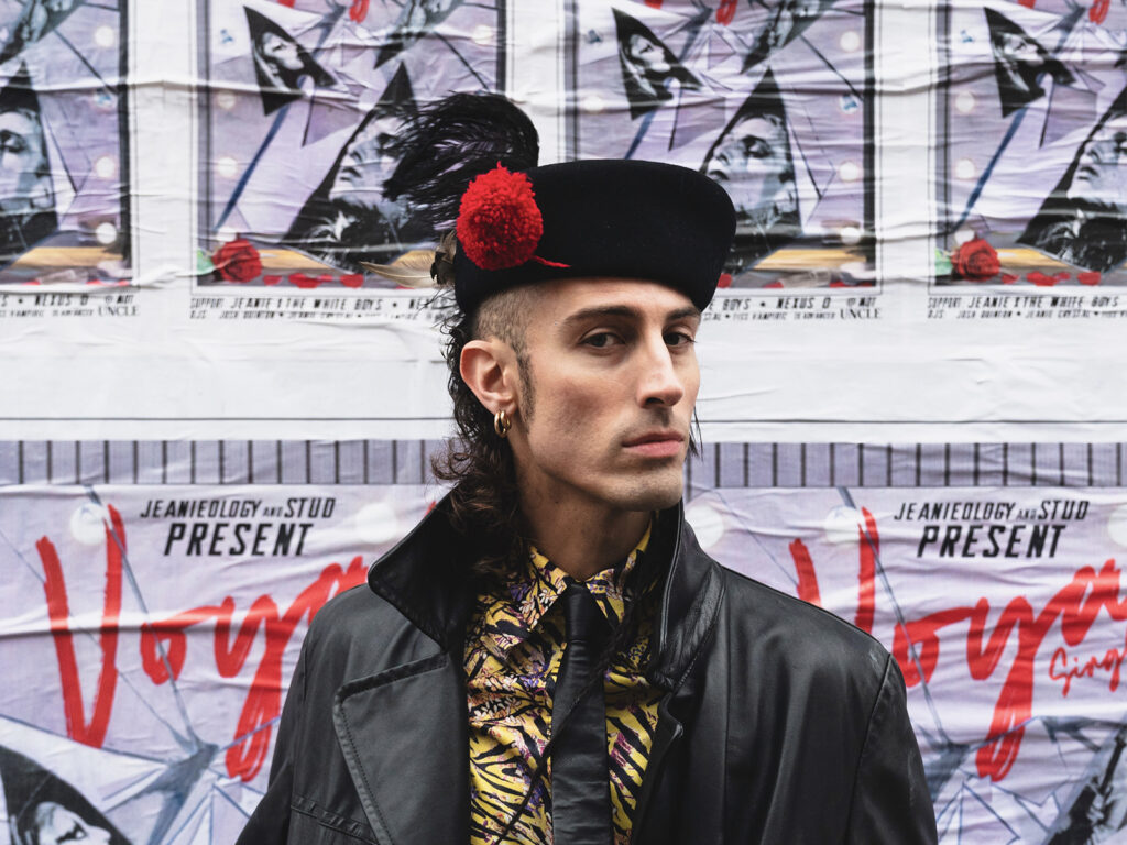
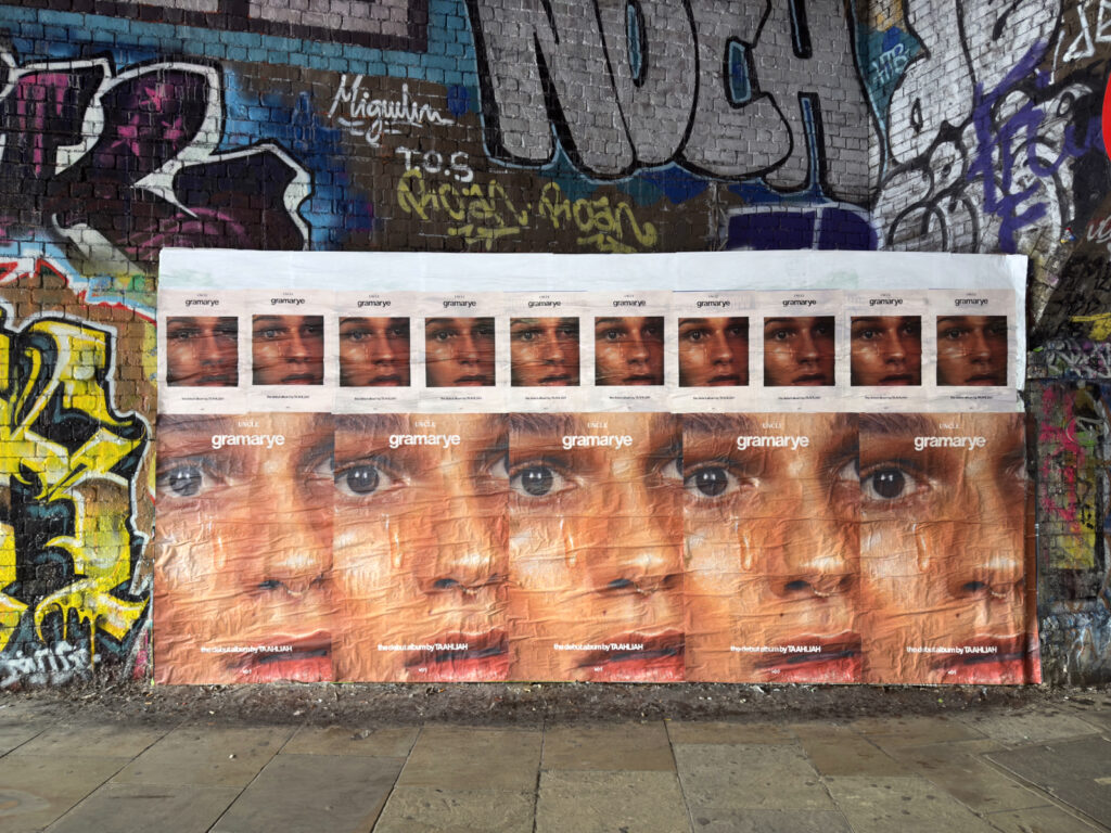
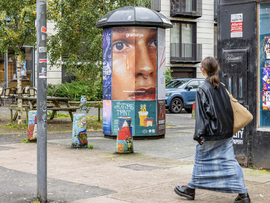
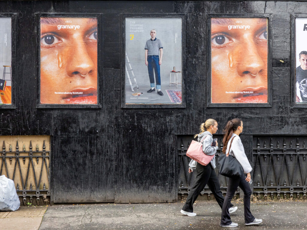
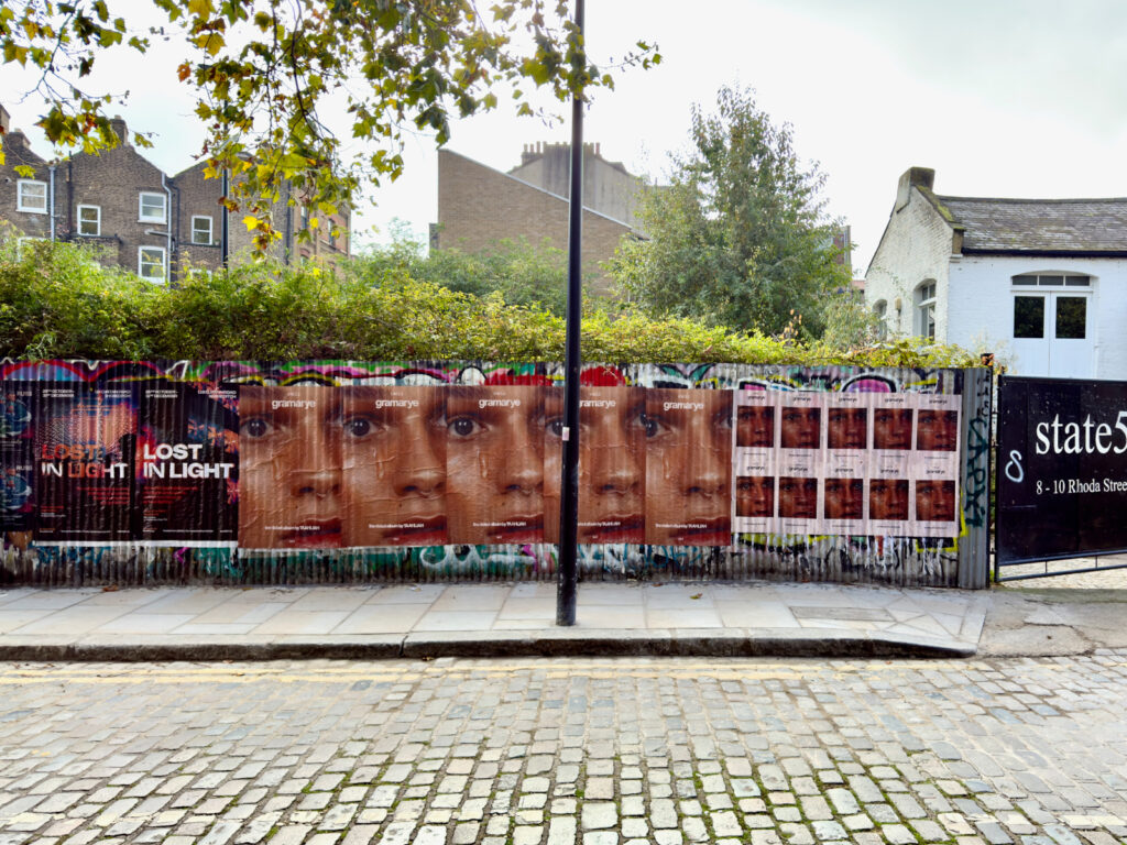
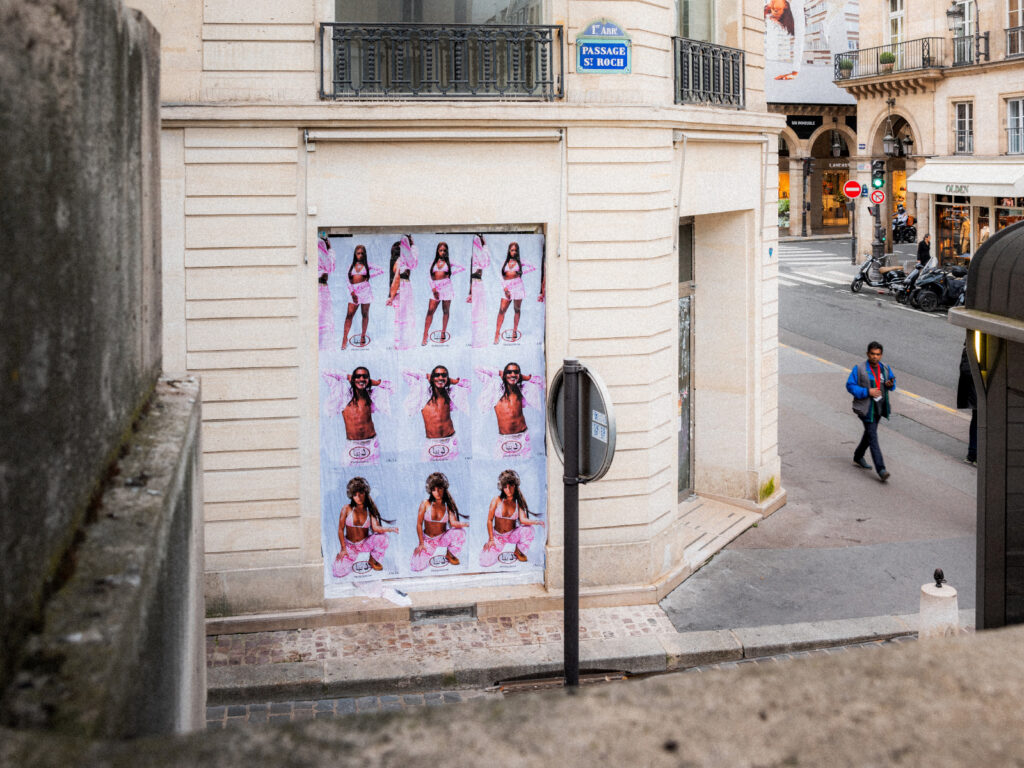
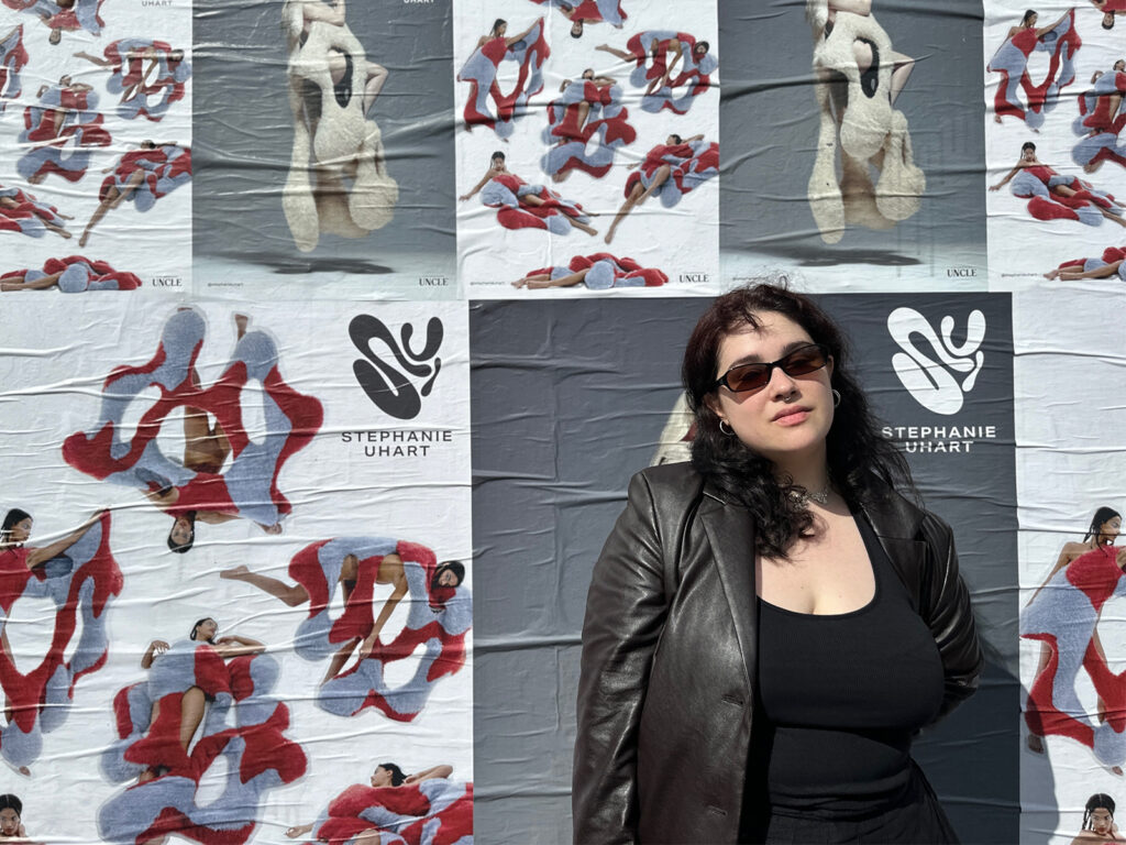
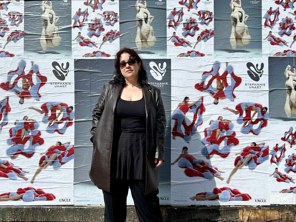
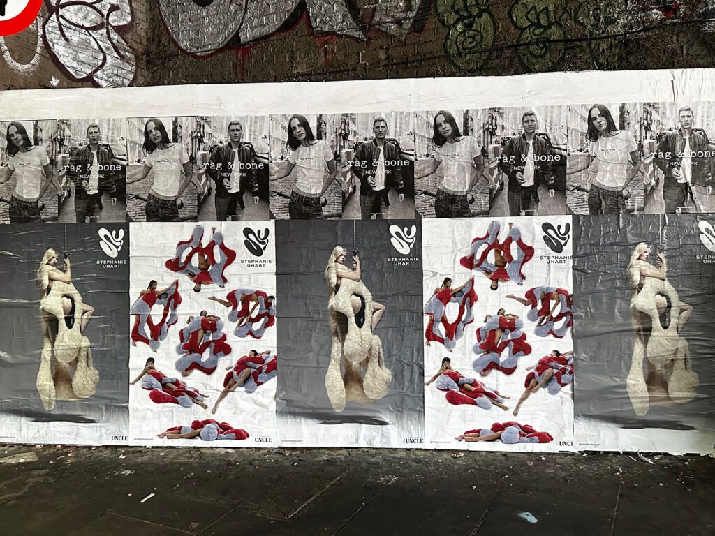
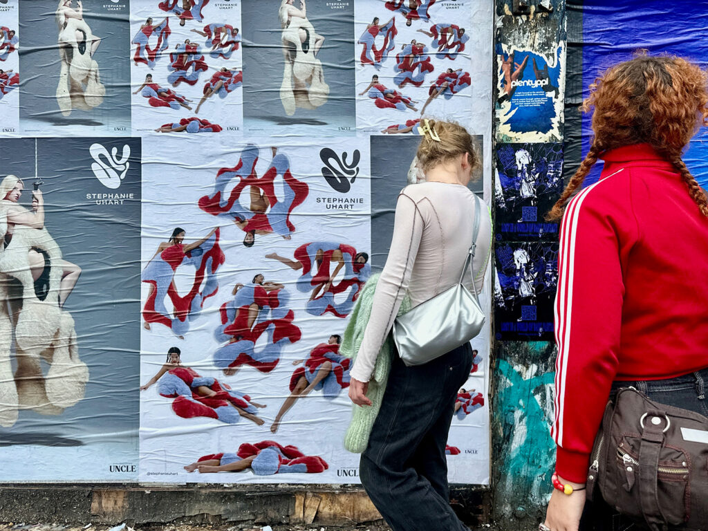
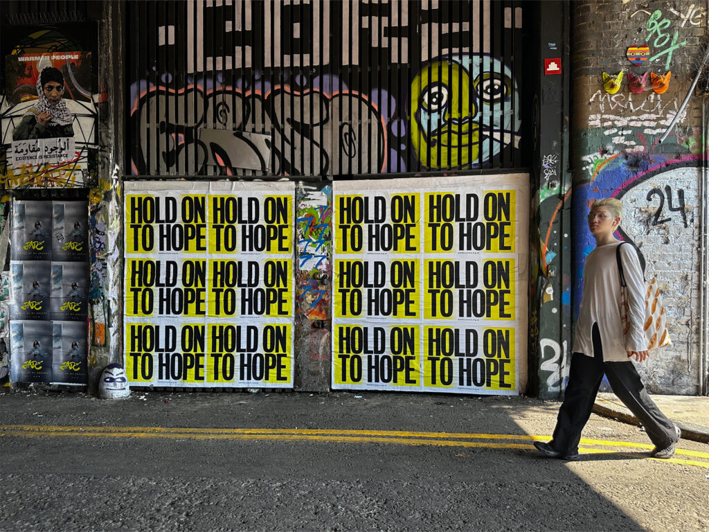
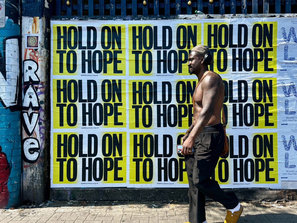
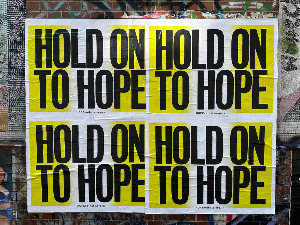
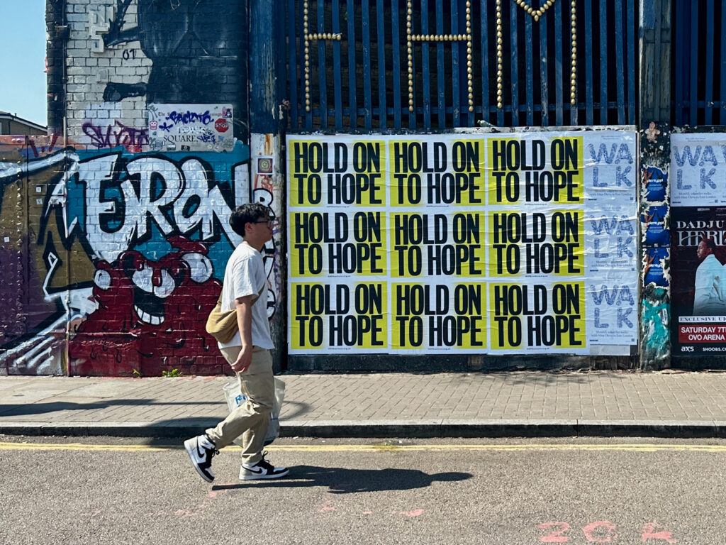
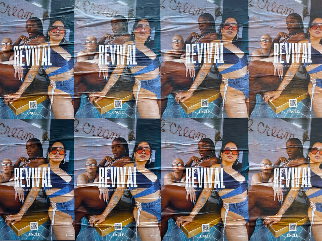
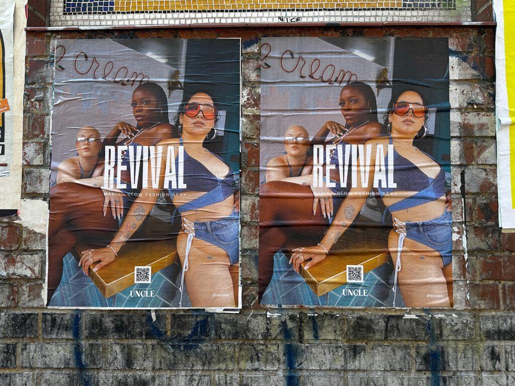
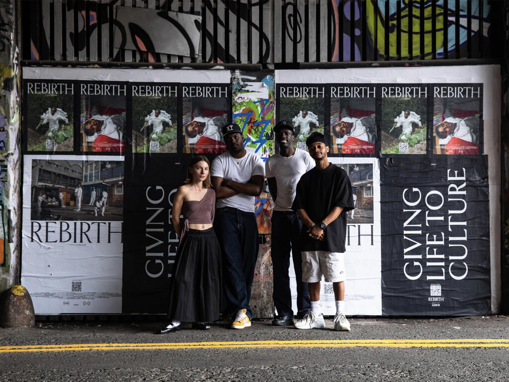
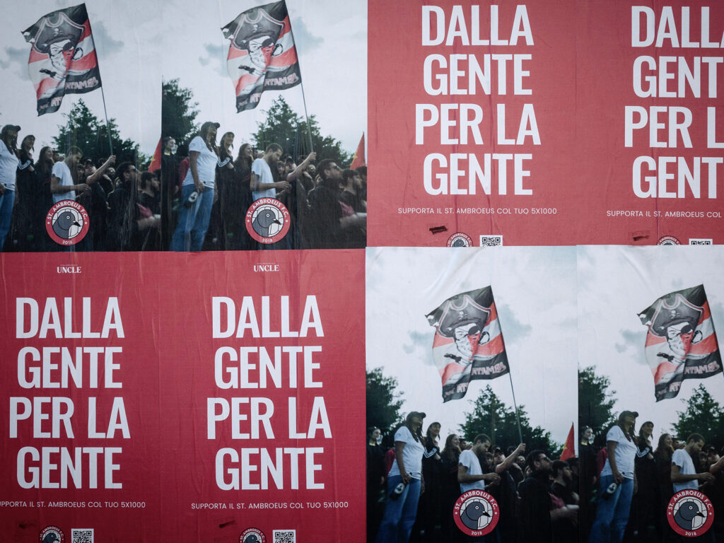
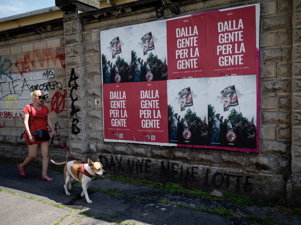
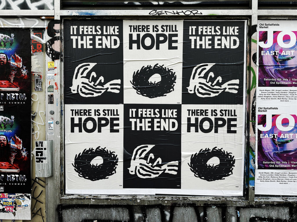
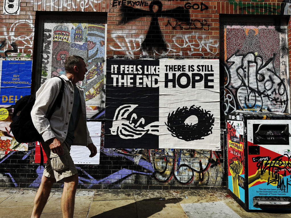
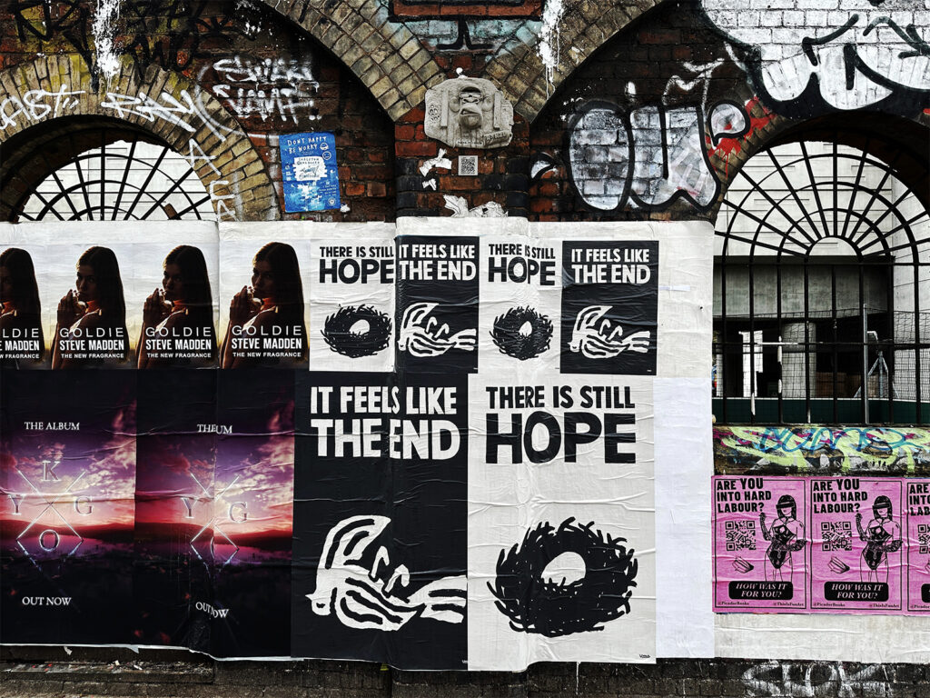
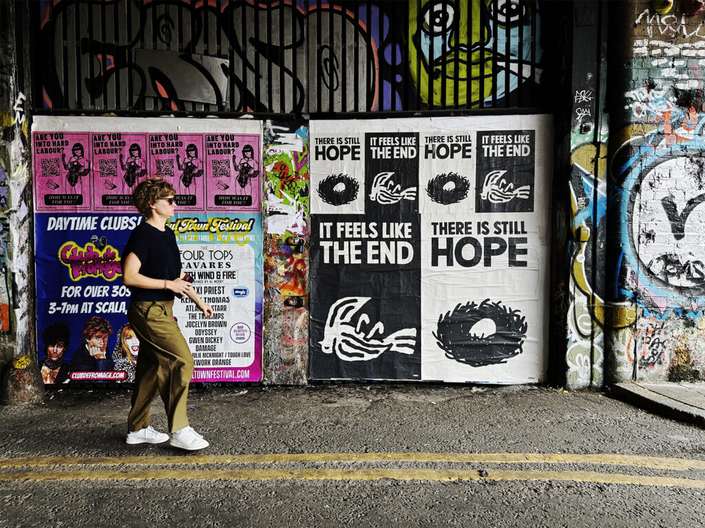
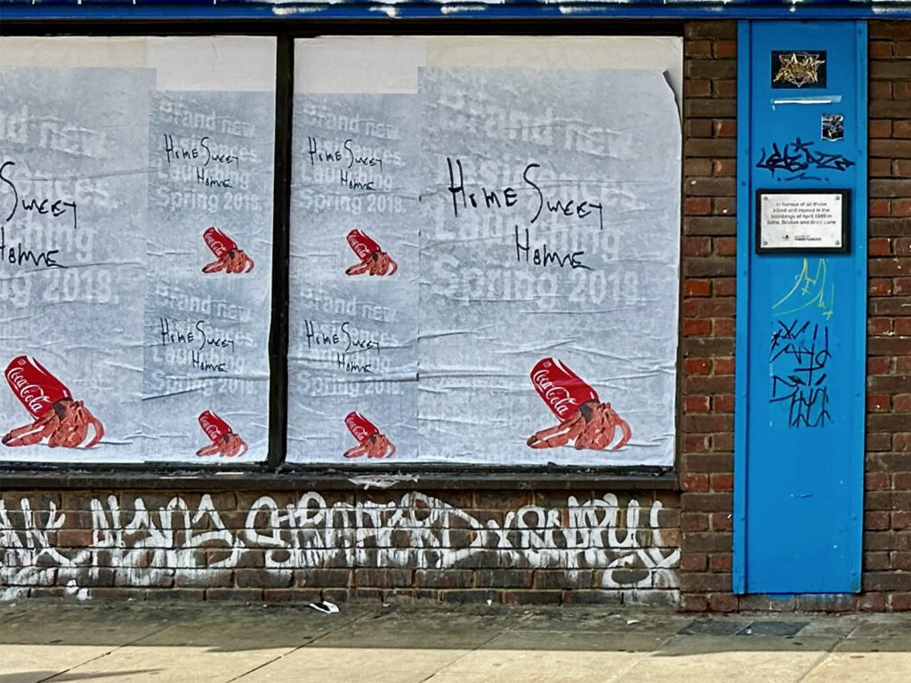
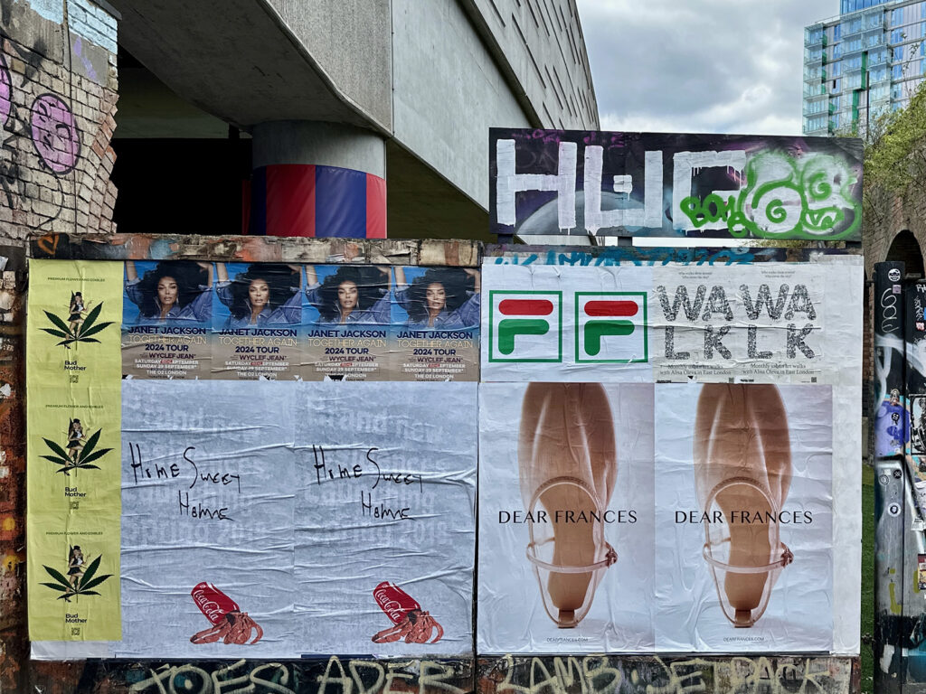
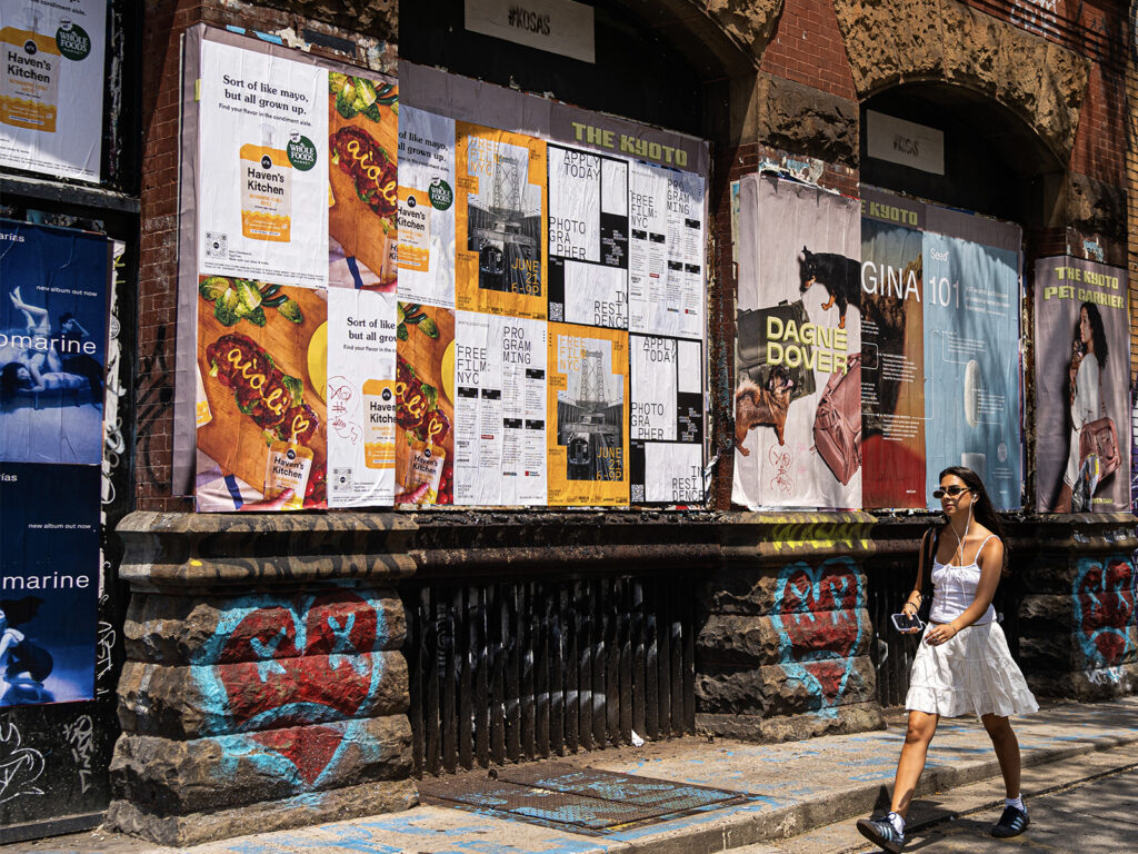
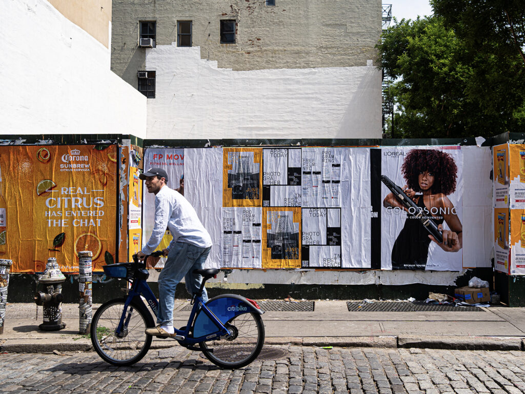
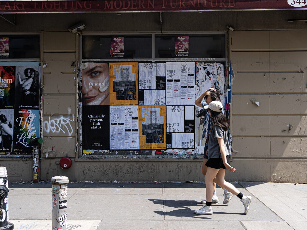
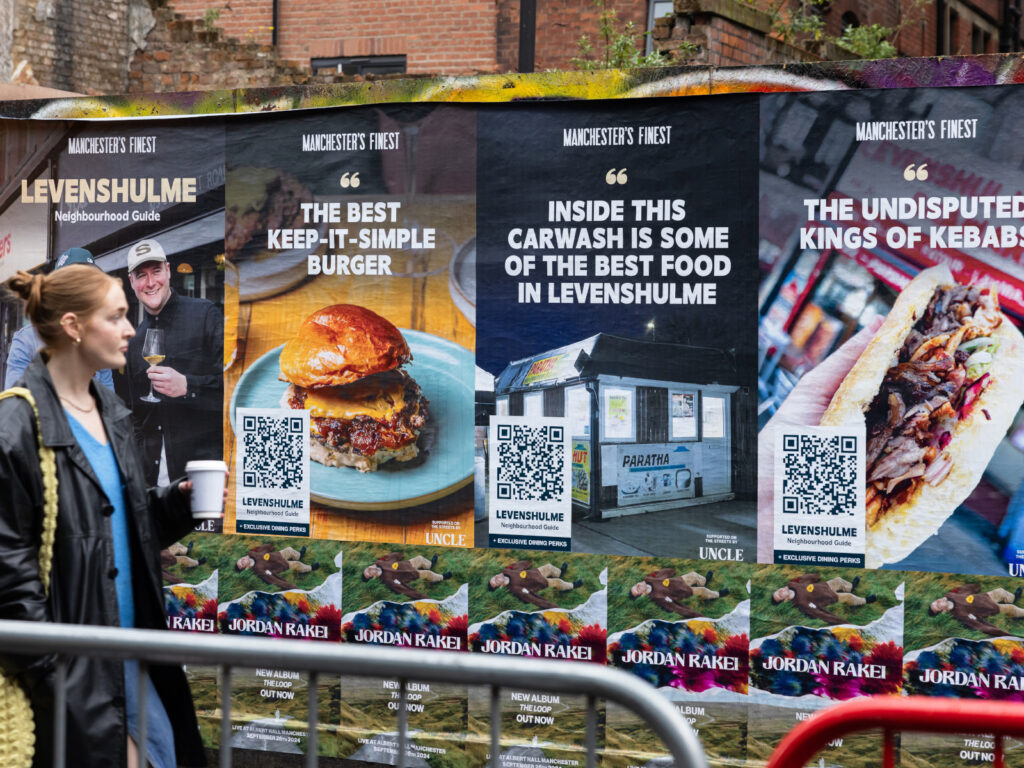
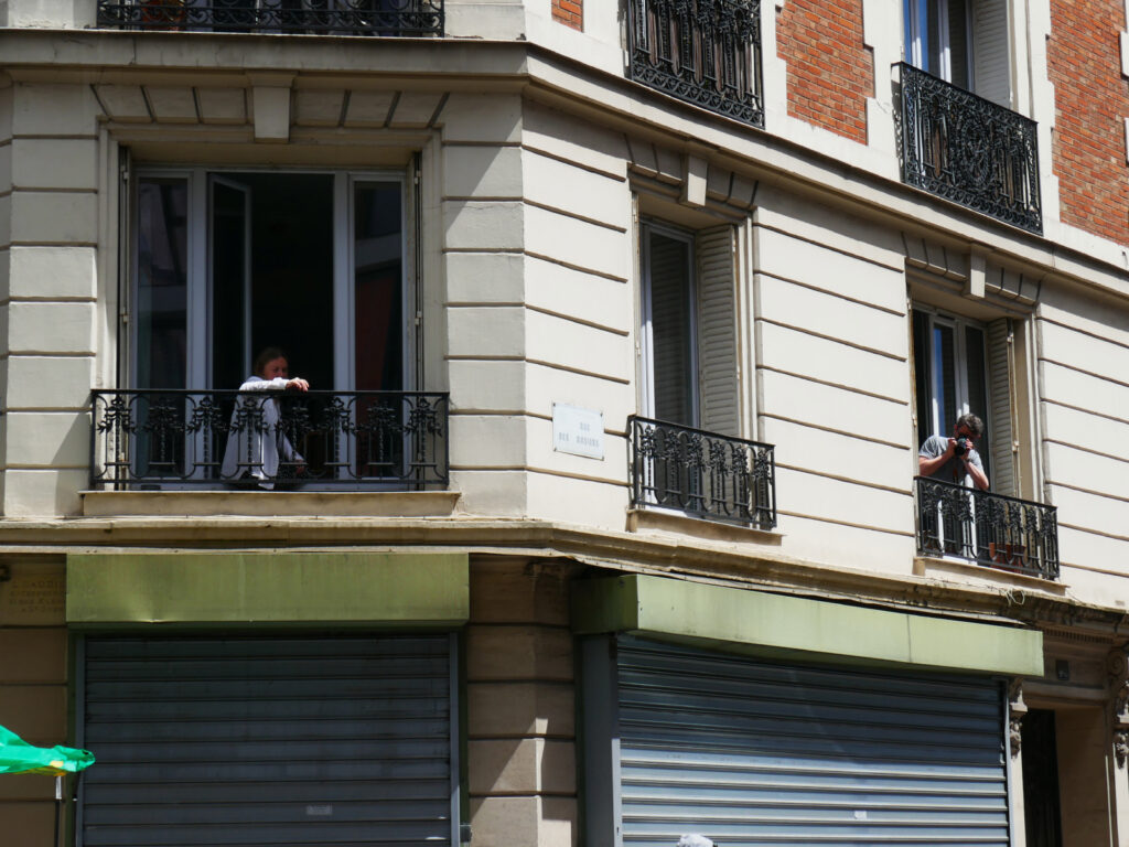
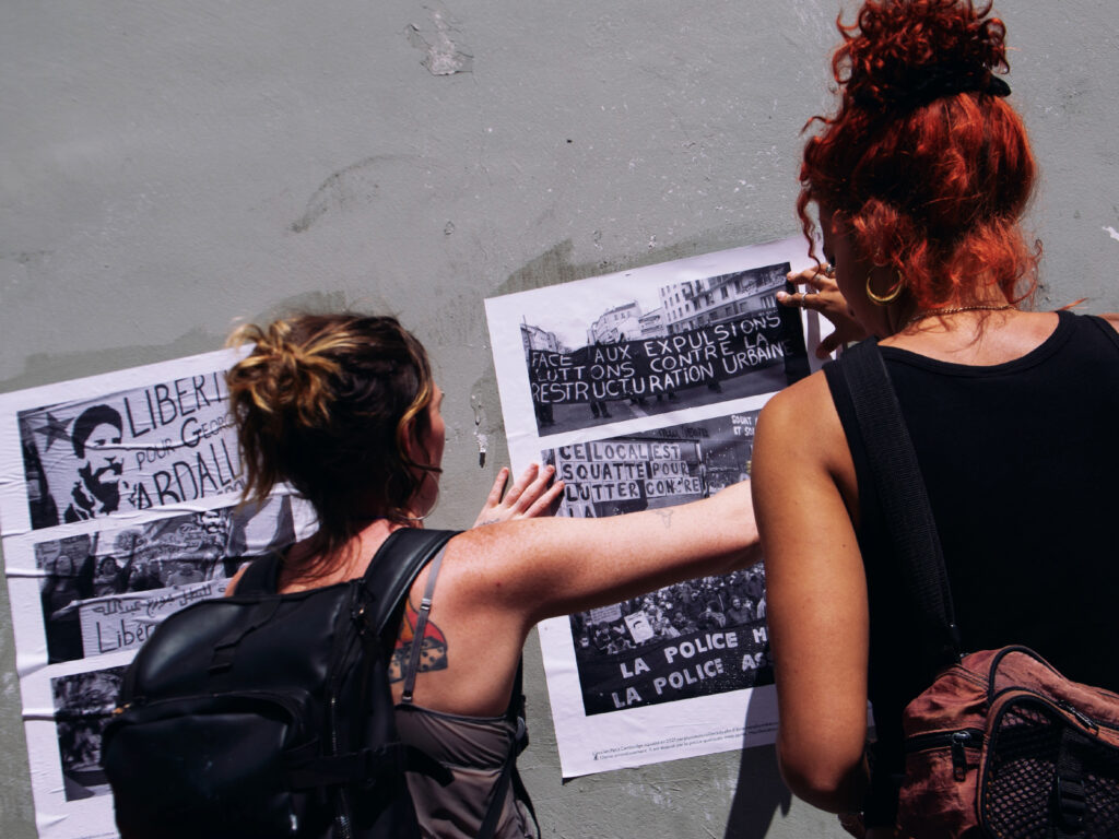
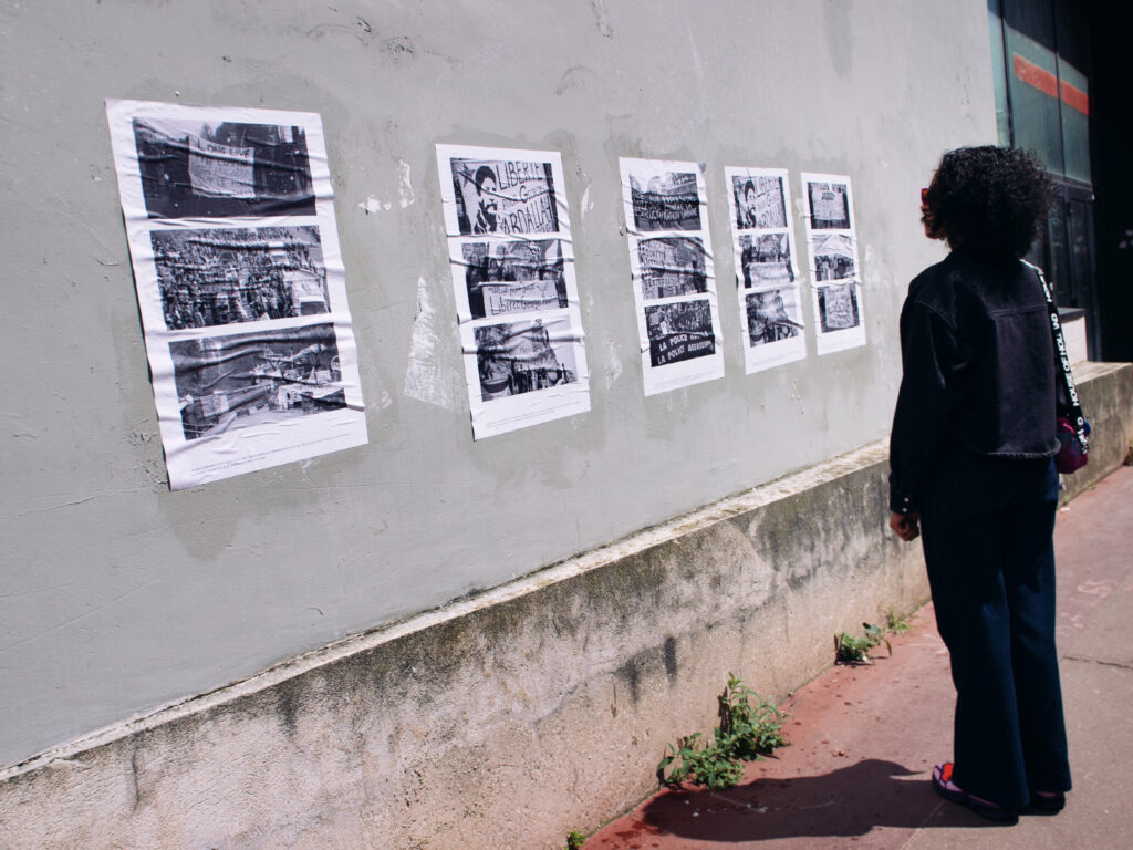
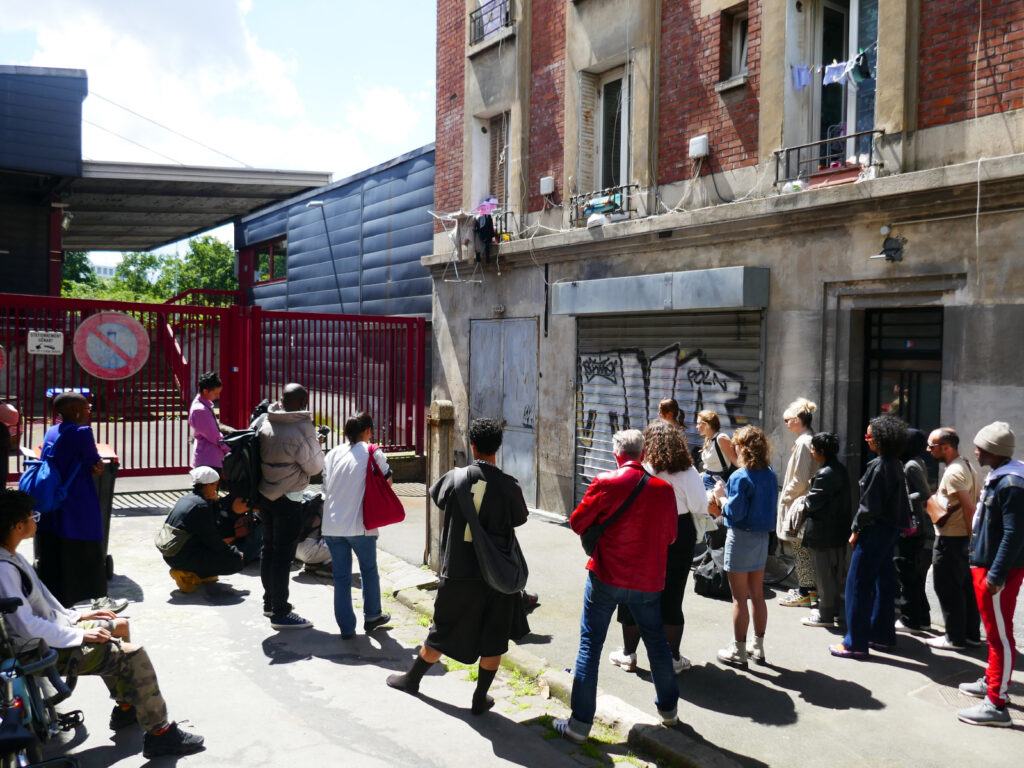
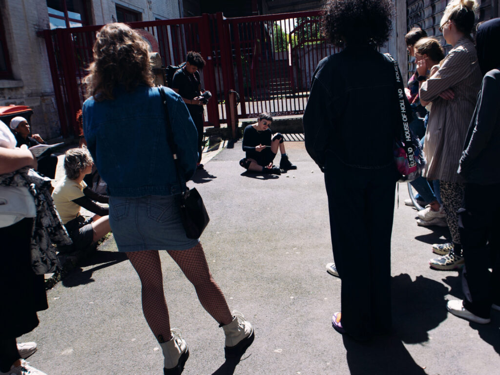
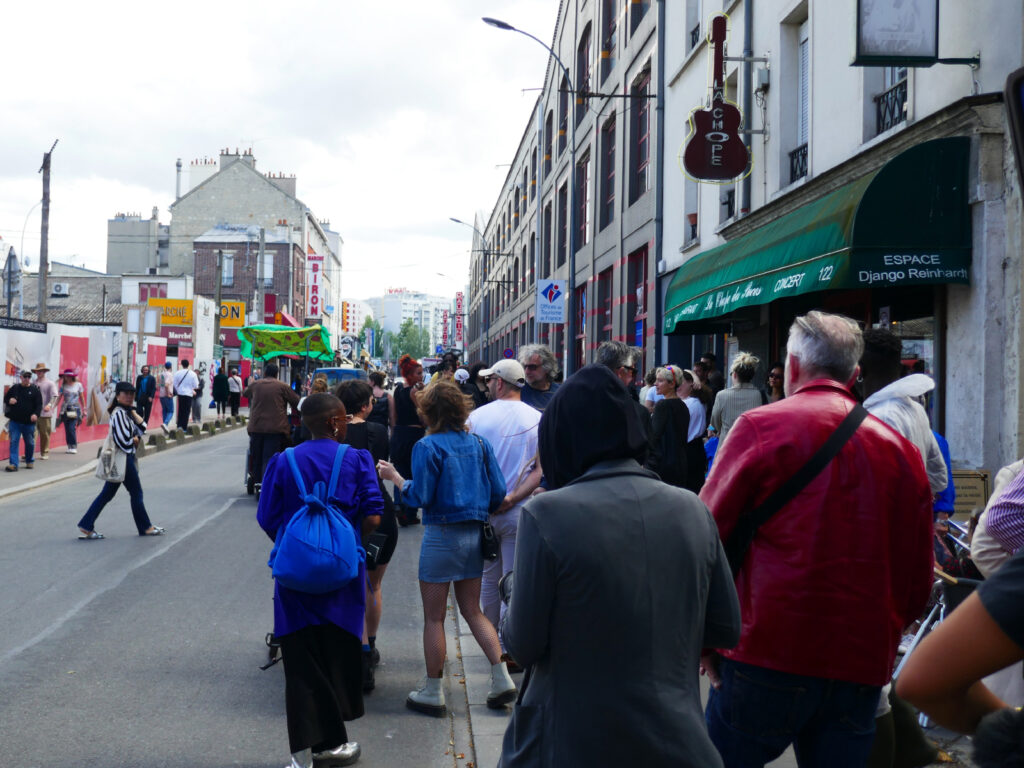
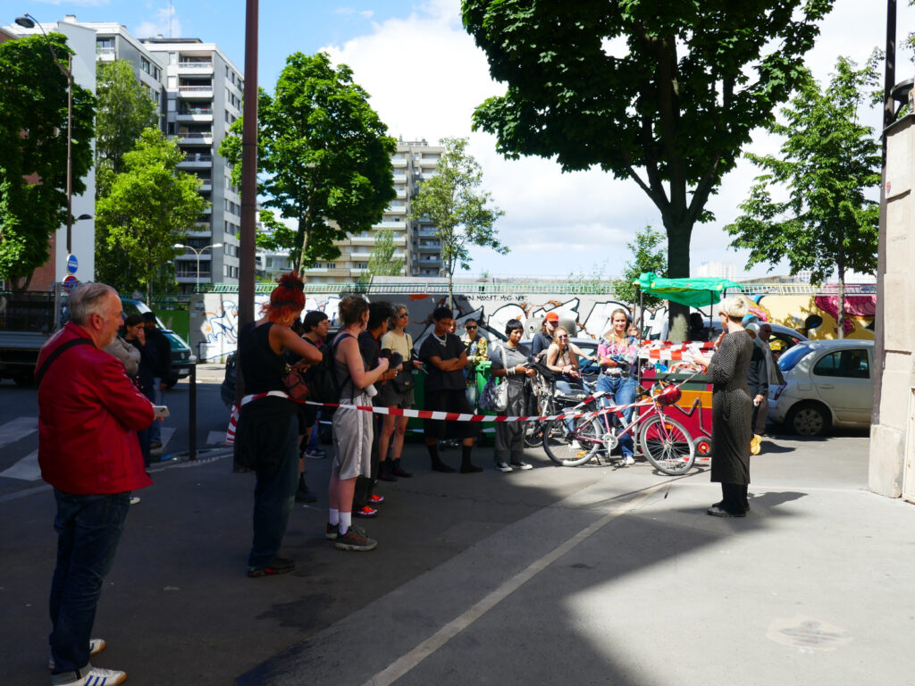
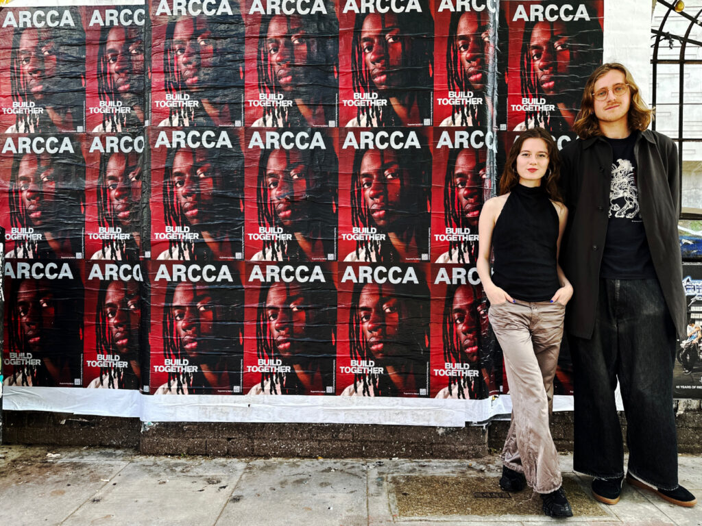
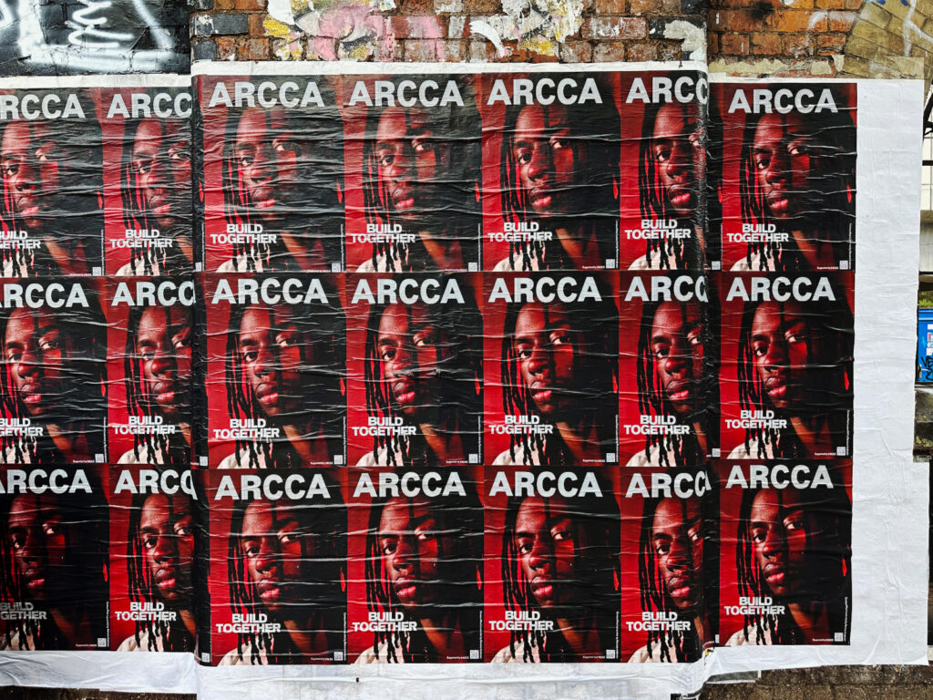
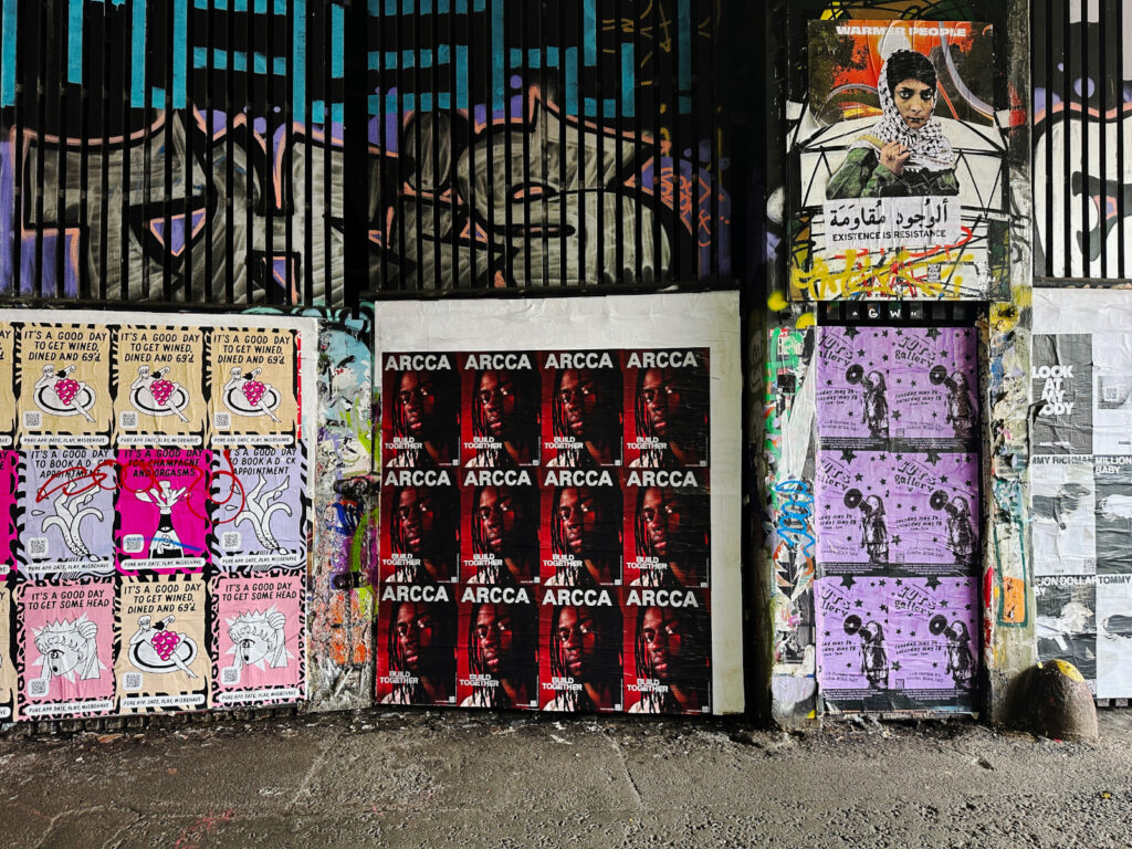
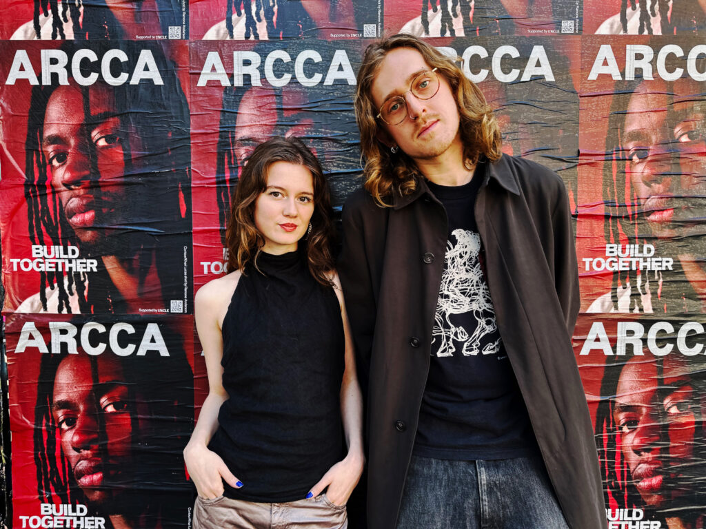
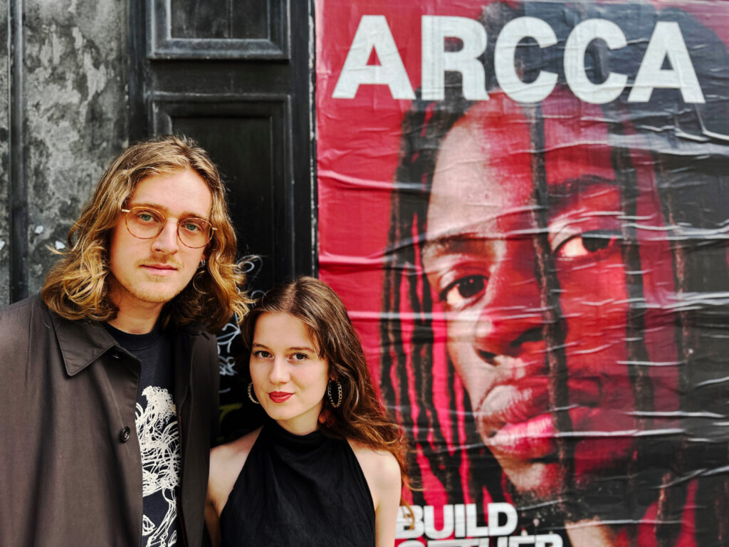
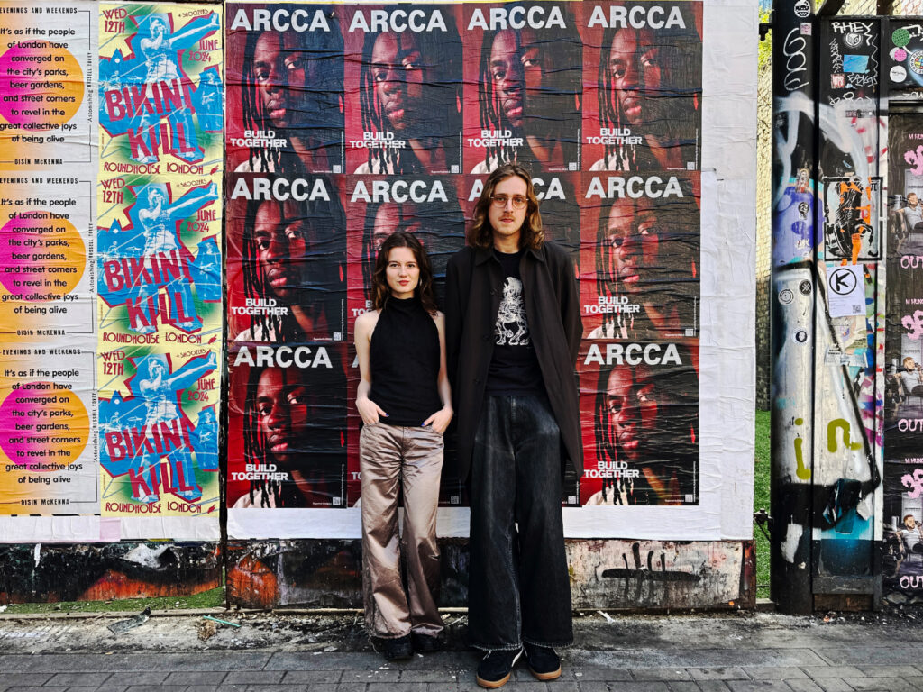
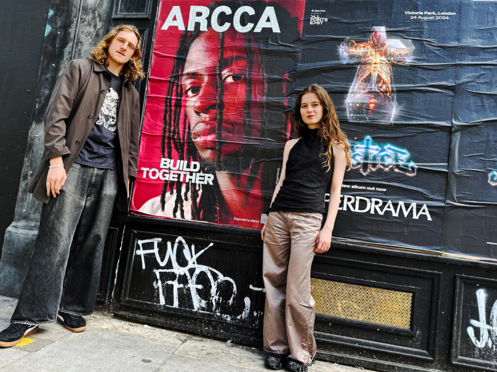
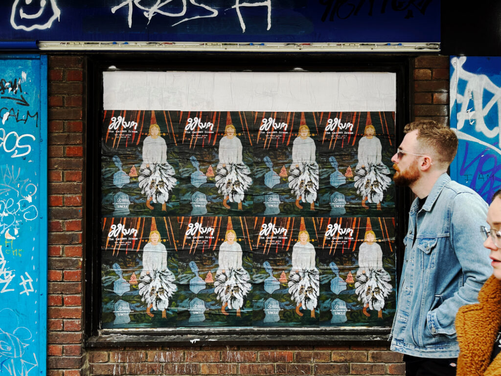
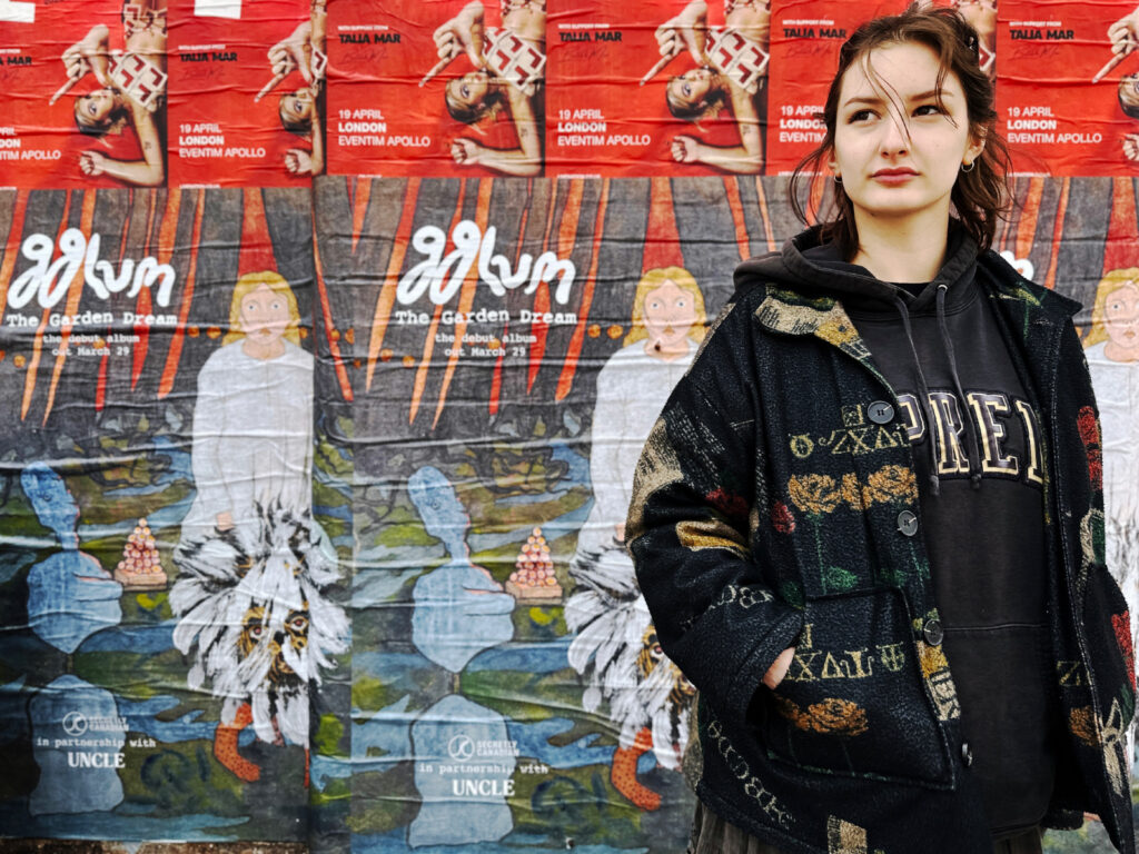
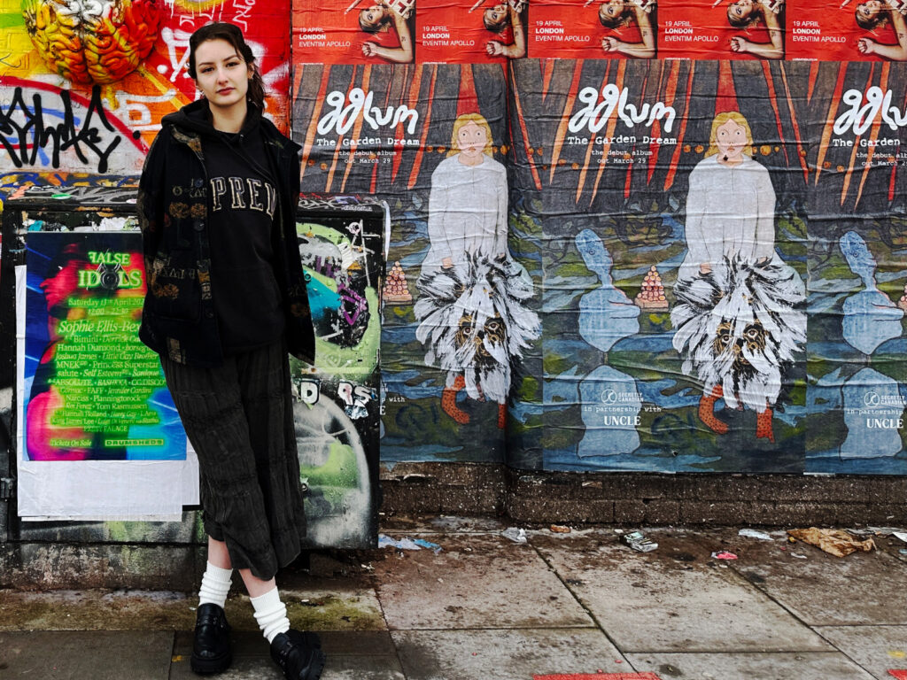
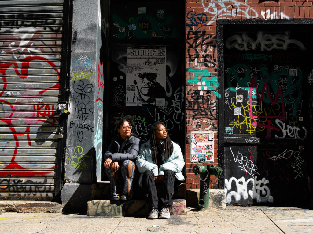
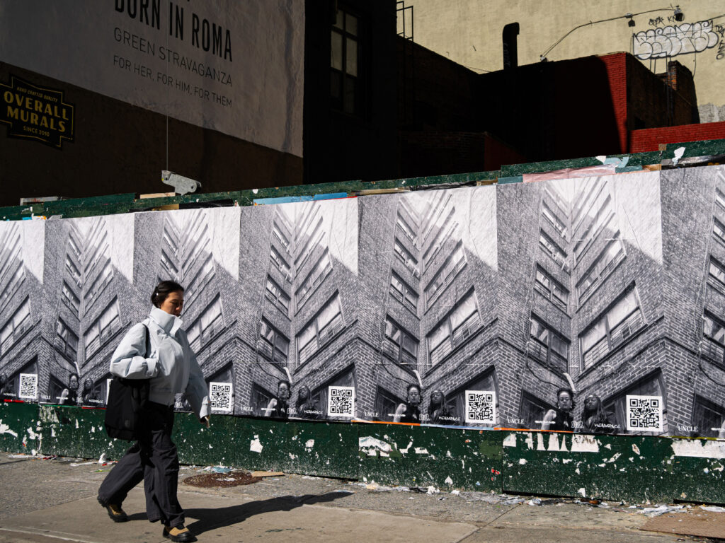
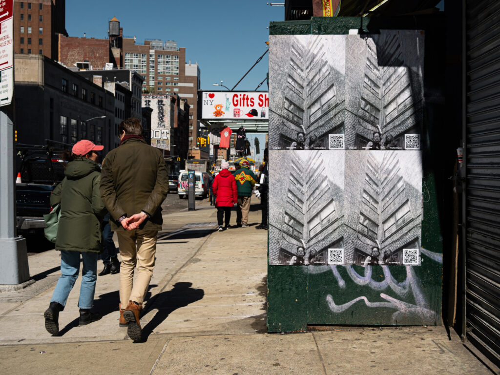
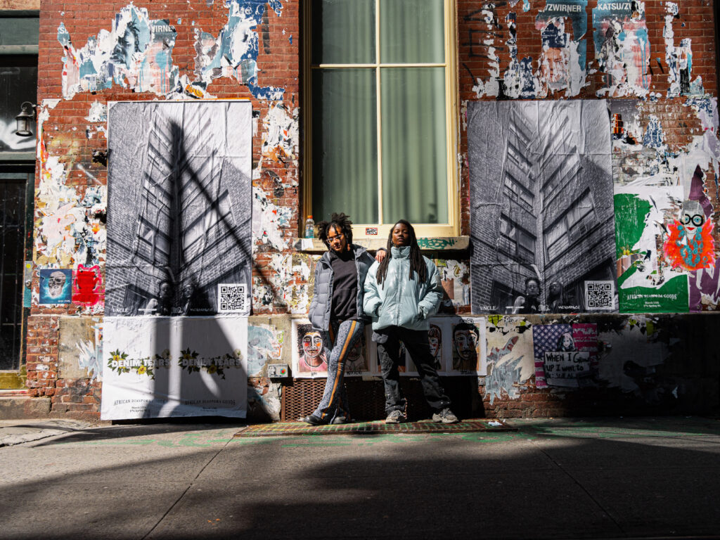
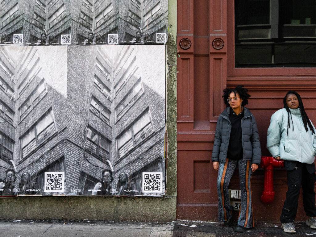
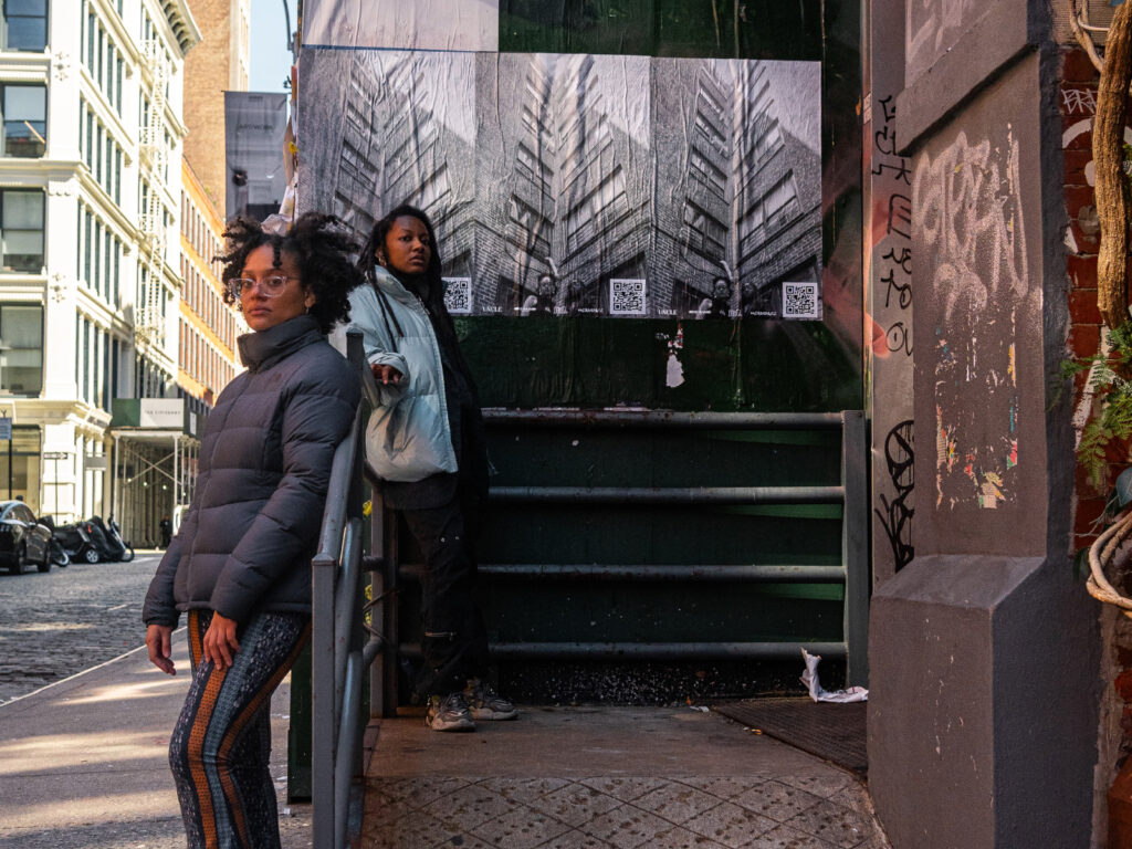
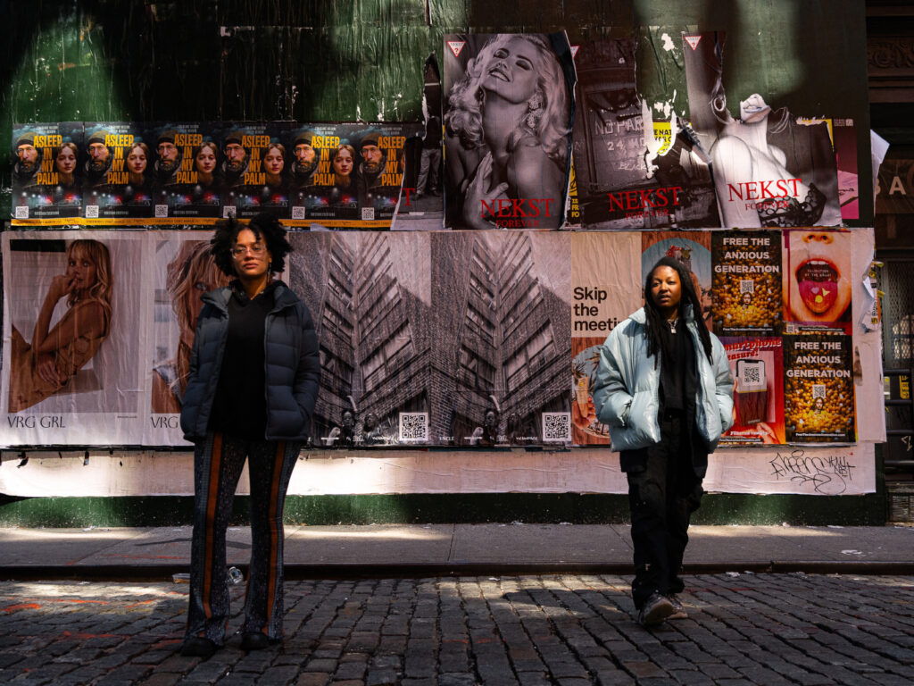
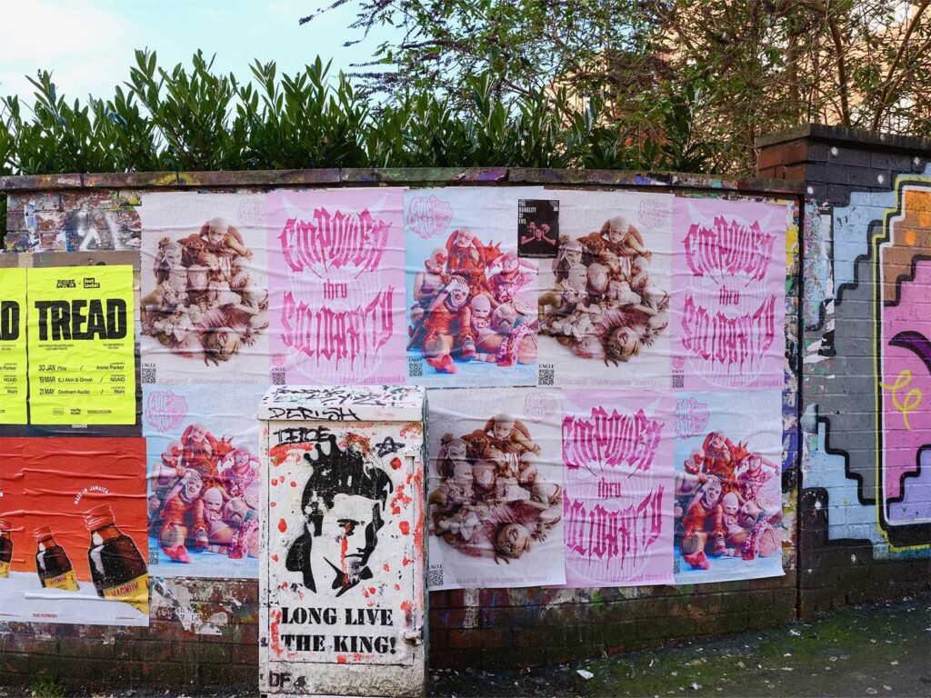
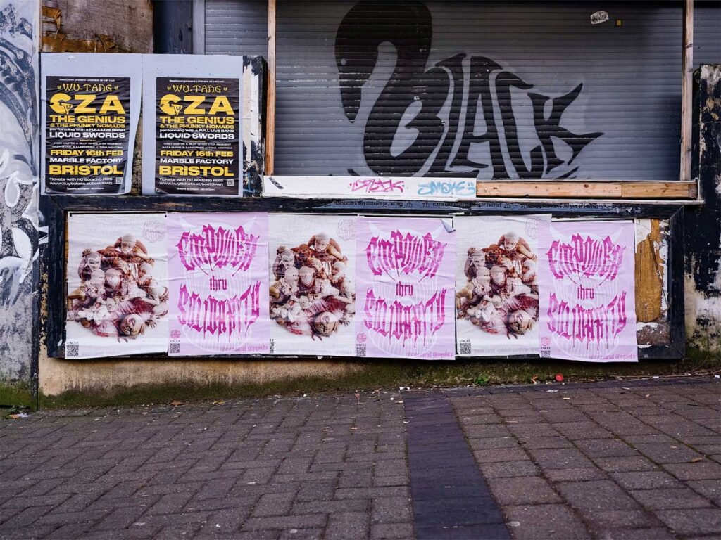
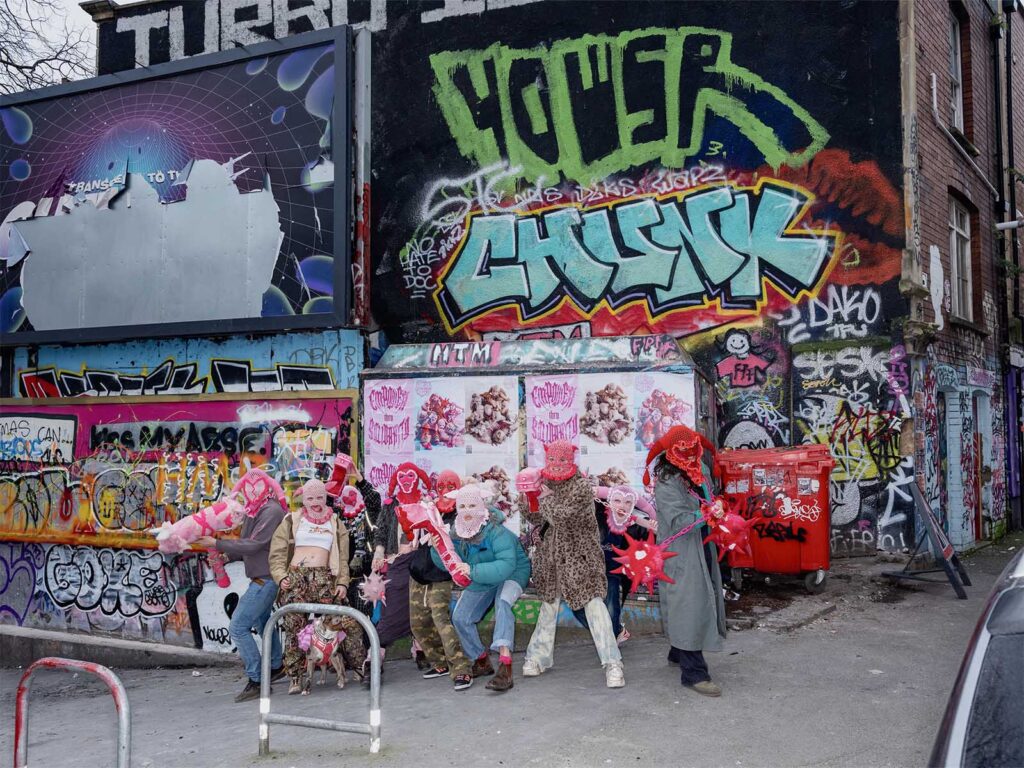
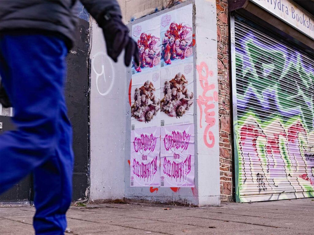
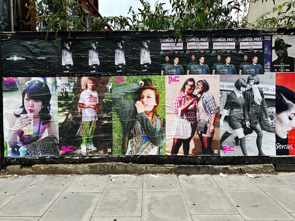
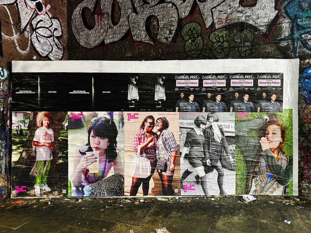
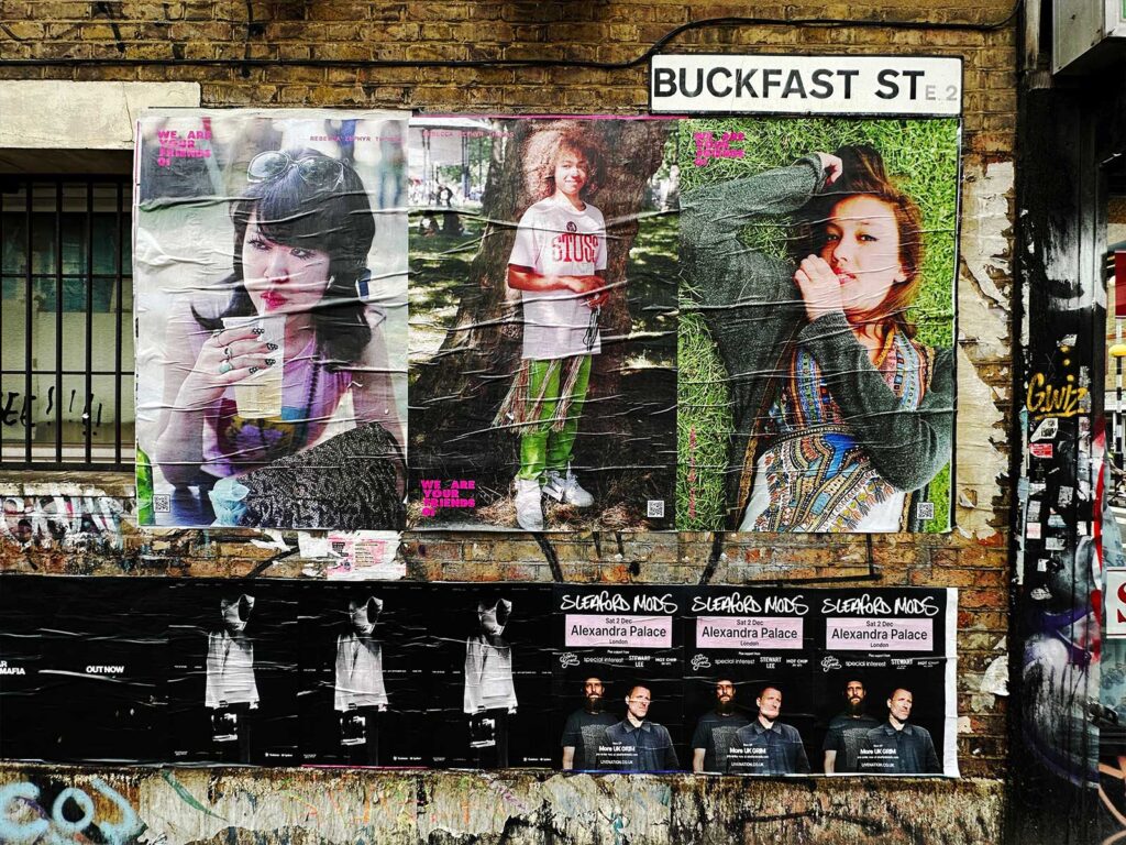
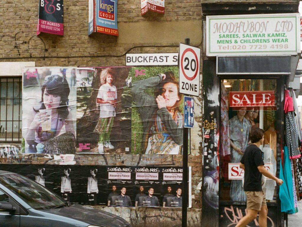
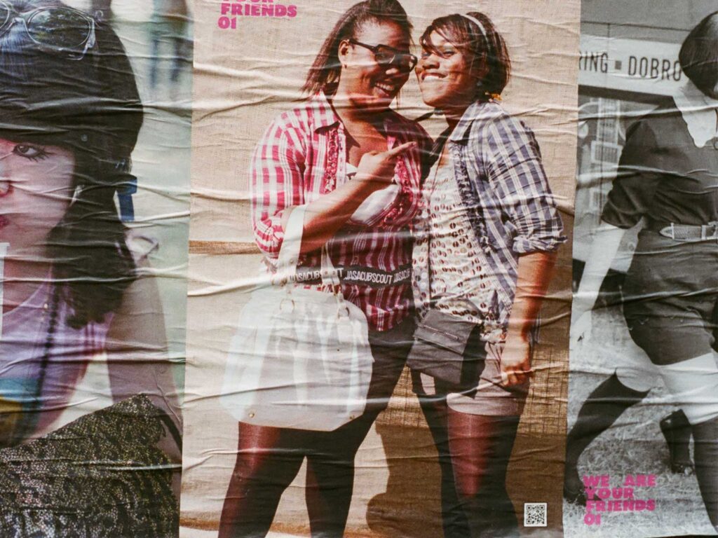
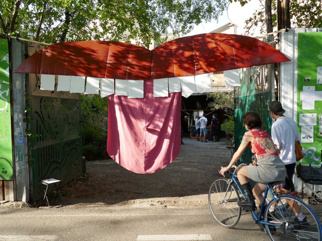
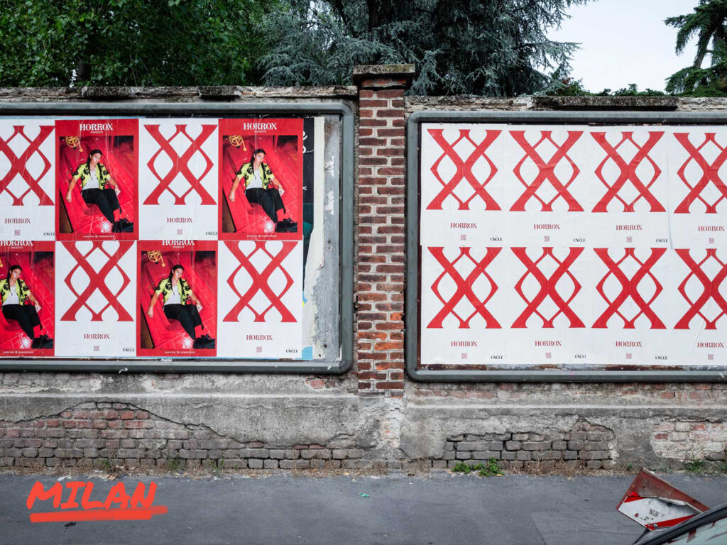
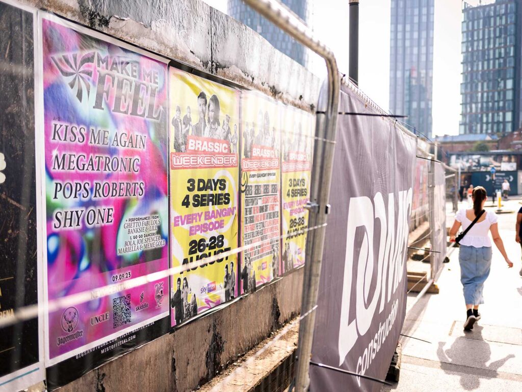
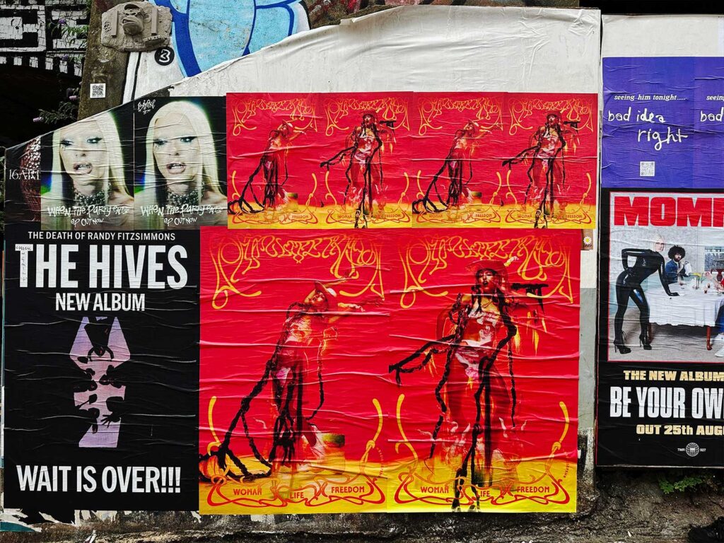
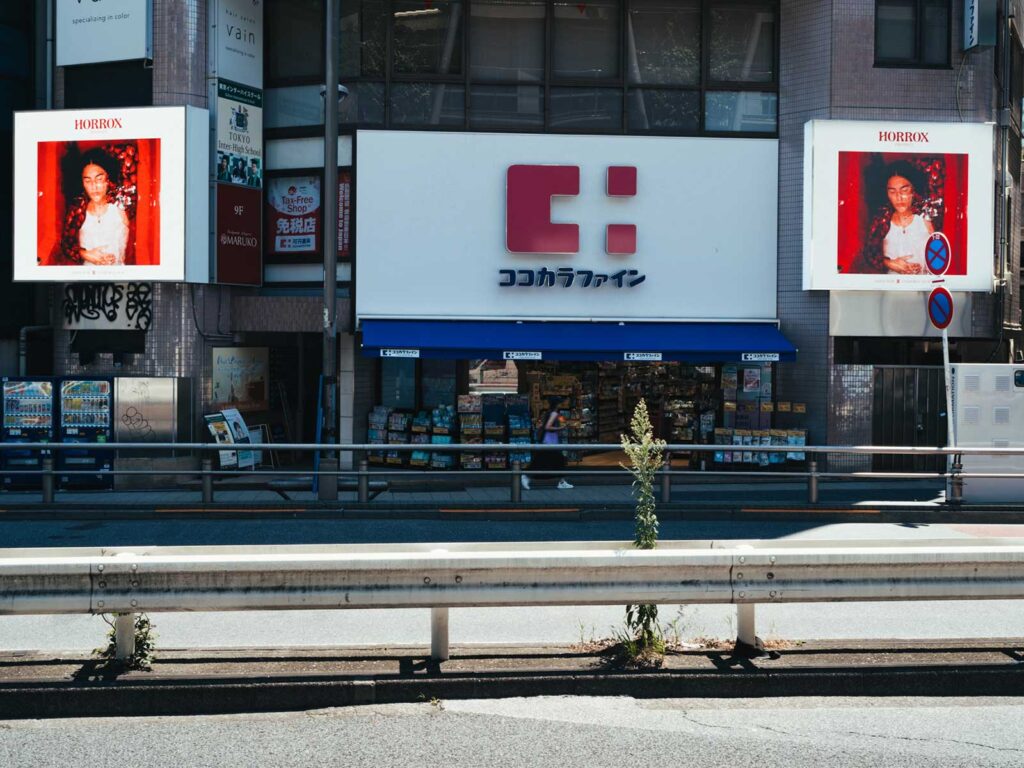
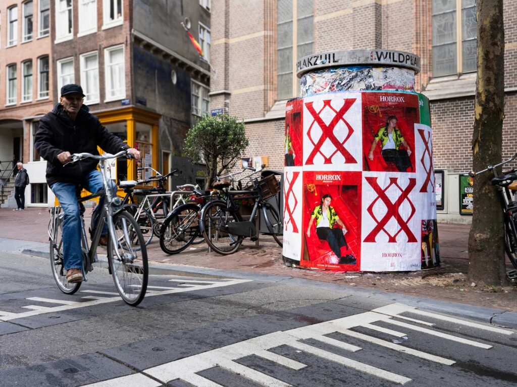
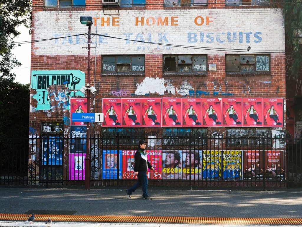
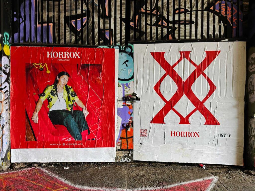
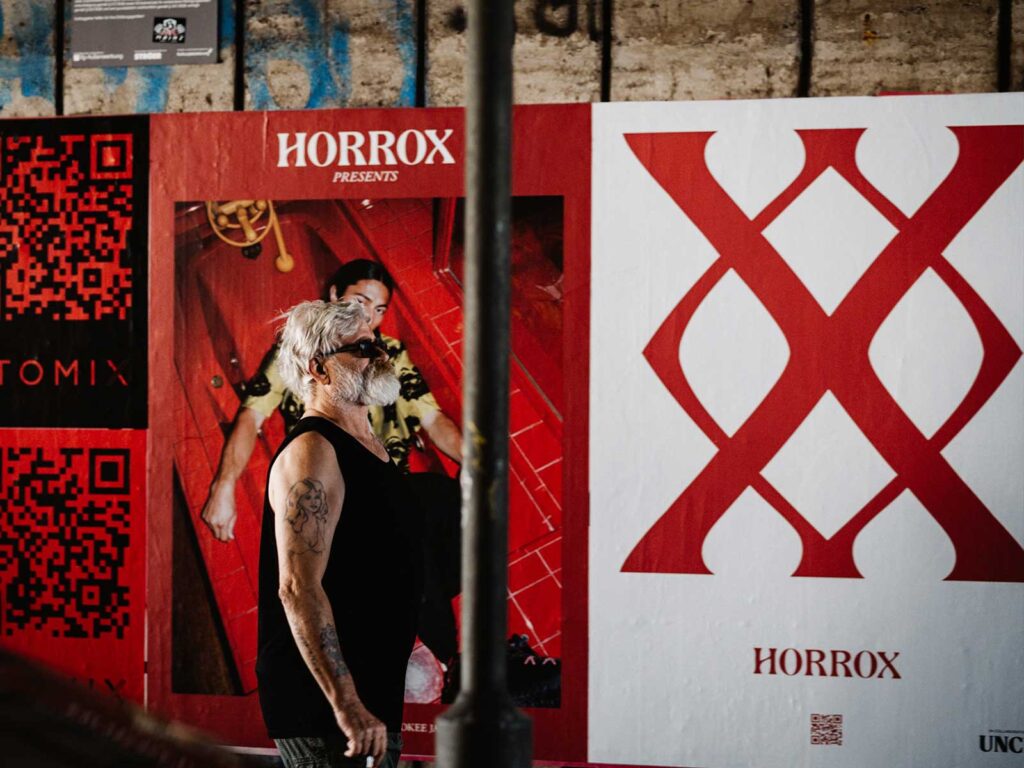
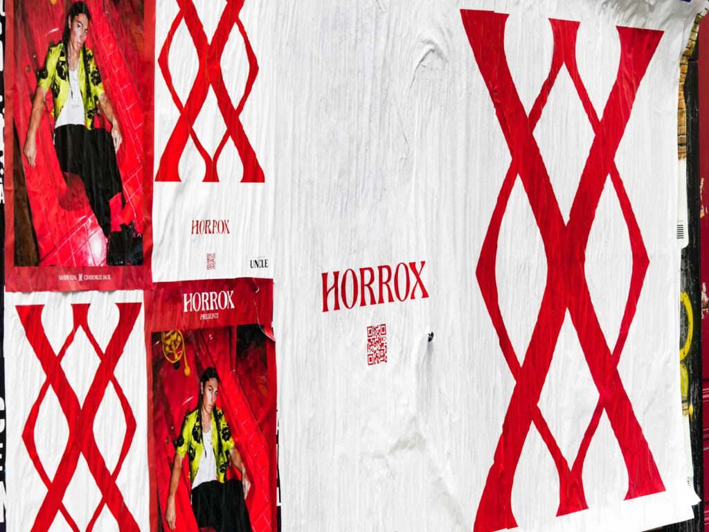
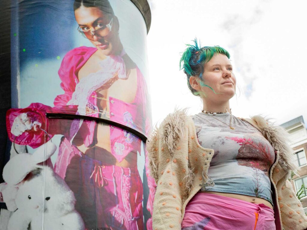
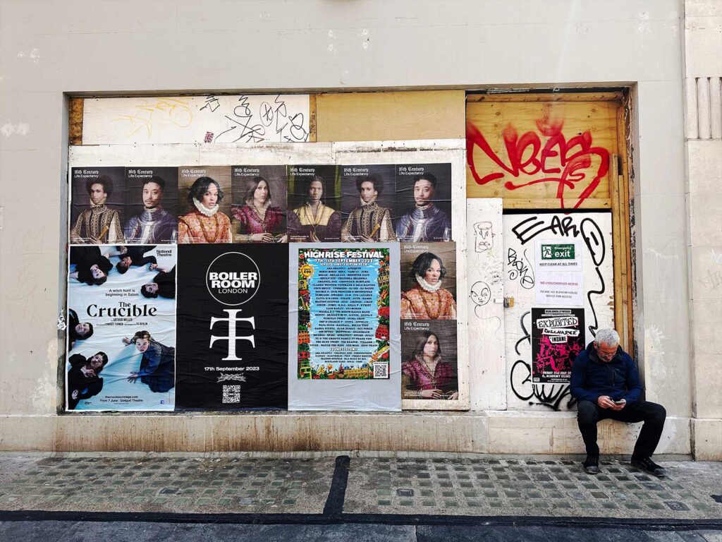
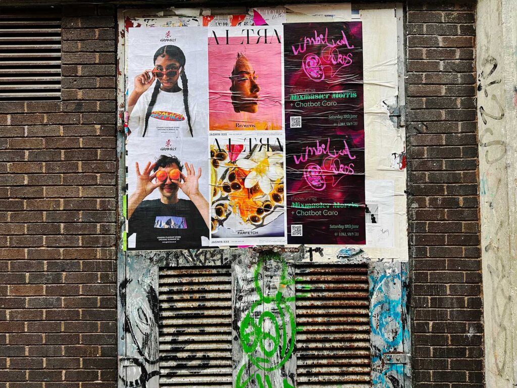
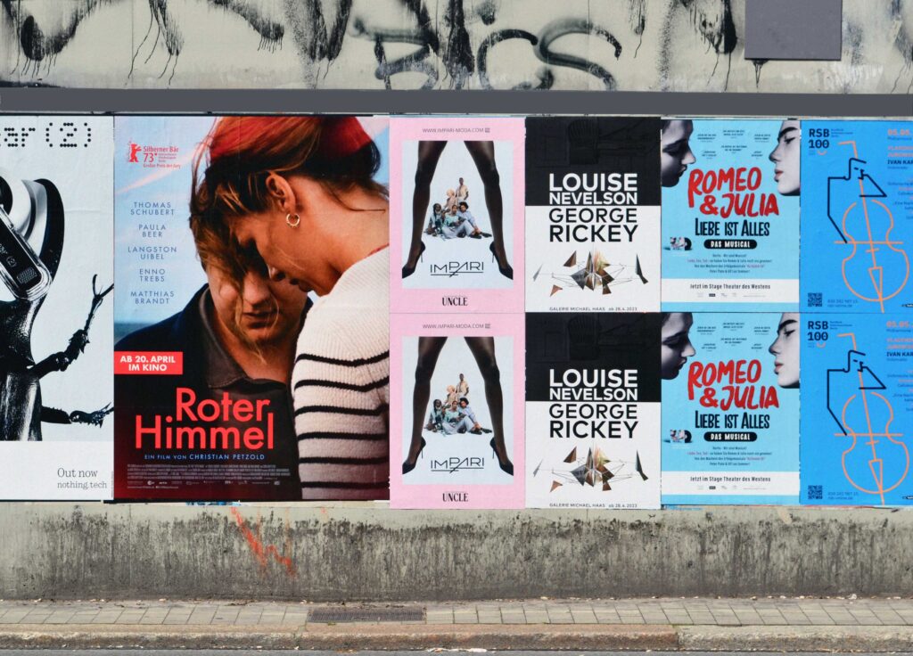
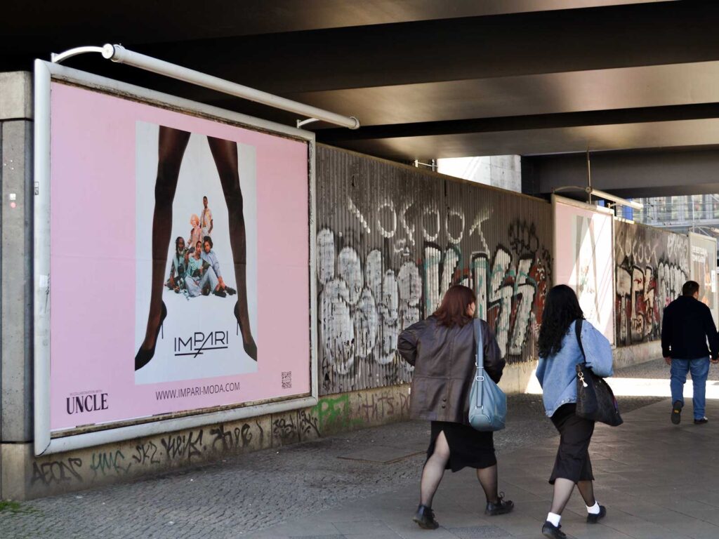
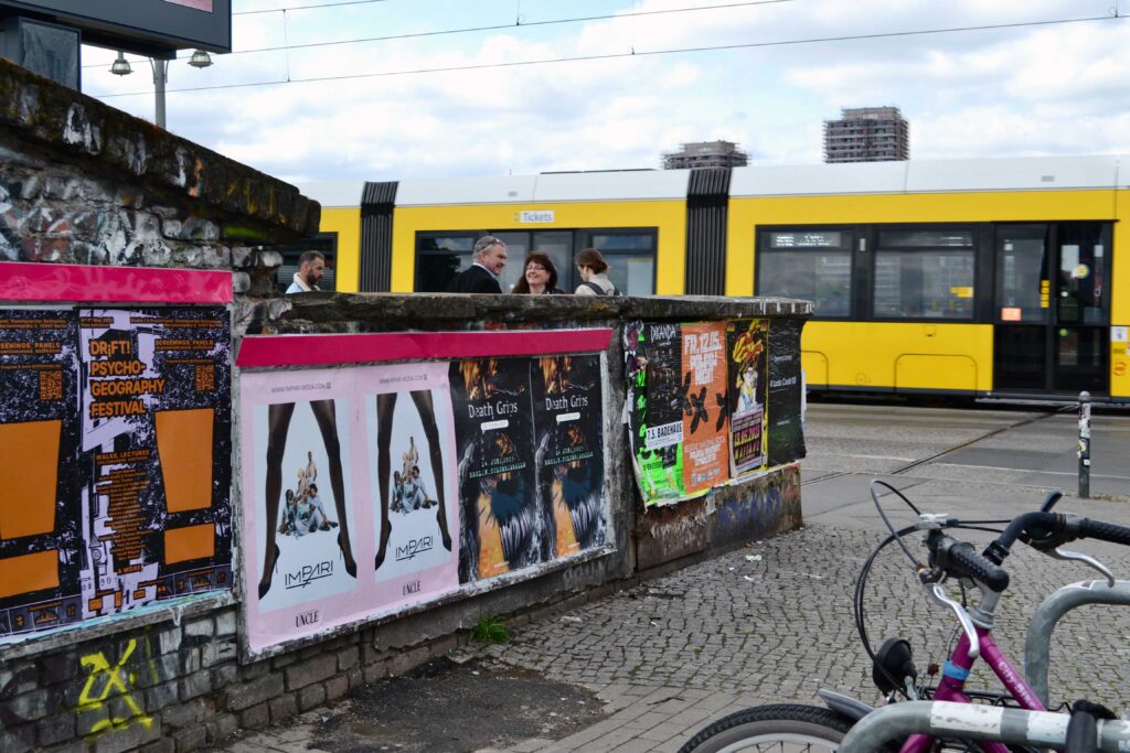
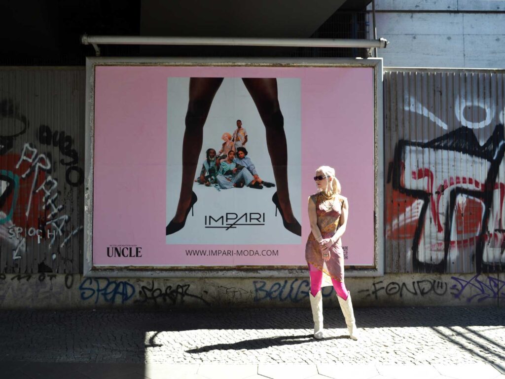
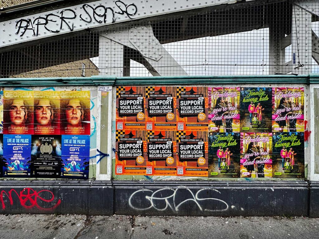
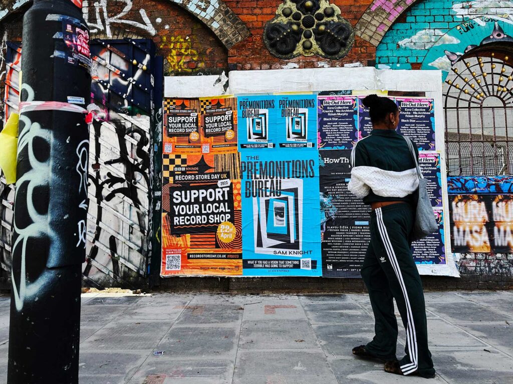
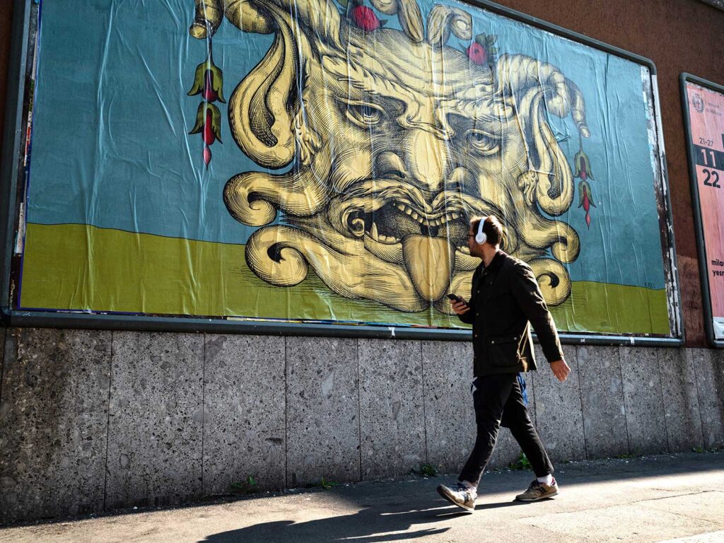
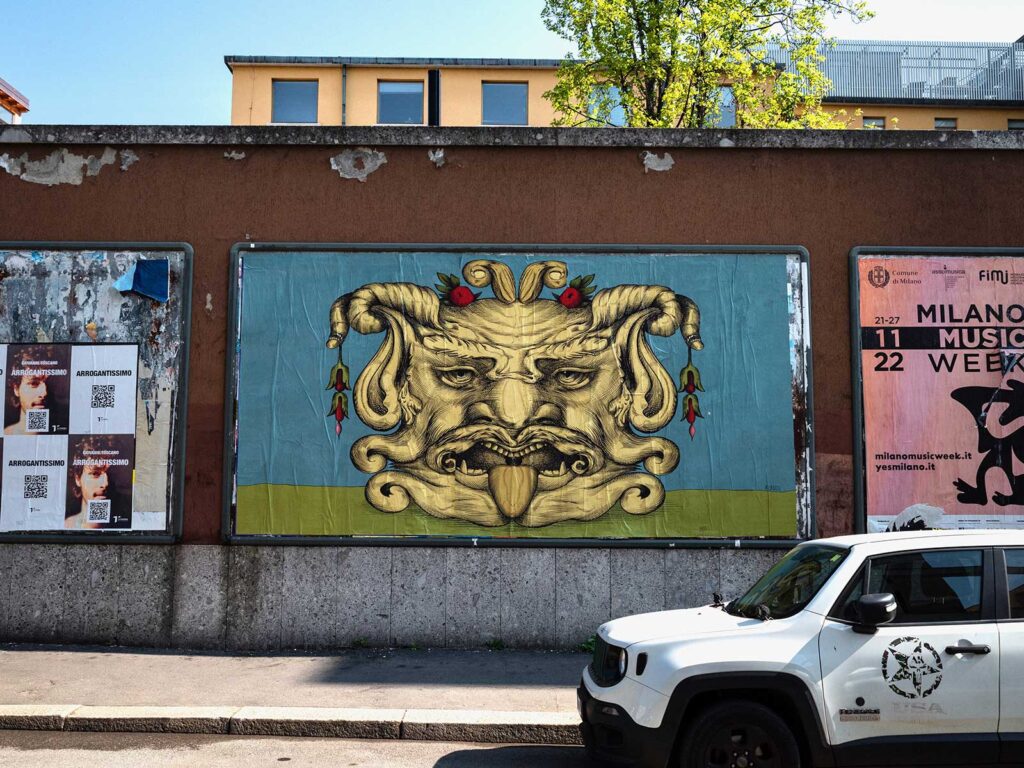
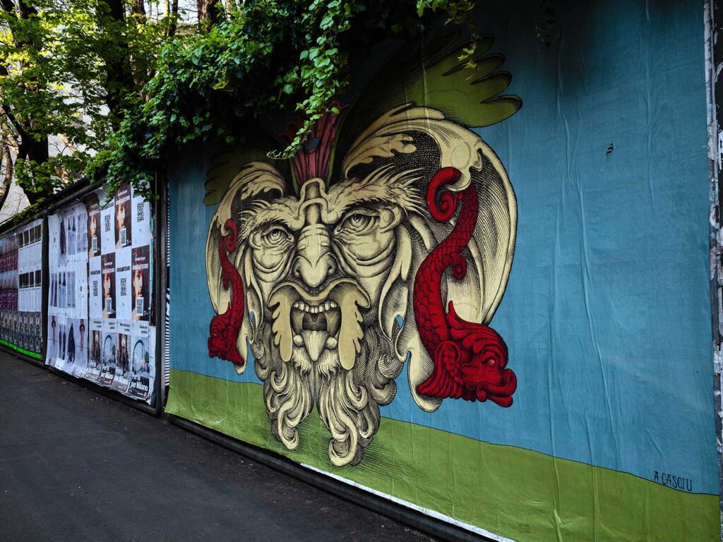
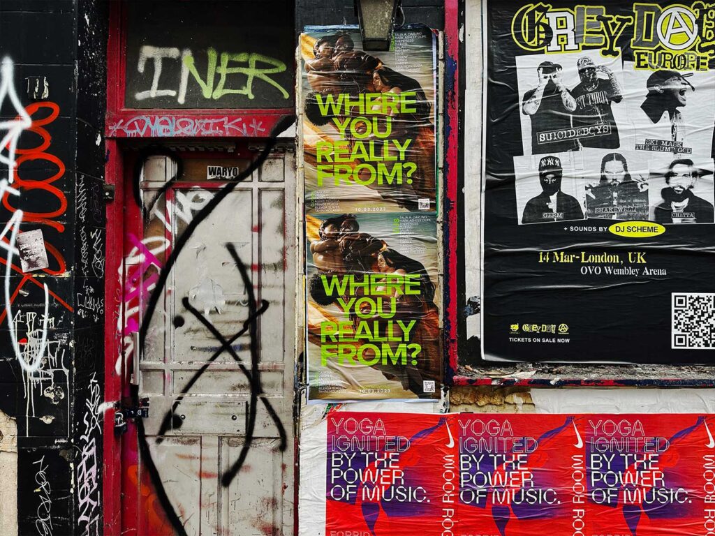
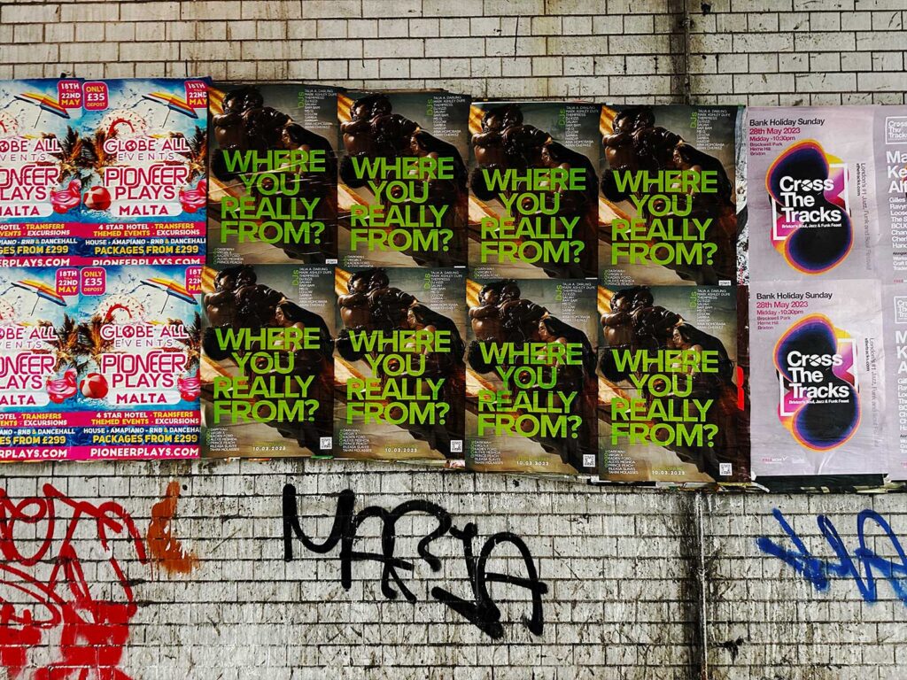
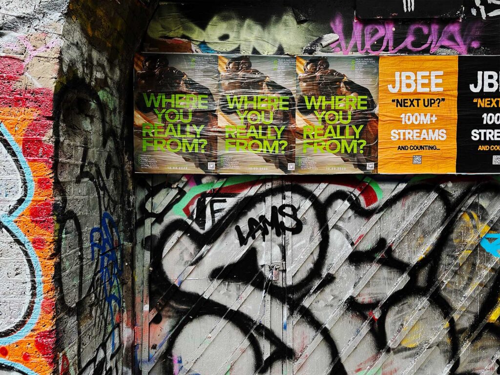
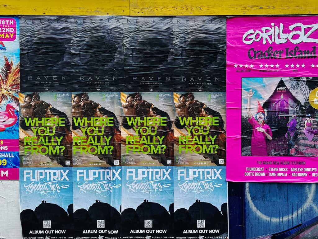
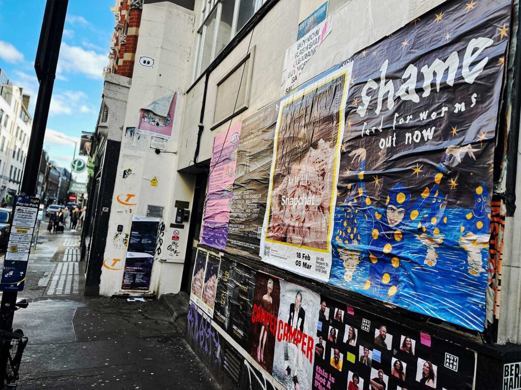
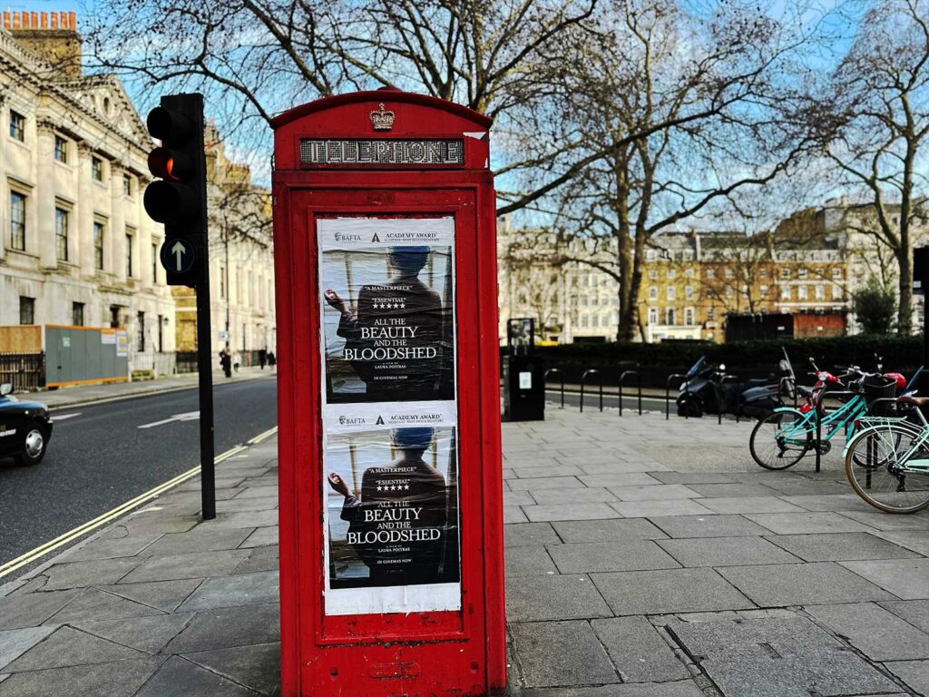
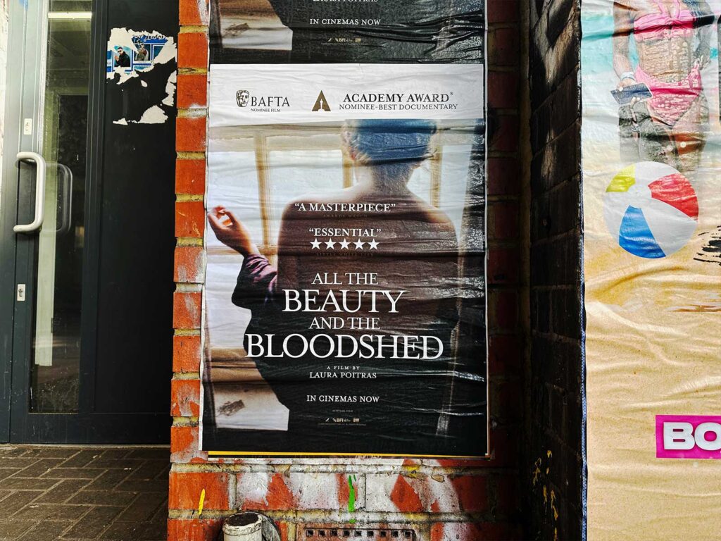
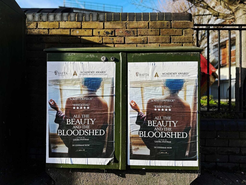
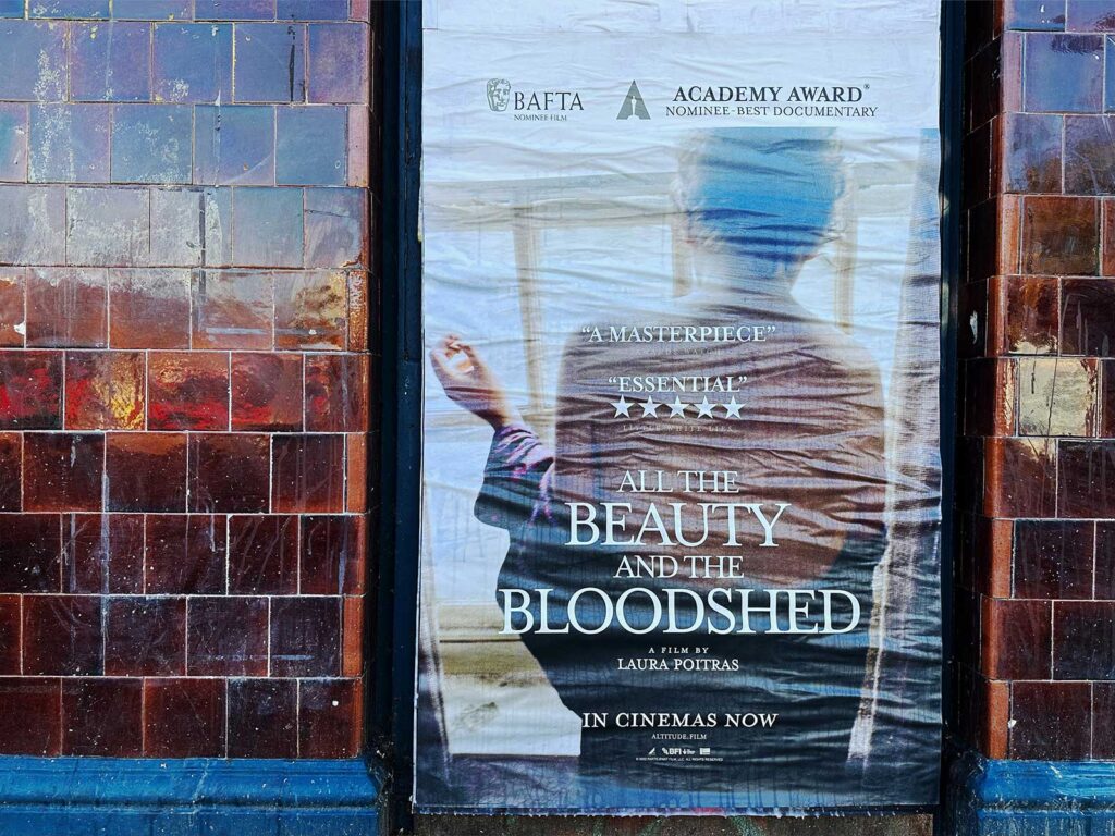
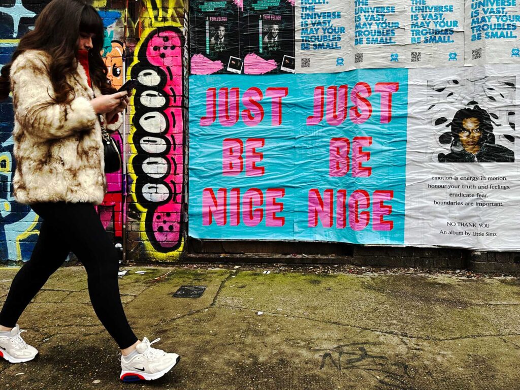
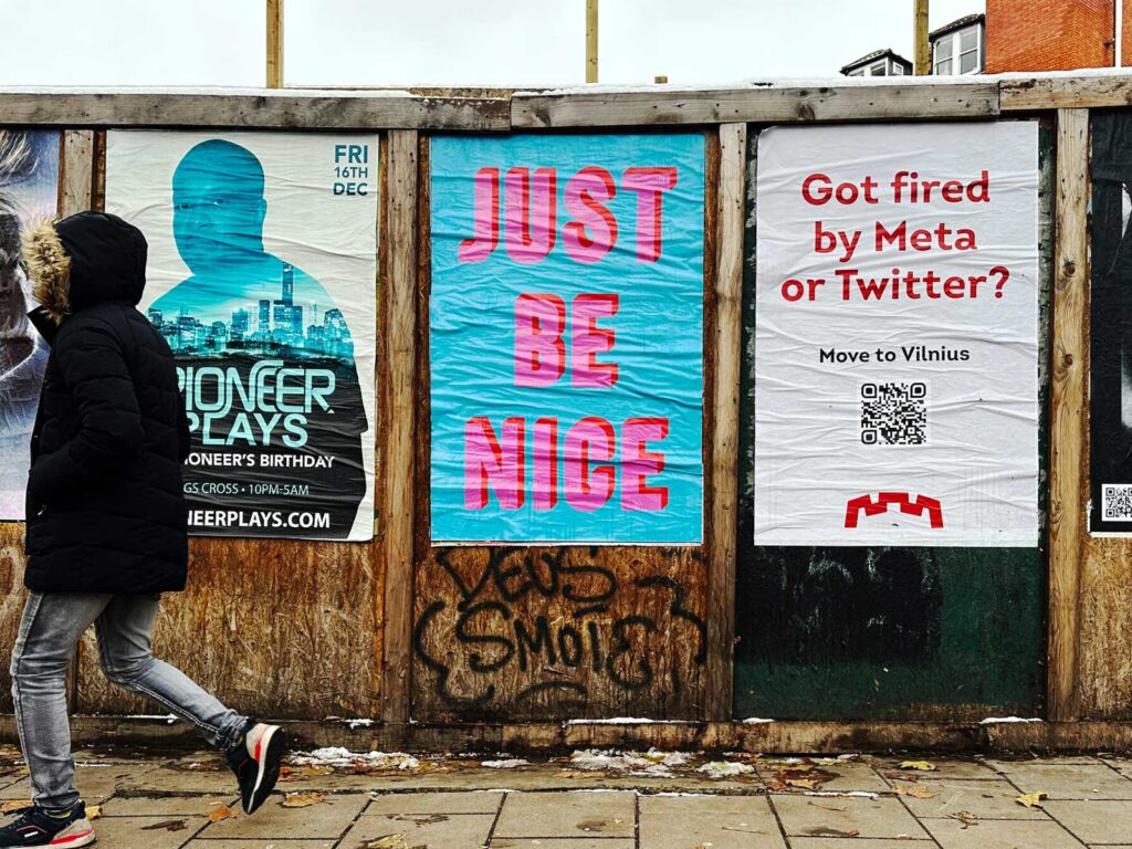
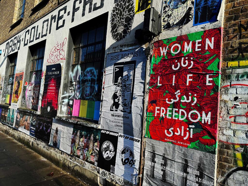
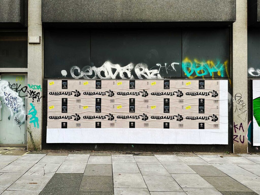
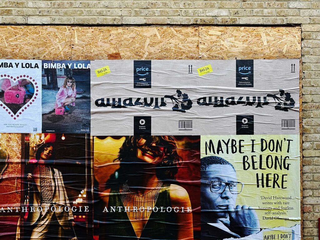
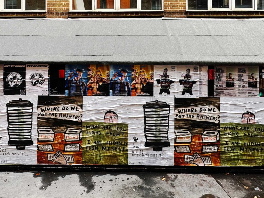
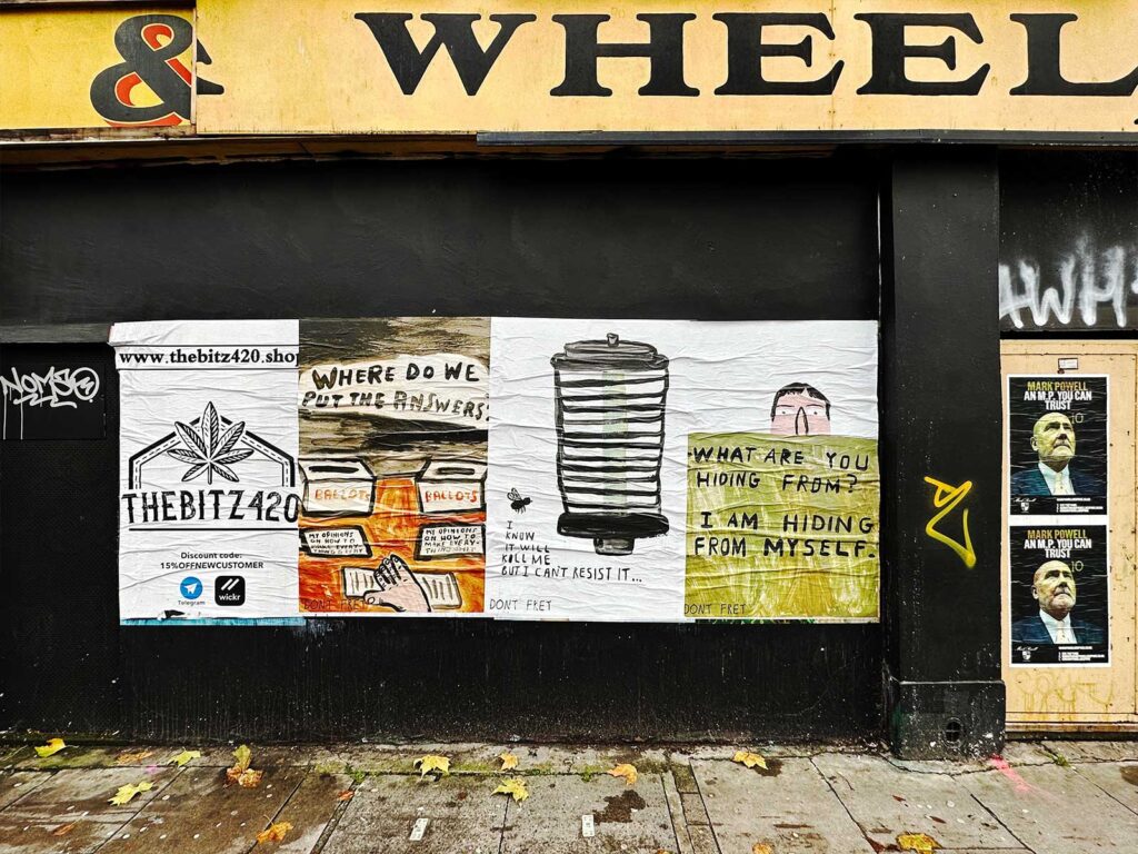
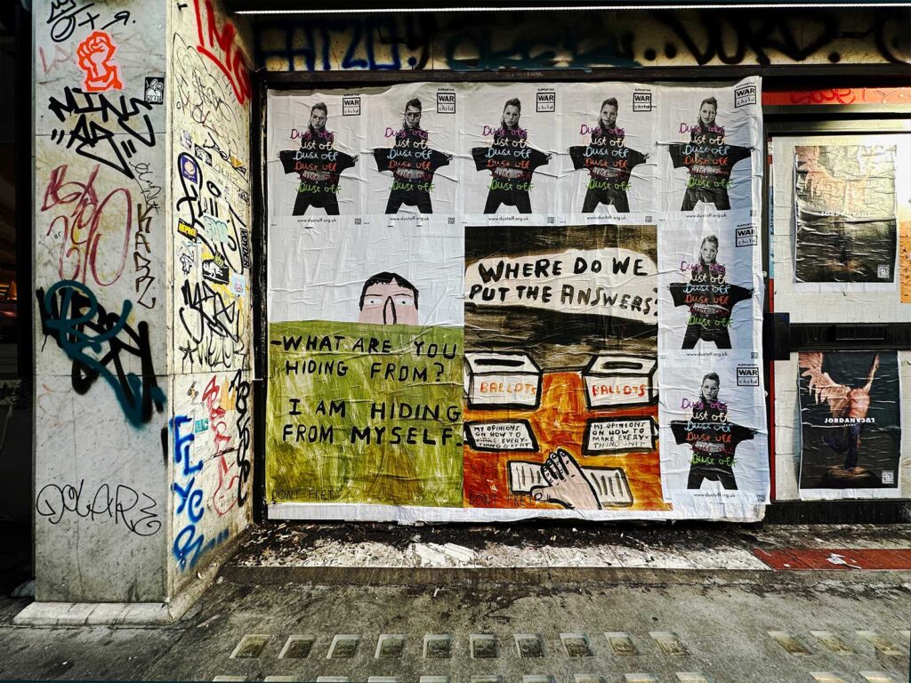
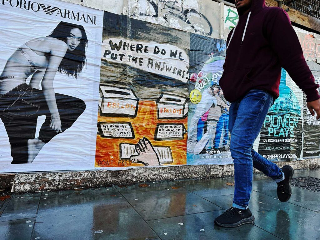
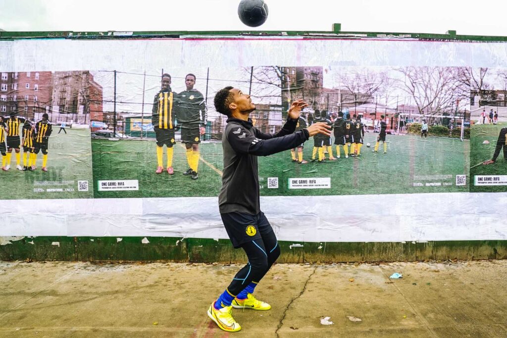
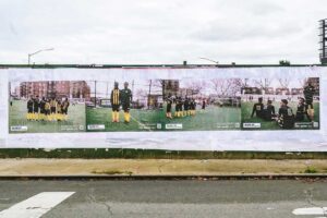
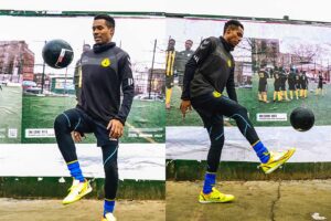
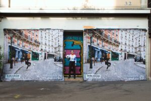
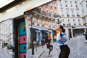
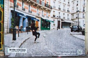
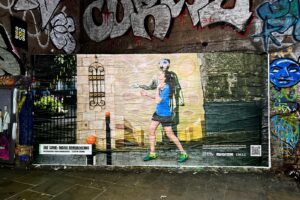
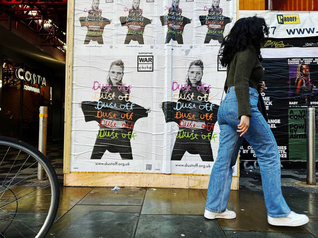
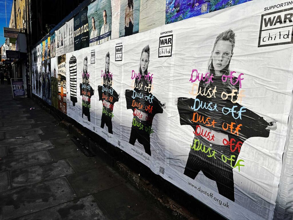
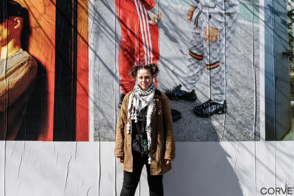
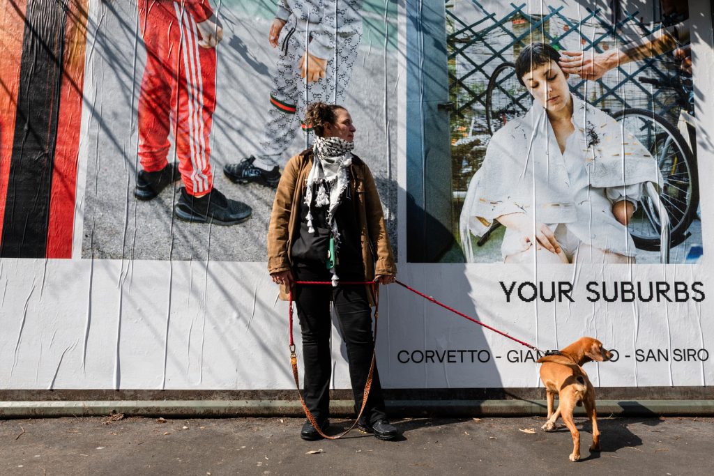
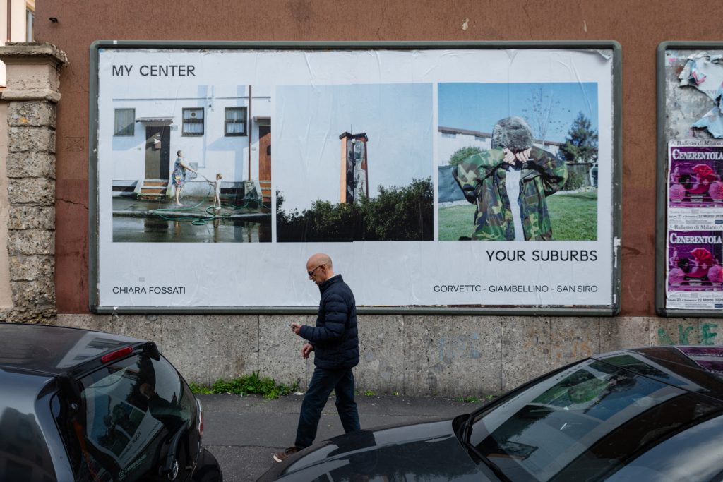
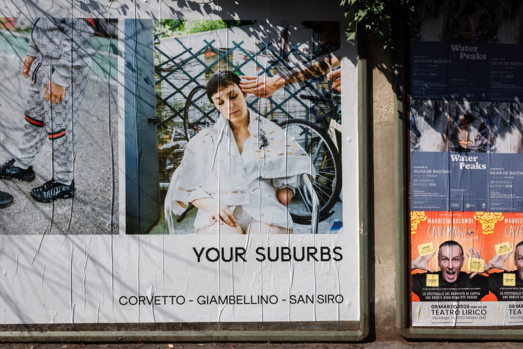
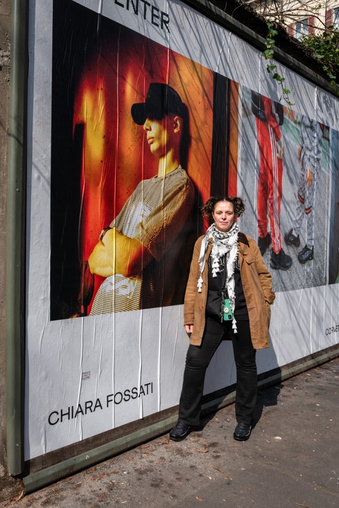
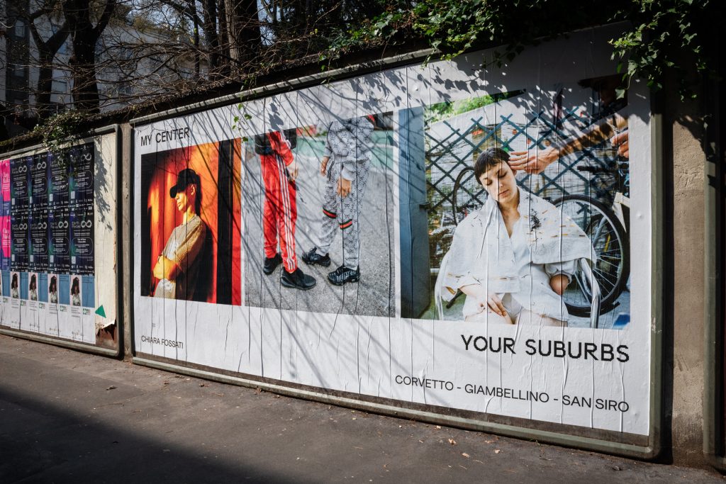
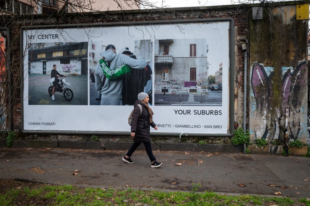
Wildposing her photographs with UNCLE in Milan brings Fossati’s portraits out of the outskirts and into the city centre. A reminder, in public, that the “other side” of the city is not an abstract idea, but people: living, growing up, looking after one other, and trying to be seen properly.
Born in Legnano in 1984 and now long since based in Milan, Fossati is a member of CESURA, the Italian photo collective and independent group built on shared skills, independent publishing, and the kind of support system photography often needs to survive as a long-term practice. “Photography is a very lonely work. So we create a sort of net,” she says.
That sense of community matters to how Fossati works, and so does place. She lives and works in Milan’s outskirts, neighbourhoods that can often be reduced to stereotypes from the outside — or, more so, from within the city centre. “People from the centre are scared of the outskirts, and a lot of it is about communication.”
Fossati’s work pushes back against that distance. Not by dressing things up, and not by chasing shock. Her images are built through time, trust, and conversation. The kind of approach where people feel involved, not taken from. The result is photographs that hold softness without ever feeling too sentimental: attentive to gesture, to presence, and to the everyday realities that rarely get given space.
Projects like Whatever, Villaggio dei Fiori and Comete! feature portraits of ravers, teenagers, and communities in Milan’s outer neighbourhoods, photographed without shock value or struggle-as-aesthetic. These are not Chiara’s subjects; they are her neighbours.
In a city sold internationally as fast, fashionable, and polished, Fossati’s photographs are a reminder that Milan is also made in stairwells, courtyards, bus stops, basketball courts — the everyday spaces where life happens without an audience. Her work has been recognised in Italy’s contemporary photography world (including prizes for Villaggio dei Fiori
and Comete!), and she has also published her first book, Whatever, through CESURA’s own publishing arm.
Wildposing her photographs with UNCLE in Milan brings Fossati’s portraits out of the outskirts and into the city centre. A reminder, in public, that the “other side” of the city is not an abstract idea, but people: living, growing up, looking after one other, and trying to be seen properly.
WHAT FIRST DREW YOU TO PHOTOGRAPHY, AND WHEN DID IT START TO FEEL LIKE SOMETHING YOU WANTED TO COMMIT TO SERIOUSLY?
I think it started because I always felt a bit different from the others. Growing up outside a big city, I was often the strange one — different hair, different looks — and I always felt slightly out of place. From a young age, I wanted to travel, to move, to meet people, and see what was beyond where I grew up.
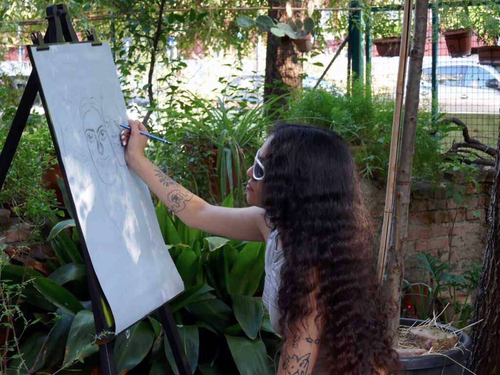
When I was at art high school, there was a darkroom, and I remember very vividly the first time I developed and printed my own photographs. Seeing that image appear, I felt like it was the closest thing to giving a real shape to what was already in my head. That moment really stayed with me.
I knew I wanted to be a photographer from around the age of fourteen, and that never changed, even when it was, and still is sometimes, very hard. It’s not the easiest job, and it doesn’t come with much security, but the freedom to follow what I’m interested in, and to do what I feel drawn to, has always mattered more to me than anything else.
YOU GREW UP IN THE SUBURBS AND LATER MOVED TO MILAN. HOW DID THOSE PLACES SHAPE THE WAY YOU LOOK AT PEOPLE AND EVERYDAY LIFE?
Growing up in the suburbs was important for me. Not living in a big city meant that many things felt out of reach, and I had to learn early on to go and get what I wanted by myself. That shaped the way I look at life with a sense of curiosity.
At first, Milan was somewhere I wanted to escape to. But later, I found myself living in the outskirts of the city again, in a council housing area in the west of Milan, where I still live today. Coming back to that environment changed everything for me.
What surprised me most was the sense of community. In Milan, it’s common not to know your neighbours at all, but here people brought me food, kids knocked on my door to say welcome, neighbours helped take care of my dog. I became part of everyday life — doing homework with children, sharing small moments — and photographing it came very naturally from that.
Living there taught me to look more closely at what’s considered ordinary. The people, the routines, the relationships — these are the things that really shape how I see everyday life now, and they’ve become central to the way I work.
A LOT OF YOUR WORK IS ROOTED IN THE OUTSKIRTS OF MILAN. WHAT IS IT ABOUT THOSE AREAS THAT KEEPS PULLING YOU BACK?
I’ve always been drawn to people and subcultures that sit on the edges of society, probably because, in different ways, I’ve felt part of that myself. With the outskirts of Milan, that instinct became something much more personal, because it’s not a place I visit to “document.” It’s where I’m living, and where my everyday life happens.
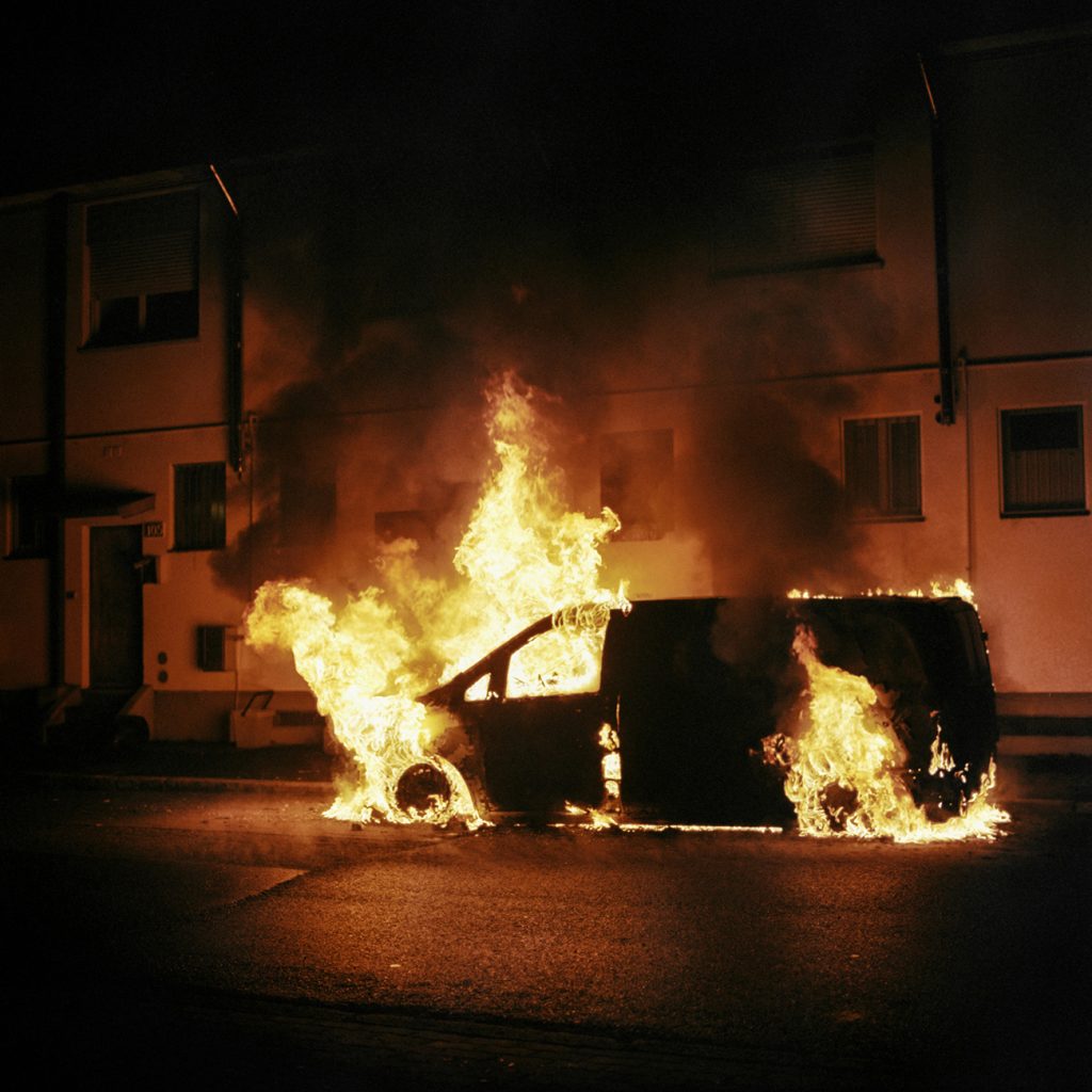
What keeps pulling me back is that these areas are constantly talked about from a distance, often with fear attached to them. Right now especially, there’s a lot of anxiety about the outskirts, and I think so much of it comes down to communication — stories being amplified, simplified, and repeated until people in the centre start imagining the outskirts as something dangerous.
So for me, photographing these places is partly about staying close to what’s real. Not making something sensational, but showing the full picture — the normal everyday things, and the people who live their lives here like anyone else.
MILAN IS OFTEN SEEN FROM THE OUTSIDE AS A FAST, FASHIONABLE, POLISHED CITY. WHAT DOES THE CITY FEEL LIKE FROM WHERE YOU’RE STANDING?
I think, like every city, Milan doesn’t have just one reality. There are many Milans happening at the same time. Of course, it’s the fashion capital, it’s fast, it has a polished surface, and there’s a lot of “cool” culture and people moving through it.
But at the same time, it’s also a city with social problems, and there’s this feeling that the municipality is trying to “clean up” the city so people from outside only experience that polished version.
From where I’m standing, the most important reality is that the people in the outskirts are not some separate world, they’re just like everyone else, doing normal everyday things, trying to have a voice and to be heard.
And personally, even though Milan can be expensive and not always the friendliest place socially, I still love parts of its physical character — the concrete, the street culture, street art, exhibitions — that vibrant feeling you get when you move through certain parts of the city.
LOOKING ACROSS WHATEVER, VILLAGGIO DEI FIORI AND COMETE, HOW DID THESE PROJECTS COME ABOUT? DID THEY GROW NATURALLY, OR DID YOU HAVE A CLEAR IDEA FROM THE START?
Usually, it’s the opposite of having a clear idea first. I might think I want to plan something, but most of the time, I find myself in a situation and then I realise, “Oh my God, this is so cool. This is so important. I want to talk about this.”
With Whatever, for example, it wasn’t like I set out to document rave culture. I was just taking pictures of my friends — and only later, looking back, I realised the photos were this really intimate glimpse into that world. It became a way to show that ravers aren’t “monsters” in abandoned buildings, but people. There’s humanity in it.
A lot of my projects start like that: life first, then the meaning reveals itself. And then, of course, once I recognise something is there, I put fuel on the fire. I commit to it and build it out.
I think it started because I always felt a bit different from the others. Growing up outside a big city, I was often the strange one — different hair, different looks — and I always felt slightly out of place. From a young age, I wanted to travel, to move, to meet people, and see what was beyond where I grew up.
When I was at art high school, there was a darkroom, and I remember very vividly the first time I developed and printed my own photographs. Seeing that image appear, I felt like it was the closest thing to giving a real shape to what was already in my head. That moment really stayed with me.
I knew I wanted to be a photographer from around the age of fourteen, and that never changed, even when it was, and still is sometimes, very hard. It’s not the easiest job, and it doesn’t come with much security, but the freedom to follow what I’m interested in, and to do what I feel drawn to, has always mattered more to me than anything else.
YOU GREW UP IN THE SUBURBS AND LATER MOVED TO MILAN. HOW DID THOSE PLACES SHAPE THE WAY YOU LOOK AT PEOPLE AND EVERYDAY LIFE?
Growing up in the suburbs was important for me. Not living in a big city meant that many things felt out of reach, and I had to learn early on to go and get what I wanted by myself. That shaped the way I look at life with a sense of curiosity.
At first, Milan was somewhere I wanted to escape to. But later, I found myself living in the outskirts of the city again, in a council housing area in the west of Milan, where I still live today. Coming back to that environment changed everything for me.
What surprised me most was the sense of community. In Milan, it’s common not to know your neighbours at all, but here people brought me food, kids knocked on my door to say welcome, neighbours helped take care of my dog. I became part of everyday life — doing homework with children, sharing small moments — and photographing it came very naturally from that.
Living there taught me to look more closely at what’s considered ordinary. The people, the routines, the relationships — these are the things that really shape how I see everyday life now, and they’ve become central to the way I work.
A LOT OF YOUR WORK IS ROOTED IN THE OUTSKIRTS OF MILAN. WHAT IS IT ABOUT THOSE AREAS THAT KEEPS PULLING YOU BACK?
I’ve always been drawn to people and subcultures that sit on the edges of society, probably because, in different ways, I’ve felt part of that myself. With the outskirts of Milan, that instinct became something much more personal, because it’s not a place I visit to “document.” It’s where I’m living, and where my everyday life happens.
What keeps pulling me back is that these areas are constantly talked about from a distance, often with fear attached to them. Right now especially, there’s a lot of anxiety about the outskirts, and I think so much of it comes down to communication — stories being amplified, simplified, and repeated until people in the centre start imagining the outskirts as something dangerous.
So for me, photographing these places is partly about staying close to what’s real. Not making something sensational, but showing the full picture — the normal everyday things, and the people who live their lives here like anyone else.
MILAN IS OFTEN SEEN FROM THE OUTSIDE AS A FAST, FASHIONABLE, POLISHED CITY. WHAT DOES THE CITY FEEL LIKE FROM WHERE YOU’RE STANDING?
I think, like every city, Milan doesn’t have just one reality. There are many Milans happening at the same time. Of course, it’s the fashion capital, it’s fast, it has a polished surface, and there’s a lot of “cool” culture and people moving through it.
But at the same time, it’s also a city with social problems, and there’s this feeling that the municipality is trying to “clean up” the city so people from outside only experience that polished version.
From where I’m standing, the most important reality is that the people in the outskirts are not some separate world, they’re just like everyone else, doing normal everyday things, trying to have a voice and to be heard.
And personally, even though Milan can be expensive and not always the friendliest place socially, I still love parts of its physical character — the concrete, the street culture, street art, exhibitions — that vibrant feeling you get when you move through certain parts of the city.
LOOKING ACROSS WHATEVER, VILLAGGIO DEI FIORI AND COMETE, HOW DID THESE PROJECTS COME ABOUT? DID THEY GROW NATURALLY, OR DID YOU HAVE A CLEAR IDEA FROM THE START?
Usually, it’s the opposite of having a clear idea first. I might think I want to plan something, but most of the time, I find myself in a situation and then I realise, “Oh my God, this is so cool. This is so important. I want to talk about this.”
With Whatever, for example, it wasn’t like I set out to document rave culture. I was just taking pictures of my friends — and only later, looking back, I realised the photos were this really intimate glimpse into that world. It became a way to show that ravers aren’t “monsters” in abandoned buildings, but people. There’s humanity in it.
A lot of my projects start like that: life first, then the meaning reveals itself. And then, of course, once I recognise something is there, I put fuel on the fire. I commit to it and build it out.
COMETE FOCUSES ON TEENAGERS AND YOUNG PEOPLE AT A VERY SPECIFIC MOMENT IN THEIR LIVES. WHAT MADE YOU WANT TO SPEND TIME WITH THIS AGE GROUP?
I’ve always been fascinated by teenagers. It’s such an important moment in everyone’s life; everything can still happen, you’re doing things for the first time, and you’re still figuring out what kind of person you’re going to be.
And honestly, I don’t know why, but after a certain age, adults completely forget what it was like. It’s like they cancel it from their brains.
With Comete, I was especially curious about what it means to be a teenager now — particularly a female teenager — with social networks, the pace of communication, and everything happening in the world. So I started stopping girls in the street, interviewing them, and making portraits. Now I have so many portraits and interviews, and I want to turn it into a book.
THERE’S A REAL SOFTNESS AND HONESTY IN THE WAY PEOPLE APPEAR IN YOUR IMAGES. HOW DO YOU CREATE THE SPACE FOR THAT TO HAPPEN?
That softness comes from connection. The conversation is what makes the portrait possible — it creates trust, and it lets the image come from something deeper than the surface.
It’s also why Comete was a different experience for me. It’s the first time I’ve gone out stopping people I didn’t already know. But even there, I still needed the talking first. Because it isn’t about catching someone looking “cool,” or styling, or aesthetics. I’m interested in gesture, and what people reveal when they feel seen rather than observed.
YOUR WORK OFTEN SHOWS COMMUNITIES THAT ARE EASY TO STEREOTYPE FROM THE OUTSIDE. HOW DO YOU THINK ABOUT REPRESENTATION WHEN WORKING IN THESE SPACES?
I think about it a lot because it’s very easy to take a picture and accidentally confirm what people already believe. And most of the time, what people “believe” about certain communities is built from distance, fear, and repetition.
So for me, representation starts with responsibility. I try to stay close to what’s real and human, rather than what’s dramatic. I’m not interested in the sensational image, I’m interested in the everyday: families, kids, small moments, gesture, tenderness. Those details are what break stereotypes.
And it also comes back to how I’m making the image. I don’t want the camera to become a shield. I want people to feel involved, not taken from – like they’re part of the project rather than just being used as “subjects.” The conversation matters because it keeps the work grounded in a relationship, not just observation.
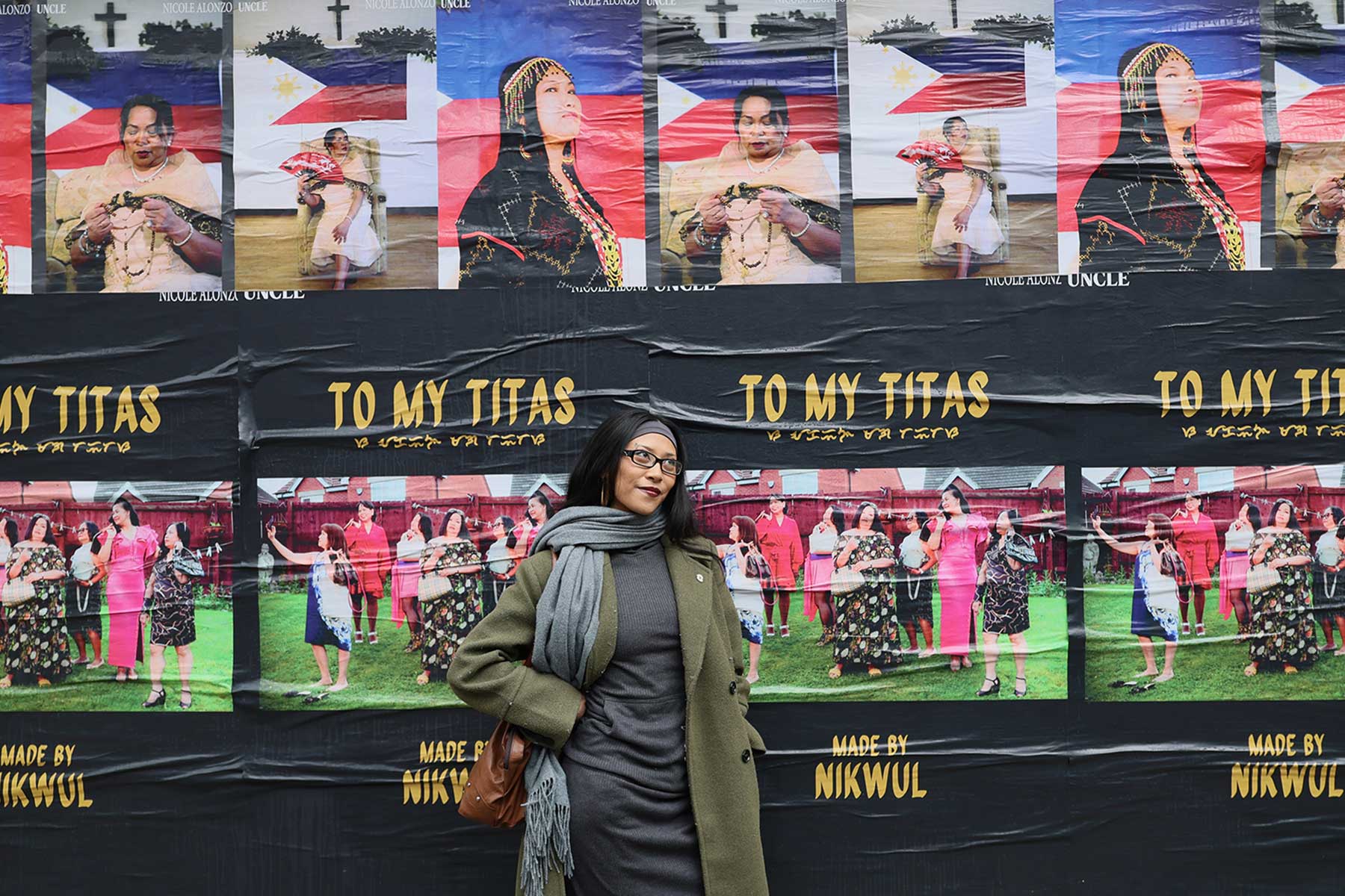
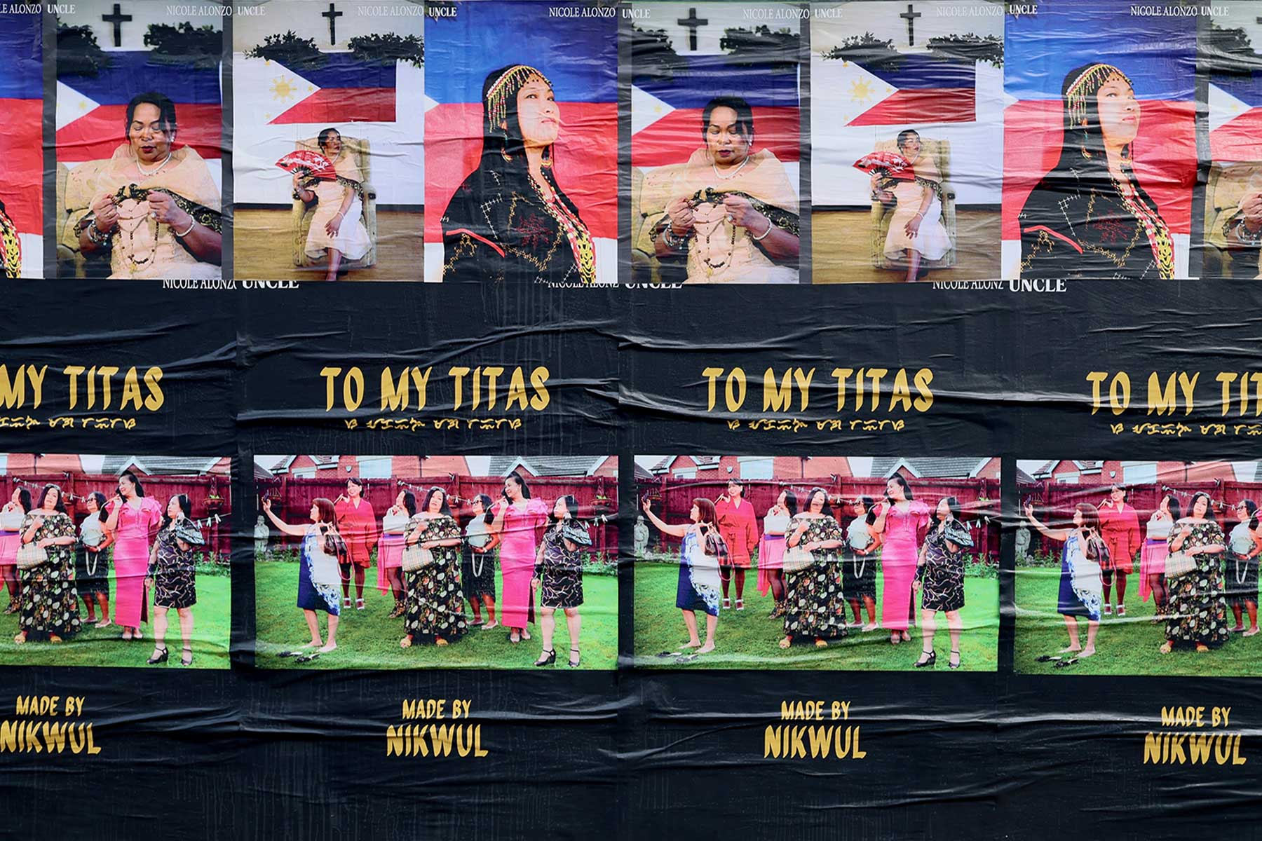
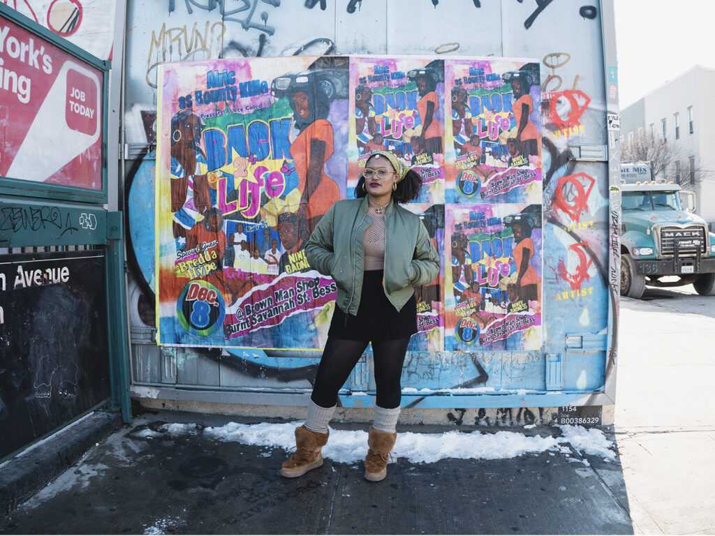
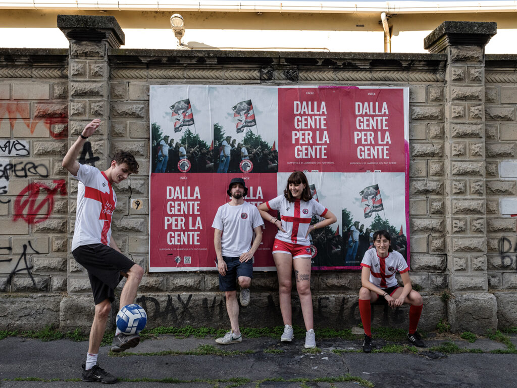
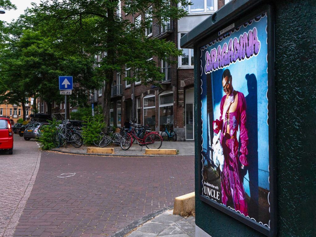
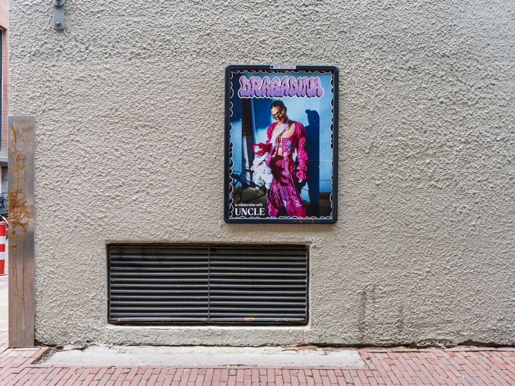
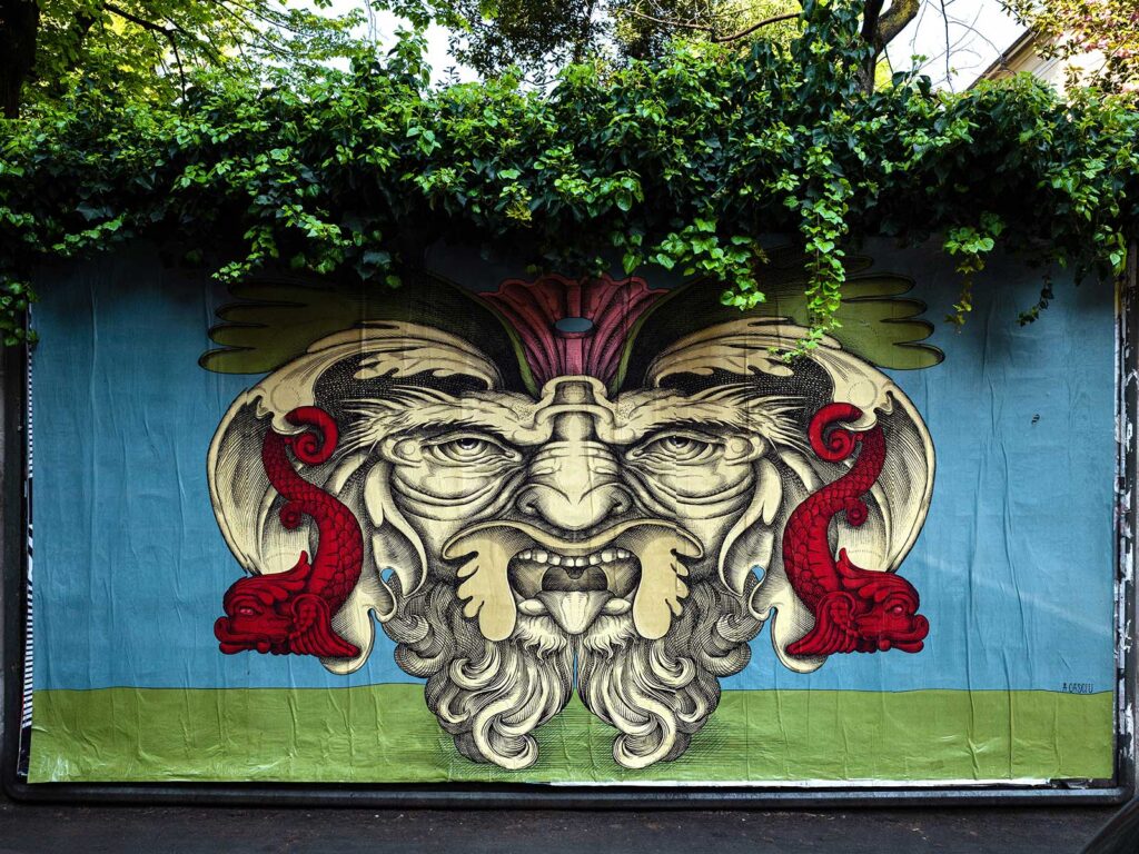
TELL US ABOUT THE PROJECT YOU’RE PUTTING ON THE WALLS OF MILAN WITH UNCLE…
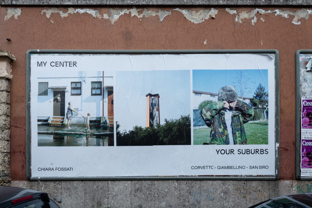
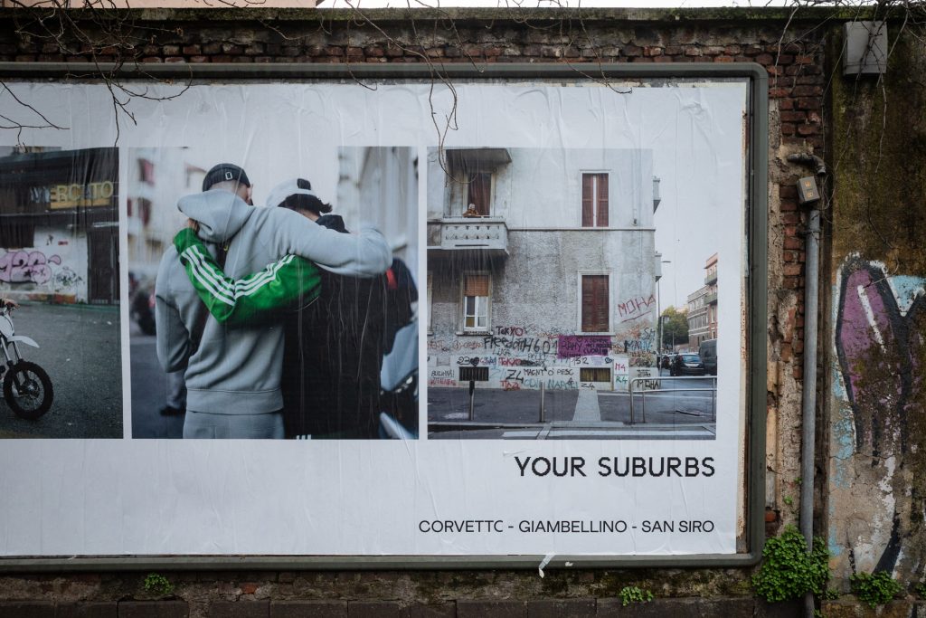
The images I’m bringing to this collaboration are a mixture of my long-term project in the suburb where I live, alongside photographs made in other outskirts of Milan.
They’re portraits of normal people — neighbours, families, young people – and what matters most to me is breaking the prejudice that a lot of people in Milan still have about the outskirts. There’s so much fear: that people are dangerous, criminals, untrustworthy. But in reality, they’re just families, with kids, with struggles… and most of those struggles don’t come from anything they’ve “done,” but from life itself.
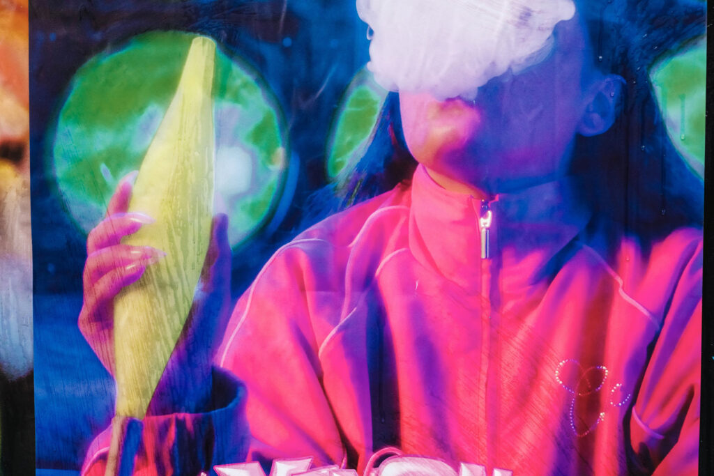
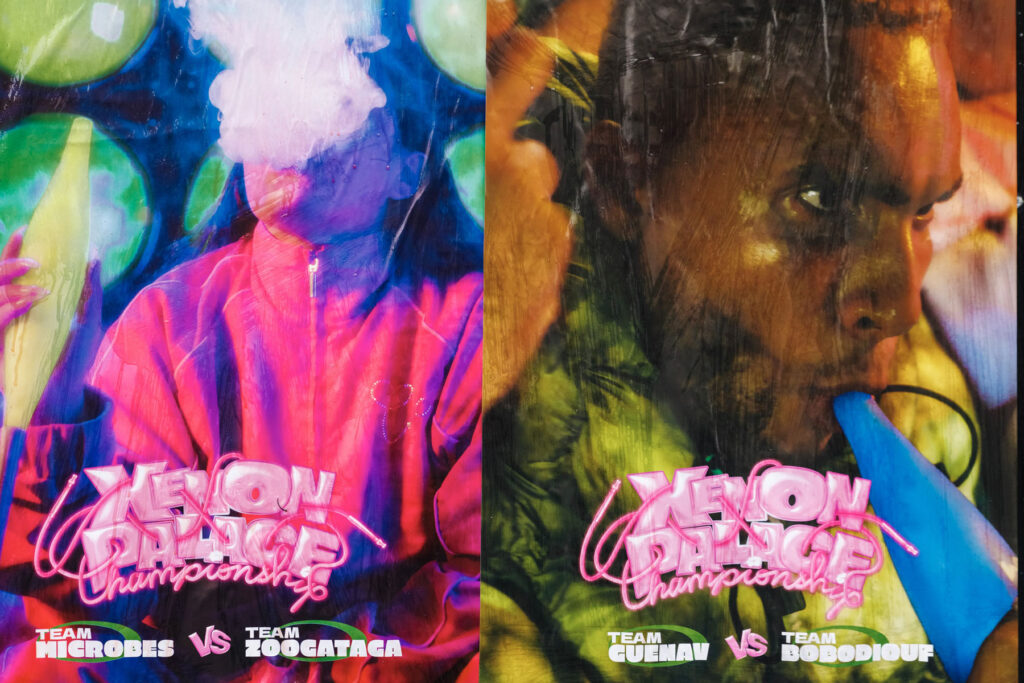
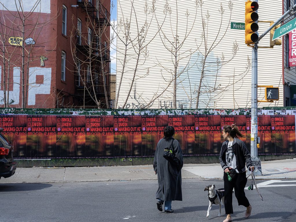
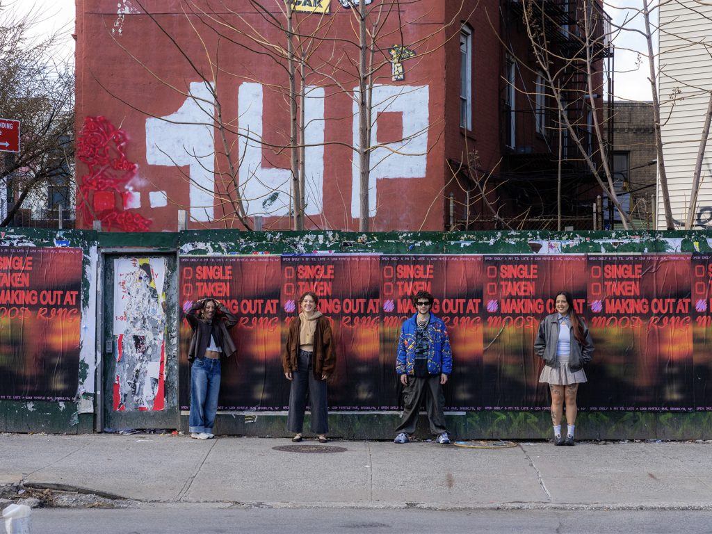
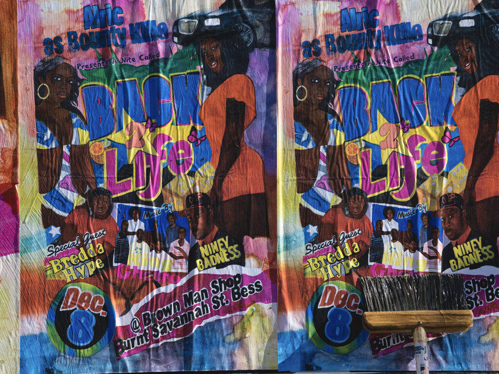
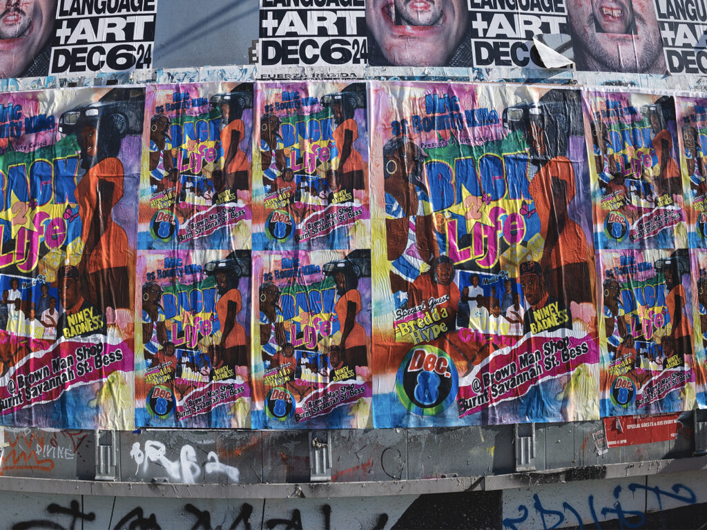
For the posters, I wanted the image to feel central, but I also wanted to include the name of the neighbourhood where it was taken.
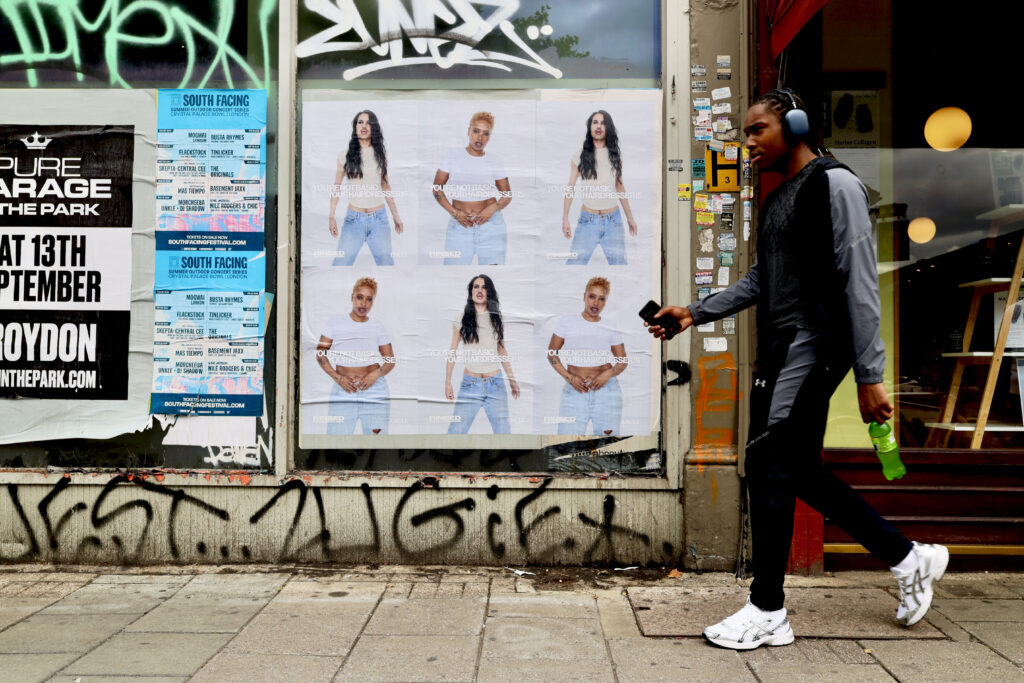
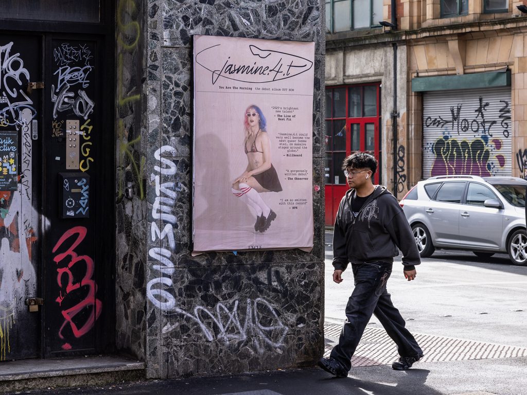
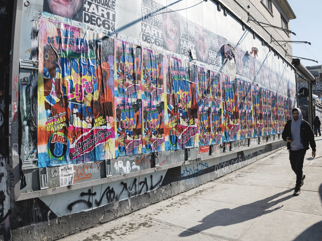
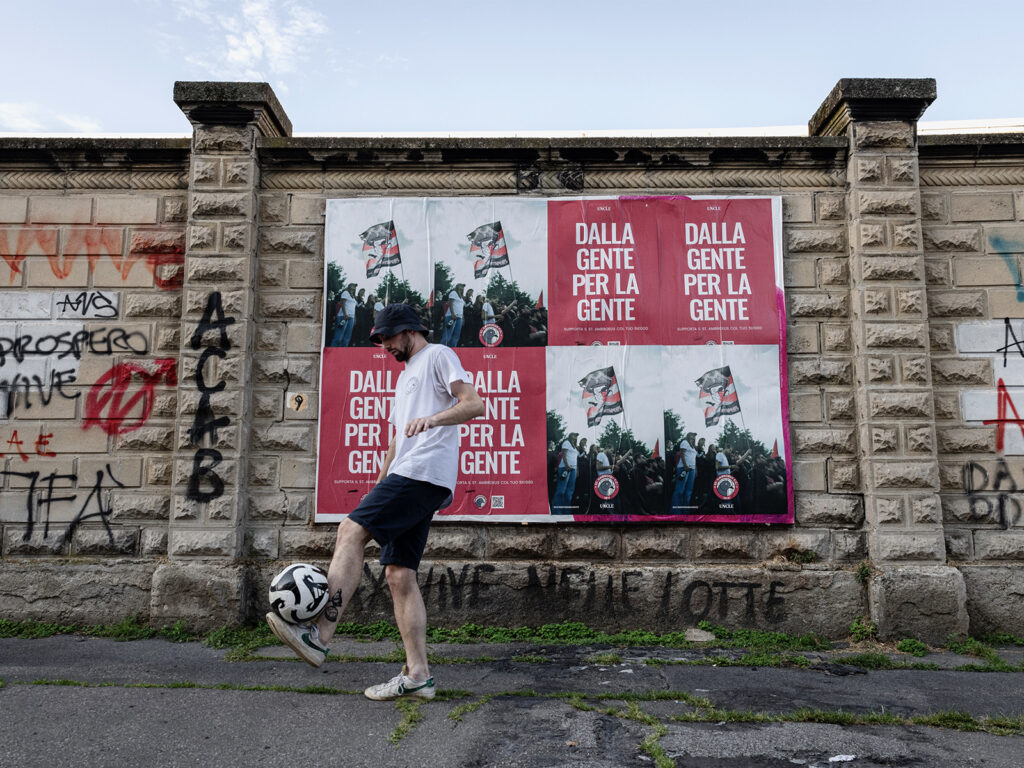
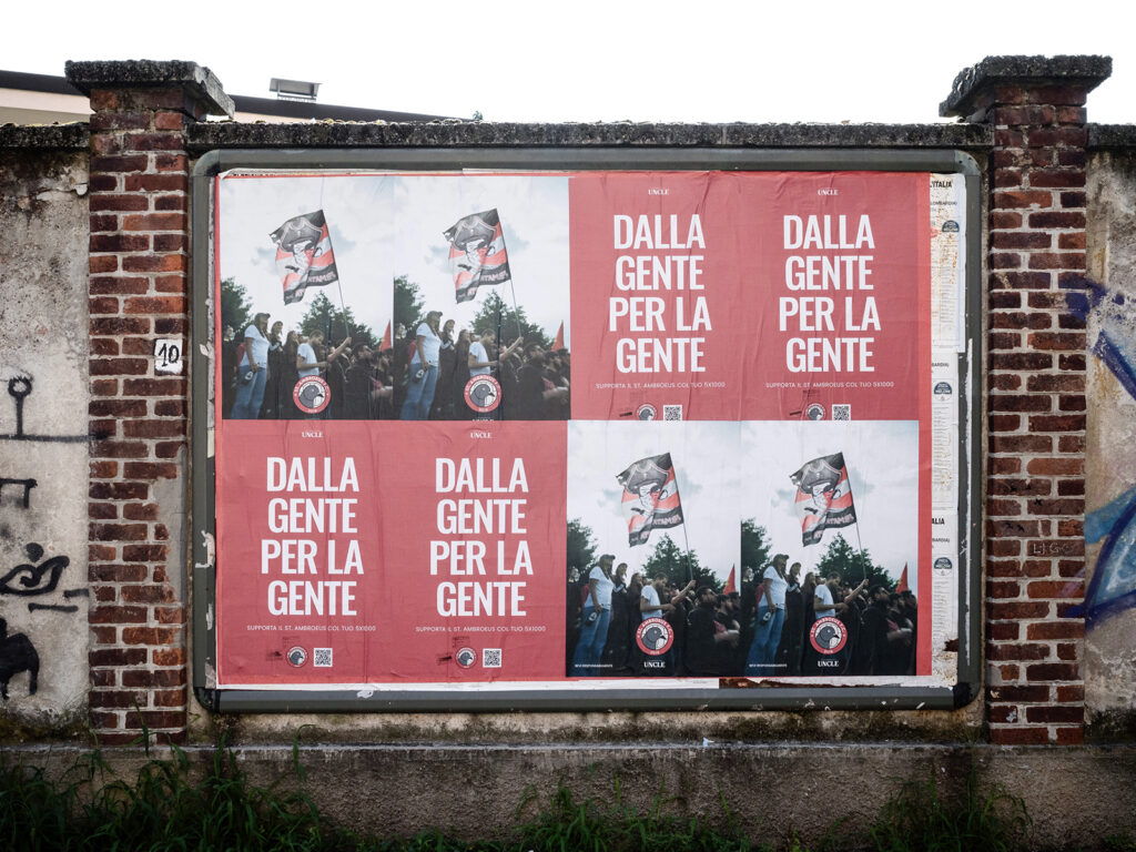
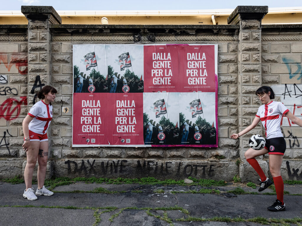
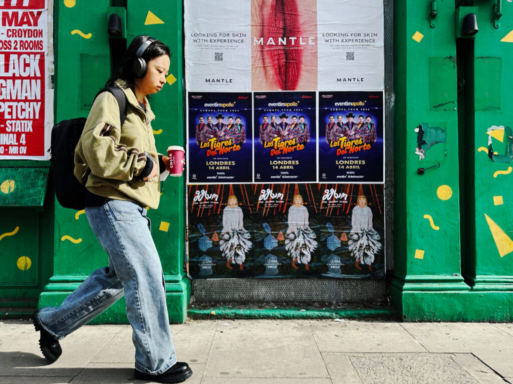
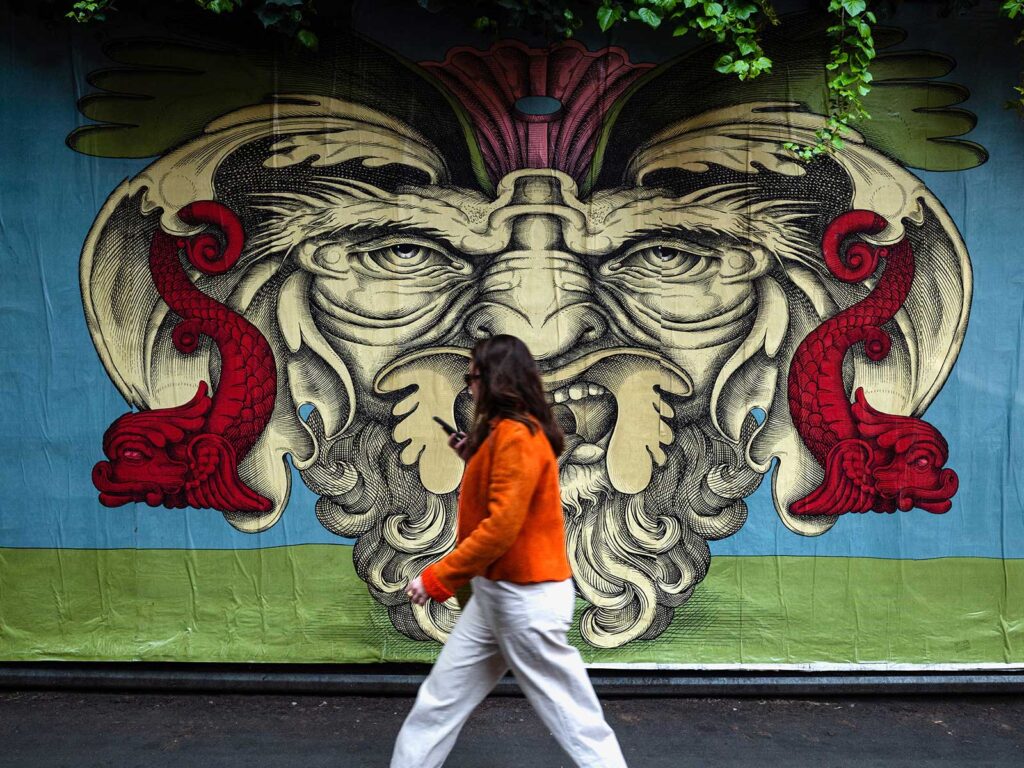
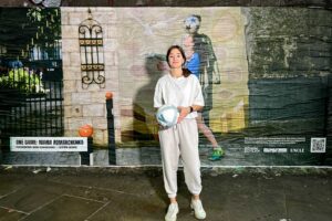
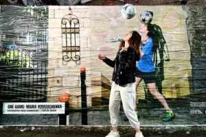
THIS COLLABORATION BRINGS YOUR WORK ONTO THE STREETS OF MILAN THROUGH WILDPOSTING. WHAT WAS YOUR FIRST REACTION TO THAT IDEA?
I thought it was really cool because it puts the work right back into the city, and people can pass by and take a moment with it.
I like the idea that someone might see a face and think: that could be my little sister… that looks like my cousin… what a nice face. Just small recognitions, and that’s enough.
And more broadly, it’s appealing because I make photographs to give people a voice, so the more people who can engage with the work, the happier I am.
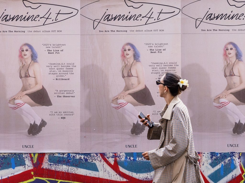
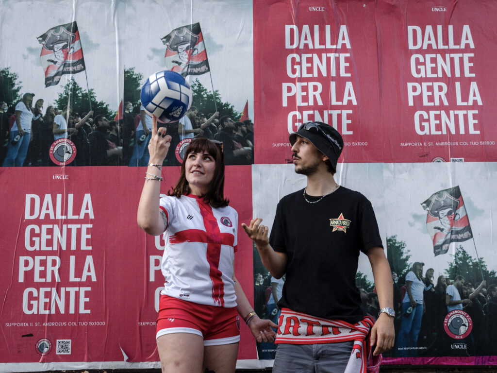
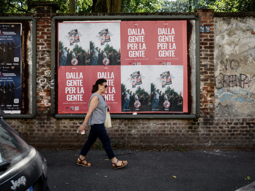
WHAT DO YOU LIKE ABOUT PEOPLE ENCOUNTERING YOUR WORK BY CHANCE — AND WHAT DO YOU HOPE THEY TAKE AWAY?
I love that the audience is completely different outside of galleries or museums — it’s just out in the world.
For me, if even one person looks at one image and feels a connection — if it makes them emotional, reminds them of something, or makes them stop and think about society or community — then it’s totally worth all the effort I put into it.
I’ve always been fascinated by teenagers. It’s such an important moment in everyone’s life; everything can still happen, you’re doing things for the first time, and you’re still figuring out what kind of person you’re going to be.
And honestly, I don’t know why, but after a certain age, adults completely forget what it was like. It’s like they cancel it from their brains.
With Comete, I was especially curious about what it means to be a teenager now — particularly a female teenager — with social networks, the pace of communication, and everything happening in the world. So I started stopping girls in the street, interviewing them, and making portraits. Now I have so many portraits and interviews, and I want to turn it into a book.
THERE’S A REAL SOFTNESS AND HONESTY IN THE WAY PEOPLE APPEAR IN YOUR IMAGES. HOW DO YOU CREATE THE SPACE FOR THAT TO HAPPEN?
That softness comes from connection. The conversation is what makes the portrait possible — it creates trust, and it lets the image come from something deeper than the surface.
It’s also why Comete was a different experience for me. It’s the first time I’ve gone out stopping people I didn’t already know. But even there, I still needed the talking first. Because it isn’t about catching someone looking “cool,” or styling, or aesthetics. I’m interested in gesture, and what people reveal when they feel seen rather than observed.
YOUR WORK OFTEN SHOWS COMMUNITIES THAT ARE EASY TO STEREOTYPE FROM THE OUTSIDE. HOW DO YOU THINK ABOUT REPRESENTATION WHEN WORKING IN THESE SPACES?
I think about it a lot because it’s very easy to take a picture and accidentally confirm what people already believe. And most of the time, what people “believe” about certain communities is built from distance, fear, and repetition.
So for me, representation starts with responsibility. I try to stay close to what’s real and human, rather than what’s dramatic. I’m not interested in the sensational image, I’m interested in the everyday: families, kids, small moments, gesture, tenderness. Those details are what break stereotypes.
And it also comes back to how I’m making the image. I don’t want the camera to become a shield. I want people to feel involved, not taken from – like they’re part of the project rather than just being used as “subjects.” The conversation matters because it keeps the work grounded in a relationship, not just observation.
TELL US ABOUT THE PROJECT YOU’RE PUTTING ON THE WALLS OF MILAN WITH UNCLE…
The images I’m bringing to this collaboration are a mixture of my long-term project in the suburb where I live, alongside photographs made in other outskirts of Milan.
They’re portraits of normal people — neighbours, families, young people – and what matters most to me is breaking the prejudice that a lot of people in Milan still have about the outskirts. There’s so much fear: that people are dangerous, criminals, untrustworthy. But in reality, they’re just families, with kids, with struggles… and most of those struggles don’t come from anything they’ve “done,” but from life itself.
For the posters, I wanted the image to feel central, but I also wanted to include the name of the neighbourhood where it was taken.
THIS COLLABORATION BRINGS YOUR WORK ONTO THE STREETS OF MILAN THROUGH WILDPOSTING. WHAT WAS YOUR FIRST REACTION TO THAT IDEA?
I thought it was really cool because it puts the work right back into the city, and people can pass by and take a moment with it.
I like the idea that someone might see a face and think: that could be my little sister… that looks like my cousin… what a nice face. Just small recognitions, and that’s enough.
And more broadly, it’s appealing because I make photographs to give people a voice, so the more people who can engage with the work, the happier I am.
WHAT DO YOU LIKE ABOUT PEOPLE ENCOUNTERING YOUR WORK BY CHANCE — AND WHAT DO YOU HOPE THEY TAKE AWAY?
I love that the audience is completely different outside of galleries or museums — it’s just out in the world.
For me, if even one person looks at one image and feels a connection — if it makes them emotional, reminds them of something, or makes them stop and think about society or community — then it’s totally worth all the effort I put into it.