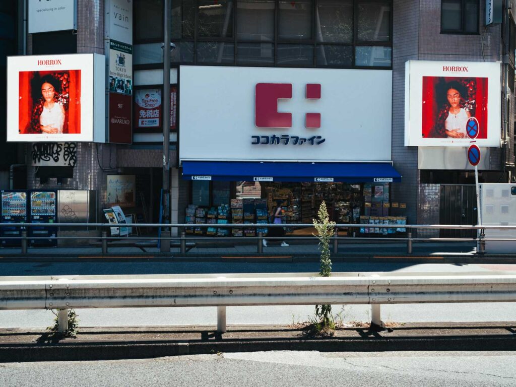
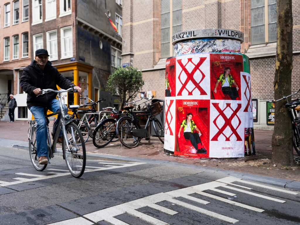
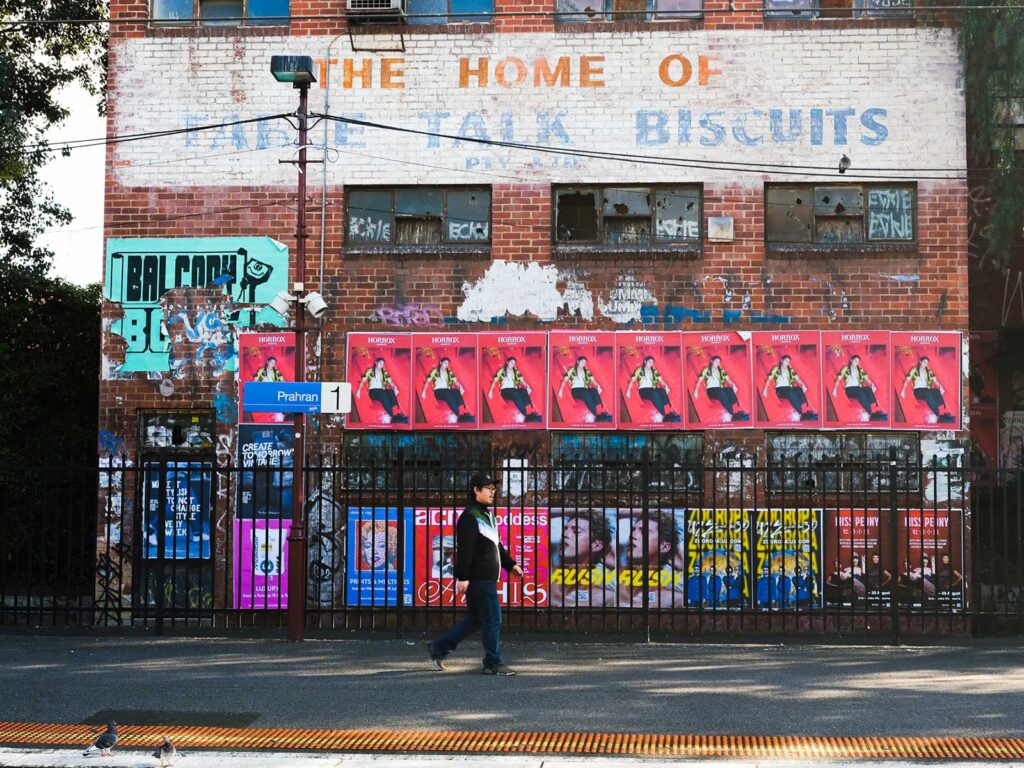
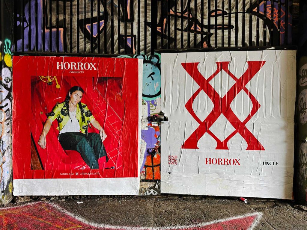
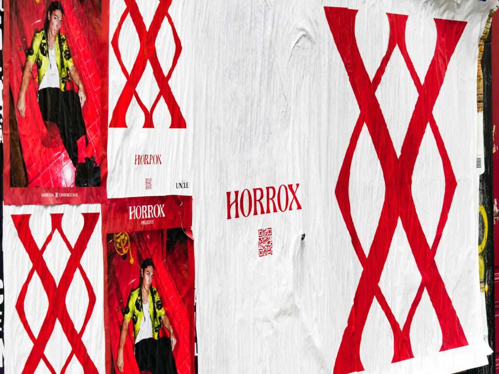
Horrox has been hotting up the fashion scene with a poster campaign popping up internationally courtesy of UNCLE. Our continued partnership with the androgenous clothing brand seems an opportune moment to home in on the effective and varied methods UNCLE uses in cities worldwide to create campaigns worth talking about.
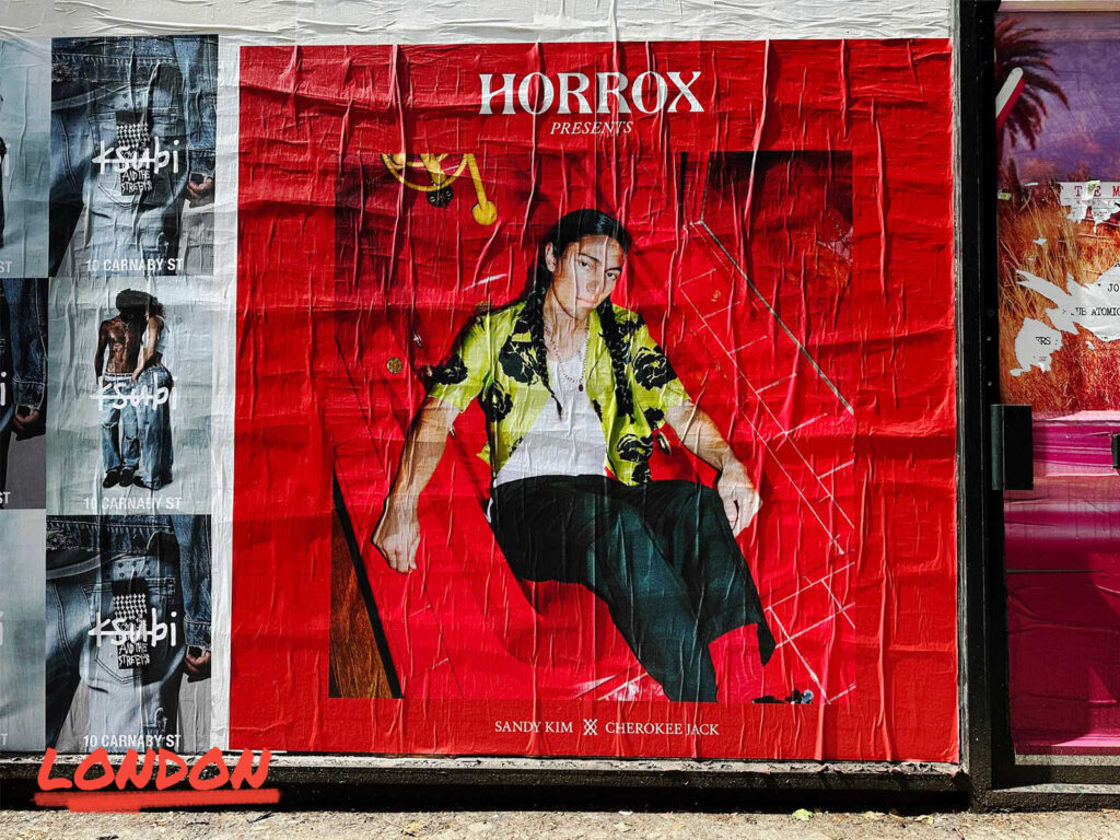
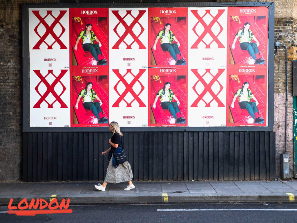
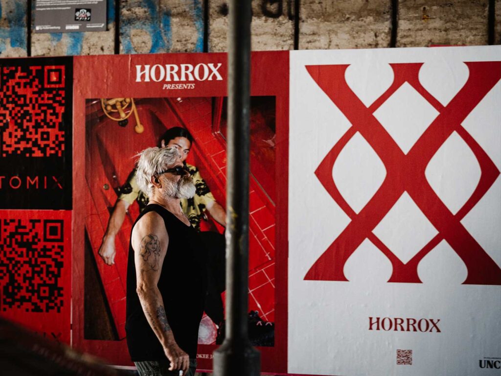
London is the foundation of UNCLE’s existence; we were borne in the rebellious beginnings of the fly format, it’s our roots. Our mindset for our home market tends to be ‘go big or go home’, using all our format types to create a high frequency and saturated campaign across the city. Whether that be three billboards in a row for a street takeover or a paste up to play with a unique square creative, Horrox took advantage of all this city has to offer.
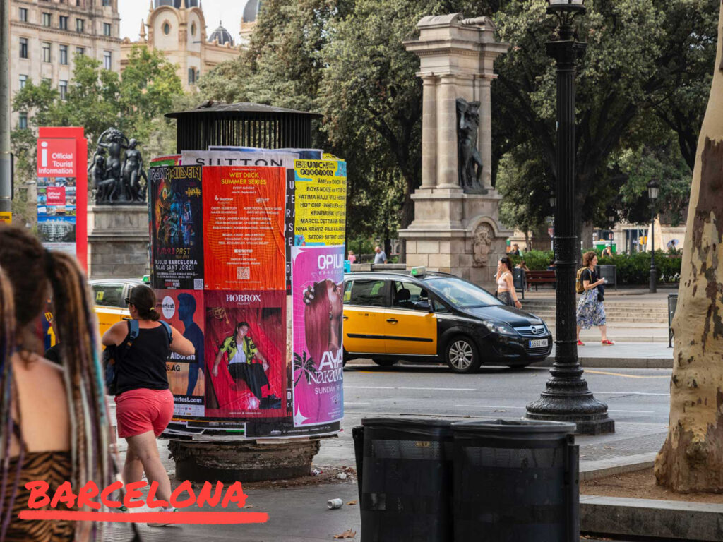
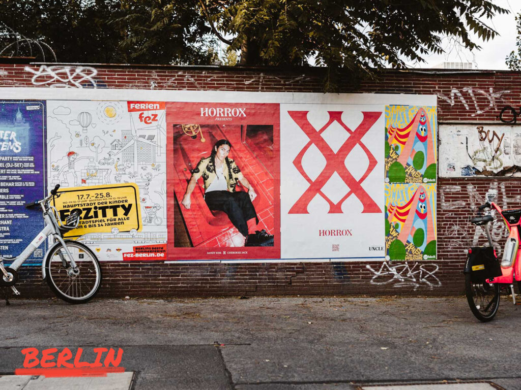
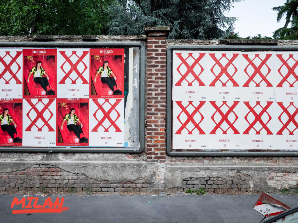
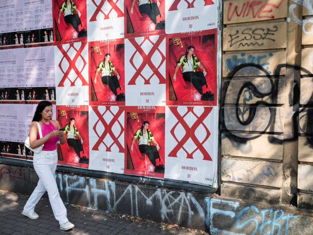
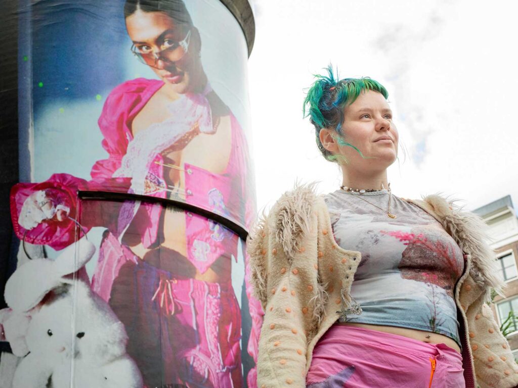
European markets themselves each carry with them individualistic elements that are iconic in their own rights. Amsterdam always makes for a campaign that transitions to the digital well, being a city so instantly recognisable, our sites work wonders across social channels. Barcelona, a sunny haven where pillars cut through crowds, high foot traffic are always on the cards for those who are displayed here. Ever the crowd pleaser is Berlin, a sought-after mecca for brands that like an edge, our sites have an industrial feel, and this grittiness certainly added a sense of intrigue to the Horrox campaign itself. Milan – one of the world’s fashion capitals – it’s sunny streets and refined site design always lead to a clean looking outcome for campaigns, a favourite of brands going for class. Finally, we have Paris, whose arguably most important feature being the context that comes with it – all things fashion needs to have a presence here. A combination of these cities made a unified stamp across the continent for Horrox and built brand image in alignment with each city’s perspective.
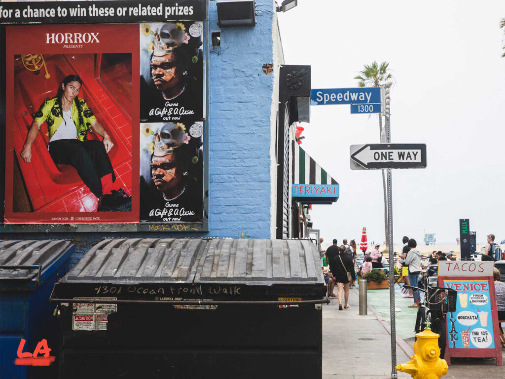
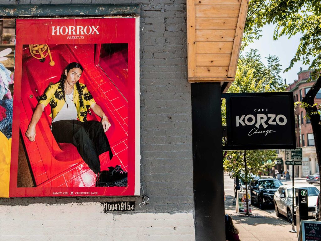
Let’s not forget our overseas cousin America – a beast that brands always want to conquer. The cities Horrox appeared in are all key players in the vast market that makes up the country. Whether the relaxed west side with Los Angeles and San Francsico – where your poster can be backdrop to a beach walk and golden sunset or the red-hot west side that offers a streetside catwalk in fashion hub New York or a fiery addition to Miami’s iconic skyline. Horrox is a brand based in Brooklyn, and the campaign felt at home amongst its streets, UNCLE made sure to emphasize the homecoming with a focus on distribution surrounding the area.
Tokyo needs no introduction; the powerhouse city of the east has an unmistakable feel. Formats here are clean cut and perfected – an apt style that seems to reflect the general feel of the city itself. Due to lack of competition with advertising space, Horrox had no trouble standing out against the brutalist architecture. The striking red was a key colour in eyeline with all onlookers, working perhaps best on the digital screens that offer a distinct look that posters cannot replicate.
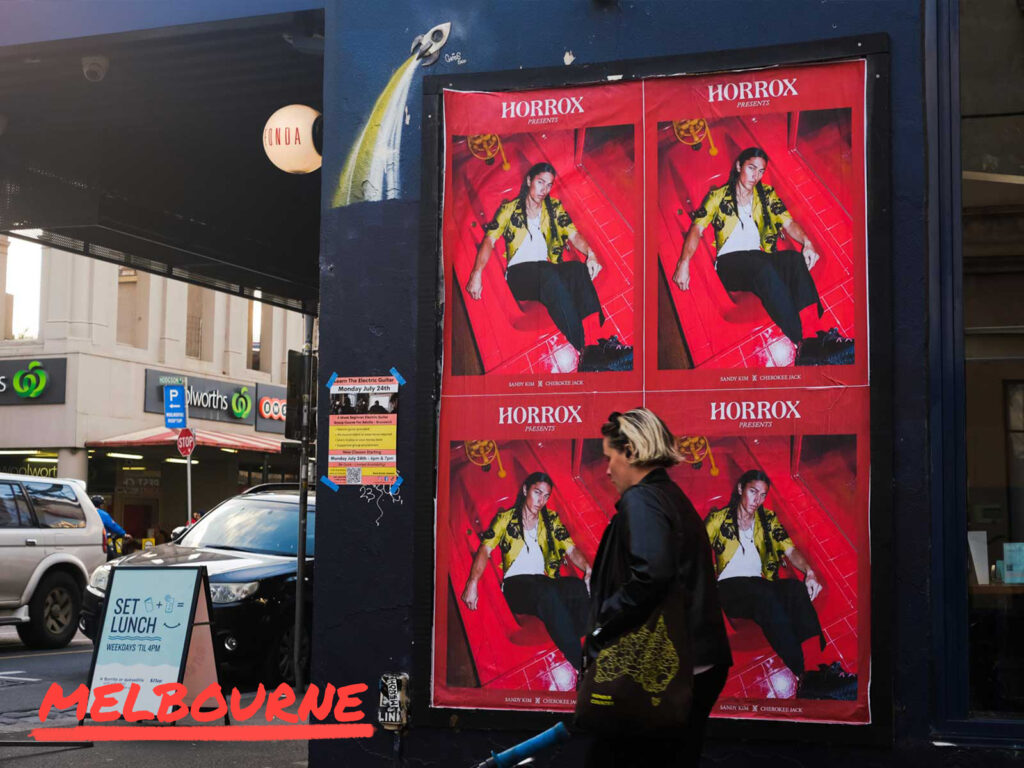
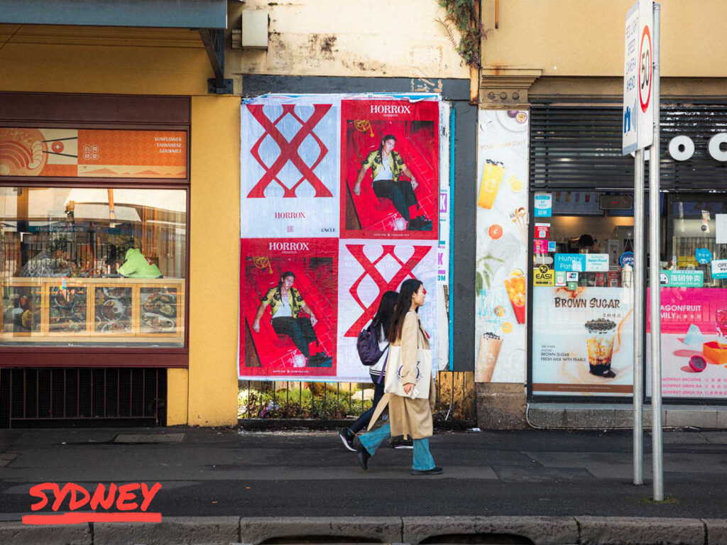
The true definition of global includes that of Australia; laid-back and homegrown posters here feel part of the woodwork and have no trouble looking like they belong. Sydney makes for a city that offers a casual edge that capitals tend not to include, this only grounded the Horrox campaign and approachability is important within advertisement. Whereas Melbourne delivers on locations that are unmissable, want to be noticed? Melbourne is the one for you if you want eyes down under.
Every city offers its own opportunities, and if you can align yourself with the pulse of that city you can appeal to its onlookers. Horrox was at home in all markets, reaping the benefits of the cultural markers and standing out amongst the grey.
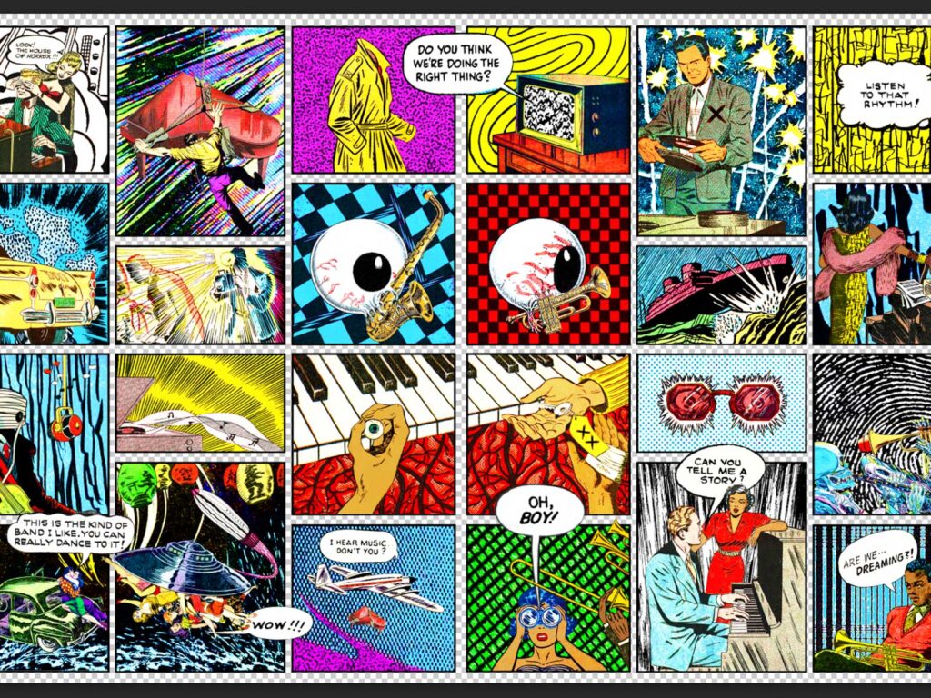
Horrox is not a brand that exclusively pulls from the past but also the present, with some of its most prominent pieces being collaborations with artists and charities. In continuation of UNCLE’s partnership with Horrox we put a spotlight on one of these collaborators. JV Aranda, an artist based in San Francisco uses a mixture of colour, printing and repetition to make an impact with his graphic designs. His playful graphics prioritise impactful, layered motifs that are reminiscent of a pop art and dadaism which seemed a fitting match for the first collaboration of Horrox as the brand also borrows from the past for its creative direction. We took a spotlight and enquired about how his contemporary techniques and style have developed as he’s grown as a creator.
HOW DID YOU GET INTO ART?
Fortuitous museum visits during my formative years. For instance, in 1998, while on a trip to Los Angeles to celebrate my 16th birthday, I had the good fortune of being introduced to the work of Yayoi Kusama via a retrospective exhibition of her work at LACMA, which was mind-blowing and incredibly influential in a multitude of ways: from her enthusiastic experimentation across different mediums to how her practice overlapped with her mental health, nationality, gender, era, and pure intuitive visual talent. Her work has always served as a wonderful example of the limitlessness of Art as a storytelling device and her resilience and prolific output continues to be an inspiration.
WHY COLLAGE?
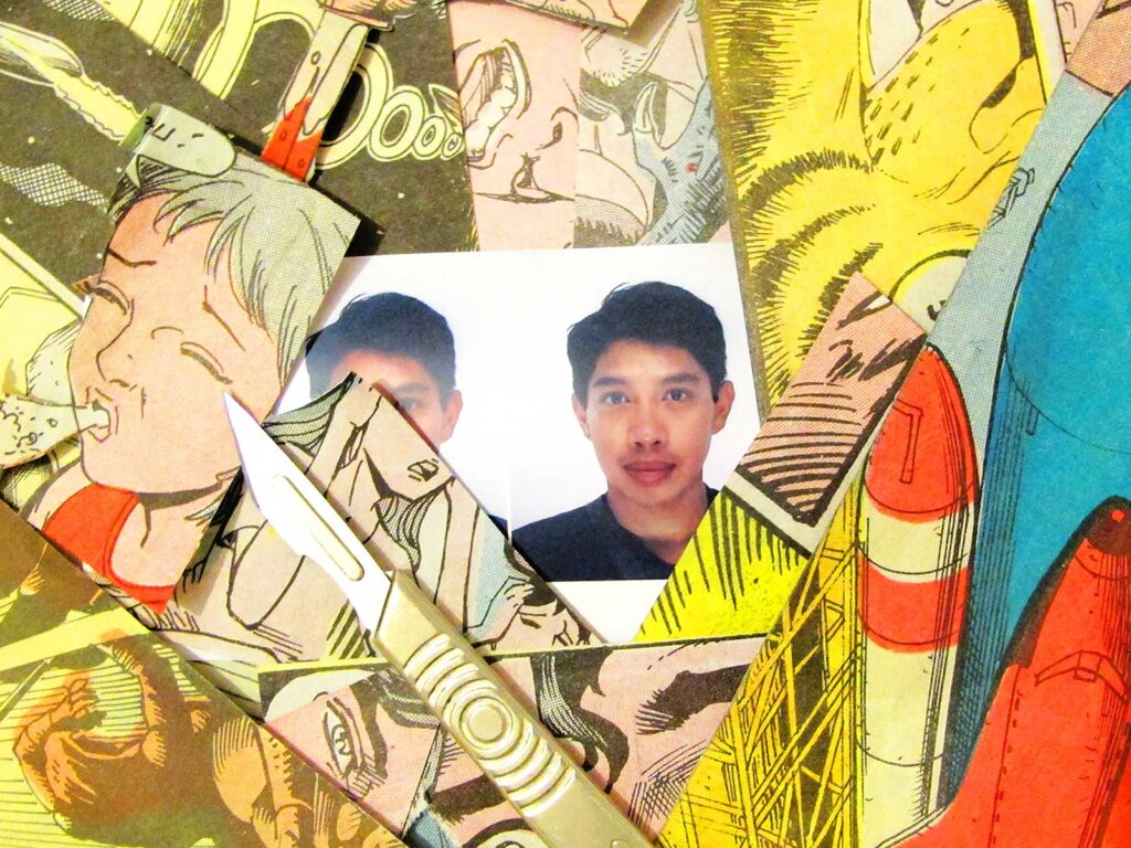
Collage was always a medium that just made sense to me since first being introduced to it at school. The materials needed were accessible and the process of destruction, manipulation and reinvention has always felt liberating and cathartic.
Additionally, with the amount of content being generated daily in this day and age, Collage has grown in importance as a method to utilise the world’s growing collective archive, showcasing and re-contextualising imagery that would otherwise be ignored or forgotten.
DESCRIBE YOUR DESIGN PROCESS?
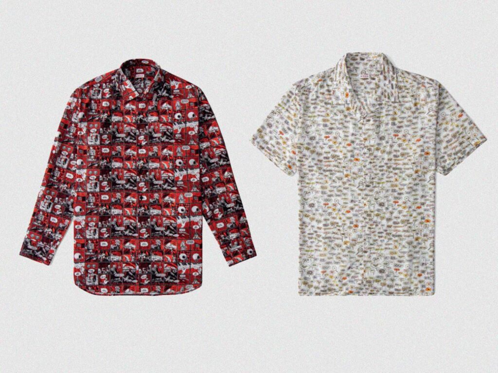
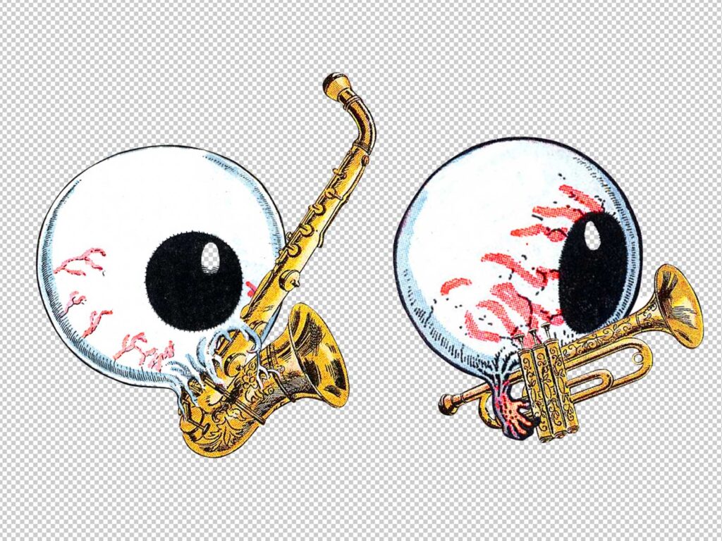
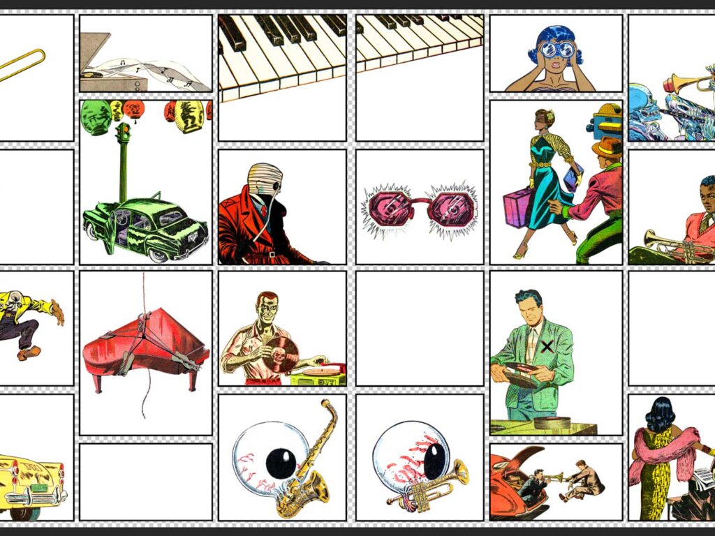
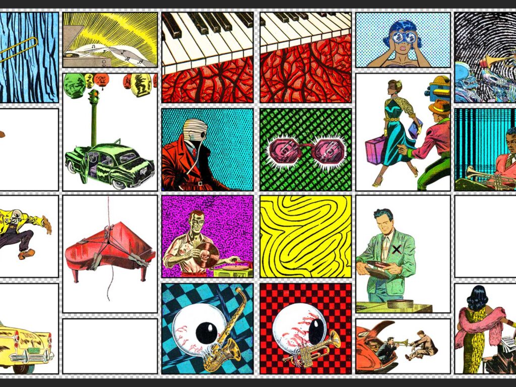
It’s a mix of following my intuition and problem-solving. I’ve always loved being commissioned and receiving a brief to interpret with various constraints to meet. So the design process can vary due to the project at hand, and my favourite experiences have been the ones that allowed me the opportunity to widen my scope and try new things, like working with Horrox, which gave me the chance to use the comic-strip panel format as a structural device and incorporate speech bubbles in my work for the first time.
WHAT IS THE THING YOU LIKE MOST ABOUT BEING AN ARTIST?
I love how artwork can form a life of its own while retaining that psychic link to its creator, who essentially become visually invisible when the work is finished. As a Queer, Person of Colour, creating artwork feels like one of the few realms in which I’m not immediately judged by any of my physical or sociological attributes, though my work is always representative of all of those things purely from being filtered through my vantage point.
TELL US MORE ABOUT THE COLLABORATION WITH HORROX?
Legs somehow found my work out there in the ether and got in touch with her vision for the prints that she had wanted to commission for Horrox. I was enthused after being introduced to her work and learning where she wanted to go conceptually with the prints and was pleasantly surprised to discover the strange parallels we had with one another; Namely that I was an American living in the U.K. at the time and that she was British and living and working in my home state of California.
WHY ARE YOU DRAWN TO USING COMIC STRIPS IN YOUR WORK?
When working with Comics, I’ve primarily been drawn to utilising work from the Golden Age of American comics, which spans from the 1940’s and 50’s, since I not only enjoy the aesthetics of that era but additionally have gotten a kick out of re-contextualising work that was originally found in arguably quite wholesome environments, and reconfiguring the work with more modern narratives that reflect our current realities and collective discourse.
HOW HAS CALIFORNIA AND LONDON INFLUENCED YOUR WORK?
Growing up in California, I was surrounded by pop culture and the grandeur of nature. I was essentially raised by cartoons and theme parks. And I’ve often felt that the hyper-saturated colour palette of my work is very much informed by being a Californian. Living in London was quite a contrast and helped me realize that pursuing the arts was not only valid but important, and it was incredibly inspiring to be in such a global and diverse city, absorbing such a range of stories. My work may be incredibly influenced by California conceptually, but I learned how to become an artist thanks to London.
HOW HAS SAN FRANCISCO HELPED SHAPED YOU AS A DESIGNER?
When Legs got in touch about the commission, I was living in London and when she mentioned she was based in San Francisco at the time and wanted the prints to reflect the city and it’s musical history, specifically during the Jazz age, I was absolutely delighted as a former San Franciscan, previously living there for a number of years in the early 2000’s, back before I even realized I was an Artist and Designer. So, I’d say my time in San Francisco planted a lot of seeds, that still grow to this day. There’s an organized chaos to the city, or rather, a battle between structure and hedonism, that definitely shapes my work.
DOES THE CITY INSPIRE YOU?
Absolutely. Living in San Francisco was my first experience as a young adult with the wonder and perils of embracing spontaneity. I was raised in San Diego, which is very much a car-based city, so it was quite liberating living in San Francisco, which is much more pedestrian friendly. I’ve always been inspired just walking around the city and getting immersed with the different personalities of both the different neighbourhoods and the characters who happen to be around on any given day.
WHAT ARE SOME OF YOUR FAVOURITE PLACES THERE?
I’m biased towards the neighbourhoods I previously lived in: the Castro and the Mission, which includes my absolute favourite place in the city, smack dab in the middle of those areas: Mission Dolores Park, which is situated on an incline with a gorgeous view of Downtown San Francisco, and has been the setting of many meditative walks, sunny celebrations and heartfelt conversations with loved ones in the past.
WHAT’S NEXT FOR YOU?
More Collages! Currently, I work as an Editorial illustrator for a variety of clients. Most recently, I’ve been working with the esteemed American automobile magazine, Road & Track, creating collages for a column called the ‘Department of Overthinking’ and I’ve also begun to participate in different art fairs, showcasing all of the different adaptations of my Collage work, in preparation of opening Sinewy Sea Fine Art, which will be a hybrid of an Arts Space, Tea Lounge and Gift Shop, showcasing modern curiosities and storytelling, to be based in San Diego.
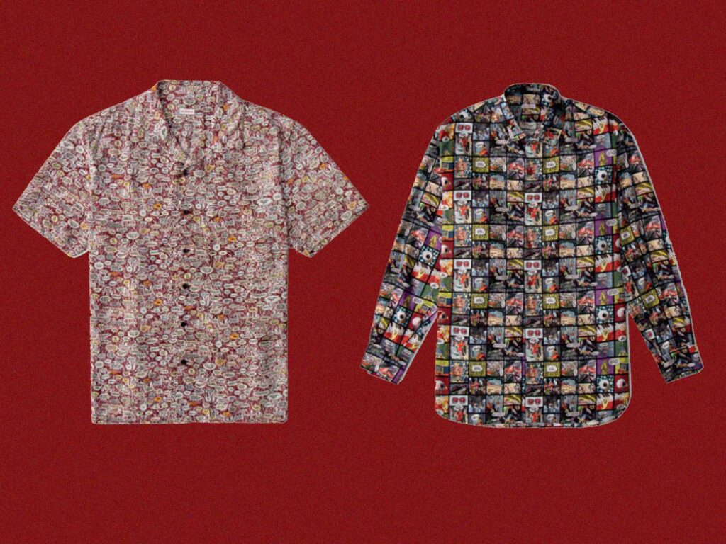
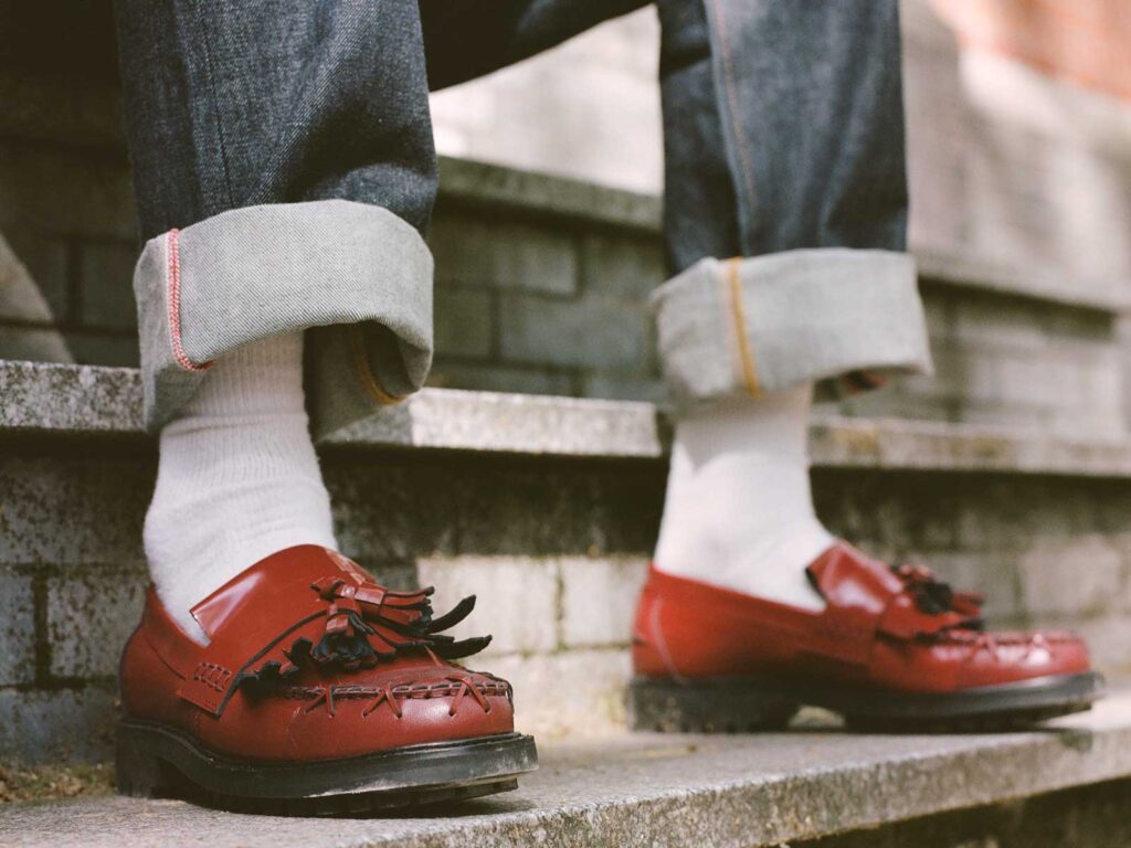
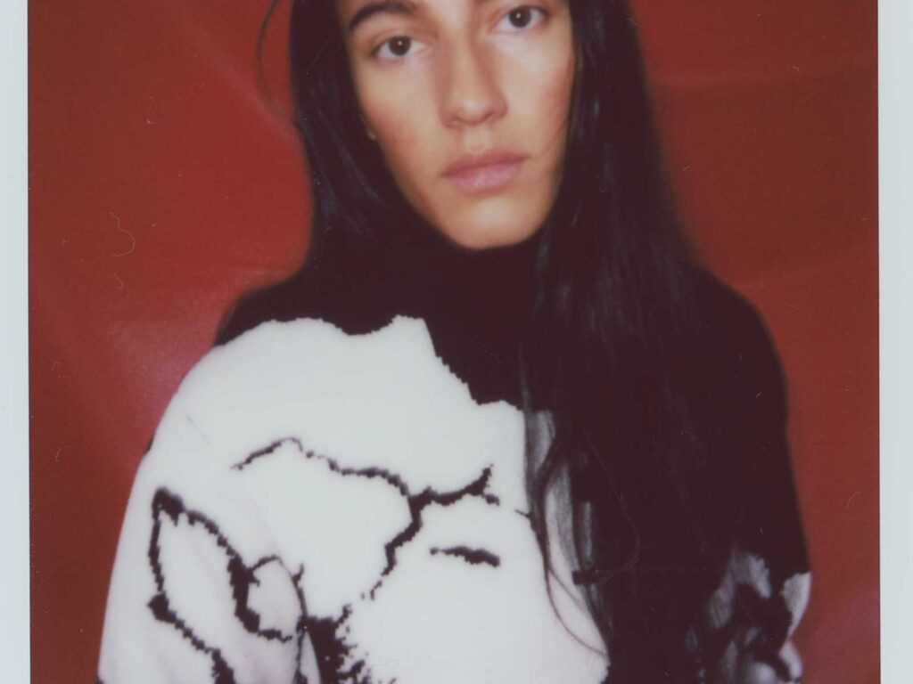
Based in Brooklyn, New York fashion brand Horrox are launching their debut collection to a global audience promising to deliver on an informed and cultural array of designs. Horrox marries culture, art, music and collaboration with fashion that culminates in an informed yet edgy drop. This emerging fashion brand seemed a great match for UNCLE to support in their beginnings with a partnership.
Horrox was born of music. From the intrigue of record sleeves and music publications, to clothing synonymous with music subcultures throughout history, it all serves as muse for the core Horrox product. Whether it be the new wave stylings of Talking Heads or punk rock powerhouse The Clash, the brand infuses distinctive eras into its pieces with a modern edge. These aesthetic choices could often misinterpreted as vapid, but instead are rooted in politics, class structure and other poignant moments within the zeitgeist. Horrox revels in research that elevates design beyond the visual and strikes a balance between concept and composition.
The brand’s founder – Riona Horrox – a graduate of the Royal College of Art used Motifs have most commonly been drawn from the ‘77 punk era, alongside elements that borrow and modernise 50s and 60s styles. Shrunken t-shirts and jeans lend themselves well to the inherited seventies influence on the west coast.
As part of the partnership, UNCLE will be continuing to dive deeper into the core of the brand with interviews with collaborators. This is only the beginning. Fashion can be a portal of education for its audience. Horrox is a brand that plays with nostalgia; style can intertwine with who you are and pull you into whichever community you wish to be a part of – let Horrox be yours.
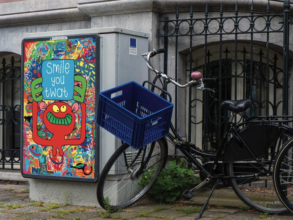
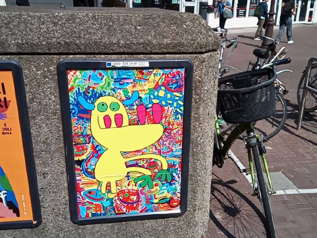
For the most part the artist Bortusk Leer marshals his signature monsters as a force for good. Despite their psychopathically inclined expressions, these variously goggle-eyed, drippy gobbed, banana fingered, saveloy limbed creations elicit smiles rather than screams.
UK born, Amsterdam based, Leer’s euphoric, and mischievous imps first appeared circa 2007. Before that the artist had already been littering the streets with his ‘nu-rave pigeons’, “Mainly to take the piss out of Banksy’s rats!” Leer explained. Then the artist’s mum dug out some of his childhood drawings and the monster motif was born.
Armed with spray paint, marker pen and a manic craving to invent daft, enchanting critters: Leer’s first comedy art progeny appeared on canvas and newsprint. Those on newsprint quickly found their way onto the streets of the UK, Netherlands, USA, Italy, Argentina, Norway… In short, we’ve undergone a bit of an invasion. They’ve even been on the telly!
Crafted on top of front-page news, gurning in tandem with the day’s events as reported in The Sun or Telegraph, etc., Leer’s urban varmints point to broader societal ludicrousness. They imply a mocking attitude toward the constant stream of distractions offered up by our mainstream media and the urban spectacle.
In terms of his visual language Leer is inspired by many things but principally the CoBrA art movement – a 1948 avant-garde group whose semi-abstract work is characterised by brilliant colour, exuberant mark-making and distorted figures seen in folk and outsider art and it’s also at the forefront of European abstract expressionism – but there is a key social dimension to his output too.
Every so often he’s charged with naivety, to which the artists replies, “I’m not afraid of naivety, I’m afraid of cynicism.” His monsters regularly, helpfully hold up signs that read: ‘Is This The Sign You’re Looking For?’, ‘Keep Fucking Smiling’ or, straight to the point, ‘Don’t Be A Dick’.
UNCLE love the idea that ‘loudly and gamesomely’ (according to his own PR) Leer seeds the city with what boils down to monstrous and unruly tenderness. Two posters in our Amsterdam collaboration offer passers-by wellbeing advice along the lines of, ‘Cheer Up You Bastard’ and ‘Love Every Day’. The third print in the trio, again, sees another of our freakish friends – this one with four magenta pink teeth and an alarming underbite – pictured against a gaudy roiling sea of raucous pattern and myriad miniature, maniacal grins.
In an effort to counter a pervasive anger, disappointment, sadness and disillusionment that’s seemingly rife the world over, Leer sees it as his calling to brighten moods and spread joy. As we try to navigate the existential disaster that is climate crisis and despair at a political system apparently unfit to address deep-seated social ills along with local and global inequalities, then there’s the cost-of-living crisis and, oh yes, we’re promised that another pandemic is almost certainly on the cards… It’s it an eye-popping, heart-warming comfort to know Bortusk Leer’s monsters are on a mission to spread an anarchic joie-de-vivre that’s also contagious (but in a good way!).
Kunstenaar Bortusk Leer zet zijn karakteristieke monsters voornamelijk in als een positieve kracht. Ondanks hun psychopathisch getinte gedaanten, roepen deze monsters met hun uitpuilende ogen, druipende monden, bananenvingers en worstachtige ledematen eerder een glimlach dan een noodkreet op.
Geboren in het Verenigd Koninkrijk en woonachtig in Amsterdam, verschenen Leer’s euforische en ondeugende aardmannetjes voor het eerst rond 2007. Daarvoor had de kunstenaar al eerder de straten bezaaid met zijn ‘nu-rave pigeons’, “Voornamelijk om Banksy’s ratten belachelijk te maken!” zegt Leer hierover. Vervolgens haalde de moeder van de kunstenaar enkele van zijn kindertekeningen uit de oude doos, en zo werd het monstermotief geboren.
Gewapend met spuitverf, markeerstift en een niet te stoppen energie om dwaze, betoverende wezens te creëren, verschenen Leer’s humoristische kunstcreaties eerst op schilderdoek en in de krant. De monsters op kranten werden al snel verspreid over de straten van het Verenigd Koninkrijk, Nederland, de Verenigde Staten, Italië, Argentinië en Noorwegen… Kortom, het lijkt alsof we te maken hebben gehad met een grote invasie. Ze zijn zelfs op tv geweest!
Getekend op voorpaginanieuws, met een grimas die overeenkomt met de gebeurtenissen van de dag zoals beschreven in The Sun of Telegraph, hinten Leer’s stedelijke aardmannetjes naar de bredere absurditeit van de samenleving. Ze impliceren een spottende houding ten opzichte van de constante stroom van afleiding die onze reguliere media en het stedelijk spektakel ons biedt.
Wat betreft zijn visuele taal, laat Leer zich inspireren door vele dingen, maar voornamelijk door de CoBrA-kunstbeweging: een avant-garde groep uit 1948 waarvan het semi-abstracte werk wordt gekenmerkt door prachtig kleurgebruik, uitbundige penseelstreken en vervormde figuren, zoals te zien is in volks- en outsiderkunst en die ook voorop staat in het Europese abstract expressionisme. Maar er is ook een belangrijke sociale dimensie in zijn werk.
Af en toe wordt hij beschuldigd van naïviteit, waarop de kunstenaar antwoordt: ‘Ik ben niet bang voor naïviteit, ik ben bang voor cynisme.’ Zijn monsters houden regelmatig behulpzame borden omhoog met teksten als: ‘Is dit het teken waar je naar op zoek bent?’, ‘Blijf fucking glimlachen’ of, meer recht voor zijn raap, ‘Wees geen lul’.
UNCLE vindt het geweldig dat Leer (volgens zijn eigen PR) op een ‘luide en speelse’ manier de stad doordrenkt met wat in essentie monsterlijke en onstuimige tederheid is. Twee posters in onze samenwerkingsserie in Amsterdam bieden voorbijgangers welzijnsadviezen zoals ‘Opvrolijken, Klootzak’ en ‘Hou Van Elke Dag’. De derde prent in de serie toont opnieuw een van onze bizarre vrienden – deze keer met vier magenta-roze tanden en een verontrustende onderbeet – afgebeeld tegen een felgekleurde zee van een onstuimig patroon en talloze miniatuur, maniakale grijnsjes.
In een poging om de vlagen van woede, teleurstelling, verdriet en desillusie die de wereld soms lijken te overvallen tegen te gaan, ziet Leer het als zijn roeping om vreugde te verspreiden. Terwijl we ons proberen te navigeren door een existentiële klimaatcrisis, ons wanhopig voelen over een politiek systeem dat blijkbaar niet in staat is om diepgewortelde sociale problemen en lokale en mondiale ongelijkheden aan te pakken, zijn er ook nog de kosten van levensonderhoud en, oh ja, de volgende pandemie ligt vrijwel zeker op de loer… Het is geruststellend en hartverwarmend om te weten dat Bortusk Leer’s monsters zich inzetten om een anarchistische joie-de-vivre te verspreiden die ook nog eens aanstekelijk is (maar op een goede manier!).”
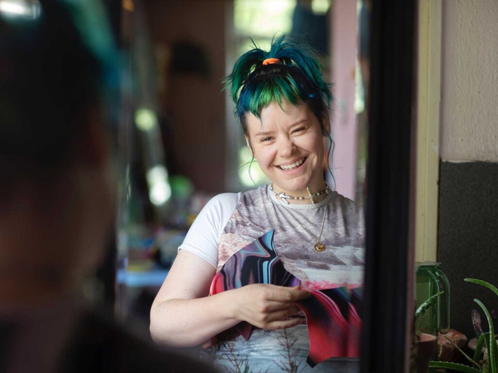
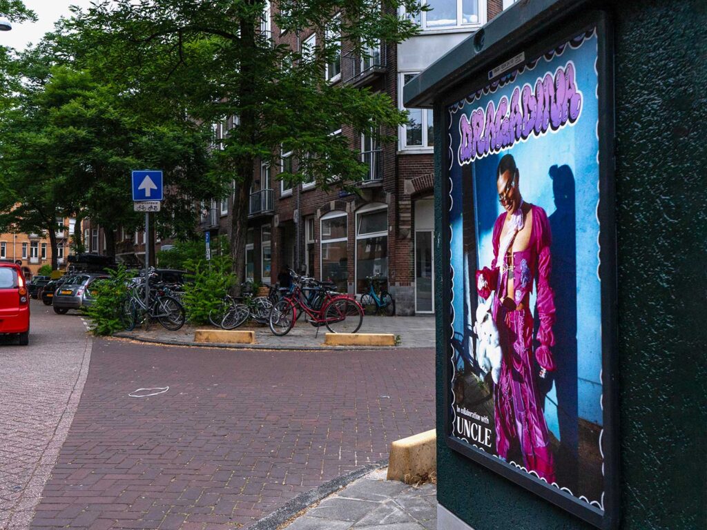
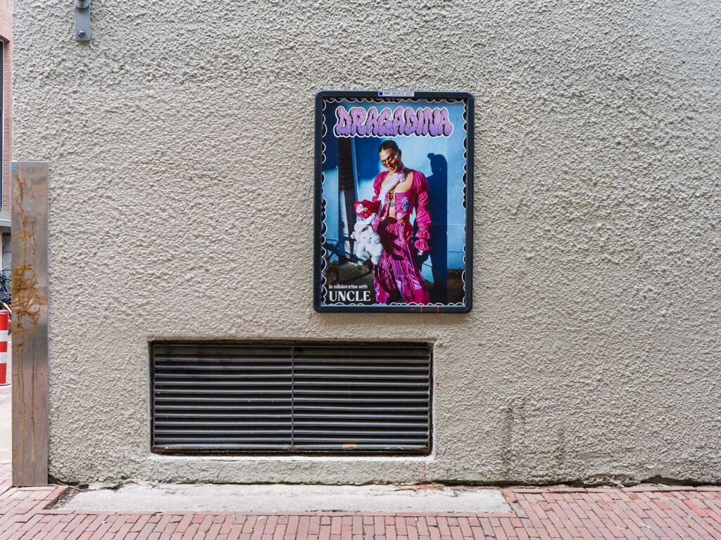
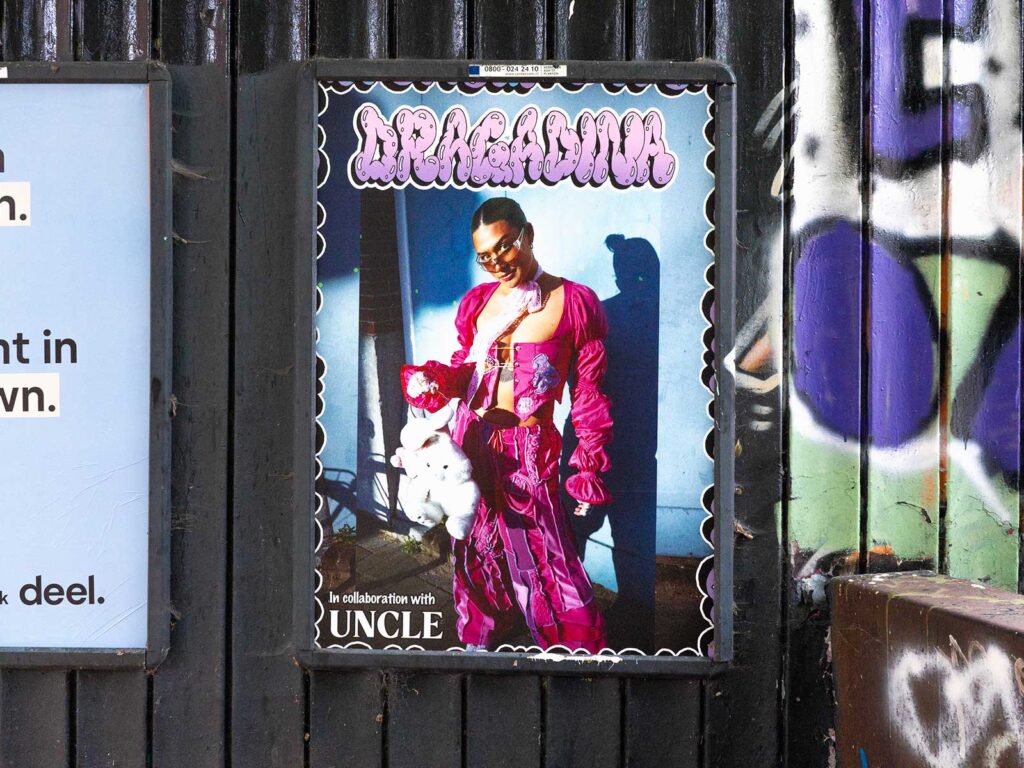
Het bruist in Amsterdam van experimentele creativiteit: in de grensverleggende stad waar innovatie het straatbeeld vormt, is DragaDina een modemerk dat is geboren uit precies deze context en er perfect onder gedijt. Maker Noortje Mulders staat aan het roer van de eclectische en experimentele collecties van het merk, en de levendige clash van stukken zorgt voor een intuïtieve eigentijdse collectie. Haar drijvende kracht: “Ik wil het speels houden en mijn intuïtie haar vrije gang laten gaan. Ik maak veel verschillende dingen en probeer mijn eigen wereld te creëren.”
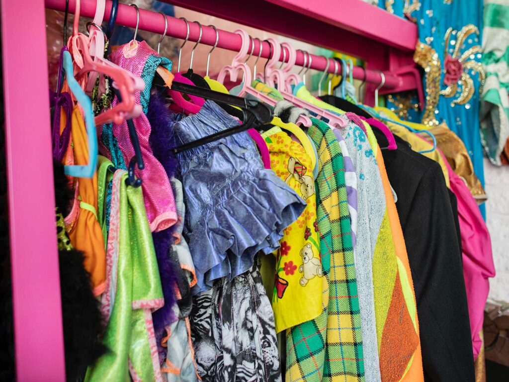
Mulders heeft mode door haar aderen stromen, dankzij haar grootmoeder die vroeger een stoffenwinkel had. Van jongs af aan was ze omringd door materiaal en inspiratie. Dit leidde tot een snelle ontwikkeling van een voorliefde voor alles wat met stijl te maken heeft. Het voelde voor haar als een vanzelfsprekendheid om met textiel te werken. Haar interesse in restjes stof en het gebruik van stoffen die in beperkte hoeveelheid beschikbaar zijn, zorgen ervoor dat haar stukken continu evolueren en uniek blijven.
Het merk DragaDina zelf richt zich op positiviteit en self-love – “Ik werk graag met mensen die zichzelf willen uiten en help hen comfortabel te voelen in hun lichaam door te creëren wat we voelen of hoe we ons willen voelen.” Haar ontwerpen richten zich op de contouren van het lichaam, waarbij gebruik wordt gemaakt van de natuurlijke lijnen en rondingen, zodat de kleding in harmonie is met het lichaam, in plaats van ertegen.
UNCLE is een samenwerking aangegaan met Noor om een platform te bieden voor haar vaardigheden en waardevolle ontwerpers’ mentaliteit. Zo hebben we DragaDina geïntroduceerd op plakzuilen naast de iconische levensaders van de stad: de Amsterdamse grachten. Vervolgens hebben we haar collectie op posters de rest van de straten door de stad laten domineren. We hebben Mulders geïnterviewd om de oorsprong van haar merk te verkennen en haar denkprocessen te doorgronden. Zo zijn we tot de kern van haar passie én merkethos gekomen.
WAT INSPIREERT JOU?
Ik word geïnspireerd door zoveel dingen om me heen, soms is het moeilijk precies te benoemen wat mijn interesse wekt. Ik probeer niet te veel na te denken, wat lastig is omdat ik altijd aan het overdenken ben. Ik vind inspiratie in de natuur, oude modeshows uit de jaren ’80, ’90 en ’00. Of ik onderzoek kleding uit het renaissance tijdperk en achterhaal welke technieken werden gebruikt. Het proces van verandering vind ik inspirerend; ik wil niet bang zijn voor verandering en ik probeer zelf actief te blijven veranderen.
HOE BEN JE IN DE MODE TERECHTGEKOMEN?
Mijn oma en moeder waren een grote invloed. Mijn oma had vroeger een klein stoffenwinkeltje, dus werken met textiel zit in de familie. Mijn moeder maakte elk jaar verjaardagsjurken voor me. Dit gaf me de mogelijkheid om stoffen te kiezen en ideeën te bedenken over hoe ik wilde dat de jurk eruitzag. Het inspireerde me als kind om creatief te zijn met kleding.
WAT WAS HET EERSTE DAT JE HEBT GEMAAKT?
Ik begon kleding te maken voor poppen en Barbies met hulp van mijn moeder en oma, maar ik denk dat mijn eerste echte item een tas was. Ik vond gewone tassen niet leuk en vond ze een beetje saai. De constructie van de tas was niet zo goed en hij kon niet eens boeken vasthouden. Ik moest hem vaak repareren, maar het gaf me tegelijkertijd veel vertrouwen in mijn creatieve vaardigheden. Ik maakte ook accessoires zoals armbanden of haaraccessoires, allerlei soorten items om mezelf met mijn uiterlijk uit te kunnen drukken.
KUN JE JE ONTWERPPROCES BESCHRIJVEN?
Ik begin meestal met het zoeken van stoffen. Ik geef de voorkeur aan tweedehands stoffen van online marktplaatsen zoals Marktplaats. Omdat er een beperkte hoeveelheid stof beschikbaar is, helpt dit mij om unieke stukken te creëren.
Ik teken niet op papier wat ik in mijn hoofd zie. Met de naaimachine breng ik de stukken samen en komt wat ik in mijn hoofd zie tot leven. Na vele jaren als textielkunstenaar te werken is het gebruik van de naaimachine een reflex en gewoonte geworden. Als kind speelde ik in de stoffenwinkel van mijn oma, waar ik texturen en kleuren combineerde, wat heeft bijgedragen aan mijn intuïtieve stijl.
WAT BETEKENT MODE VOOR JOU?
Mode is voor mij een manier om uit te drukken hoe ik me voel. Het helpt me om zelfverzekerd te zijn in mijn eigen lichaam. Het helpt ook om me aangetrokken te voelen tot gelijkgestemde mensen. Ik vind het echt leuk om mensen te helpen zichzelf uit te drukken en zich comfortabel te voelen met hun uiterlijk.
WAT VIND JE HET LEUKSTE AAN ONTWERPER ZIJN?
Ik zie mijn ontwerpen als een verlengstuk van mezelf, en daarom geniet ik ervan om bepaalde karakters/persoonlijkheden in mezelf te verkennen. Mensen denken dat ik me zo kleed om op te vallen, maar dat is het niet. Kleding is voor mij een manier om mijn innerlijke zelf uit te drukken. In mijn projecten streef ik er vaak naar om een meeslepende ervaring te creëren. Ik wil dat de outfits passen in hun omgeving. Mijn werk creëert een ruimte waarin ik pas, in een wereld die me niet altijd verwelkomt.
HOE HEB JE JE EIGEN PERSOONLIJKE STIJL VERFIJND?
Ik geniet van speelse en onthullende outfits die enerzijds een gevoel van sensualiteit oproepen maar tegelijkertijd ook passen bij veel verschillende lichaamstypes. Met levendige kleuren en printcombinaties is alles mogelijk. Mijn innerlijke kind komt tot uiting in de manier waarop ik ontwerpen maak en in de looks die tot stand komen.
HEEFT KLEUR VEEL BETEKENIS VOOR JOU? WAAROM?
Ja, het betekent veel voor me. Kleurencombinaties inspireren me, ik vind ze in de natuur en organisch materiaal zoals tropische kikkers, paddenstoelen en bloemen. Soms ontdek ik deze combinaties buiten, en andere keren vind ik ze online. Ik print referenties uit om inspiratieboeken te maken waarin ik mezelf overspoel met mogelijkheden.
WAT ZIJN ENKELE KERNELEMENTEN VAN JE KLEDINGONTWERP?
Zichtbare stiksels en naden, die je meestal wilt verbergen, vind ik interessant om te laten zien en zo de constructie van de outfit bloot te leggen. Ten tweede is de pasvorm erg belangrijk in mijn ontwerpen. Ik hou ervan wanneer kleding zich rondom het lichaam vormt en rondingen omarmt in plaats van verbergt. Het is in zekere zin extreem, met levendige kleuren en patronen. Het is ook een filter om mensen aan te trekken die geïnteresseerd zijn om zichzelf expressief uit te drukken door kleding.
HOE EXPERIMENTEER JE MET TEXTUUR?
Het is een heel natuurlijk proces en ik denk niet echt veel na over combinaties. Ik probeer te experimenteren met de items die ik zie en gebruik ze op onverwachte manieren in mijn ontwerpen. Ik weet van tevoren niet altijd hoe het zal uitpakken.
VERTEL ONS OVER JE ONTWERP VAN KUNSTWERKEN? HET CREATIEVE PROCES EN DE BETEKENIS DAARVAN?
De mensen die mijn kleding dragen en de gemeenschap die ontstaat wanneer deze mensen samen zijn, definiëren mijn merk. Ik werk graag met mensen die zichzelf willen uiten, hen helpen zich comfortabel te voelen in hun lichaam door te creëren wat we voelen of hoe we ons willen voelen. Mijn partner fotografeert al mijn werk, hij legt mijn projecten vast, draagt bij aan de creatieve richting en helpt me met Instagram.
WAAR VIND JE INSPIRATIE IN DE STAD?
Op de markt, op straat, grappige winkels, het nachtleven. Ik vind mijn beste kleine items voor accessoires of kleding in onverwachte winkels zoals tabaks- of sleutelwinkels. De verschillende mensen, cultuur en items inspireren me waar ik ook ga.
WAT VIND JE LEUK AAN DE STAD?
Ik hou van mijn vrienden en ook de diversiteit van culturen en mensen inspireren me. Ik woon nu in Rotterdam en probeer zoveel mogelijk te reizen. Uiteindelijk zou ik graag naar de Verenigde Staten willen verhuizen. Ik heb in Londen en Berlijn gewoond en New York en New Orleans vaak bezocht. Ik hou van al deze verschillende steden en de ervaringen daar brengen me elke keer iets nieuws.
HOE HEEFT NEDERLAND JE GEVORMD ALS ONTWERPER?
De mogelijkheid en het voorrecht om als volwassene te reizen buiten mijn eigen stad en nieuwsgierig te zijn naar de wereld heeft gevormd wat ik creëer. Mijn ontwerpen gaan over jezelf uitdrukken, over verschillende mensen die elkaar respecteren en onze lichamen omarmen. Omdat ik opgroeide in de omgeving van Rotterdam en leerde over andere culturen, ben ik altijd enthousiast en nieuwsgierig geweest naar andere ervaringen. Zo heb ik gezien waarop mensen zich op verschillende manieren uitdrukken en hoe ze trouw zijn aan hun innerlijke zelf. Dat inspireert me om dat zelf ook te doen.
HOE ZOU JE JOUW MERK OMSCHRIJVEN?
Ik wil het speels houden en mijn intuïtie laten stromen. Ik maak veel verschillende dingen en probeer mijn eigen wereld te creëren.
WAT IS HET VOLGENDE VOOR DRAGADINA?
Ik heb net een groot project afgerond genaamd “Busy in my minds”, waarbij ik beeldend kunstenaars heb uitgenodigd om samen een nieuwe collectie te creëren. Nu dat het af is, besef ik dat ik mijn kleding graag wil zien bij meer onafhankelijke winkels over de hele wereld. Het zou geweldig zijn om al reizend met DragaDina bezig te zijn en te creëren terwijl ik ontdek! Mijn ultieme droom is om een winkel op een zeilboot te hebben en van daaruit te ontwerpen.
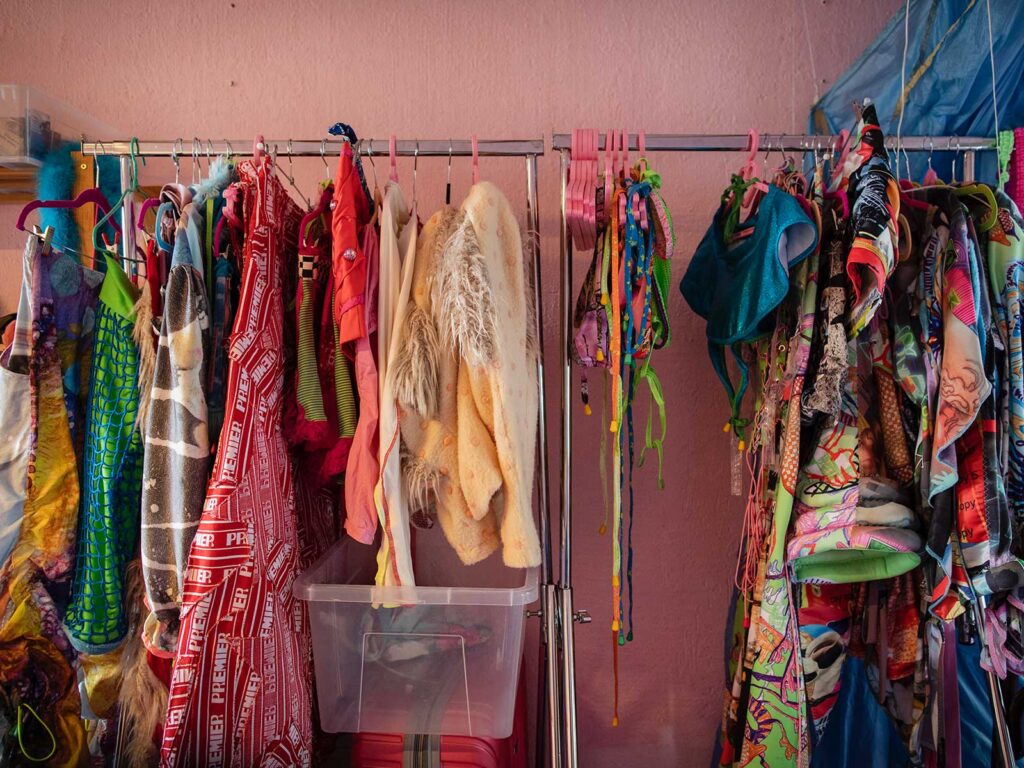
Amsterdam is a hub of experimental creativity; the unorthodox city seems to perpetuate innovations across it’s streets and DragaDina is a brand that was borne of these conditions and flourished under them. It’s creator Noortje Mulders is at the helm of the fashion brand’s eclectic and experimental offerings, and the vivid clash of pieces makes for a truly unique collection. Her driving force being “I’d like to keep it playful and like to keep my intuition flowing. I make a lot of different things and try to create my own world.”
Mulders has fashion running through her veins thanks to her grandmother who owned a fabric store, and from a young age this meant she was surrounded by material and inspiration. This led to a quick development of a passion for all things style, it felt only natural to her to remain within a textile space. Her interest in offcuts and pulling fabrics that are low in quantity ensure her pieces continue to develop and remain one of a kind.
The brand DragaDina itself is focused on positivity and self-love – “I love to work with people who want to express themselves, helping them feel comfortable in their body by creating what we feel or how we want to feel.” Her designs aim to shape around the body, taking advantage of its natural lines and curves, so that the clothing works in harmony with the body rather against it.
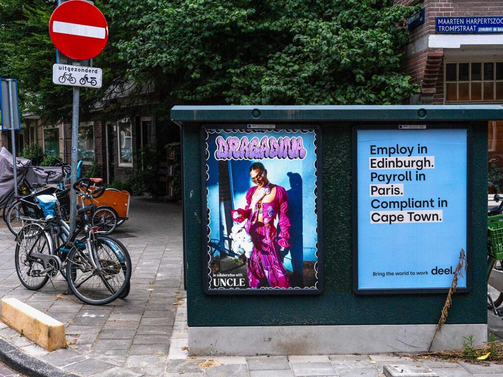
UNCLE partnered with Noor to give a platform to her skills and valuable design mindset. There is nothing more iconic to Amsterdam than the canals, so we got up close and personal with the life blood of the city by pasting columns for DragaDina alongside them. Then we framed her collection defining creative throughout the rest of the city to dominate the streets. We’ve interviewed Mulders to explore the beginnings of her brand and understand her thought processes more; in doing so we got down to the grit of her passion and brand ethos.
WHAT INSPIRES YOU?
I’m inspired by so many things around me which makes it hard to pinpoint what exactly sparks my interest. I try not to think too much, which is difficult because I’m always overthinking.
I find inspiration from nature, old runway shows of the 80’s, 90’s, 00’s I like to look up clothing from renaissance era and research what kind of techniques were used. I find change inspirational; I don’t want to be afraid of change, I try actively to keep changing.
HOW DID YOU GET INTO FASHION?
My Grandma and Mother were a big influence. My Grandma used to own a little fabric store, so working with textiles runs in the family. My Mom made me birthday dresses every year, this gave me the freedom to choose fabrics and ideas on how I wanted the dress to look. This inspired me as a child to be creative through clothing.
WHAT WAS THE FIRST THING YOU CREATED?
I started making clothes for dolls and Barbie’s with help from my mother and grandmother, but I think my first real item was a bag. I didn’t like regular bags and thought they were a bit dull. The construction of the bag wasn’t that great, and it couldn’t even hold books. I had to repair it often, but it gave me a lot of confidence in my creative abilities. I also created accessories, like bracelets or hair accessories, all different types of items to express myself through my looks.
DESCRIBE YOUR DESIGN PROCESS?
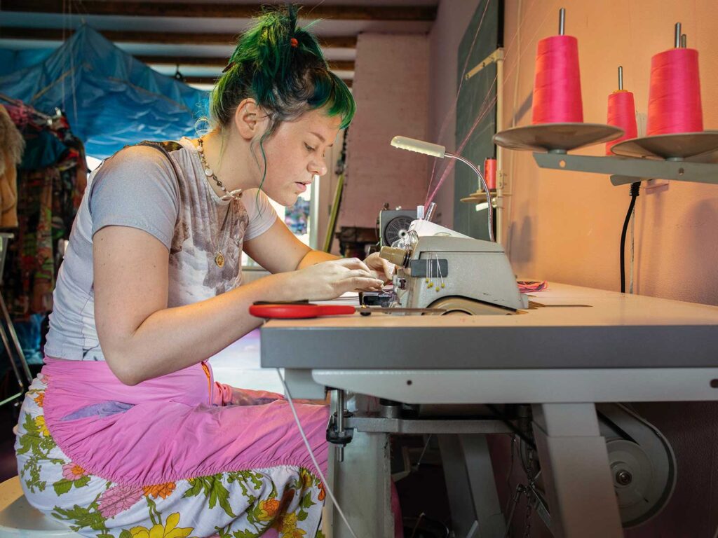
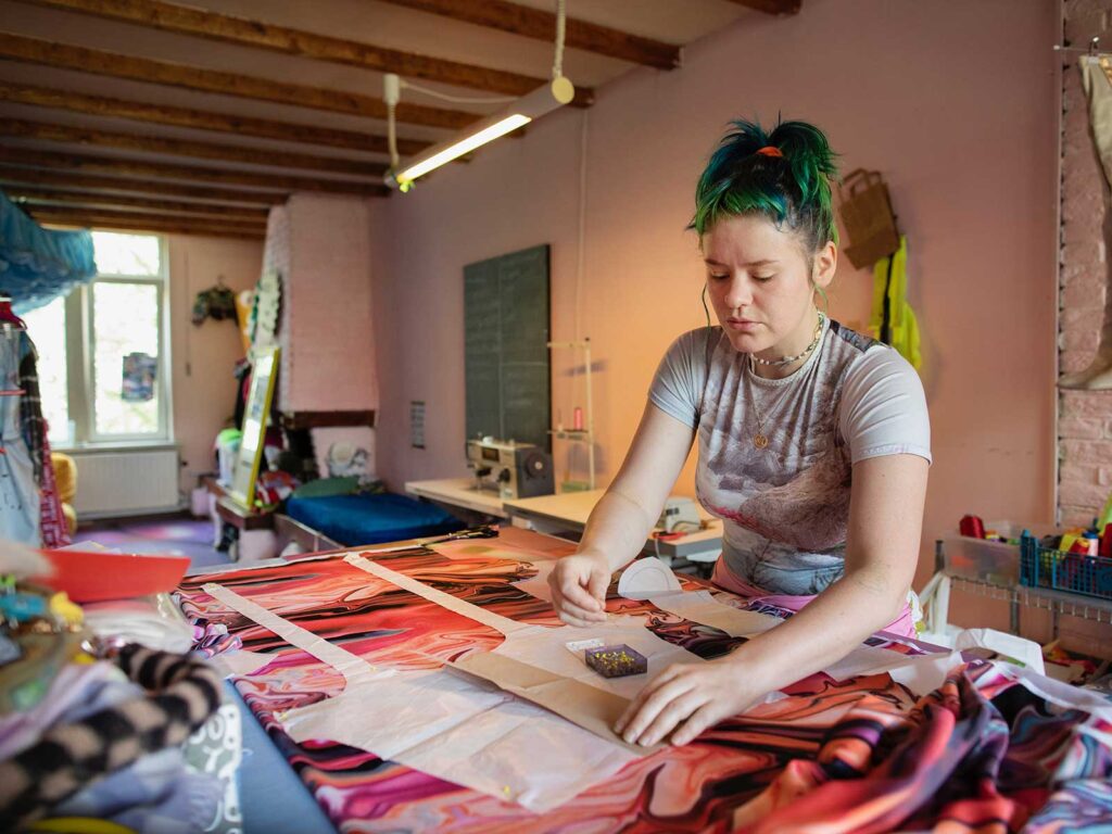
I usually start by finding fabrics first. I prefer to find second-hand fabrics from online marketplaces like Marktplaats. Since there’s a limited amount of fabric available, this helps me create unique pieces.
I don’t really draw what I envision in my mind on paper. Under the sewing machine I sculpt the pieces together and what I see in my mind comes to life. After many years as a textile artist, working with the sewing machine has become a reflex and habit. As a child, I used to play in my grandmother’s fabric store, combining textures and colors, which helped to create my intuitive making style.
WHAT DOES FASHION MEAN TO YOU?
Fashion is a way for me to express how I feel. It helps me to be confident in my skin and with my body. It also helps to attract me to likeminded people. I really enjoy helping people express themselves and feel comfortable with their appearance.
WHAT IS THE THING YOU LIKE MOST ABOUT BEING A DESIGNER?
I see my designs as an extension of myself, and that’s why I enjoy exploring certain characters/personalities within me. People think I dress this way to stand out, but that’s not it. Clothing is a way for me to express my inner self. In my projects, I often strive to create an immersive experience. I want the outfits to fit into their environment. My work creates a space where I fit in, in a world that doesn’t always welcome me.
HOW HAVE YOU REFINED YOUR OWN PERSONAL STYLE?
I enjoy playful and revealing outfits that evoke a sense of sexiness but are adaptable to diverse body types. Vibrant colors and print combinations to create a femme atmosphere where everything or anything goes. My inner child comes through in the way that I create designs and in the final looks.
DOES COLOUR MEAN A LOT TO YOU? WHY?
Yes, it means a great deal to me. Color combinations truly inspire me, I find them in nature and organic material such as tropical frogs, mushrooms and flowers. Sometimes I discover these combinations outdoors, and other times I find them online. I print out references to make inspiration books where I overwhelm myself with options.
WHAT ARE SOME OF THE CORE DESIGN ELEMENTS OF YOUR CLOTHING?
Exposed stitching and seamlines, usually you want to hide it, but I like to show the construction of the outfit. Secondly, fit is very important to my designs. I love it when the clothing shapes the body to embrace your curves rather than hide it. It’s extreme in a way, vibrant colors and patterns. It’s also a filter for attracting people who are excited about expressing themselves through clothing or artists in general.
HOW DO YOU EXPERIMENT WITH TEXTURE?
It’s a very natural process and I don’t really think much about combinations. I try to experiment through the items I see and use them in unexpected ways in my designs. I do not always know beforehand how it will work out.
TELL US ABOUT YOUR ARTWORK DESIGN? THE CREATIVE DIRECTION/IT’S MEANING?
The people who wear my clothing define my brand, and the community that is created when we are together. I love to work with people who want to express themselves, helping them feel comfortable in their body by creating what we feel or how we want to feel. My partner photographs all my work, he captures my projects, contributes to the creative direction and helps me with Instagram.
WHERE DO YOU FIND INSPIRATION IN THE CITY?
The market, on the street, funny stores, nightlife. I find my best little items for accessories or clothing at unexpected shops like tobacco or key stores. The differences in people, culture and items inspires me wherever I go.
WHAT DO YOU LOVE ABOUT THE CITY?
I love my friends also the diverse range of cultures and people inspire me. I live in Rotterdam now and try to travel as much as possible. Eventually I would like to move to the USA. I have lived in Londen, Berlin, and visited New York and New Orleans many times. I love all these different cities and the experiences there bring me something new every time.
HOW HAS THE NETHERLANDS SHAPED YOU AS A DESIGNER?
The ability and privilege to travel as an adult beyond my own hometown and be curious about the world has shaped what I create. My designs are about expressing yourself, about different people who respect each other and embrace our bodies. Because I learned about other cultures while growing up in the area of Rotterdam, I have always been excited and curious about other experiences and have seen different ways how people express themselves, how they are true to their inner self. That inspires me to do that myself.
HOW WOULD YOU DEFINE YOUR BRAND?
I’d like to keep it playful and like to keep my intuition flowing. I make a lot of different things and try to create my own world.
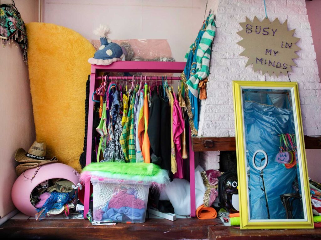
WHAT’S NEXT FOR DRAGADINA?
I have just finished a big project called “Busy in my minds” where I invited visual artists to co-create a new collection. Now that it is finished it made me realize I want to find more independent shops around the world where to carry my clothing. It would be amazing to have DragaDina on the road and create while I travel! My ultimate dream is to have a sailboat shop for a little while and design from there.
This website uses cookies to improve your experience while you navigate through the website. Out of these, the cookies that are categorized as necessary are stored on your browser as they are essential for the working of basic functionalities of the website. We also use third-party cookies that help us analyze and understand how you use this website. These cookies will be stored in your browser only with your consent. You also have the option to opt-out of these cookies. But opting out of some of these cookies may affect your browsing experience.
> NECESSARYAlways enabled
Necessary cookies are absolutely essential for the website to function properly. These cookies ensure basic functionalities and security features of the website, anonymously.
> FUNCTIONALDisabled
Functional cookies help to perform certain functionalities like sharing the content of the website on social media platforms, collect feedbacks, and other third-party features.
> ANALYTICSDisabled
Analytics cookies are used to understand and analyse website traffic and user behavior. This helps us improve our website and services.