


features
10.23 Artist Charlotte Smith uses a bold amalgamation of stylistic choices to incite conversation.

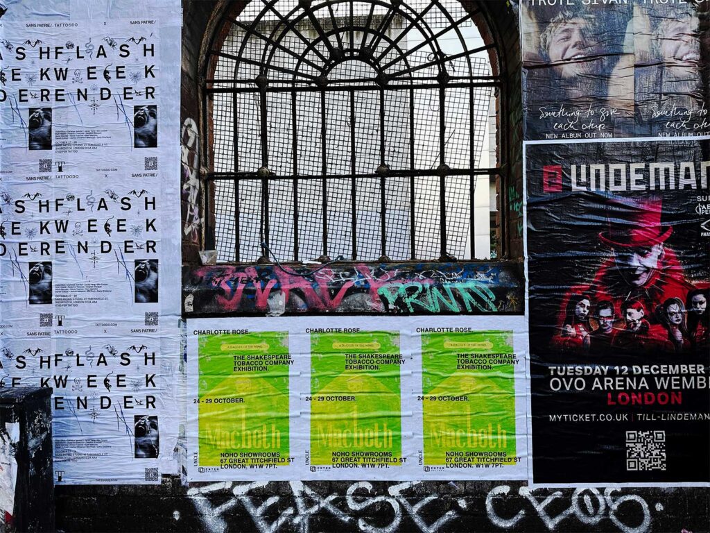
Charlotte Smith has an exhibition at Noho Showrooms running until Sunday 29th October showcasing her truly unique set of offerings. Inspired by classic cigarette packaging and drawing parallels between Shakespearean literature and modern-day consumerism – her pieces pack a punch. In her words “the cigarette companies were selling what are effectively poison to the consumer wrapped up in a beautiful box, there’s something macabre but also… dare I say, impressive about this lie. For this exhibition I found that the themes of Shakespeare, power, greed, mortality are really reflected in Big tobacco”.
The legacy of Shakespeare on modern culture is not something easily ignored, but as often as positive presences entwine themselves with society, so do negative ones. The tobacco industry seeped into the everyday life of the consumer and has never really left, even after mandates and new facts outlining the dangers – especially compared to what was known half a century ago. Though comparing Macbeth and other Shakespearean references with cigarettes initially can seem left field it certainly makes sense when given consideration, as both have been core parts of the human zeitgeist. Their themes overlap, especially in the hands of Smith who incites the conversation around the topic of history repeating itself in – let’s face it, mysterious ways.
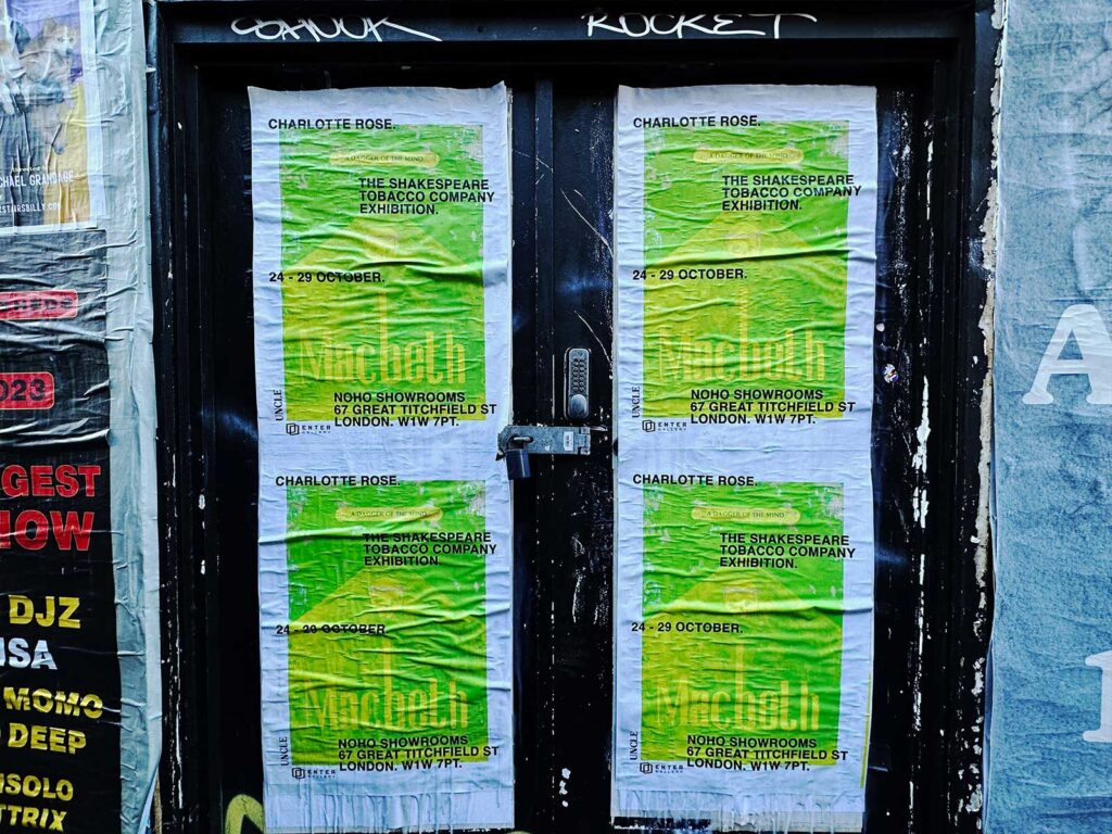
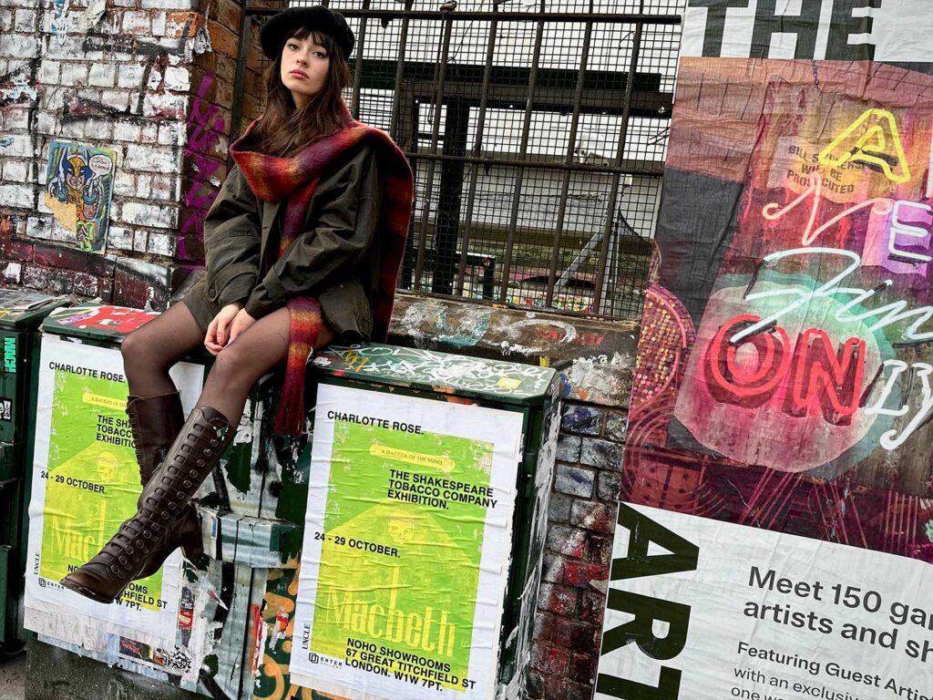
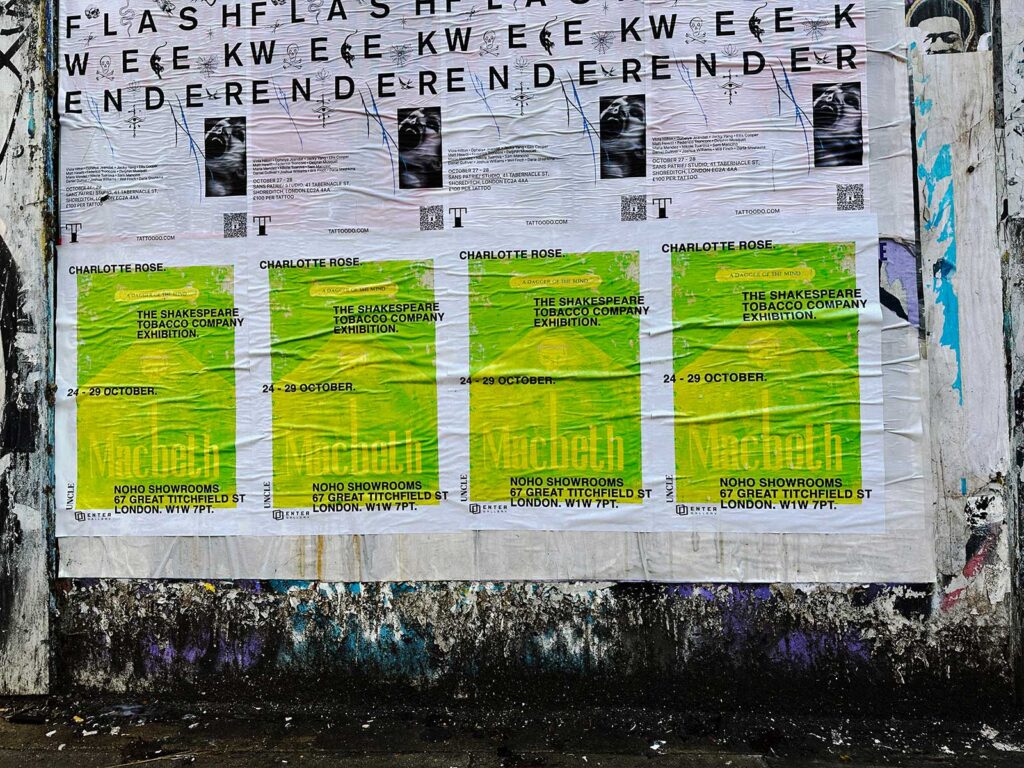
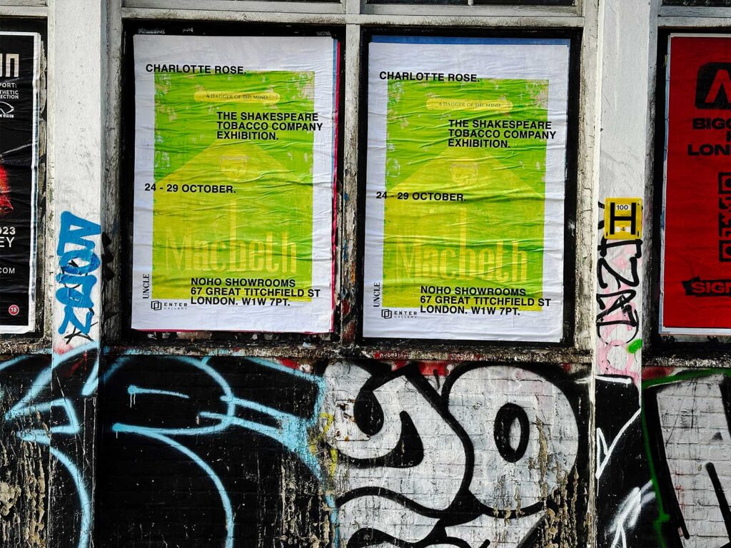
UNCLE partnered with Smith to get word out to the streets that something big was happening – and with a zesty lime green poster the streets were brightened. We did a photoshoot of her with the artwork in the heart of Shoreditch, and then the lowdown on the shows theming and London ties with an interview.
HOW DID THE NAME ‘THE SHAKESPEARE TOBACCO COMPANY’ COME TO BE?
I never start a body of work with the name of the exhibition, I start with a theme and a few ideas for some paintings, I’m usually five paintings down before I think of a name for the show. I wanted something punchy and a little dramatic, I quite like the idea of someone walking past the gallery and seeing it with no context and being a little confused as to whether or not we are actually selling cigarettes. As if they’re stepping into an alternate universe where my paintings are a real product; we even filmed a 60s style satirical cigarette advert for the capulet box.
WHAT DREW YOU TO CIGARETTE BRANDS IN PARTICULAR TO DRAW COMPARISON WITH OTHER THINGS?
My first exhibition in 2021 ‘I Quit Last Week’, was a collection of the classic cigarette boxes of the 60s and 70s. Brands such as Marlboro are so intrinsically tied to the American Dream. The idea that if you smoke a particular cigarette brand you step into the shoes of a cowboy, a film star, a baseball player. The cigarette companies were selling what are effectively poison to the consumer wrapped up in a beautiful box, there’s something macabre but also… kinda, dare I say, impressive about this lie. For this exhibition I found that the themes of Shakespeare, power, greed, mortality are really reflected in Big tobacco.
WHY DOES CLASSIC LITERATURE PLAY A BIG PART IN YOUR ARTWORK?
I studied literature and creative writing at university, I wanted to write novels as a kid, I think Literature is something that I naturally pull reference from since it’s something that built the foundation of my life as a young adult.
DO YOU HOPE THE PROVOCATIVE THEMING OF YOUR DESIGNS WILL CAUSE A STIR?
I think if you endeavour to create artwork your intention is to evoke some sort of reaction from the audience. But I try to keep my work satirical and playful!
WHAT IS YOUR ASPIRATION FOR THE EXHIBITION?
I want to share my work with people, I spend most of the year alone in the studio so it’s nice to have a place where I can connect with those who have being following my work and have the opportunity to hang the paintings in a space curated by me!
TELL US ABOUT HOW YOU FOUND YOUR STRIKING STYLE AND THEMING CHOICES?
I’m really inspired by 1960s branding and advertisement, so all of my boxes have an essence of that era. I love the weathered look to the boxes; I try to emulate the feeling that the box has been sat in the back pocket of someone’s jeans for a while! A few boxes (specifically the Capulet and Montague) are massively inspired by medieval court paintings, I’m a history nerd so I wanted to reflect a little slice of that side to my interests.
WHY ARE YOU DRAWN TO THE STYLISTIC CHOICES YOU ARE? COLOUR, EMBOSSMENT, SHAPES ETC…
This exhibition is comprised of oil paintings, I love the richness and depth of colour you can achieve, and I often use gold leaf which adds to this sumptuous result. My screen print Macbeth pieces are in three colour ways: Black red and neon green. The idea for the neon green actually came from the colour of the screen in the screen-printing process, I thought it looked dope and I wanted a ‘slap in the face’ with the impact of the colour – I think we achieved this ha! This exhibition I designed most of the cigarette’s boxes so I looked to design work from the 60s/70s as these eras really do it for me in terms of style! I tried to make each box design simple but impactful and interesting.
WHAT WAS YOUR INTENTION WITH THE POSTER DESIGN?
For the poster design I chose the neon green screen print of the Macbeth, the neon green packs a punch and will stand out as a paste up across the city. The story of Macbeth acts as a reflection of the cigarette industry – turning a blind eye to morality for power and profit, for me this image represents what the exhibition is trying to convey in one stand out artwork.
HOW HAS LONDON SHAPED YOUR DESIGN CAREER AFTER MOVING HERE AND DO YOU FIND INSPIRATION IN THE CITY?
I think surrounding yourself with creative and driven people is the most valuable thing. London really is a city of all different people from different backgrounds that come to chase a dream of some sort. Finding my people in this city has been the biggest thing for me as an artist. I love the street art in and around London, whether it’s a big fat mural or a sticker slapped to the back of a lamp post. Sign writing is a big one for me, my camera roll is full of snaps from the backs of moving cabs, shop fronts, bakeries, tailors. It’s a dying art so when I see hand painted signs, I really appreciate it MORE OF THAT PLEASE!!