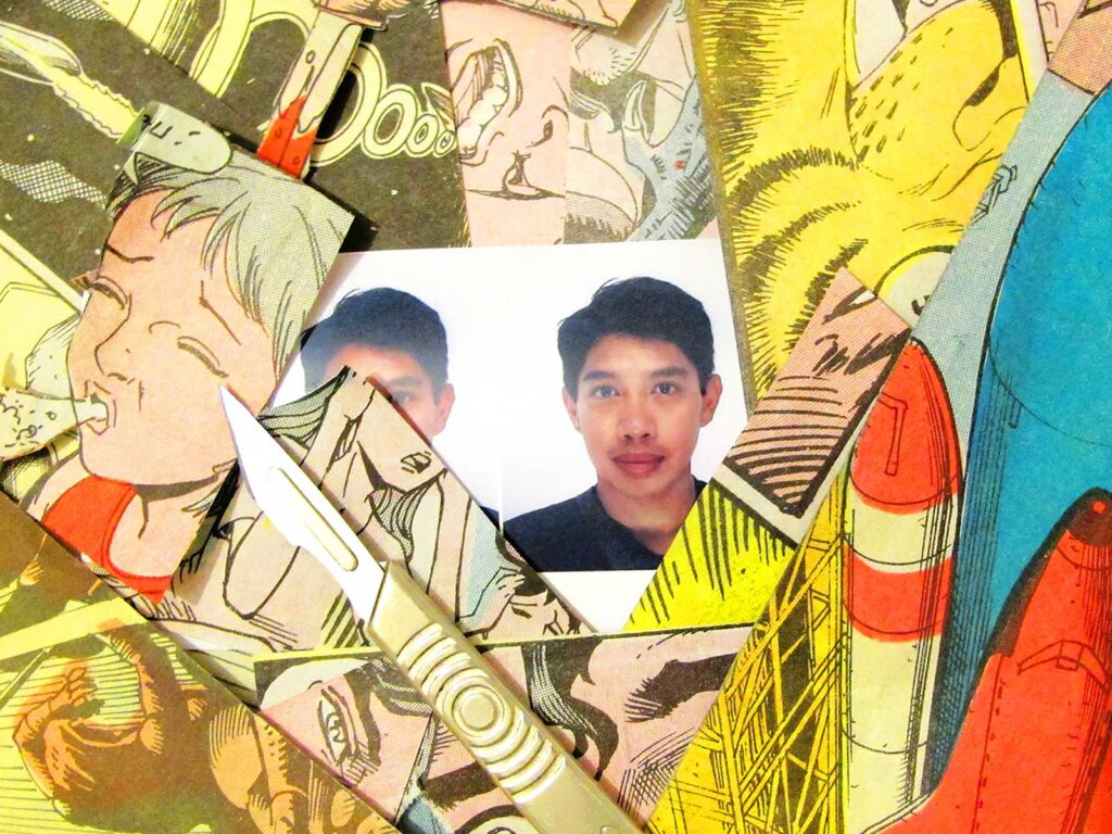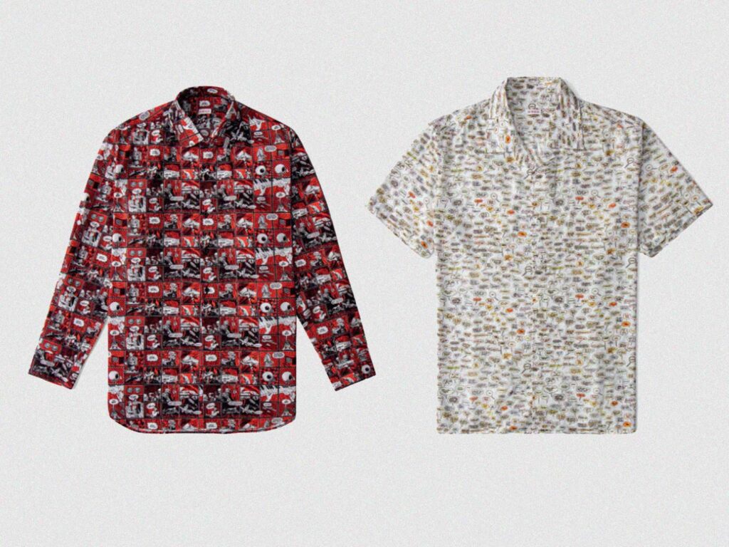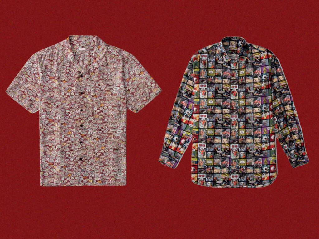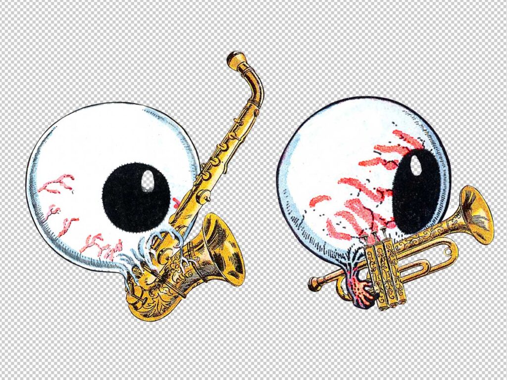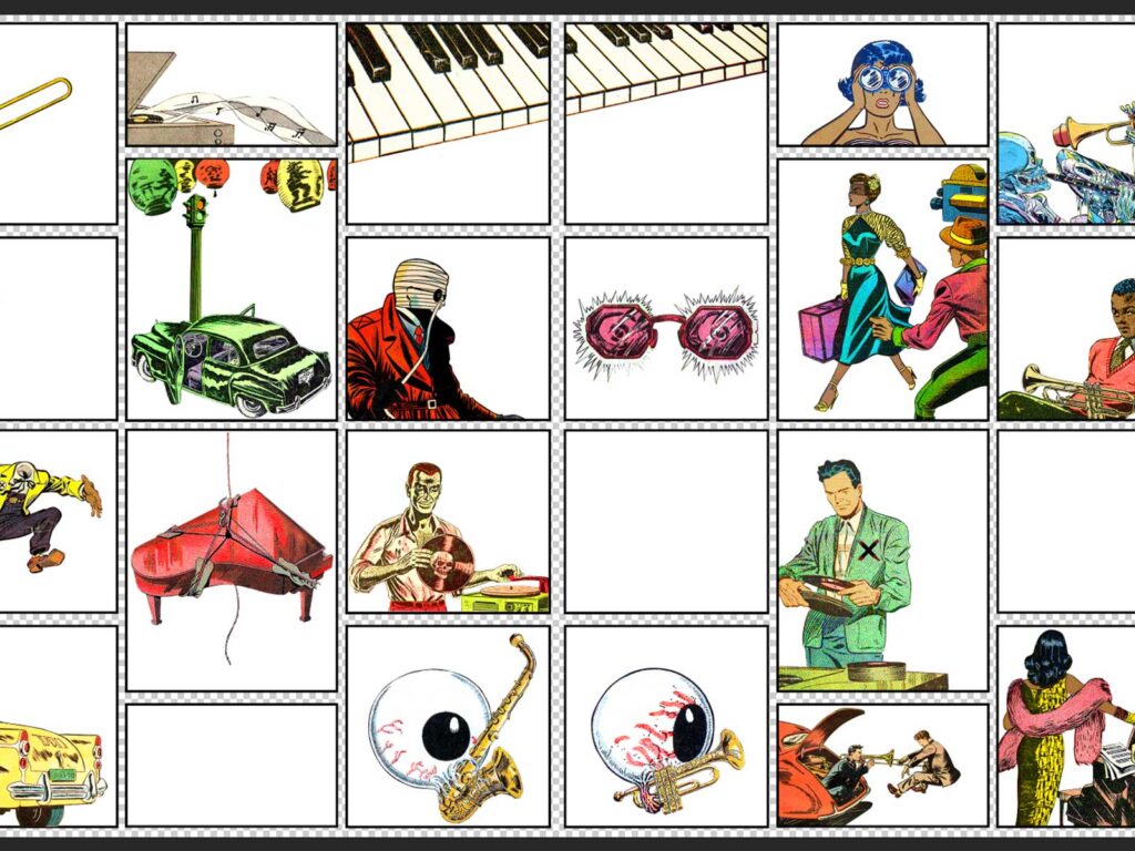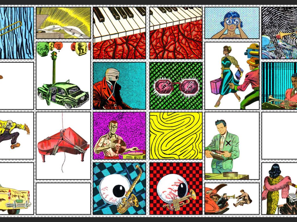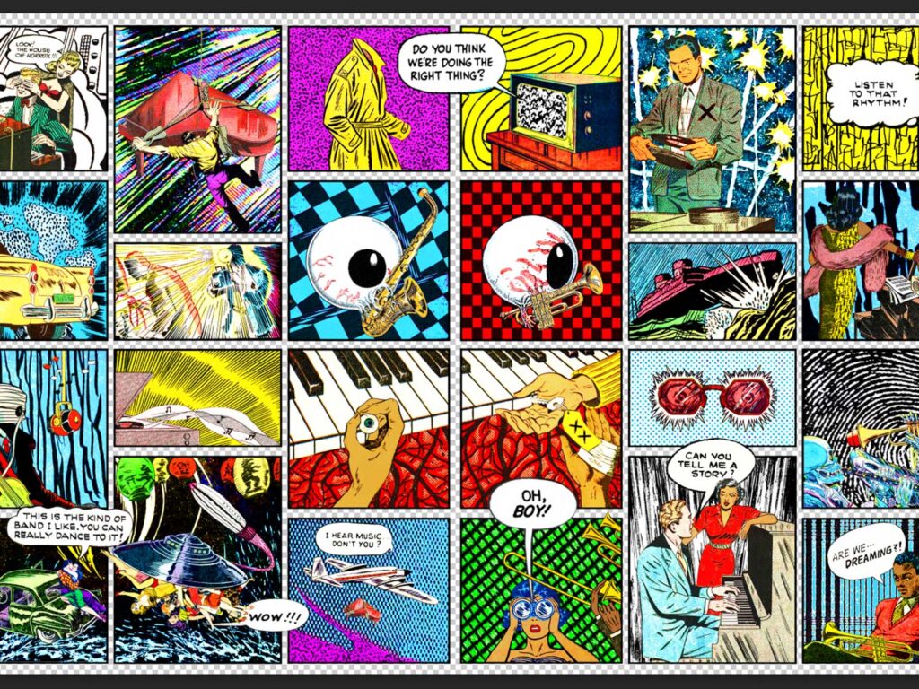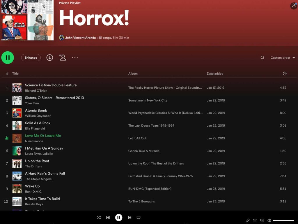
Horrox is not a brand that exclusively pulls from the past but also the present, with some of its most prominent pieces being collaborations with artists and charities. In continuation of UNCLE’s partnership with Horrox we put a spotlight on one of these collaborators. JV Aranda, an artist based in San Francisco uses a mixture of colour, printing and repetition to make an impact with his graphic designs. His playful graphics prioritise impactful, layered motifs that are reminiscent of a pop art and dadaism which seemed a fitting match for the first collaboration of Horrox as the brand also borrows from the past for its creative direction. We took a spotlight and enquired about how his contemporary techniques and style have developed as he’s grown as a creator.
HOW DID YOU GET INTO ART?
Fortuitous museum visits during my formative years. For instance, in 1998, while on a trip to Los Angeles to celebrate my 16th birthday, I had the good fortune of being introduced to the work of Yayoi Kusama via a retrospective exhibition of her work at LACMA, which was mind-blowing and incredibly influential in a multitude of ways: from her enthusiastic experimentation across different mediums to how her practice overlapped with her mental health, nationality, gender, era, and pure intuitive visual talent. Her work has always served as a wonderful example of the limitlessness of Art as a storytelling device and her resilience and prolific output continues to be an inspiration.
WHY COLLAGE?
Collage was always a medium that just made sense to me since first being introduced to it at school. The materials needed were accessible and the process of destruction, manipulation and reinvention has always felt liberating and cathartic.
Additionally, with the amount of content being generated daily in this day and age, Collage has grown in importance as a method to utilise the world’s growing collective archive, showcasing and re-contextualising imagery that would otherwise be ignored or forgotten.
DESCRIBE YOUR DESIGN PROCESS?
It’s a mix of following my intuition and problem-solving. I’ve always loved being commissioned and receiving a brief to interpret with various constraints to meet. So the design process can vary due to the project at hand, and my favourite experiences have been the ones that allowed me the opportunity to widen my scope and try new things, like working with Horrox, which gave me the chance to use the comic-strip panel format as a structural device and incorporate speech bubbles in my work for the first time.
WHAT IS THE THING YOU LIKE MOST ABOUT BEING AN ARTIST?
I love how artwork can form a life of its own while retaining that psychic link to its creator, who essentially become visually invisible when the work is finished. As a Queer, Person of Colour, creating artwork feels like one of the few realms in which I’m not immediately judged by any of my physical or sociological attributes, though my work is always representative of all of those things purely from being filtered through my vantage point.
TELL US MORE ABOUT THE COLLABORATION WITH HORROX?
Legs somehow found my work out there in the ether and got in touch with her vision for the prints that she had wanted to commission for Horrox. I was enthused after being introduced to her work and learning where she wanted to go conceptually with the prints and was pleasantly surprised to discover the strange parallels we had with one another; Namely that I was an American living in the U.K. at the time and that she was British and living and working in my home state of California.
WHY ARE YOU DRAWN TO USING COMIC STRIPS IN YOUR WORK?
When working with Comics, I’ve primarily been drawn to utilising work from the Golden Age of American comics, which spans from the 1940’s and 50’s, since I not only enjoy the aesthetics of that era but additionally have gotten a kick out of re-contextualising work that was originally found in arguably quite wholesome environments, and reconfiguring the work with more modern narratives that reflect our current realities and collective discourse.
HOW HAS CALIFORNIA AND LONDON INFLUENCED YOUR WORK?
Growing up in California, I was surrounded by pop culture and the grandeur of nature. I was essentially raised by cartoons and theme parks. And I’ve often felt that the hyper-saturated colour palette of my work is very much informed by being a Californian. Living in London was quite a contrast and helped me realize that pursuing the arts was not only valid but important, and it was incredibly inspiring to be in such a global and diverse city, absorbing such a range of stories. My work may be incredibly influenced by California conceptually, but I learned how to become an artist thanks to London.
HOW HAS SAN FRANCISCO HELPED SHAPED YOU AS A DESIGNER?
When Legs got in touch about the commission, I was living in London and when she mentioned she was based in San Francisco at the time and wanted the prints to reflect the city and it’s musical history, specifically during the Jazz age, I was absolutely delighted as a former San Franciscan, previously living there for a number of years in the early 2000’s, back before I even realized I was an Artist and Designer. So, I’d say my time in San Francisco planted a lot of seeds, that still grow to this day. There’s an organized chaos to the city, or rather, a battle between structure and hedonism, that definitely shapes my work.
DOES THE CITY INSPIRE YOU?
Absolutely. Living in San Francisco was my first experience as a young adult with the wonder and perils of embracing spontaneity. I was raised in San Diego, which is very much a car-based city, so it was quite liberating living in San Francisco, which is much more pedestrian friendly. I’ve always been inspired just walking around the city and getting immersed with the different personalities of both the different neighbourhoods and the characters who happen to be around on any given day.
WHAT ARE SOME OF YOUR FAVOURITE PLACES THERE?
I’m biased towards the neighbourhoods I previously lived in: the Castro and the Mission, which includes my absolute favourite place in the city, smack dab in the middle of those areas: Mission Dolores Park, which is situated on an incline with a gorgeous view of Downtown San Francisco, and has been the setting of many meditative walks, sunny celebrations and heartfelt conversations with loved ones in the past.
WHAT’S NEXT FOR YOU?
More Collages! Currently, I work as an Editorial illustrator for a variety of clients. Most recently, I’ve been working with the esteemed American automobile magazine, Road & Track, creating collages for a column called the ‘Department of Overthinking’ and I’ve also begun to participate in different art fairs, showcasing all of the different adaptations of my Collage work, in preparation of opening Sinewy Sea Fine Art, which will be a hybrid of an Arts Space, Tea Lounge and Gift Shop, showcasing modern curiosities and storytelling, to be based in San Diego.
