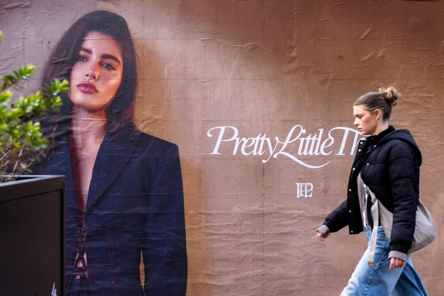
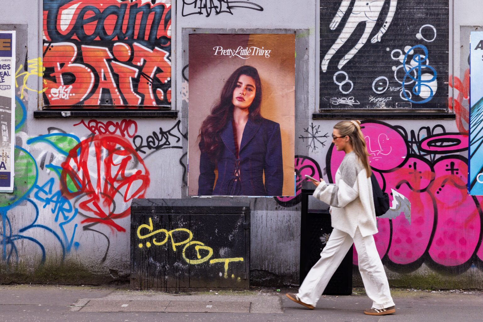
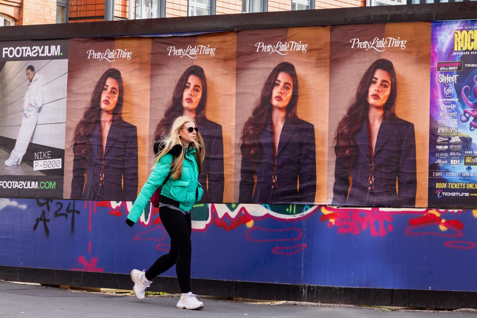
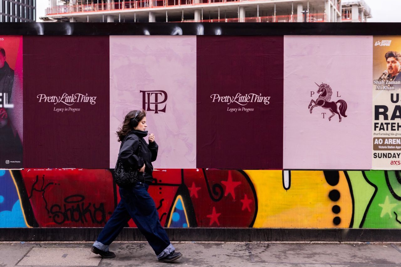
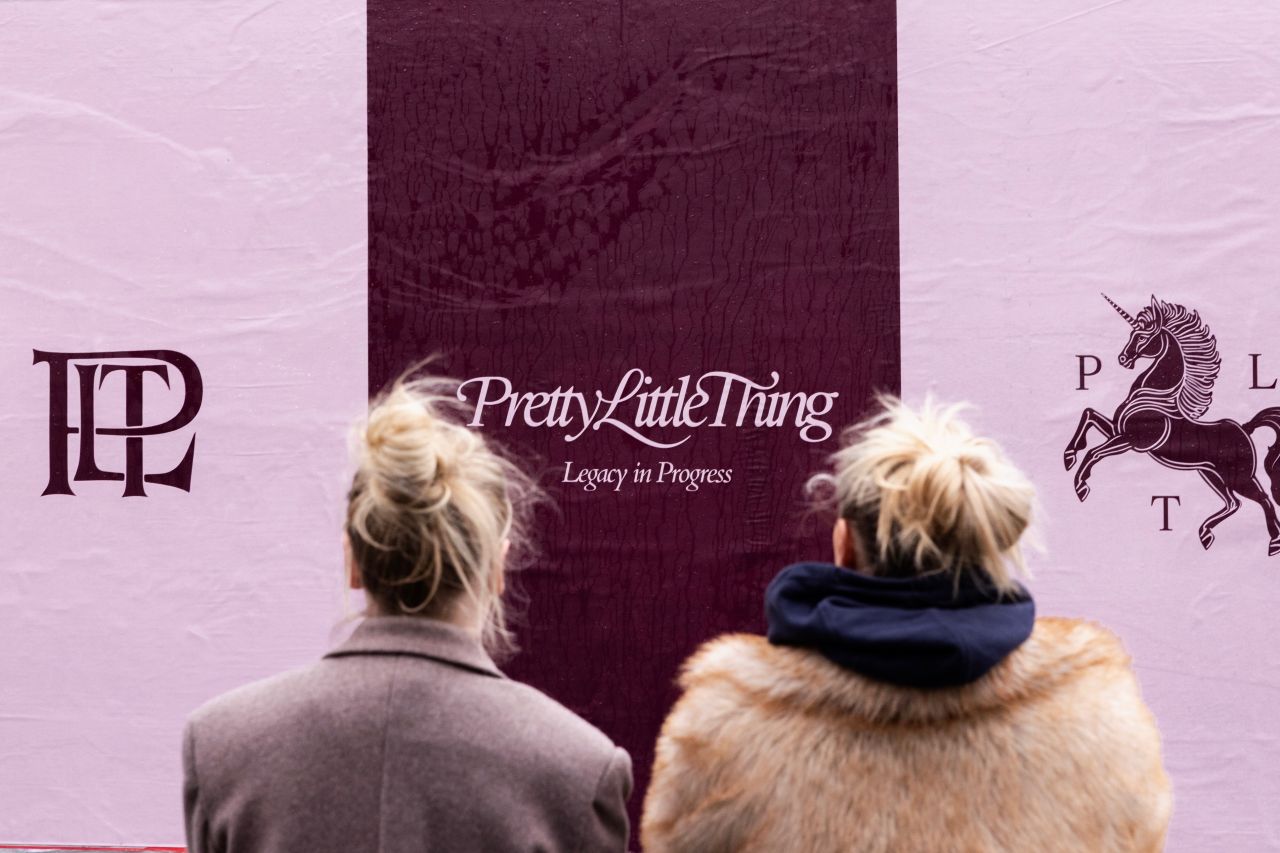
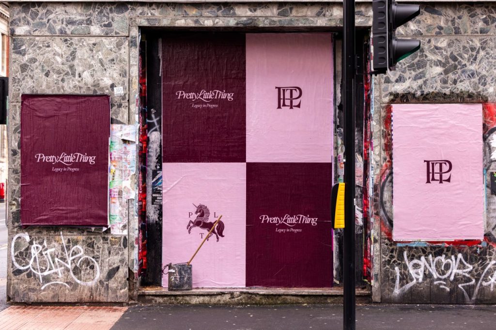
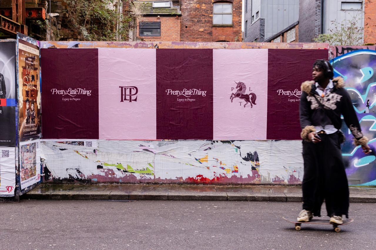
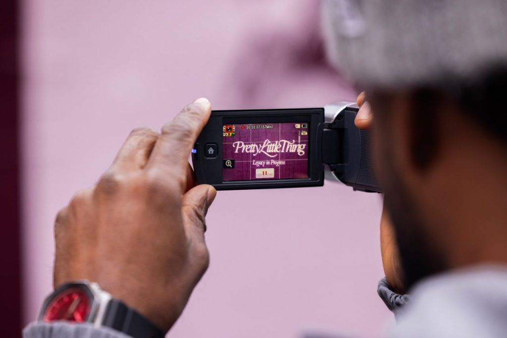
PrettyLittleThing has entered a bold new era. With a sleek redesign of their typeface and logo, this rebrand isn’t just an upgrade – it’s a power move. A fresh identity, a revitalised energy, and a campaign that made waves. The launch wasn’t just about visuals; it was a statement. With UNCLE capturing the shift in a dynamic video featured across
PLT’s socials, the message was loud and clear: this is PLT, redefined.
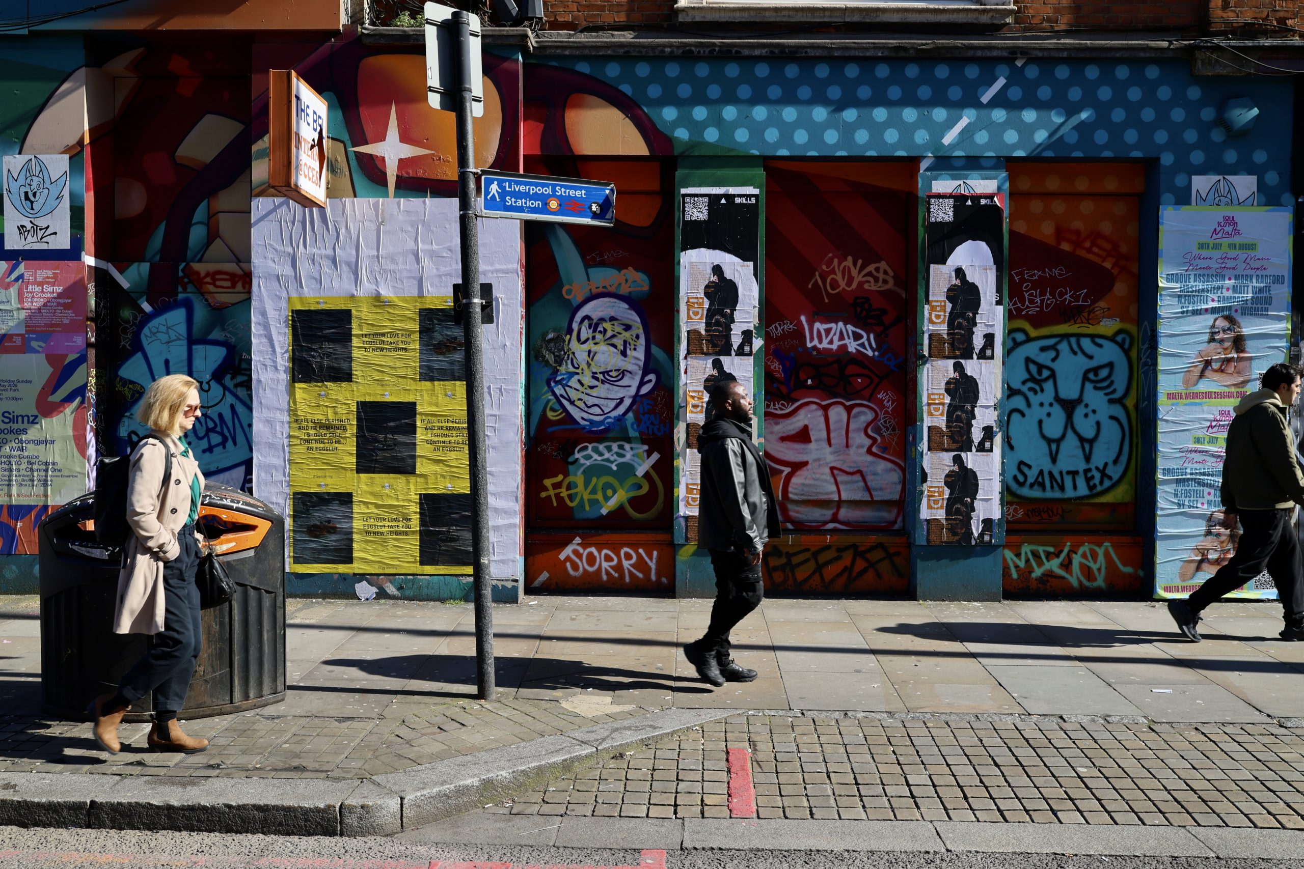
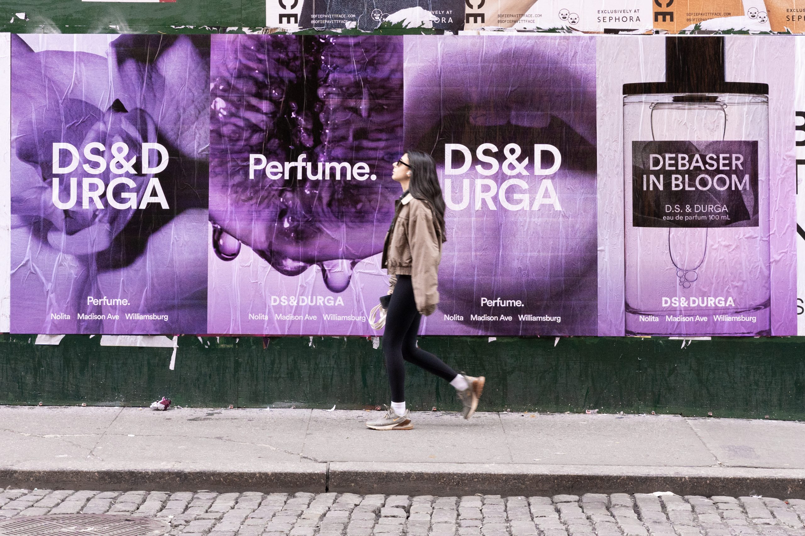
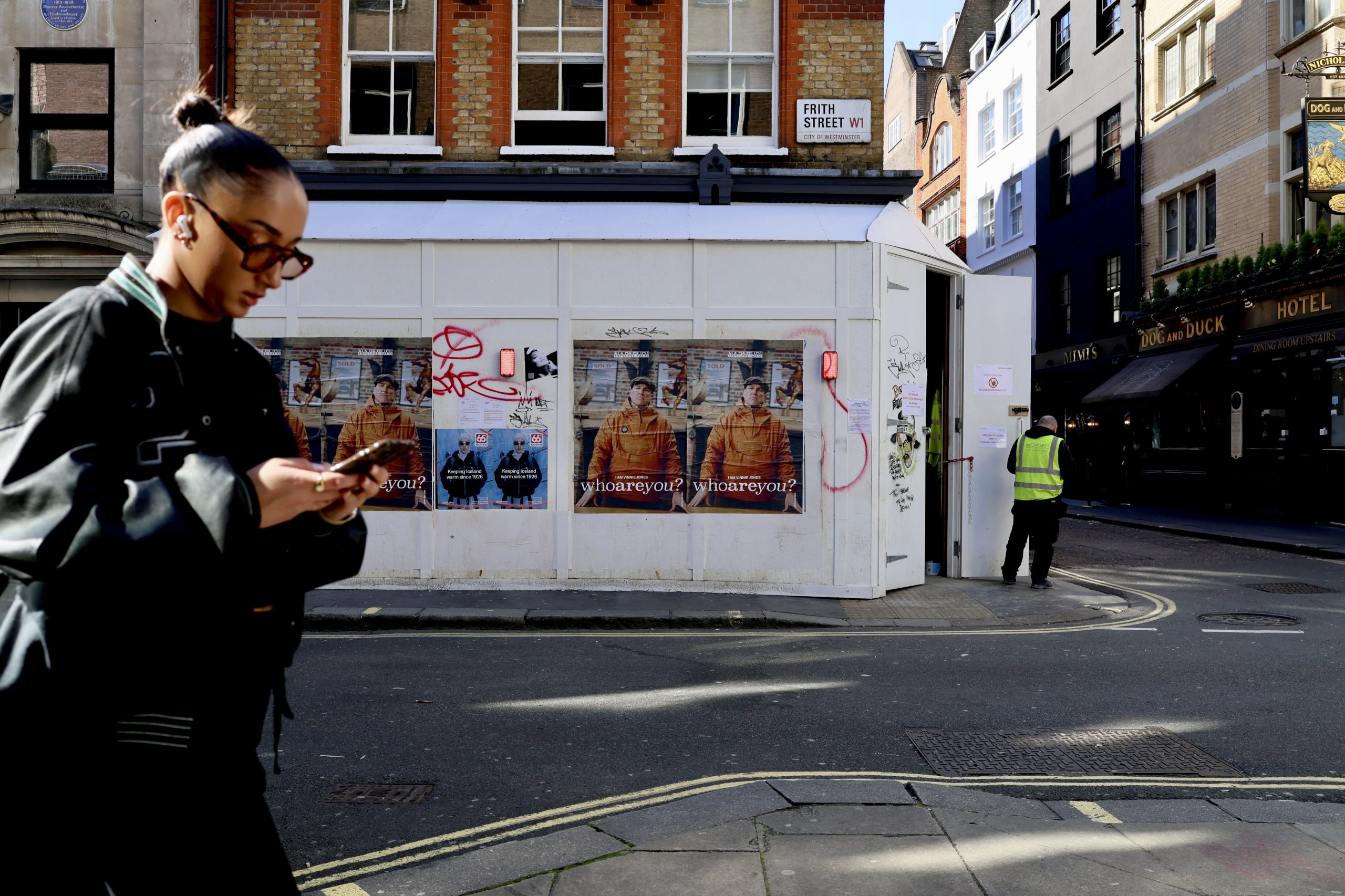
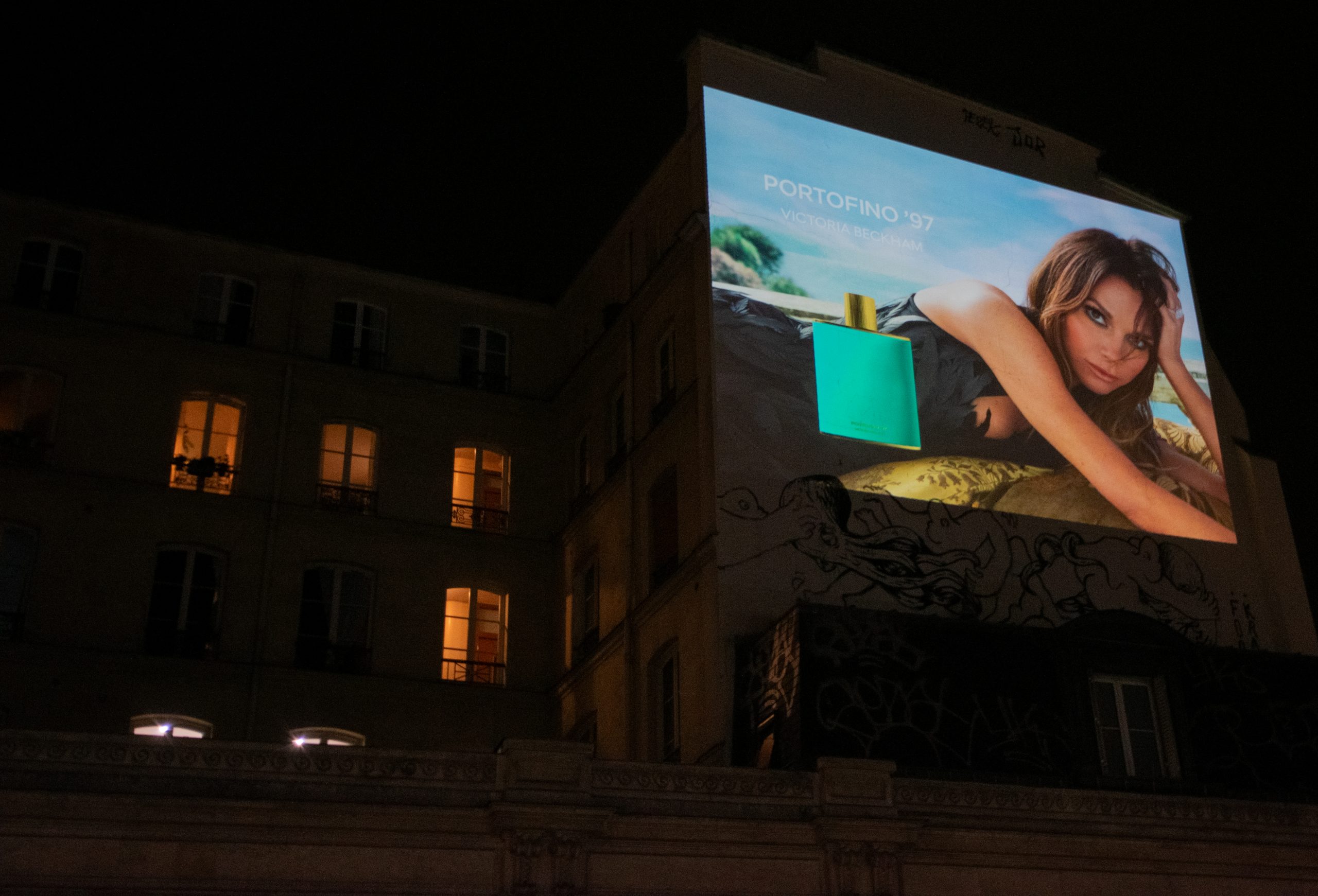
The momentum didn’t stop there. A second wave of flyposting hit the North with a new creative, turning streets into a canvas for PLT’s evolution. Backed by
Emporia Marketing Ltd, the campaign didn’t just get seen; it got felt. Visuals make the message clear. Want your audience to feel the shift? A poster can do just that.
