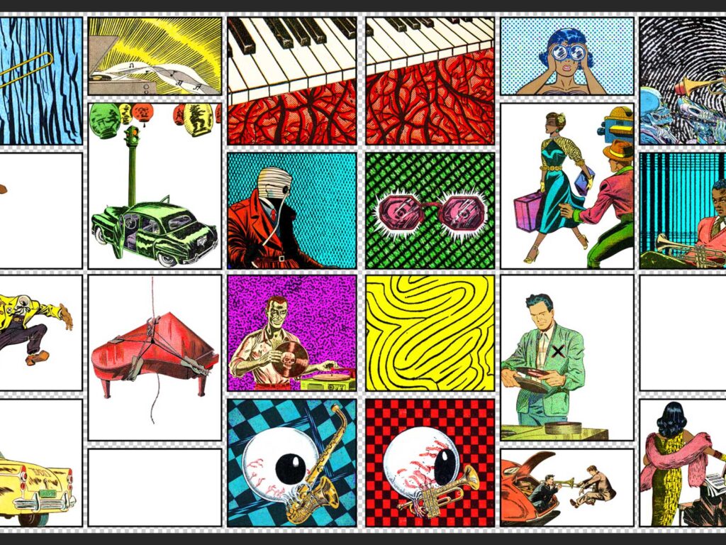
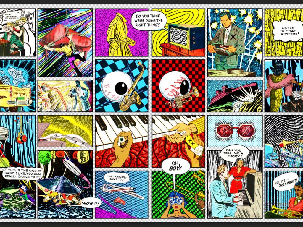
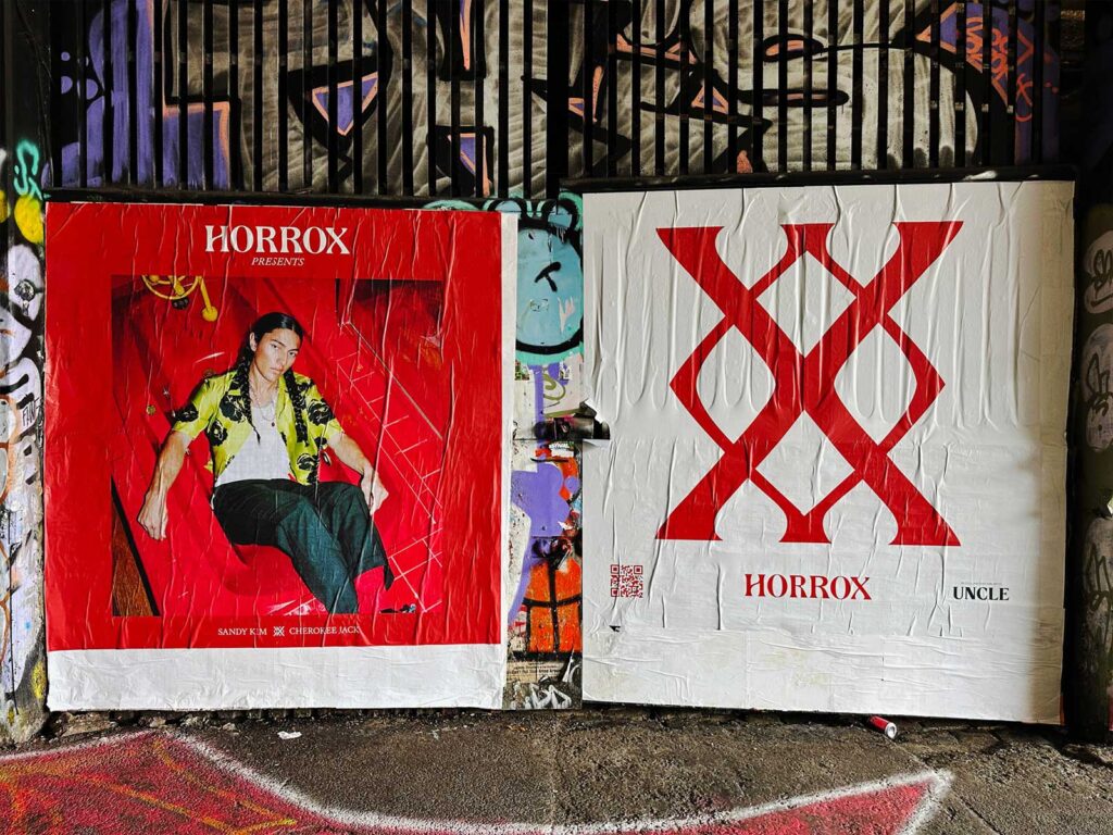
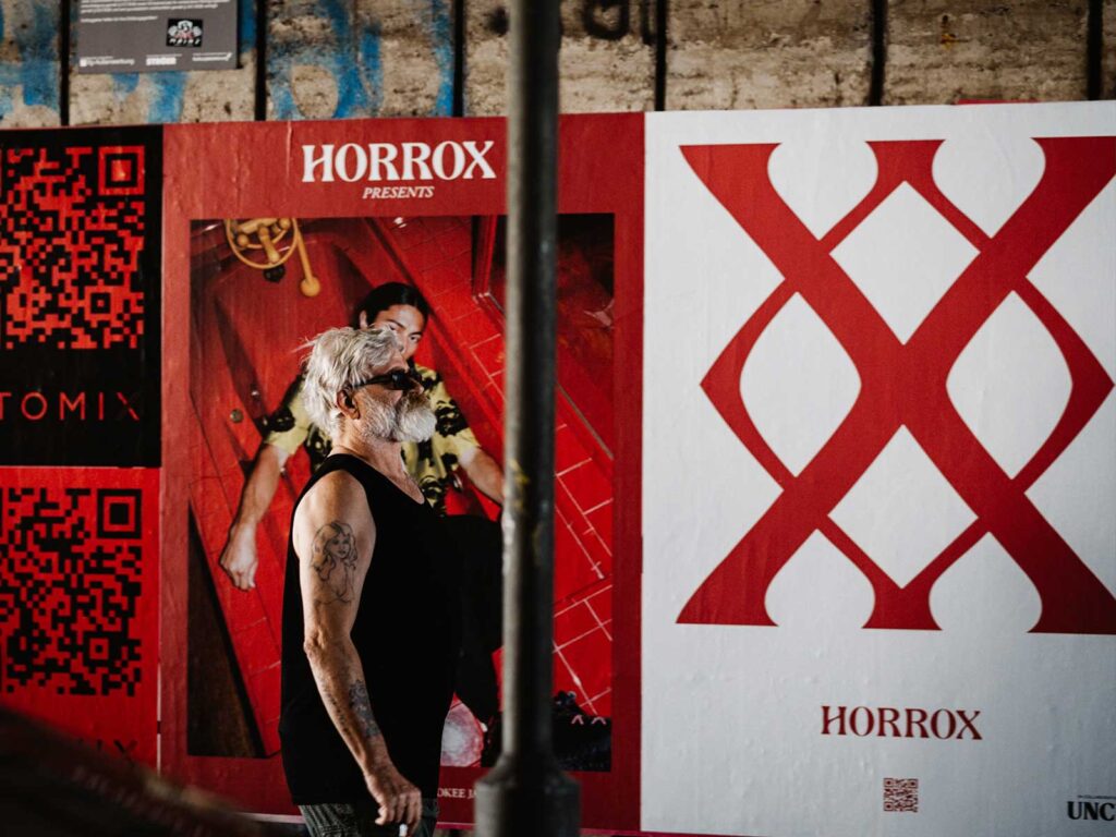
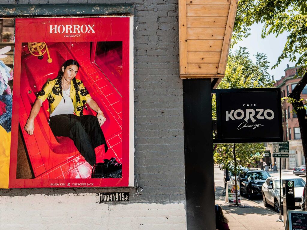
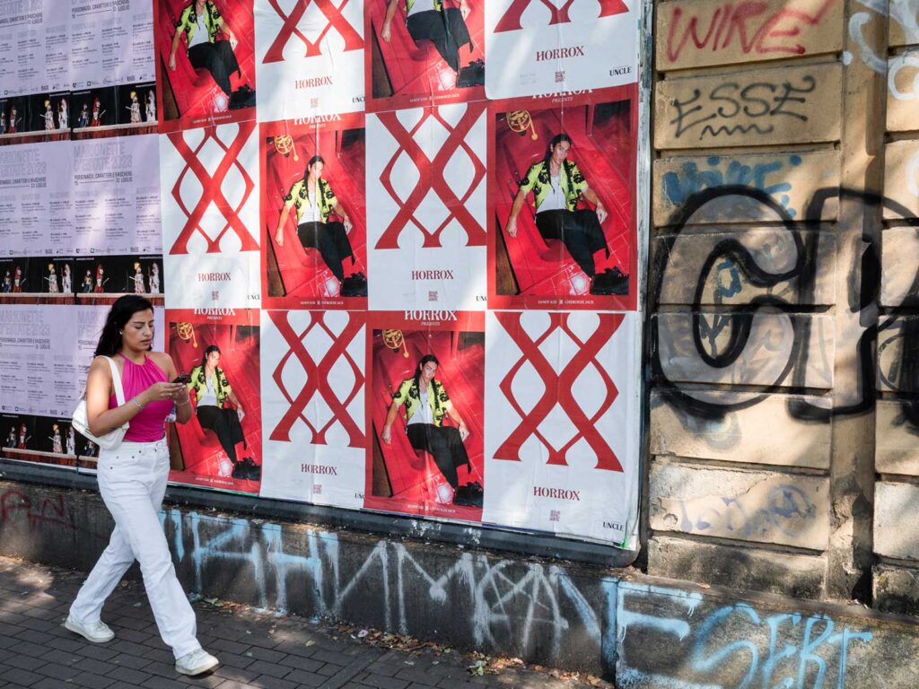
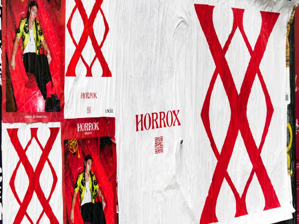
Horrox has been hotting up the fashion scene with a poster campaign popping up internationally courtesy of UNCLE. Our continued partnership with the androgenous clothing brand seems an opportune moment to home in on the effective and varied methods UNCLE uses in cities worldwide to create campaigns worth talking about.  

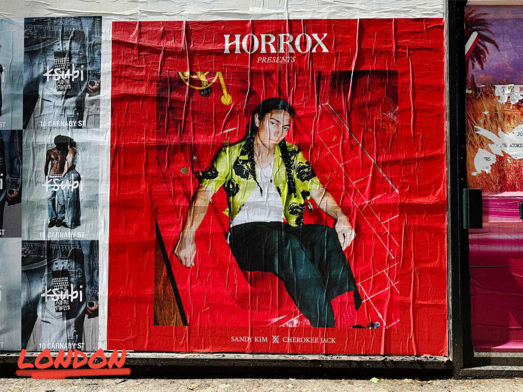
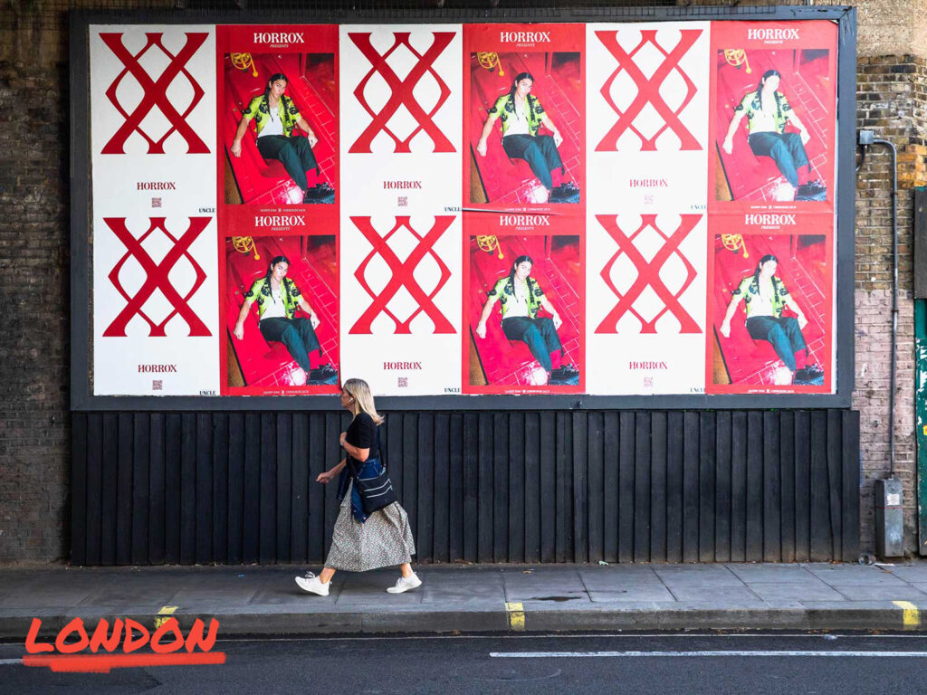
London is the foundation of UNCLE’s existence; we were borne in the rebellious beginnings of the fly format, it’s our roots. Our mindset for our home market tends to be ‘go big or go home’, using all our format types to create a high frequency and saturated campaign across the city. Whether that be three billboards in a row for a street takeover or a paste up to play with a unique square creative, Horrox took advantage of all this city has to offer.  

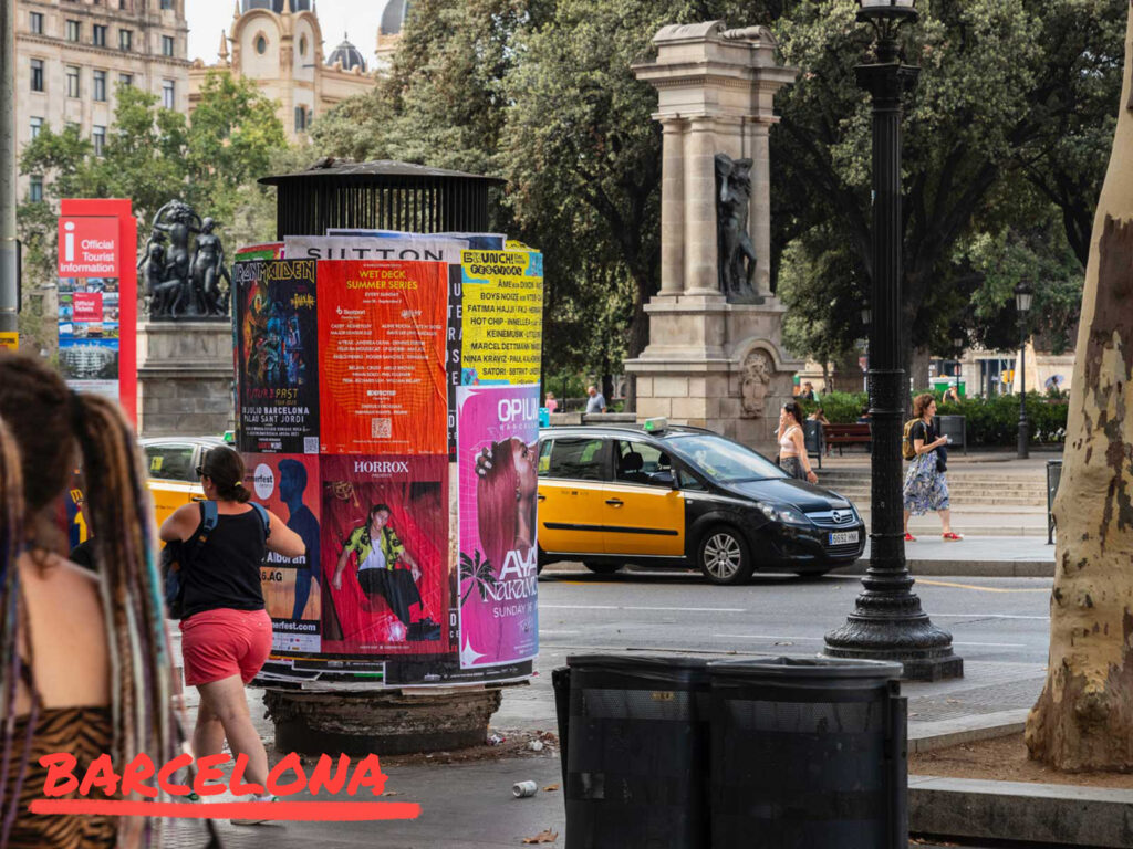
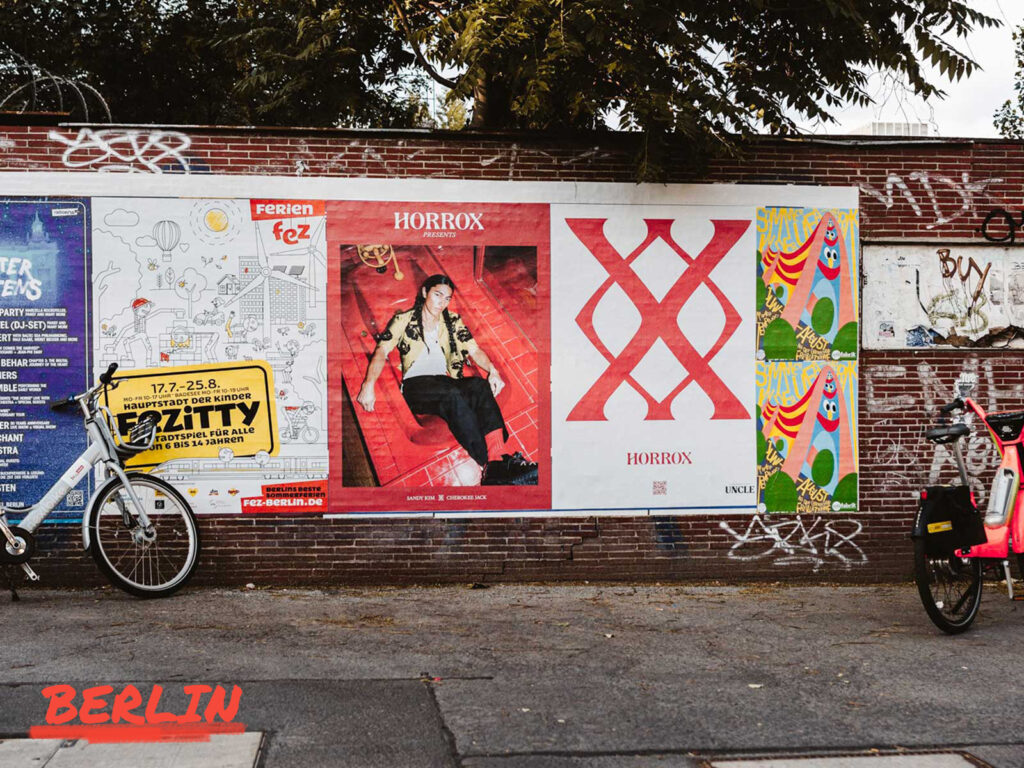
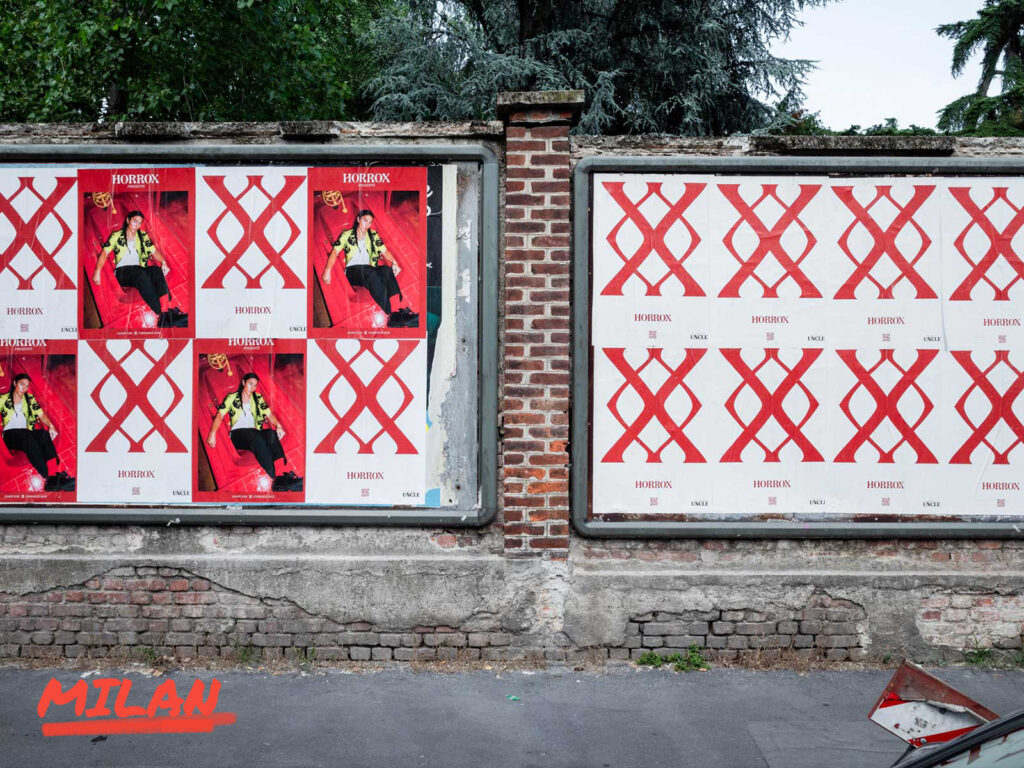
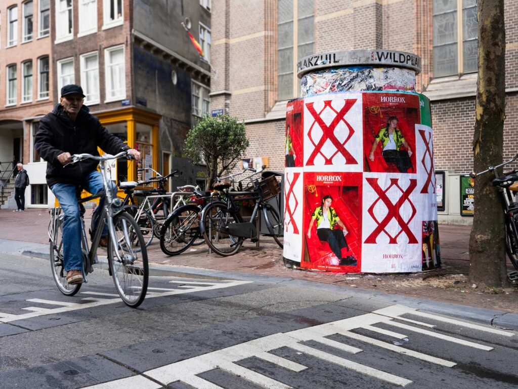
European markets themselves each carry with them individualistic elements that are iconic in their own rights. Amsterdam always makes for a campaign that transitions to the digital well, being a city so instantly recognisable, our sites work wonders across social channels. Barcelona, a sunny haven where pillars cut through crowds, high foot traffic are always on the cards for those who are displayed here. Ever the crowd pleaser is Berlin, a sought-after mecca for brands that like an edge, our sites have an industrial feel, and this grittiness certainly added a sense of intrigue to the Horrox campaign itself. Milan – one of the world’s fashion capitals – it’s sunny streets and refined site design always lead to a clean looking outcome for campaigns, a favourite of brands going for class. Finally, we have Paris, whose arguably most important feature being the context that comes with it – all things fashion needs to have a presence here. A combination of these cities made a unified stamp across the continent for Horrox and built brand image in alignment with each city’s perspective.  

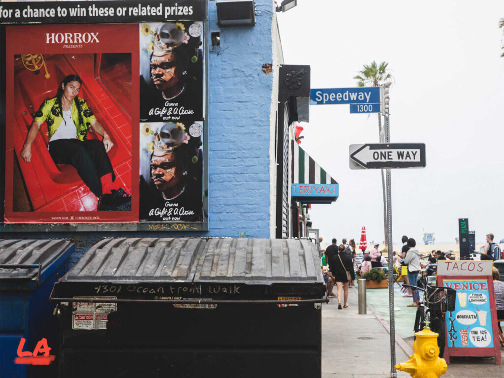
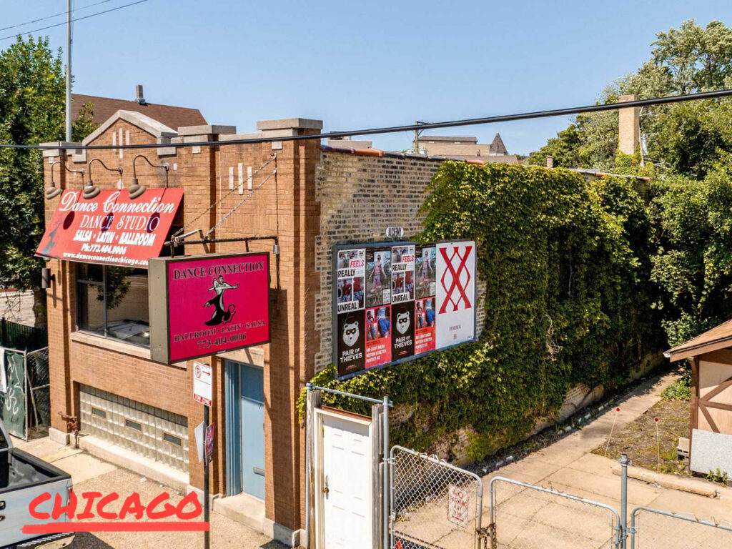
Let’s not forget our overseas cousin America – a beast that brands always want to conquer. The cities Horrox appeared in are all key players in the vast market that makes up the country. Whether the relaxed west side with Los Angeles and San Francsico – where your poster can be backdrop to a beach walk and golden sunset or the red-hot west side that offers a streetside catwalk in fashion hub New York or a fiery addition to Miami’s iconic skyline. Horrox is a brand based in Brooklyn, and the campaign felt at home amongst its streets, UNCLE made sure to emphasize the homecoming with a focus on distribution surrounding the area. 

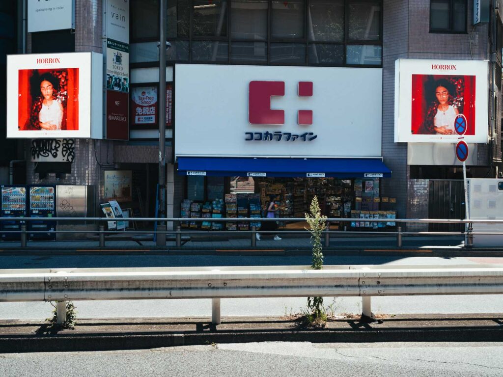
Tokyo needs no introduction; the powerhouse city of the east has an unmistakable feel. Formats here are clean cut and perfected – an apt style that seems to reflect the general feel of the city itself. Due to lack of competition with advertising space, Horrox had no trouble standing out against the brutalist architecture. The striking red was a key colour in eyeline with all onlookers, working perhaps best on the digital screens that offer a distinct look that posters cannot replicate.  

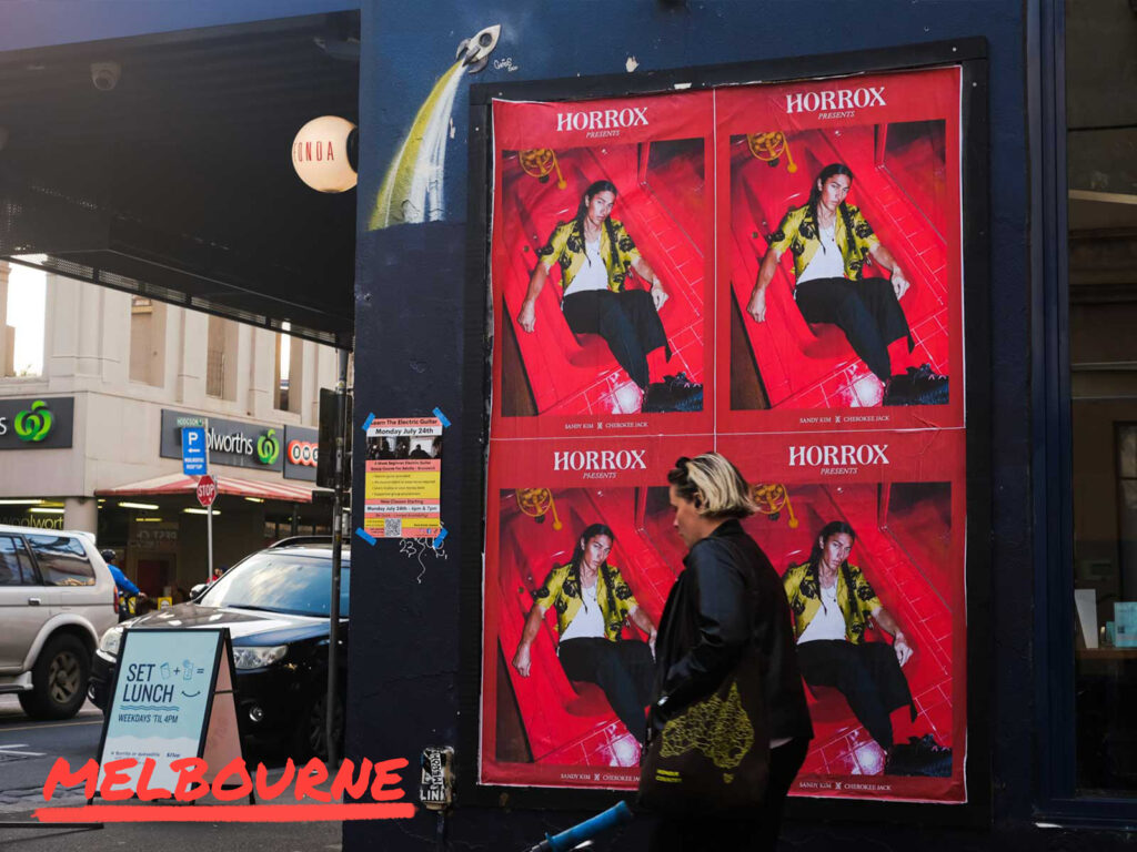
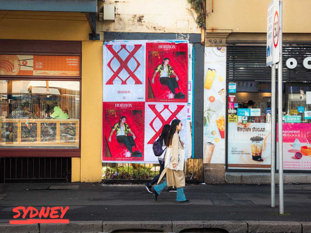
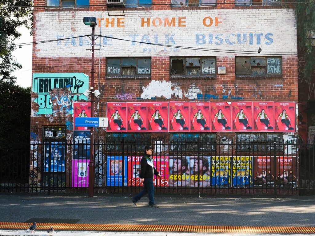
The true definition of global includes that of Australia; laid-back and homegrown posters here feel part of the woodwork and have no trouble looking like they belong. Sydney makes for a city that offers a casual edge that capitals tend not to include, this only grounded the Horrox campaign and approachability is important within advertisement. Whereas Melbourne delivers on locations that are unmissable, want to be noticed? Melbourne is the one for you if you want eyes down under.  

Every city offers its own opportunities, and if you can align yourself with the pulse of that city you can appeal to its onlookers. Horrox was at home in all markets, reaping the benefits of the cultural markers and standing out amongst the grey.  

Horrox is not a brand that exclusively pulls from the past but also the present, with some of its most prominent pieces being collaborations with artists and charities. In continuation of UNCLE’s partnership with Horrox we put a spotlight on one of these collaborators. JV Aranda, an artist based in San Francisco uses a mixture of colour, printing and repetition to make an impact with his graphic designs. His playful graphics prioritise impactful, layered motifs that are reminiscent of a pop art and dadaism which seemed a fitting match for the first collaboration of Horrox as the brand also borrows from the past for its creative direction. We took a spotlight and enquired about how his contemporary techniques and style have developed as he’s grown as a creator.  

HOW DID YOU GET INTO ART?   

Fortuitous museum visits during my formative years. For instance, in 1998, while on a trip to Los Angeles to celebrate my 16th birthday, I had the good fortune of being introduced to the work of Yayoi Kusama via a retrospective exhibition of her work at LACMA, which was mind-blowing and incredibly influential in a multitude of ways: from her enthusiastic experimentation across different mediums to how her practice overlapped with her mental health, nationality, gender, era, and pure intuitive visual talent. Her work has always served as a wonderful example of the limitlessness of Art as a storytelling device and her resilience and prolific output continues to be an inspiration.  

WHY COLLAGE?   

Collage was always a medium that just made sense to me since first being introduced to it at school. The materials needed were accessible and the process of destruction, manipulation and reinvention has always felt liberating and cathartic.   

Additionally, with the amount of content being generated daily in this day and age, Collage has grown in importance as a method to utilise the world’s growing collective archive, showcasing and re-contextualising imagery that would otherwise be ignored or forgotten.  

DESCRIBE YOUR DESIGN PROCESS?   

It’s a mix of following my intuition and problem-solving. I’ve always loved being commissioned and receiving a brief to interpret with various constraints to meet. So the design process can vary due to the project at hand, and my favourite experiences have been the ones that allowed me the opportunity to widen my scope and try new things, like working with Horrox, which gave me the chance to use the comic-strip panel format as a structural device and incorporate speech bubbles in my work for the first time.  

WHAT IS THE THING YOU LIKE MOST ABOUT BEING AN ARTIST?   

I love how artwork can form a life of its own while retaining that psychic link to its creator, who essentially become visually invisible when the work is finished.  As a Queer, Person of Colour, creating artwork feels like one of the few realms in which I’m not immediately judged by any of my physical or sociological attributes, though my work is always representative of all of those things purely from being filtered through my vantage point.  

TELL US MORE ABOUT THE COLLABORATION WITH HORROX?  

Legs somehow found my work out there in the ether and got in touch with her vision for the prints that she had wanted to commission for Horrox. I was enthused after being introduced to her work and learning where she wanted to go conceptually with the prints and was pleasantly surprised to discover the strange parallels we had with one another; Namely that I was an American living in the U.K. at the time and that she was British and living and working in my home state of California.   

WHY ARE YOU DRAWN TO USING COMIC STRIPS IN YOUR WORK?  

When working with Comics, I’ve primarily been drawn to utilising work from the Golden Age of American comics, which spans from the 1940’s and 50’s, since I not only enjoy the aesthetics of that era but additionally have gotten a kick out of re-contextualising work that was originally found in arguably quite wholesome environments, and reconfiguring the work with more modern narratives that reflect our current realities and collective discourse.       

HOW HAS CALIFORNIA AND LONDON INFLUENCED YOUR WORK?  

Growing up in California, I was surrounded by pop culture and the grandeur of nature. I was essentially raised by cartoons and theme parks. And I’ve often felt that the hyper-saturated colour palette of my work is very much informed by being a Californian.  Living in London was quite a contrast and helped me realize that pursuing the arts was not only valid but important, and it was incredibly inspiring to be in such a global and diverse city, absorbing such a range of stories.  My work may be incredibly influenced by California conceptually, but I learned how to become an artist thanks to London.  

HOW HAS SAN FRANCISCO HELPED SHAPED YOU AS A DESIGNER? 

When Legs got in touch about the commission, I was living in London and when she mentioned she was based in San Francisco at the time and wanted the prints to reflect the city and it’s musical history, specifically during the Jazz age, I was absolutely delighted as a former San Franciscan, previously living there for a number of years in the early 2000’s, back before I even realized I was an Artist and Designer. So, I’d say my time in San Francisco planted a lot of seeds, that still grow to this day. There’s an organized chaos to the city, or rather, a battle between structure and hedonism, that definitely shapes my work. 

DOES THE CITY INSPIRE YOU? 

Absolutely. Living in San Francisco was my first experience as a young adult with the wonder and perils of embracing spontaneity. I was raised in San Diego, which is very much a car-based city, so it was quite liberating living in San Francisco, which is much more pedestrian friendly. I’ve always been inspired just walking around the city and getting immersed with the different personalities of both the different neighbourhoods and the characters who happen to be around on any given day. 

WHAT ARE SOME OF YOUR FAVOURITE PLACES THERE? 

I’m biased towards the neighbourhoods I previously lived in: the Castro and the Mission, which includes my absolute favourite place in the city, smack dab in the middle of those areas: Mission Dolores Park, which is situated on an incline with a gorgeous view of Downtown San Francisco, and has been the setting of many meditative walks, sunny celebrations and heartfelt conversations with loved ones in the past. 

WHAT’S NEXT FOR YOU?  

More Collages! Currently, I work as an Editorial illustrator for a variety of clients. Most recently, I’ve been working with the esteemed American automobile magazine, Road & Track, creating collages for a column called the ‘Department of Overthinking’ and I’ve also begun to participate in different art fairs, showcasing all of the different adaptations of my Collage work, in preparation of opening Sinewy Sea Fine Art, which will be a hybrid of an Arts Space, Tea Lounge and Gift Shop, showcasing modern curiosities and storytelling, to be based in San Diego. 

Based in Brooklyn, New York fashion brand Horrox are launching their debut collection to a global audience promising to deliver on an informed and cultural array of designs. Horrox marries culture, art, music and collaboration with fashion that culminates in an informed yet edgy drop. This emerging fashion brand seemed a great match for UNCLE to support in their beginnings with a partnership. 

Horrox was born of music. From the intrigue of record sleeves and music publications, to clothing synonymous with music subcultures throughout history, it all serves as muse for the core Horrox product. Whether it be the new wave stylings of Talking Heads or punk rock powerhouse The Clash, the brand infuses distinctive eras into its pieces with a modern edge. These aesthetic choices could often misinterpreted as vapid, but instead are rooted in politics, class structure and other poignant moments within the zeitgeist. Horrox revels in research that elevates design beyond the visual and strikes a balance between concept and composition.  

The brand’s founder – Riona Horrox – a graduate of the Royal College of Art used Motifs have most commonly been drawn from the ‘77 punk era, alongside elements that borrow and modernise 50s and 60s styles. Shrunken t-shirts and jeans lend themselves well to the inherited seventies influence on the west coast.   

As part of the partnership, UNCLE will be continuing to dive deeper into the core of the brand with interviews with collaborators. This is only the beginning. Fashion can be a portal of education for its audience. Horrox is a brand that plays with nostalgia; style can intertwine with who you are and pull you into whichever community you wish to be a part of – let Horrox be yours.