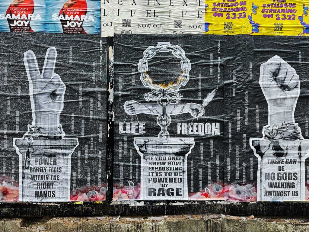
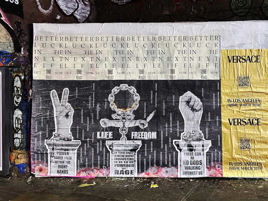
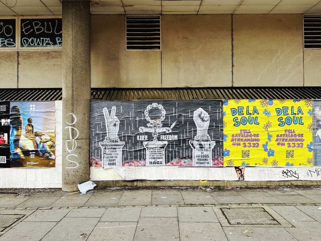
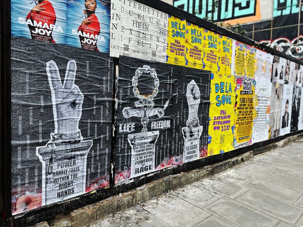
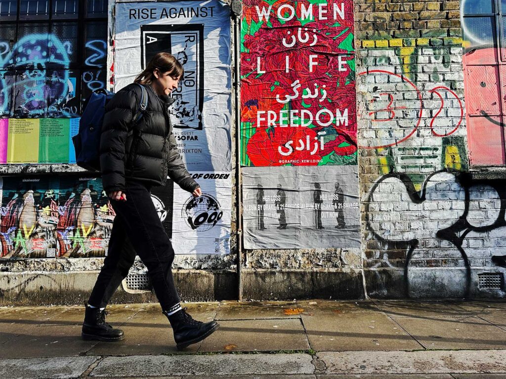
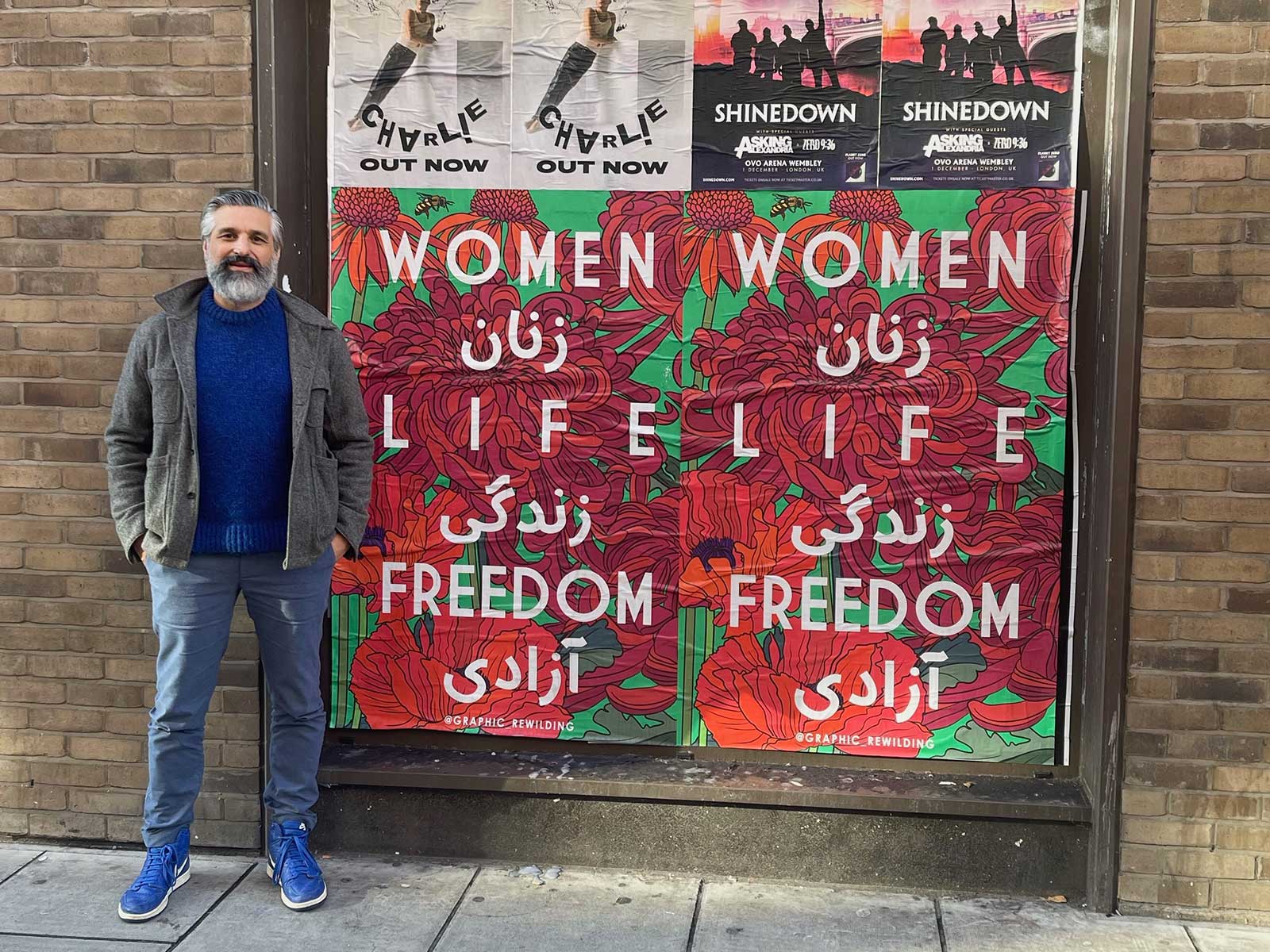
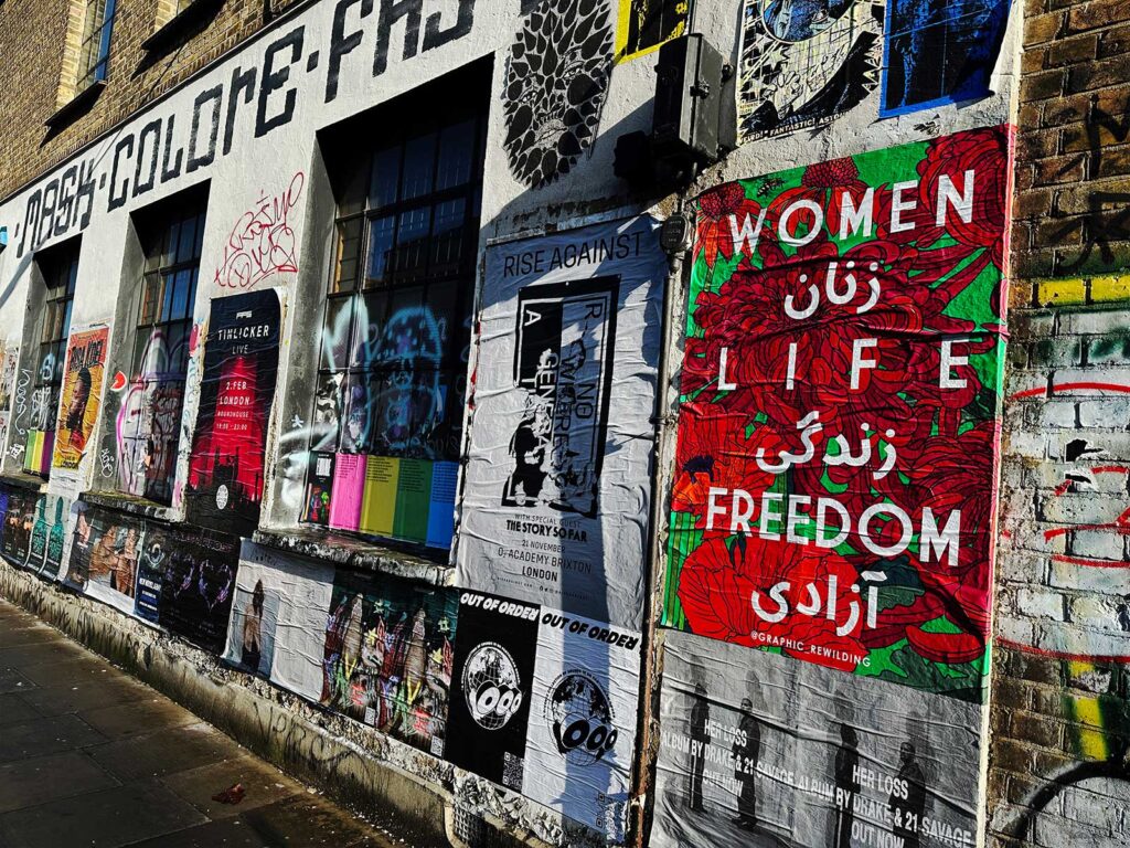
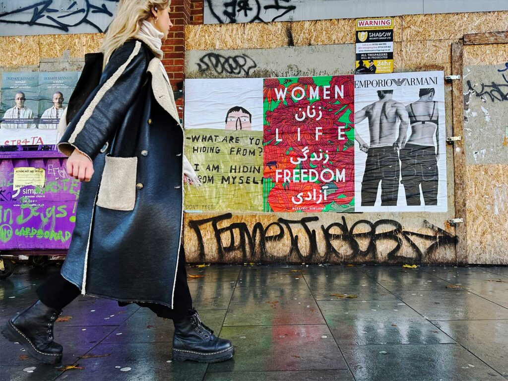
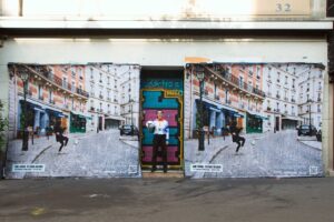
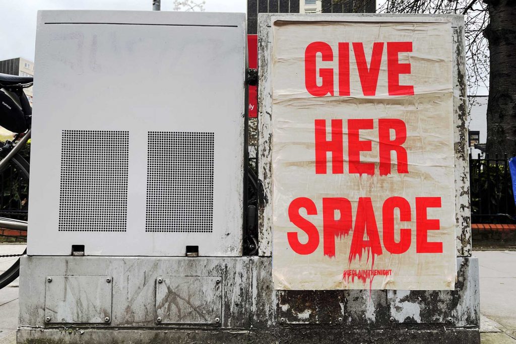
Acclaimed artist Aida Wilde is no stranger to speaking her mind, her name being synonymous with bold and pointed slogans that sum up the world she sees around her. For International Women’s Day UNCLE collaborated with Aida to get the powerful piece she designed in front of eyes across the UK.  

Wilde is a multifaceted creator most prominently known for her screen-printing, but she also creates in many different mediums including printmaking, street art, installation and murals. Her pieces are responsive to issues surrounding politics, gender, education, gentrification and equality and have been displayed internationally at venues like the Victoria & Albert Museum, Women’s Art Library, Goldsmiths, Vienna’s Fine Art Academy, Somerset House, the Fitzwilliam Museum, and Saatchi Gallery to name a few.   

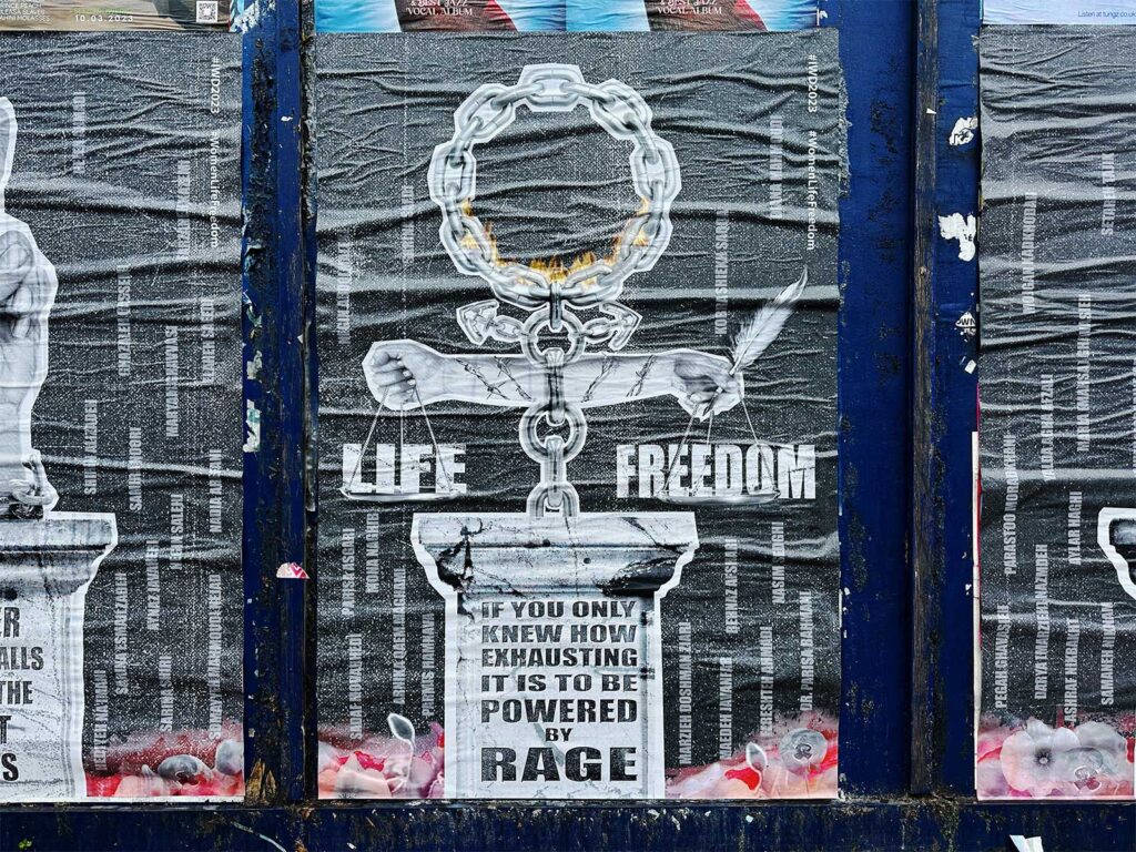
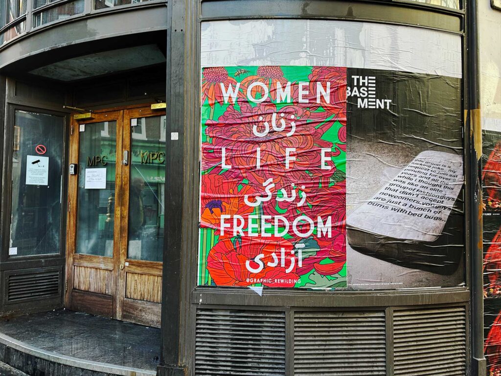
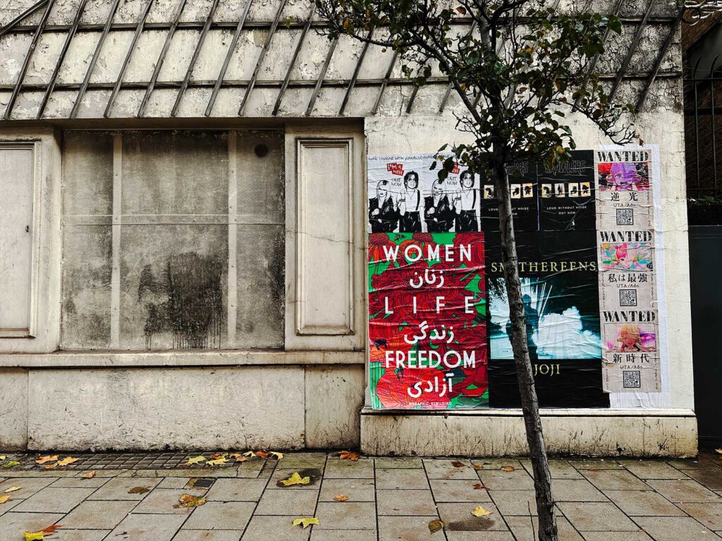
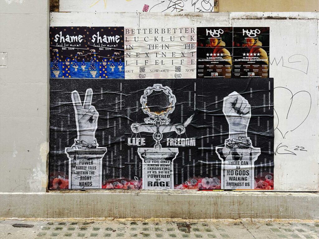
The artwork for this collaboration was designed to somewhat be a homage to Wilde’s Iranian heritage, being born there and later fleeing to the UK during the war. This experience is unfortunately not a unique one, with so many women being affected in similar ways, and many still facing extreme oppression in the country itself. The slogan featured on the piece promotes both reflection and action – “Power rarely falls within the right hands”; “If you only knew how exhausting it is to be powered by rage”; “There can be no Gods walking among us.”.  

Aida has been active since 1993 and is disruptive in a world that didn’t always treat her fairly. Her womanhood never defined her, but it certainly informed her experience and as she looks back, she can see the true impact it had on her journey. We discussed this and her artistic beginnings, experience in the field and the importance of the work she does.  

WHAT ARE YOUR MAIN INSPIRATIONS AS AN ARTIST?  

When I was at university, I stopped reading magazines and most newspapers. You’re taught to follow trends and fashion and keep up to date, so I consciously decided not to do that. I’ve shut myself off from media, the only thing I really look at now to inspire me sometimes is what’s trending on Twitter. I make a conscious decision not to follow anyone trendy or upcoming, any painters and printmakers, I just don’t want that to cloud whatever vision I get. I want everything to be very organic. Even if I have seen something and it does influence me, I’ll know that I wasn’t looking at that certain artist or that certain thing. Most of my inspiration comes from the past, be it archives and looking at political posters, fine art prints and what occurred before us. There’s nothing new – I believe you can’t do anything original, so I think for me to look in the past and bring a sort of a fresh perspective onto things, that’s what inspires me.   

WHERE DO YOUR ICONIC SLOGANS COME FROM?  

I’m a bit dyslexic so the majority of my better-known slogans have always come from me reading something wrong, like whether I stumble across a newspaper headline passing by and I’ve read it wrong, replaced one word with the other one and think it makes so much sense. A lot of the slogans come to me like a whisper or a dream, it’s really strange, then you get this compulsion that you can’t stop and then you need to just create that piece of work. I write a lot of notes, sometimes one word just comes into my head and it’s perfect, these notes trickle down to what becomes either pieces in my graphic design or work on the street.   

WHAT IS IMPORTANT TO YOU ABOUT YOUR ART?  

I’m not here to please everybody but I think what I do is for everybody. I like to think that it is for a collective consciousness. I don’t over complicate the visual language so anyone can just stand in front of it and understand. That’s the main thing, if people understand it straight away it means maybe we could all relate to each other and it could be talked about, shared and understood. I don’t like overcomplicating things; accessibility is so important when it comes to art especially in the age where people want to overcomplicate. Yes sometimes, it’s fun to dig deeper meanings but you know so many messages are overdesigned.  

HOW DID YOU COME TO SCREEN PRINTING AND WHY IS THAT SOMETHING THAT YOU WERE DRAWN TO?  

At school I was doing art, but I wasn’t very good, I just had a really strong desire to do it. I was good at other stuff like business studies, and I think that’s really helped me with my career understanding economics and things like that. Some of the other kids used to be able to screen print by stencilling and I was just so envious. Then when I turned 17, I was trying to do it by myself, and it just wasn’t working. I then started to do my foundation course in art and design, and they had a screen-printing facility and me and my best mate who I still collaborate with went into this screen print room. My work was photography based, I still loved photographing things and blowing them up and collaging them. I transferred all my photographs onto the screen and literally my work changed within a week. At my first crit showing the prints I always remember the teacher who said, “Oh my God, I think you found what you’re meant to do” and I think I was always meant to do it.  

WHAT WOULD YOU SAY IS YOUR FAVOURITE PART OF YOUR CREATIVE PROCESS IS?  

I can tell you what my least favourite is cleaning screens, it’s so boring and I’ve got to clean this screen today and expose something, you know it’s those labour things. But I always wanted to be self-contained, to be involved from the beginning, the idea conception, making the artwork, printing/painting with the screens – so I’m all in one. So much labour goes into screen printing, the hours of just stripping screens, coating screens, cleaning exposing, touching up you know and that’s just for one piece.  

I love that sometimes you could look something up digitally, choose your colours you want, but it can all change once you start physically laying down those layers and how they interact with each other.  I love that process; I like how one layer sometimes dictates your next layer. It is all so satisfying in the end. 

HOW HAS BEING A WOMEN IN THE CREATIVE SPACE CHANGED FOR YOU OVER THE YEARS?  

I started with slogan T-shirts, and they always used to be a bit angsty, that’s how they started out, it just felt like a natural thing. When the credit crunch hit, and I had to close my shop, I started doing more political stuff. At that point I met a lot of street artists as they were up and coming and I was printing for them as well as my own. It was like the beginning of something, and a couple of the guys said I had something to say and that I should put some work up in the streets. Later around 2008, an East End gallery approached me who’d seen some of my artwork on T-shirts and said have you ever thought about doing these on paper- as editions and Its many years later that I realised I’d been using my talent and my gift to serve the men I was working with – and this went on for many years. I was printing for everybody and as I began to rise slowly, I started noticing the minute that I was doing well for myself – I was doing more installations and more international shows, this balance was shifting in the way they perceived me. I didn’t realise for how many years I was desexualising myself to keep my integrity and reputation intact. I just became this little tomboy in a hoodie, I kind of lost myself and I think it was this realisation of yes you empowered me to do this but at the same time I’ve completely lost track of who I am and how I am seen as a woman. I pulled back, stopped most of my printing for men and set those boundaries, and after years of collaborations, they all dispersed. I think that’s when the penny dropped.  

HOW HAS BEING A WOMEN AFFECTED YOUR ART?  

Women especially overcompensate I think, we know that sometimes we have to work twice or three times harder than men. So, I used to over produce just to compensate and demonstrate my productivity. I suppose I lost my trade but there was a point where I questioned – is the process fulfilling enough for me? The making process is a form of therapy, it’s a form of escapism and it’s a form of me trying to prove myself to something. I don’t even think I’m proving anything to myself anymore, I think I’ve done that. Not deviating from my vision, keeping my integrity and having a big voice and not compromising has given me the freedom to what I am able to do today – but this obviously comes with heavy price.  

FEMALE ARTISTS YOU LIKE AT THE MOMENT?  

Sarah Lucas has just created a show Big Women in Colchester, where she’s focusing on heavyweight, mid-career female artists. I love that she has brought attention to talented women of a certain era/age with this curation, as we all know, the shift in attention and current artistic opportunities are very youth and style orientated or on the other side, the forgotten/undiscovered, dead/dying female artist. What happens in middle… nobody knows?  

HOW HAS YOUR HERITAGE AFFECTED YOU?  

I’ve obviously come from a political background; my father was a sort of government figure, and we got political asylum because my dad was murdered by the government not long after the 1979 Iran Revolution. I’d love to go back to Iran; I’d like to see my dad’s grave. But I’m so proud of Iran, when you think about the state of the Middle East and Middle Eastern men and how most of them are portrayed as being misogynistic. The Iranian men have really shocked me standing there with the women shoulder to shoulder willing to risk everything in the recent uprising/revolution. We also need to focus on these men that are standing fighting alongside the women and being killed. I’m just sad I’m not a bigger part of it.  

TALK US THROUGH THE DESIGN OF THE WOMEN’S DAY POSTER?  

I deliberately wanted to make it feel like a throwback to a 60s or 70s political graphics, and knew I wanted to do a collage as this is how most of my work starts, so I cut things up at the beginning of the screen-printing process. The hands are mine, my mum’s and my two sisters one of them being (Ziba Karbassi) she is a really great eminent Iranian poet so she’s the one holding the little quill in her hand to symbolise the liberation that a pen/writing can do for us (especially when you think about the banning and the weaponization of an educational rights to girls and women of Afghanistan by the Taliban currently). The rage slogan was an angry day, and it came to me in an instant, like a flash and I literally stopped what I was doing and scribbled it down on a piece of paper. Then that night I storied it and right away it blew up. So many people wrote to me saying you’ve nailed this. The background of the artwork consists of a list of names of all the women that have been killed in Iran from the current uprising since the murder of Mahsa Amini in September 2022 – December 2022. Accessing current and correct information is quite complex – the figures are much higher than what we could find but at least, this piece can take the anonymity out of some of these brutal killings. The names are falling and rising in a ghostly stream from the poppy fields at their base – honouring and humanising the countless women and girls lost to this ongoing state-sanctioned femicide. 

Controversial as this slogan ‘There Can Be No Gods Walking Amongst Us’ can appear to be interpreted, it is a direct reference to Iran’s autocratic ruling – to imply that if we want to achieve equality as humans, NO ONE is above anyone. The same implication goes into the other words on the right plinth states: “Power rarely falls within the right hands.”  

Sigh / 15 / Revolution

From everyone/ more than everything/ From all/ More than everyone ever/ I believe in my own chest/ In the moment of the bullet. 

Poem by Ziba Karbassi 

Translated by Ziba Karbassi and Nazlee Radboy 

shame are a rough-and-ready post punk band and are back for their third time around, with album ‘Food for Worms’. It debuted on 24th February after a slew of singles gave a taste to avid listeners, eager to hear what’s next. UNCLE partnered with shame on the release by pasting their alluring artwork across their hometown of London.  

Having established themselves on the scene of alternative music in early 2018, shame have only since grown, having become a force to be reckoned with. They have consistently appearing in cult music magazines NME, Clash and Pitchfork, and their previous album ‘Drunk Tank Pink’ was met with universal praise, peaking at number three on the UK indie charts.  

The resurgence of modern post punk has eclipsed certainly the UK music scene for the better part of the last decade. However, shame have been more eclectic with their sound in ‘Food for Worms’ taking influence from the lyrical stylings of Lou Reed and the more melodic approach of German band, Blumfeld. It’s a record primarily about friendship –and how have the fivesome grown together. They hope it’ll be a welcome departure from overused subject of romantic love and tap into audiences on a different level.  

Tha band have also just released a music video for ‘Fingers of Steel’, an irreverent take on the Information Age seeing the band create social media accounts to like their own content – an on brand jovial take on society. They band are set to embark on a European tour in the coming months, along with an American tour following that. See their website for full details of the tour and tickets. 

To mark the moment for the album release we talked to drummer Charlie Forbes and bassist Josh Finerty who shed light over the growth of the group’s sound, artistic choices and live shows. 

HOW DID THE NEW ‘FOOD FOR WORMS’ COME TO BE? 

Charlie – The summer of 2021, we got our own practise space, which we’ve never had before. So we were like thought we had a bit of time to write this album quickly and then we won’t need to worry about it – and that didn’t work. We almost forgot how to make music, we failed to write anything for a really, really long time, and I thought we’d forgotten how to write music altogether. That is annoying when you’re trying to write an album.  

Josh – Then it kind of just clicked, at the beginning of 2022. Our management booked in some shows for us in some small venues – like The Windmill – where we had to perform all new material, so the pressure is on and it kind of went there.  

HOW IS THIS ALBUM DIFFERENT TO YOUR PREVIOUS ONES? 

Charlie – It’s less overthought than the second album, definitely more melodic, our most melodic album, there’s a lot of group vocals and harmonies. We’ve embraced periods of actual space in music which didn’t happen on the second where we just clogged up every single beat of every single song with 15 different sounds. We’ve tried to consciously have parts in the songs where stuff really comes down, varied dynamics. 

WHY DO YOU TACKLE THE SUBJECTS YOU DO AND HOW HAS THIS CHANGED?  

Charlie – The political stuff was early days, we’re obviously still political individuals, but I don’t know how much that comes through in the music anymore. We’ve left that behind and started talking about our feelings and emotions, we’re men but we have feelings, and we want the world to know. It’s [frontman Charlie Steen] Steens remit but I know he writes what’s on his mind. It naturally comes through; he writes what he sees and feels. He was perhaps looking outward a bit more during the first album and then he started looking inwards. Obviously covid happened and everything became really introspective. This one’s all about friends, it’s primarily a platonic rock album. 

HOW DO YOU DECIDE ON ARTWORK FOR YOUR RELEASES? 

Charlie – We got lucky this time around, we got ahead of the curve with trying to sort it out, which didn’t happen on the first two. We got in touch with this artist Marcel Dzama, is who our manager knows and went from there. We picked some of his pre-existing works that we thought would work well singles. It lined up quite nicely for us on this one, which was nice, as I said the previous were very stressy to get done.  

Josh – The first two were very DIY, it’s nice having somebody who has their own style, that we can build our own world from, and it feels adjacent to the music. We made a decision and wanted something cohesive and wanted somebody to have their way with it and usually we’ve very different people and we have very different tastes, and we had to try and find some sort of middle ground. You have to trust in one vision and put it in someone else’s hands sometimes. 

WHAT DOES MUSIC MEAN TO YOU? 

Charlie – I didn’t like any music, there wasn’t a single song that I liked until I was ten or something. But then I heard Franz Ferdinand – ‘Do We Want To’ in an advert for ‘Foster’s Home for Imaginary Friends’ on Cartoon Network. I’m very grateful that I get to do it every day as my job, very lucky boy. I don’t know – it’s just about rocking out and feeling fine.  

Josh – He’s joking but it’s true, it’s that rock n’ roll feeling. 

YOU’VE USED THE PHRASE “WRITING TO PLAY” IN THE PAST, DO LIVE SHOWS IMPACT THE WAY YOU THINK ABOUT MUSIC CREATION? 

Josh – I think that’s how we approached this album especially.  The way in which we wrote this album was very different to how we wrote the second – ‘Drunk Tank Pink’ we had a year off touring, we only did festivals, and we used it to hunker down in a make-shift studio in my parents’ house. We recorded everything very separately and we didn’t really have any live shows to test out the songs on. But when we first started, we’d have a gig booked for the next week and we didn’t have enough songs to play. So we’d just box something out and get it ready so that it wasn’t super embarrassing. As Charlie said that’s exactly how we did this album. So we puddled together and wrote in a very insular way. 

HOW HAVE YOUR LIVE SHOWS CHANGED OVER THE YEARS? 

Charlie – I think the set is a bit more thought out in terms of ebb and flow, we try to keep things moving in a fresh way. The way in which we play them hasn’t changed all too much, it’s just now a bit more considered. 

Josh– There’s still an energy to it, which we’ve carried over. We are very happy to do a small set, like we used to, where we’d slap something together and in a way that’s better than something really thought out, but you can get carried away. 

WHAT’S YOUR FAVOURITE LONDON GIG VENUE? 

Charlie – The Queen’s Head, which is just round the corner from the [Brixton] Academy, and the Windmill of course, where we have played roughly 60,000 shows, each better than the last, apart from a few duds. I’d say the Windmill is easily the most important building in the whole of London or maybe in the whole of the UK in terms of new music. It’s just incredible, that’s where we did the new material shows for this album. 

WHAT’S YOUR FAVOURITE SONG TO PLAY LIVE? 

Charlie – I like ‘Tasteless’, ‘Tasteless’ is a banger, it’s always good live, it’s quite simple but it has a catchy hook at the end, that repeats over and over, it’s primal. 

JOSH – I really like playing the song ‘Adderall’ which is a new song like about to release. It starts off really slow, and it’s this much needed rest bite in the set, but it has a big climax and payoff. People always are trepidatious when it starts, they think it’s mellow, but then, by the end people are won over with it and say it’s one of their favourite songs from the set. 

WHAT GOALS DO YOU HAVE FOR YOURSELVES AS A BAND? 

Charlie – The most albums sold of all time would be good. 

Josh – To play some wonderful shows with some wonderful people and just have a great time making friends across the across the globe. Oh and have some fun that would be great, that’s kind of where I’m at with it. 

HOW DO YOU WANT TO BE REMEMBERED MUSICALLY? 

Charlie – Maybe in 30 years someone in a pub will say – “Do you remember that band shame? I saw them once, they’re pretty good live” – that’d be alright, I wouldn’t mind that. 

UNCLE have partnered with film company Altitude and PR Agency Margaret for ‘All the Beauty and the Bloodshed‘ – the latest offering from Academy Award winner Laura Poitras detailing the esteemed life and work of Nan Goldin and her significant activism. Integrated with rare footage and Goldin’s progressive photographic catalogue comes a deeply emotional story of her fight with the Sackler family, intending to hold them accountable for the overdose crisis.  

The contentious issues surrounding the big pharma rhetoric need no introduction thanks to the growing number of corruption allegations that seem to plague the sector. Movements continue to be led against these apparent conspiracies, with Nan Goldin being a prominent spearhead. Goldin took a risk to forever impact her own legacy by taking on Sackler – having been told that her involvement would probably result in her career imploding. 

The brevity of life is explored through the film’s narrative depicts the travesty of the opioid epidemic and the companies that are able to make billions from the industry. Poitras expertly weaves the story of Goldin into the fabric of the documentary giving the crisis grounding thanks to a personal connection to the cause. 

Goldin’s artistic history is riddled with rawness, never shying from depicting harsh truth. Her famed projects ‘The Ballad of Sexual Dependency’ and ‘Witnesses: Against Our Vanishing’ have legendary status on their own right and now also appear in the film.  The documentary details the various creatively driven protests taken against the family that culminates in one of the most riveting social issues of our time.  

The fallacy that a monetized industry is concerned about anything other than profit first is dissected in the piece, hoping to shed the light and influence the masses trust in these organisations. ‘All the Beauty and the Bloodshed‘ received the Golden Lion for Best Film at the Venice Film Festival, as well as securing five-star reviews from The Telegraph, The Sunday Times, Metro and Empire and an Academy Award nomination. UNCLE pasted posters over London to bring eyes to the worthy cause. 

UNCLE are hitting the streets with a no-brainer message for the festive period. Artist, printmaker, motorcycle rider and Jaffa Cake connoisseur Dave Buonaguidi has supplied a version of his kindly classic JUST BE NICE poster for us to spread far and wide on walls around the U.K.

After decades spent in the clasps of advertising, Buonaguidi – AKA Real Hackney Dave – found a new calling: that of the humble screen printer. It’s a process superbly aligned with the artist’s fondness for mass communication techniques, propaganda and making work that stirs a reaction.

But in Buonaguidi’s case the printing is anything but humble. Bombs, photobooth pic.s, ordnance survey maps, postage stamps, vintage love letters… You name it, he’s printed on it. And in mediums ranging from pheromones to glitter, sprinkles to gold leaf. “I love to work with found images and materials, experimenting with the practice of screen printing to push the boundaries of what it is and can be.”

Promoting Buonaguidi’s bright and bold type JUST BE NICE poster is a double no-brainer as it’s also the title of an auction and show in aid of The Big Issue magazine. East Art Gallery is hosting the event where a profusion of brilliant artists have made works that riff on the JUST BE NICE template. Over sixty superbly diverse pieces are featured, in Buonaguidi’s words, “The work is insane, I am humbled by all the artists’ talent and generosity.”

We know winter isn’t a festive time of year for everyone. What with international conflict and injustice, climate fears, the cost-of-living crisis, homelessness, in-work poverty and the imminent Xmas Jaffa Cake shortage, JUST BE NICE is a positive, uplifting message that transcends faith, race, ethnicity and many another perceived boundary. Our thanks go to Real Hackney Dave, UNCLE are overjoyed to share his poster’s warm sentiment as our 2022 seasonal greeting.

When Lee Baker (of Baker & Borowski studio, aka Skip Gallery, Graphic Rewilding, etc.) got in contact regarding their latest poster campaign advocating for Iranian women’s freedom from social and political oppression it was a no brainer for UNCLE to support such a pressing and important cause.

In September this year – after 22 year old Kurdish woman Mahsa Amini died whilst being detained by Iran’s morality police – girls and women across Iran have defied the draconian dress code: cut their hair, burned their headscarves and confronted the Islamic authorities and armed security forces with such bravery and determination it’s been argued that this might be “the start of the end of the Islamic Republic.

The clarion cry, roaring defiance and demanding justice as women take to the streets in protest against the Tehran regime is WOMEN, LIFE, FREEDOM. Baker and Borowski have presented this phrase in English and Farsi using bold white type against red and verdant green flora. The glowing, ember-like cluster of asters, chrysanthemums, and poppies with their dark purple pistils is a fiery and foreboding background that propels the text’s fervent message forward.

In recent years Baker and Borowski have created numerous exhibitions, installations and environments that have delighted, amused and entranced audiences. Their street posters, whilst being equally eye catching and sumptuous, are a more laconic means of communication.

In March 2022 they hit the streets with their PHONE YOUR MUM BACK poster: a work that addressed both moving personal issues and at the same time critiqued the commodification of motherly love. With the thunderingly salient WOMEN, LIFE, FREEDOM poster seeded into the urban environment we’re reminded that across the globe human rights and civil liberties we often take for granted are being denied by cruel and undemocratic regimes.

We’ll leave the last word to Baker and Borowski, “Collaborating with UNCLE on this artwork and helping spread the word about the tumultuous events in Iran, has been tremendously important to us. Lee’s mum came from Iran when she was 15. She dated an Englishman in secret for a year, and when her family decided to return she stayed. But for fate, how different our lives would have been. Her children would be having to fight tooth and nail for freedoms people take for granted in the UK.”

As part of an ongoing mission to optically energise major cities throughout Europe and the U.S., UNCLE is sponsoring artists, activists, designers and writers to originate visually striking image and/or text-based posters for display on the streets. Italian visual activist Biancoshock has come up with the goods…

Biancoshock’s poster features the Amazon logo cut in half and so made to look like a row of felled trees. It rankled the Milan based interventionist that ‘mention of’ or ‘searches for’ the word ‘Amazon’ nowadays doesn’t garner the world’s most important rain forest – lungs of the planet, but the ubiquitous delivery service.

The run up to Xmas is obviously one of the busiest times of the year for Amazon, the fifth richest company in the world. That wealth is rooted in global tax avoidance, questionable working conditions in factories, nigh-on slave labour in supply chains and a cataclysmic impact on our environment.

Biancoshock is famed for making incisive, thought provoking and wry critiques that address individual trauma as well as broader ecological and socio-political concerns. For one street project he offered small, medium and large swatches of bubble wrap to passers-by so they could choose which size to take depending on the degree of stress that needs assuaging. He’s built tiny rooms in Milan’s manholes and ‘dressed’ fissures in the city’s architecture with oversized Band-Aids.

He can even raise a droll smile even when advocating for downtrodden bike couriers. The Heavy Meal series of interventions – huge concrete roadblock cubes painted with various food delivery companies’ liveries – manage to look both preposterous and doleful. Imagine couriers’ bulky, cumbersome food delivery backpacks were made of concrete! It’s an apt representation for workers whose employment rights and conditions again amount to a form of contemporary serfdom. Except nowadays these bike couriers are subject to the whims of an algorithm, shackled by poverty and precarity rather than eking out a subsistence that’s beholden to landowners.

Biancoshock refers to himself as an ‘ephemeralist’ because, while his interventions always have a compelling visual, material and conceptual impact, they tend not to hang around for very long in physical space. As sources of critical light on matters of concern, however, they continue to glow bright in the memory.

The Amazon poster for UNCLE was originally intended for display in his hometown. However, it turns out the municipal crew who install street posters in Milan were panicked by Biancoshock’s plainly packaged protest. It’s hardly contentious to say – as the poster subtly does – that the ‘price’ we pay for Amazon’s is ‘deforestazione veloce ed illimitata’: ‘rapid and unlimited deforestation.’

So, after some wrangling, public display of the work was relocated to London. Milanese authorities explained that before they would consider displaying the poster in their city UNCLE would need to get written permission from Amazon. Well, as they say in Italy, that’ll happen when donkeys fly!

But hey, the show goes on… Biancoshock’s more than happy to see his work feature on the streets of London. Especially as the display coincides with the annual retail frenzy that is Black Friday. And UNCLE is thrilled to be working with such an inventive, astute, playful and principled individual.

Anonymity and intrigue form the perfect storm for Chicago based artist DONT FRET. His signature illustrated portraits feature a combination of witty remarks rooted in societal commentary and humour. DONT FRET has been able to carve out a place in the zeitgeist that takes advantage of modern-day oversaturation by offering refined and funny critique.  

DONT FRET got his start with paste ups and murals so a collaboration with UNCLE felt like a natural fit. We got to work bringing a selection of his pieces to both New York and London. The collaboration features four designs that blend irreverence with thought provoking sentiment – in a world more introspective than ever, his sharp takes feel relevant without being intrusive. 

His selection of artwork worked well in the fast-paced cities as a visual break for passers-by. He used sarcasm to pose a question to a smiley face – “What is he so goddamn happy about?” in New York whilst across London he was equally tongue-in-cheek playing with politics and voting habits as well as a metaphoric fly and light – “I know it will kill me but I can’t resist it…”. Perhaps his most famous motif is portraiture and his final offering features a face behind a wall quoting “What are you hiding from? I am hiding from myself”. The collection sees DONT FRET sparking conversation on the streets – winking as he goes. 

This is a collaboration with Flying Leaps who are constantly bringing forward thinking artists and their work to light. Check out their website for more on DONT FRET and other upcoming artist spotlights. 

With all eyes on football this month, UNCLE have teamed up with Goal Click on project One Game to celebrate the unity football can bring to communities across the globe. Goal Click are an international football storytelling organisation who specialise in bringing real stories to light via an assortment of mediums. UNCLE have collaborated with Goal Click to show how football can be used as a force for good for people across the globe. We have adorned our poster sites with beautiful photography showcasing extraordinary stories that exhibit the true power of the beautiful game. 

Project One Game is bringing visibility to the movement worldwide; Goal Click have provided important stories that range from the USA to Europe. Across UNCLE’s three poster designs we showcase Maria Romanchenko, Fatima Rouina and Samuel Gedeon. We wildposted their respective cities – London, Paris and NYC – with imagery indicative of the countless ways football can fit into the lives of many. Football is the most popular sport in the world, but not every game is played on a pitch, and it is this flexibility that allows the sport to touch so many. The stories told by One Game hope to portray this range and the transformative nature of the game. 

Maria Romanchenko is a Ukranian refugee now living in London, she played at a professional level in Odesa, Ukraine. Football has shaped who she is, playing a formative part of her settling into her new home – “Football gave me a lot: friends, endurance, character and determination. This is something that I will never tire of doing. With the help of football, I maintain my physical and spiritual health”.  

Fatima Rouina champions the beauty and freedom of street football, she is empowered by the versatility of the game – “Football is the place where I feel myself the most. I love playing on the street. There is freedom to play in the city. Football has this magic of being a sport that brings people together without borders. My friend Sarah was juggling the ball in a typical street of Montmarte area. You just need a ball to play on any type of field”.  

Finally, is Samuel Gedeon, a refugee originally from Haiti, and aspiring diplomat, who sought out Rooklyn (RIFA) – a disadvantaged youth charity that provide integration into New York City life through football – “I tried to show how passion for soccer has brought immigrants from different countries together and created a community”.  

We orchestrated a visit to their respective sites so they could see the impact that their story can have on the masses – reflecting the very ethos of Goal Click. The project is in partnership with BUILDHOLLYWOOD who have also set up sites exploring UK based communities. Please visit the Goal Click website to learn more about the positive impact they make and to read the full stories of those involved in the One Game project. 

With ongoing instability in the world due to humanitarian crisis, UNCLE wanted to help shed light on a cause that supports the needs of the many by partnering with Dust Off. They are an organisation that – through the medium of photography – spread awareness about global issues and are hosting a photographic print sale in aid of the charity War Child UK. We have decided to support the sale to show how powerful art can be in promoting positive change amongst the masses – a core principle of ours and Dust Off respectively. 

Over 150 collectable and noteworthy photographers are being featured in the collection, presenting “trailblazing and authentic images from fashion to documentary, to portraiture”. Those involved have been selected to ensure an eclectic and fresh selection of images from both recognisable and emerging photographers across the world. The photographers include: David Sims, David Bailey, Inez & Vinoodh, Anders Edström, Casper Sejersen, Venetia Scott, Carlijn Jacobs, Nadav Kander, Drew Vickers, Willy Vanderperre, Zhong Lin, Walter Pfeiffer and Tim Walker. 

The sale is running from the 3rd October to 30th November with all proceeds from the sales going to helping vulnerable children living through conflict from Afghanistan to Ukraine. The collaboration also involves John Gayner from INK Retouch and with support from Michael Nash Associates, Chroma Centre, and The Lab.  

Our posters will be going up around London over the course of the month in order to spread the word of the cause. Prints from the sale are available on at here

With SHIFTING SCAPE(S), Two Artists Reach Across Borders

In recent years, we’ve all learned that connecting as human beings doesn’t always mean being able to touch one another, reaching across screens and borders to forge genuine human connection. Two artists, Jim Eyre and Natalie Christensen, have taken that connection to the next level with a large-scale mural project that they collaborated on from different countries–the UK and U.S.A. The piece, entitled SHIFTINGSCAPE (S), will be taking over two mega sites in London.

A colourful, chaotic piece that challenges our perception and retrains our eyes, Shiftscapes is going to stop passers-by in their steps. Natalie and Jim began their partnership in 2017 over Instagram and since then have refined their work together. As they put it, their correspondence “blossomed into a collaboration in which they built art pieces that respond to the often-fraught practice of sharing work in a virtual space that wasn’t built with art appreciation in mind.”

SHIFTINGSCAPE (S) is a 10’ x 20’ installation that works as “an idealised manifestation of a social media hyperscape and its accompanying profound psychological effects.” Speaking to Uncle, Jim said: “Working in different continents has its limitations and time differences but working in a new way we are able to meet , share and produce work in our digital studio. We meet physically in the real world when we display our work to have a shared experience and create memories.”

With their work, says Jim, the duo aim to challenge the viewer, to make them ask questions of themselves and to open conversations about the digital realm. Natalie added: “It is important to us that the audience experience a sense of wonder and disorientation from our work, especially SHIFTINGSCAPE (S). Because we take our inspiration from social media and the impact of those spaces on our brains and lives, we want to create that kind of experience through our art.” They do that with a mash up of street elements, a confusing mix of scale and texture, bright colours, and the temporary nature of installation. 

Reflecting disorientation and aimlessness, the bright colours and chaotic visual landscape encourage us to keep watching–even when it’s uncomfortable.  SHIFTINGSCAPE (S) will be live until the end of August, when Natalie will also visit the piece.

Marina Abramović Leads Us Into the Future

Legendary performance and conceptual artist Marina Abramović needs no introduction. Born in Serbia, Abramović has made global waves in the art work with innovative works that straddle the boundaries of art and performance. Exploring the limitations of humanity and the human body first with her Rhythm series and more recently with The Artist is Present, there is no one working in that field today quite like Abramović–or that wasn’t inspired by her.

That’s why we’re so honoured to team up with Abramović and The Cultural Institute of Radical Contemporary Art (CIRCA) on a very special piece of work entitled The Hero. The Hero is a collection of 25FPS NFTs that will “expand the concept of time-based media for a digital audience”, hosted on the energy efficient Tezos blockchain.

To get the word out about The Hero, UNCLE are flyposting across London. Featuring Abramović on a horse waving a white flag, the posters include a QR code so passers-by have their chance to own a piece of history–and the future. Speaking, fittingly, to Hero Magazine, Abramović explained that she originally filmed The Hero in 2001 when her father died, an homage to her own hero. In order to fill the screen in Piccadilly Circus, Abramović worked for months to edit each individual frame.

Explaining her foray into NFTs, Abramović said, “If we think about the history of performance art, it’s always about immateriality,” she added, “All that is left with the audience is a memory of that event and the performance is very important to be done for the public, so it’s also interactive. So many years later, what do we have? We have the NFT which is also immaterial, also about time and also about the direct experience of the audience.”

The Hero will launch on July 25 at 2pm UTC.

As our technologies advance, it becomes increasingly apparent that all things regarding the digital world and metaverse are ever evolving. For our latest collaboration, we have partnered with RedKite and Ourtypes to put up flyposters promoting their group NFT art fundraising show.

Running for 16 days, the art show entitled ‘Humanity’ has been created to raise money and awareness surrounding the conflict in Ukraine. The show features 33 esteemed artists, both traditional and NFT specialists, who have come together with the intention of raising USD $84,000 for charities including: Emergency Fund, The Refugee Council, UNICEF UK Children’s and The Voices of Children Foundation.

The collection of work itself sees 256 NFT art pieces, ranging from 0.1 ETH, 0.15 ETH, 0.2 ETH, and 0.25 ETH in value, are available in editions of 8. Pieces include art from the likes of Pure Evil, street artist Fanakapan, Ben Eine and Dave Buonaguidi, AKA Real Hackney Dave. Most notably is work featured by Heath Kane – who created a bold image with the text ‘liar, thief and murderer’ in Ukrainian, which we flyposted across London.

Speaking on the show, curator Angie Davey said, “as with any global crisis, artists are some of the first to get involved to help out, and as an NFT platform with access to these artists and a means to raise funds, RedKite made the quick decision to put on Humanity, to aid refugee charities.” Alongside the show, limited edition artwork created by Pure Evil during a session of art therapy with children in Ukraine will be put on auction on Tuesday 21st June. You can find out more here.

Yoko Ono wants you to IMAGINE PEACE

As an artist, Yoko Ono is synonymous with the word “peace”. A lifelong pacifist, her “Imagine Peace” project was born in March 1969–an event with strong imagery that people around the world remember, regardless of whether or not they’re fans of her work. It was then that Ono and her late husband John Lennon staged a “bed-in” against the Vietnam War, protesting from their bed for a week at the Amsterdam Hilton hotel and later Queen Elizabeth Hotel in Montreal. It was part of a larger series of similar protests, but theirs and the photos of it garnered the most attention. 

Russia’s invasion of Ukraine is the latest war that has shocked the world and grabbed the attention of Yoko Ono. We collaborated with Ono, arts and culture platform Circa Art and BUILDHOLLYWOOD to promote the latest instalment of a decades-long project for peace. Ono’s words, “Imagine Peace”, will be occupying digital screens across the world in their local language. Piccadilly Lights in London, Times Square in New York and K-Pop Square in Seoul were among those interrupted to broadcast the phrase, but the art installation, presented by Circa and Serpentine Galleries, can also be seen in Berlin, Los Angeles, Melbourne and Milan. Our flyposters spread word of the project in London and New York, bringing a message of peace to streets across the world.

Alongside the public art and posters, a limited-edition print will go on sale with all proceeds donated to the United Nations Central Emergency Response Fund. In a press release, Ono said, “Imagining is something that we can all do, even when we have different opinions about how to get there.” You can find out when the screen near you will next be interrupted here.

Migrate Art and Idris Khan Team Up to Aid Ukraine

In the wake of Russia’s invasion of Ukraine, you can see the familiar blue and yellow of Ukraine’s flag flown in solidarity everywhere you go. Many artists are using their talents and those colours to show support of Ukraine, both with art and with tangible efforts like cash aid.

We teamed up with Migrate Art and artist Idris Khan to create his own take on the flag, a limited-edition print on sale for £300 for 10 days only, a reflection of the concept of running out of time. Called “I Thought We Had More Time…”, the piece inspires the viewer to think about the reality of what’s happening and their own lives. Collaged with those bold colours over sheets of music, Khan was inspired because the flag has become, “the symbol of the free world for a lot of people, and a symbol of hope and defiance. It’s really strong — two bold, strong colours, blue and yellow,” he said to the Evening Standard.

We’ll be putting up flyposters across the UK, bringing the crisis to the attention of all passersby. Sold as part of the Evening Standard’s Ukraine appeal, the piece is powerful. Speaking to the Standard, Khan said, “My first thought was about not having any time. One day everything’s okay, and then suddenly you’ve got two hours to leave everything behind and get out of your house or flat, wherever you are, and make a decision about what you take. I’ve got two kids as well, and that vision of just grabbing them and having to flee and leave everything behind while you watch your home be destroyed–that was a complete shock. Your emotions are: what can you do? How can you help?”

Everyone has been using what they have to hand to help the people of Ukraine, and in both our and Khan’s case, that’s art. 100% of profits will be donated to the Disasters Emergency Committee. 

Artist and illustrator Magda Archer’s irreverent, colourful pieces play with nostalgia and innocence to convey relatable feelings. We partnered with Archer to bring that tongue-in-cheek relatability to the streets with posters featuring an ice-skating, happy mouse with the headline “THIS CHRISTMAS…STAY POSITIVE ABOUT STAYING NEGATIVE.”

Playing with the fatigue that we all felt entering yet another Christmas during the COVID-19 pandemic, Archer’s unique and upbeat style offers a different perspective. We pasted the posters on the streets of London and New York, brightening up the world at Yuletide. Posting on Instagram, Archer said, “WE’RE TRYING HERE little ice-skating mouse in the hand-knit!” and got a major positive response from her followers, which is all you can really ask for!

Archer is an accomplished artist with an instantly recognisable style. She trained at Ravensbourne College of Art, Chelsea School of Art and the Royal College of Art. Her CV includes a number of group exhibitions, the children’s book Watch Out Arthur!, and a solo show in Manchester. Speaking to Ingenue Magazine about developing her unique style, she said, “It’s something that changes, that develops, all the time. Simply put, I paint what I would like to see. My paintings tend to be little references to things that are happening to me. Why they look how they look is a bit of a mystery to me, but they have evolved. That’s the way it works. I like bright, cheerful colours and I do laugh when things go wrong in my life – so I guess these things come out in what I am painting.”

That ability to not take things too seriously is needed during such a dark time, and we’re proud to have brought just a little bit of that levity to our struggling city streets and passers-by.

The upcoming AW21 collection for Charles Jeffrey’s brand, LOVERBOY, reflects on why it’s important to acknowledge the bad times as well as the good.

Ceremoniously dubbed “the ringleader of London’s next generation of club kids,” by Dazed, Jeffrey’s LOVERBOY was born as a cult club night, morphed over the years into something more without ever losing that subversive, collective spirit.

To celebrate his AW21, Gloom collection, we collaborated with the designer to flypost the streets of London with bright red and white posters of striking models wearing his gender neutral, punk-inflected pieces. Inspired by Jeffrey’s home, the collection radically uproots tradition, riffing on tartan and knitwear, tearing up the rulebook to create unique kilts, jumpsuits and other garments that feel fresh yet familiar. A new uniform for an uncanny Glaswegian autumn.

Shot by iconic fashion photographer Thurstan Redding, the images will stop even the busiest passerby with “the brightest gloom around.” Gloom is almost an indefinable mood, but as Jeffrey puts it, “Gloom speaks to the moment in which we find ourselves, for how could we do it otherwise? Teetering on the edge of something new and gazing into the unknown.” The shots show models lounging on beds and couches, as Jeffrey says they are, “stuck in their own melancholy, dreaming of celestial bodies in their teenage bedrooms.” 

The depth of the photographs and garms captures the ethos of LOVERBOY’s Gloom, offering a texture that needs to be seen IRL to be understood.

A collab with Real Hackney Dave puts the onus for women’s safety where it belongs.

While the city streets can be a source of inspiration, for many others, especially women, they can be a breeding ground for fear. With gendered violence dominating the news this year, women have felt increasingly unsafe walking the streets, and the onus is often put on them to avoid terrifying outcomes. This series Give Her Space, in collaboration with printmaker extraordinaire Real Hackney Dave, has an important mission statement of “Brightening the streets with simple ways men can show up for women against sexual harassment.”

Give Her Space launched in early 2021 in an effort to combat the narrative around street harassment and to help women to feel less at risk when out and about, particularly at night. Real Hackney Dave, known for his tongue-in-cheek text-based pieces, seemed like a natural fit to keep the project’s message concise yet unforgettable.

We wanted to get this important message, “Just be nice, give her space”, onto the streets, prompting men to step up and find ways to make women feel less scared. With stats that show 97% of women have been sexually harassed, these bold, red, simple yet effective texts all over the UK were intended to serve as a reminder to everyone and take the pressure off women for a change.

Cult British-Jamaican menswear designer Martine Rose has had an unusual and illustrious career. Born in South London, Rose received a degree in fashion design at Middlesex University before launching her eponymous label in 2007, focusing on menswear with a playful twist. She has also worked with a number of big names both in street and luxury fashion, collaborating with CAT on a line of boots in 2011, working as a consultant to Balenciaga for Demna Gyesalia in 2015, and collaborating with Nike on a tracksuit in 2018.

For her own line, Rose draws inspiration from punk, reggae, rave and other London subcultures to craft boundary-pushing clothes that don’t fit into any box. She incorporates playful fabrics not often associated with menswear, like fur, satin and lurex into her designs, crafting collections whose reference point is always music and subculture, drawing on her upbringing and first influences.

Her pieces blur gender boundaries in menswear, and we were excited to bring her SS21 collection to the streets. With camboy thrills, stretch nylon and frills, the clothes bring a playful edge to an arena that can often feel stale. The posters, featuring models poised on a frilly pedestal, are simple, bringing the focus to the clothes and to Rose’s venerated name, letting the work speak for itself. Rose often showcases her work in non-traditional spaces, including a street market and a climbing gym, so the street seemed like the perfect catwalk for someone so adept at subverting the fashion world’s strict expectations.

Patti Smith needs no introduction. The punk poet laureate has been making her unmistakable mark on our culture since the ‘70s, inspiring artists as iconic in their own right as Shirley Manson, Courtney Love and Madonna. Her unique fusion of poetry and awe-inspiring rock makes her a voice for our times, as epitomised by her collab with CIRCA Art. CIRCA is an art and culture platform with a purpose, collaborating with vision-driven artists like Ai Wei Wei, David Hockney and Jenny Holzer to stop the clock and spread important messaging every single day at 20:21. Their billboards and projections are seen across the world, and they seemed a natural partner for Patti Smith’s impactful words.

CIRCA commissioned a series of curated poems, imagery and texts to celebrate Greta Thunberg’s 18th birthday, featuring this handwritten poem by Smith calling Thunberg a herald of “wonderful tomorrows”. In an effort to bring attention to the dire effects of climate change that Thunberg herself has been so adept at raising awareness of, the posters celebrate a tomorrow that can only happen if we join together. As well as the posters and imagery, “A NEW YEAR” by Patti Smith streamed online every evening throughout January at 20:21.